July 2012
 We published our first monthly newsletter in January 2004. The first topic was variation – the point where you should always begin when talking about statistical process control (SPC). We now have over 100 newsletters on SPC and related topics. This newsletter takes a look back at all those newsletters. We do this, on occasion, to let our newer readers know what is available on-line and to remind our long-time readers about the wealth of knowledge that we have available.
Remember special and common causes of variation? How about the contributions of Dr. W. Edwards Deming? Questions on when to use a certain control chart or what the difference is between variable and attribute control charts? How can a histogram be used to monitor incoming material from a supplier? How do I know if my measurement system is any good? What is process capability and how do I determine it? How do I get to root cause? How do I know if these three processes are the same? All this information and much more is in our newsletters.
Since our last review, we have added newsletter articles on experimental design, attribute gage R&R, on where control limits come from and the purpose of control charts. We have looked at how to use SPC in downtime, in surveys and in purchasing as well as what to do when your control chart goes out of control. We talked about some measurements that everyone can do and how to balance people and process. And much, much more.
One of our objectives has been to make the website a place where people can go for information on SPC and related topics. We believe our newsletters have helped us reach this objective. There is a wealth of information in these newsletters. We hope you enjoy the review. You can view all our newsletters by selecting the “Articles & Newsletters” link to the left.
The newsletter topics have been divided in the following sections:
- Variation
- Dr. W. Edwards Deming
- Control Charts
- Variable Control Charts
- Attribute Control Charts
- Control Chart Examples
- Bar Charts: Paretos and Histograms
- Measurement Systems Analysis
- Process Capability
- Root Cause Analysis
- Comparing Processes
- Experimental Design Techniques
- Miscellaneous
- Summary
- Quick Links
Please feel free to leave any comments you have at the end of the newsletter. If there is a topic you would like us to cover, please let us know.
You access all the newsletters at this link, sorted by categories.
Variation
This takes us back to where everyone needs to begin whenever you are dealing with statistical process control – with variation. To effectively use SPC, you must understand the concept of variation and, in particular, the difference between common and special causes of variation. While variation is really part of each of our newsletters, we have eight that address the issue directly. If you don’t know the difference between common and special causes of variation, this is where you need to begin. The funnel experiment is a great example of what happens when you confuse special and common causes of variation. The red bead experiment is unsurpassed for helping people understand variation. The February 2009 newsletter contained a free red bead experiment that can be downloaded and run in Excel. In December 2010, we took a look at how to teach variation to leadership. It is important that leadership use SPC to monitor the data important to them, e.g., sales. The newsletters on variation are listed below.
- Variation (January 2004)
- Leadership and Variation (February 2004)
- Revisiting Variation (March 2006)
- Overcontrolling a Process: The Funnel Experiment (July 2006)
- Revisiting Variation (January 2008)
- The Red Beads: Understanding Variation (February 2009)
- Teaching Variation to Leadership (December 2010)
- Returning to the Basics: Variation (January 2012)
Dr. W. Edwards Deming
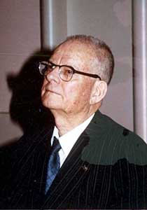 Any study of variation is incomplete without understanding the teachings of Dr. W. Edwards Deming. Our newsletters include a four-part series on the teachings of Dr. Deming. Dr. Deming was a remarkable man. He is often credited with helping the Japanese rebuild economically after World War II. The Deming Prize is still given to companies for major advances in quality improvement. (Note: permission to use the Media Gallery photo of Dr. Deming granted by Diana Deming Cahill of the W. Edwards Deming Institute).
Dr. Deming spent years developing a theory for helping companies move forward into the twenty-first century. Remarkably, it all still applies today. Understanding Dr. Deming begins with understanding his “system of profound knowledge.” This system is composed of four bodies of knowledge:
- Knowledge of a system
- Knowledge of variation
- Theory of knowledge
- Knowledge of psychology
To understand the system of profound knowledge, you must understand what a system is and what the “aim” of a system is. You must also understand variation and realize that the true benefit of this understanding comes from how you lead people. You must understand the theory of knowledge, and finally you must understand motivation and psychology. You don’t have to be an expert in each of these areas. However, you must know something about each area because they are interrelated. Our four-part series addresses each of the bodies of profound knowledge:
- Dr. Deming and Profound Knowledge – Part 1 (October 2006)
- Dr. Deming and Profound Knowledge – Part 2 (November 2006)
- Dr. Deming and Profound Knowledge – Part 3 (December 2006)
- Dr. Deming and Profound Knowledge – Part 4 (January 2007)
Control Charts
Control charts, of course, are the workhorse of statistical process control and represent the topic of many of our newsletters. A control chart is a movie of your process over time. It is the way that your process communicates with you. The control chart will tell you if everything is working as the process was designed (just common cause variation present) or if there is a problem (special cause variation present). All you have to do is listen.
To listen, you must be able to interpret a control chart. This was the first of our newsletters on control charts. The newsletter on control strategies provided a method of looking for the causes of out of control points. The January 2005 newsletter covered how to start and maintain control charts as well as provided insights on what should be charted. The newsletter on the impact of statistical control explains why calculated values of an average, a standard deviation, or a Cpk value have no meaning unless the process is in statistical control. The April 2006 newsletter provided a process flow diagram for selecting the right control chart to use. Our general control chart newsletters are listed below.
Since our last review, we have done 5 newsletters about control charts. The March 2011 newsletter is a great review on the purpose of control charts. This was written to help dispel some of the misinformation about control charts on a blog. We also had newsletters on the using control charts for KPIs, how and when to recalculate control limits, applying control charts to baseball and then what to do when your process goes out of control – an updated look at control strategies.
- Interpreting Control Charts (April 2004)
- Control Strategies (August 2004)
- Use of Control Charts (January 2005)
- The Impact of Statistical Control (February 2006)
- Selecting the Right Control Chart (April 2006)
- Control Limits – Where Do They Come From? (September 2010)
- The Purpose of Control Charts (March 2011)
- KPIs, Control Charts and Linking of Measurements (July 2011)
- When to Calculate, Lock, and Recalculate Control Limits (August 2011)
- Control Charts and America’s Favorite Pastime – Baseball (November 2011)
- My Process is Out of Control! Now What Do I Do? (June 2012)
Variable Control Charts
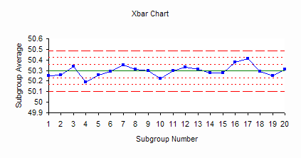
Variable control charts are used when you have variables data – data that you can measure to any precision (depending on your measurement system). Examples of variables data include height, weight, density and time. We have covered three variable control charts: Xbar-R, Xbar-s and the individuals (X-mR) control charts. Rational subgrouping is important when using Xbar-R and Xbar-s control charts. There are two newsletters that cover rational subgrouping along with a great exercise that shows the impact of rational subgrouping. In addition, we demonstrated how individuals control charts can be used to handle “rare” data as well as “chunky” data. Our variable control chart newsletters are listed below. Our January 2011 newsletter showed how to use within/between control charts – what to do when it is not reasonable to assume that the within subgroup variation can be the same as the between subgroup variation.
- Xbar-R Charts – Part 1 (March 2005)
- Xbar-R Charts – Part 2 (April 2005)
- Rational Subgrouping and Xbar-R Charts (May 2005)
- Rational Subgrouping and Xbar-R Charts – Part 2 (June 2005)
- Individuals Control Charts (October 2006)
- Chunky Data and Control Charts (April 2007)
- Rare Events and X-mR Charts (May 2007)
- Xbar-s Control Charts – Part 1 (September 2008)
- Xbar-s Control Charts – Part 2 (October 2008)
- Xbar-mR-R (Between/Within) Control Chart (January 2011)
Attribute Control Charts
 As of this year, we have completed newsletters on each of the four attribute control charts: p, np c and u control charts. Our April 2009 newsletter reviews all four. We also covered how the control limit equations for these charts are not valid in the “small sample case” and how to handle these situations. Our eight newsletters on attribute control charts are listed below. We added the g control charts as an attribute chart in 2011.
- c Control Charts (July 2004)
- p Control Charts (July 2005)
- u Control Charts (July 2007)
- Small Sample Case for p and np Control Charts (February 2008)
- Small Sample Case for c and u Control Charts (March 2008)
- np Control Charts (March 2009)
- Attribute Control Charts (April 2009)
- g Control Chart (February 2011)
Control Chart Examples
We have ten newsletters that describe how to use control charts in specific industries or situations. We have added three since the last review: using SPC with downtime/equipment effectiveness, with surveys and in purchasing.
- Monitoring Customer Complaints Using SPC (June 2006)
- SPC and On-Time Performance (June 2007)
- SPC & Process Improvement in the Warehouse (August 2007)
- SPC and Customer Service (November 2008)
- An Example of the Misuse of SPC in Health Care (August 2009)
- SPC and Pharmaceutical In-Process Control (September 2009)
- SPC and Pharmaceutical Finished Product Quality Specifications (October 2009)
- SPC, Downtime, and Overall Equipment Effectiveness (December 2011)
- Control Charts and Surveys (April 2012)
- Control Charts and Purchasing (May 2012)
Bar Charts: Pareto and Histograms
The Pareto diagram and the histogram are often referred to as bar charts. The Pareto is used to separate the “vital few” from the “trivial many” problems or causes. Histograms are used to estimate the location, spread and shape of a set of data. Our second part on the histogram newsletters showed how you can use histograms to monitor incoming material from suppliers.
- Pareto Diagrams (June 2004)
- Histograms – Part 1 (December 2005)
- Histograms – Part 2 (January 2006)
Measurement Systems Analysis/Gage R&R
 Collecting and analyzing data are a vital part of process improvement. It is important to be sure that the data we are collecting are accurate and precise. Our first newsletter on test methods examined how to use control charts to monitor the measurement system. We also have a four-part series on the variables measurement system that covers stability, bias, linearity, and gage R&R. The November 2009 newsletter listed below gives a procedure to use to determine the % of variance due to the measurement system. The last two newsletters describe attributes gage R&R.
- Monitoring Test Methods Using SPC (May 2006)
- Variables Measurement Systems – Part 1: Stability (September 2007)
- Variables Measurement Systems – Part 2: Bias (October 2007)
- Variables Measurement Systems – Part 3: Linearity (November 2007)
- Variables Measurement Systems – Part 4: Gage R&R (December 2007)
- Measurement Systems – Is Yours Any Good (November 2009)
- Attribute Gage R&R Studies: Comparing Appraisers (May 2010)
- Attribute Gage R&R Studies: Part 2 (June 2010)
Process Capability
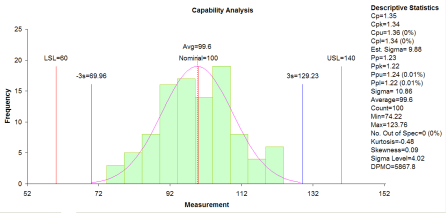
“Is the process capable of meeting specifications?” This is the key question that must be asked in the end. Does the process really do what we want it to? This is the issue of process capability and involves terms such as Cpk and Ppk. Our three-part series on process capability provides an in-depth explanation of process capability. Our February 2012 newsletter describes a methodology to improve Cpk.
- Process Capability – Part 1 (October 2004)
- Process Capability – Part 2 (November 2004)
- Process Capability – Part 3 (December 2004)
- Cpk Improvement Methodology (February 2012)
Root Cause Analysis
One major aspect of problem solving is root cause analysis. What caused the problem to occur? How do we know it is the true cause of the problem? Our newsletters cover scatter diagrams to see if one variable is linearly correlated to another. Also included is how to create and analyze cause and effect (fishbone) diagrams. The Failure Mode and Effect Analysis newsletters resulted in the most visits to our website. We also have looked at modeling a process using linear regression. ANOVA was introduced in our December 2008 newsletter. Since our last review, we have added how to use Pareto diagrams with control charts, correlation analysis and scatter plot matrices.
- Scatter Diagrams (February 2005)
- Creating Cause and Effect Diagrams (October 2005)
- Analyzing Cause and Effect Diagrams (November 2005)
- Failure Mode and Effects Analysis (May 2008)
- Linear Regression – Part 1 (June 2008)
- Linear Regression – Part 2 (July 2008)
- Single Factor ANOVA (December 2008)
- Using Pareto Diagrams and Control Charts Together (November 2010)
- Correlation Analysis (April 2011)
- Scatter Plot Matrix (May 2011)
Comparing Processes
On occasion, you have the need to compare two or more processes. Are the processes operating at the same average? With the same variance? The newsletters listed below describe how this can be done.
- Comparing Two Processes (August 2006)
- Paired Sample Comparison (September 2006)
- Comparing Multiple Processes (February 2007)
- Box and Whisker Plots (March 2007)
- Comparing Multiple Processes: Bonferroni’s Method (January 2009)
- Bartlett’s Test for Equality of Variances (July 2009)
Experimental Design Techniques
Since our last review, we have introduced experimental design techniques in four newsletters. We described in detail how to conduct a two-level experimental design. Our April 2010 newsletter presented a look at how experimental design techniques can be used in the pharmaceutical industry.
- Experimental Design Techniques – Part 1 (January 2010)
- Experimental Design Techniques – Part 2 (February 2010)
- Experimental Design Techniques – Part 3 (March 2010)
- Design of Experiments in Pharmaceutical Development (April 2010)
Miscellaneous Topics
We also have offered a variety of miscellaneous topics. These include an explanation of standard deviation as well as skewness and kurtosis. A ten-step problem solving model, a method for data collection and a model for process management have been covered. The normal distribution and how to make a normal probability plot have also been introduced in our newsletters. Since our last review, we have added newsletters on waterfall charts, Levey-Jennings charts, inferences on proportion, measurement, and balancing process and people.
- Operational Definitions/Measurement System Analysis (March 2004)
- Problem Solving Model (May 2004)
- Data Collection (September 2004)
- Explaining Standard Deviation (August 2005)
- Inspecting Supplier Material (September 2005)
- Process Management Model (November 2006)
- Are the Skewness and Kurtosis Useful Statistics? (April 2008)
- Normal Distribution (May 2009)
- Normal Probability Plots (June 2009)
- Waterfall Charts (July 2010)
- Levey-Jennings Charts (August 2010)
- Inferences on Proportions (October 2010)
- Anderson-Darling Test for Normality (June 2011)
- But, You Can’t Measure What I Do! (September 2011)
- Balancing People and Process (October 2011)
- Variation, People and Pay for Performance (March 2012)
Summary
We have taken a look back at the over 100 newsletters we have published since January 2004. These newsletters represent a wealth of knowledge on many topics. We hope that our readers have found them useful and entertaining.
Comments are now closed for this newsletter. Please e-mail bill@www.spcforexcel.com if you would like to add a comment.