April 2021
(Note: all the previous SPC Knowledge Base in the variable control chart category are listed on the right-hand side. Select this link for information on the SPC for Excel software.)

There were a number of control charts I was exposed to back then. One was the X-s chart. This chart is similar to the X-R chart, except that the subgroup standard deviation is used instead of the subgroup range for the within subgroup variation.
In this publication, we will compare the two charts to see when you use one or the other. Traditionally, it has been suggested that you use the X-R chart with subgroup sizes of 9 or less; you use the X-s chart with subgroup sizes larger than 9. For the purposes of this publication, the chart to use is the one that gives you the best estimate of the process standard deviation. A simulation was developed to help do this.
The basic conclusion is that there is no reason not to use the X-s chart all the time.
In This Issue:
- Review of X-R and X-s Control Charts
- When to Use the X-R and X-s Control Charts Historically
- Estimating Sigma, the Process Standard Deviation
- Data and Simulation
- Control Charts from a Stable Process
- Simulation with a Stable Process
- Simulation with a Mixed Process
- Simulation with Out of Control Points
- Summary
- Quick Links
You may download the workbook with the simulation at this link. This workbook contains the results of the simulation as well as the VBA code to let you run your own simulations. The data used in the control chart figures below are also included in the workbook. You may also download a pdf copy of this publication at this link.
Review of X-R and X-s Control Charts
These two control charts are quite similar. Each is really two charts – one to track the between subgroup variation and the other to track the within subgroup variation. You start with the individual values and then form subgroups of size n. For example, suppose you are tracking the weight of bags containing sand. You are measuring the weight for 5 consecutive bags at the start of each hour. You take those 5 weights and form a subgroup. In this case, the subgroup size, n, is 5. The average of each subgroup is calculated using the following:
X= SXi/n
where Xi is are the individual X results in the subgroup. This is repeated and the X values are plotted over time. So, the X chart monitors how the subgroup averages vary over time – this is why it is said to track the between subgroup variation.
The two charts differ in how they track the within subgroup variation. For the X-R chart, the subgroup range is used. The range within a subgroup is defined as the largest value minus the smallest value:
Subgroup Range = R = Xmax – Xmin
This is a measure of the variation within a subgroup. The subgroup range is plotted on the R chart, which is used to measure the variation within a subgroup from subgroup to subgroup.
For the X-s chart, the subgroup standard deviation (s) is used:
The value of s is a measure of the variation within a subgroup – it essentially measures how far each individual X value in the subgroup is away from the subgroup average, X. The s values are plotted on the s chart. Like the R chart, the s chart monitors the variation within a subgroup from subgroup to subgroup.
Note that the calculation of s involves each individual X value in the subgroup while the subgroup range, R, uses only two of the individual values, the maximum and the minimum, regardless of how large the subgroup is.
Once you have sufficient data, you can begin to calculate the averages and control limits. These calculations are given below:
X-R Chart:
X-s Chart:
where k = number of subgroups, R = the average subgroup range, s = the average subgroup standard deviation, X= the overall average and D4, D3, A2, B4, B3 and A3 are all constants that depend on subgroup size.
For more information on the X-R and X-s control charts, please visit our SPC Knowledge Base.
When to Use the X-R and X-s Control Charts Historically
One reason that the X-R chart has been used more than the X-s chart is that it is easier to explain a range then the standard deviation. Back in the calculator days, the range was a lot easier to calculate than the standard deviation. The use of software now makes that point rather moot.
Another reason is that as the subgroup size, n, increases, the standard deviation becomes a better estimator of the process standard deviation – the variation in the process. Is that true? Quite often, the suggestion is to use the X-R chart when n is less than 8 to 10. Different sources suggest either 8, 9 or 10. Otherwise, for larger subgroups, use the X-s chart. The rest of this publication takes a look at how accurate this is.
Estimating Sigma – The Process Standard Deviation
One key use of a control chart is to estimate the process standard deviation, s. This value is used in other calculations such as process capability. The within subgroup variation control chart is used to estimate the process standard deviation. The process standard deviation is measuring the variation in the individual values. The equations for estimating s are given below for the two chart:
X-R Chart:
s =R/d2
X-s Chart:
s =s/c4
where d2 and c4 are constants that depend on subgroup size. We will use the value of s to help compare how well the X-R chart and X-s chart perform and when you should use one or the other.
Data and Simulation
To determine how well the X-R chart and X-s chart perform, a simulation was run multiple times. A “population” of 5000 randomly generated numbers was created using the random number generator in the SPC for Excel software. The normal distribution was used with an average of 100 and standard deviation of 10. The actual values for the 5000 points are:
Population Average = 100.0257
Population Standard Deviation = 10.0401
These 5000 points represent all the possible outcomes from a process. The simulation uses subgroup sizes from n = 2 to 20. The number of subgroups for each simulation is k = 20. The simulation works in the following way:
- Sort the 5000 points in random order
- Take the first nk points
- For example, if n = 3 and k = 20, the first 3*20 = 60 points are taken to form the subgroups and do the calculations
- For each n value (from 2 to 20)
- Form subgroups of size n
- Calculate the subgroup range (R) and subgroup standard deviation (s) for each subgroup
- Calculate the average subgroup range (R) and the average subgroup standard deviation (s) for the 20 subgroups
- Repeat this 1000 times
- After the 1000 times, calculate the overall average subgroup range and overall average subgroup standard deviation for the 1000 times for that value of n
- Calculate the process standard deviation (s) from the overall average subgroup range and overall average subgroup standard deviation
- Compare the results to each other and to the actual process standard deviation from the 5000 data points
The results of the simulation are described below.
Control Charts from a Stable Process
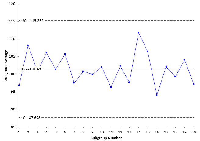
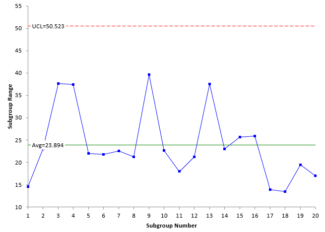
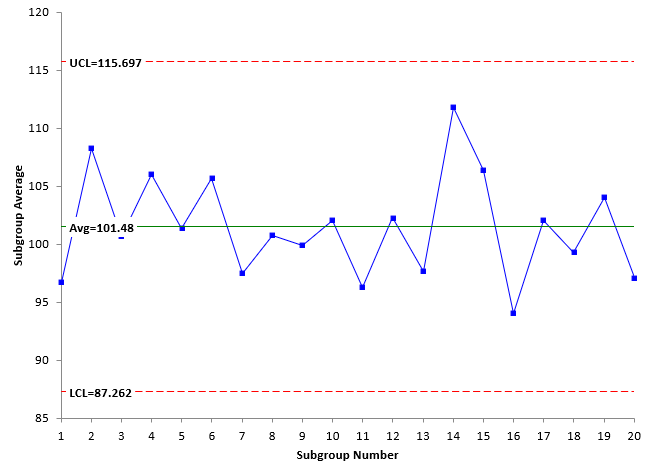
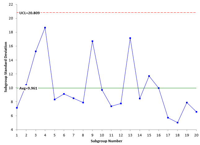
Drawing random samples from the 5000 point population described above is a stable process. Taking samples from it and creating a control chart will produce a process that is very stable – it is in statistical control. Below are examples of the X-R chart and X-s chart for a random sample taken from the 5000 points with n = 5.
Figure 1: X Chart with Limits Based on the Average Subgroup Range
Figure 2: Subgroup Range Chart
Figure 3: X Chart with Limits Based on the Average Subgroup Standard Deviation
Figure 4: Subgroup Standard Deviation Chart
Look at Figures 1 and 3, which are the X charts for the X-R chart and X-s chart, respectively. The plotted values are the same for each chart – the X values. In addition, the overall average is the same for both charts. The only differences are the values of the upper control limit (UCL) and the lower control limit (LCL). The control limits in Figure 1 are based on the average subgroup range R while the control limits in Figure 3 are based on the average subgroup standard deviation s. Note that the values are close.
Figures 2 and 4 represent the within subgroup variation as defined by either the subgroup range or the subgroup standard deviation. These two will often follow a similar pattern, e.g., a large subgroup range will generate a large subgroup standard deviation. Usually, the X-R chart and X-s chart will look similar.
The control charts in Figures 1 to 4 are in statistical control – there are no points beyond the control limits or patterns in the data. The process standard deviation can be calculated for the two charts as shown below:
s =R/d2 =23.894/2.326=10.272
s =s/c4 =9.961/0.94=10.597
The first one is based on the average subgroup range; the second on the average subgroup standard deviation. The two are similar. From above the “true” standard deviation is 10.0401. Both are near that as well.
Note that is one time going through the process of determining the process standard deviation. The simulation does this 1000 times for each subgroup size and chart and takes the overall average of the 1000 results for each chart to estimate s.
Simulation with a Stable Process
The simulation was run 1000 times to determine the average long-term value of s as a function of subgroup size. The results are shown in Table 1.
Table 1: Simulation Results for a Stable Process
| n | R | s | d2 | c4 | s from R | s from s |
|---|---|---|---|---|---|---|
| 2 | 11.322 | 8.006 | 1.128 | 0.7979 | 10.0371 | 10.0335 |
| 3 | 17.087 | 8.946 | 1.693 | 0.8862 | 10.0930 | 10.0944 |
| 4 | 20.649 | 9.241 | 2.059 | 0.9213 | 10.0287 | 10.0299 |
| 5 | 23.238 | 9.395 | 2.326 | 0.9400 | 9.9906 | 9.9949 |
| 6 | 25.471 | 9.565 | 2.534 | 0.9515 | 10.0517 | 10.0520 |
| 7 | 27.163 | 9.633 | 2.704 | 0.9594 | 10.0456 | 10.0411 |
| 8 | 28.588 | 9.692 | 2.847 | 0.9650 | 10.0414 | 10.0437 |
| 9 | 29.803 | 9.725 | 2.97 | 0.9693 | 10.0346 | 10.0334 |
| 10 | 30.921 | 9.778 | 3.078 | 0.9727 | 10.0456 | 10.0526 |
| 11 | 31.905 | 9.814 | 3.173 | 0.9754 | 10.0552 | 10.0615 |
| 12 | 32.721 | 9.819 | 3.258 | 0.9776 | 10.0434 | 10.0444 |
| 13 | 33.522 | 9.857 | 3.336 | 0.9794 | 10.0485 | 10.0646 |
| 14 | 34.277 | 9.874 | 3.407 | 0.9810 | 10.0608 | 10.0649 |
| 15 | 34.699 | 9.836 | 3.472 | 0.9823 | 9.9939 | 10.0137 |
| 16 | 35.394 | 9.862 | 3.532 | 0.9835 | 10.0208 | 10.0273 |
| 17 | 36.092 | 9.916 | 3.588 | 0.9845 | 10.0592 | 10.0725 |
| 18 | 36.522 | 9.897 | 3.64 | 0.9854 | 10.0335 | 10.0437 |
| 19 | 37.043 | 9.911 | 3.689 | 0.9862 | 10.0414 | 10.0492 |
| 20 | 37.498 | 9.915 | 3.735 | 0.9869 | 10.0395 | 10.0467 |
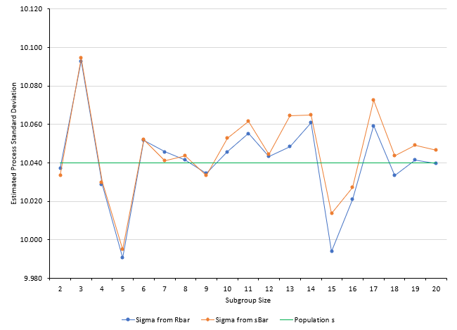
This table contains the average of the 1000 estimates for R and s for the various subgroup sizes. It also includes the control chart constants needed to determine s. The values of s are included in the table. The values of s are plotted in Figure 5 along with the “true” population average.
Figure 5: Values of s from the Simulation for a Stable Process
The values of s are close to the population value of 10.0401. For n values up to 9, the estimate of s is about the same between the two charts. Sometimes the s from R is higher than the s from s. Other times it is not.
Starting at n = 10, the value of s from s is always higher than the s from R. But, for a stable process, both give results fairly close to the population standard deviation. In fact, if you take the average of the s results from n = 10 to n = 20, the average based on R is closer to the population standard deviation than the average based on s:
“True” population standard deviation = 10.0401
Based on R = 10.0402 (for n = 10 to 20)
Based on s: = 10.0492 (for n = 10 to 20)
It appears, that for a stable process, it doesn’t matter whether you use the X-R chart or the X-s chart for subgroups n = 2 to 20.
But what about unstable processes? Two cases are considered below.
Simulation with Two Processes Mixed
To simulate a less stable process, 500 of the original 5000 points were replaced with a distribution that had an average of 85 and a standard deviation of 10. So, 90% of this new distribution had an average of 100 and 10% had an average of 85. Both had a standard deviation of 10. The new distribution average and standard deviation were:
Population Average = 98.454
Population Standard Deviation = 11.0486
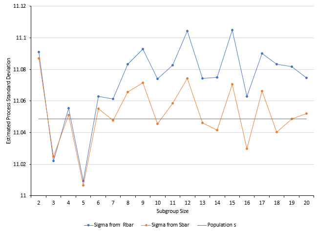
The simulation was run again using this distribution. The tabular results are not included here but are in the workbook containing the simulation at this link. Figure 6 shows the results for s.
Figure 6: Values of s from the Simulation for Mixed Processes
For n = 2 to n = 5, the results are similar. But from n = 6 on, the value of s estimated from R is considerably higher than that estimated from s. So, when there is some additional variation added to the mix, it appears that s is a much better choice than R to estimate s.
Simulation with Out of Control Points Added
To include some out of control points, 200 points in the original distribution were deleted and 50 values each of 60, 65, 135 and 140 were added to the distribution. These represent out of control points since the original distribution was based on an average of 100 and a standard deviation of 10. About 4% of the points are beyond the 70 to 130 range defined by the original distribution. The new distribution had the following values:
Population Average = 100.025
Population Standard Deviation = 12.3904
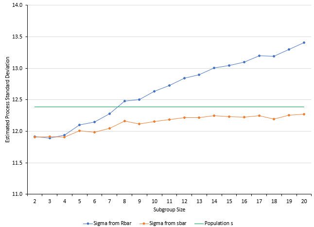
The simulation was run again. The tabular results are not included here but are in the workbook containing the simulation at this link. The results are shown in Figure 7.
Figure 7: Values of s from the Simulation with Out of Control Points Added
Figure 7 shows that the estimated process standard deviation from the two methods diverge considerably. The value of s estimated by R is inflated while the value of s estimated by s is deflated but does begin to approach the population standard deviation as n increases.
If the process is out of control, then neither method is that accurate although the s method appears to be a better choice as n increases.
Summary
This publication examined using the estimated process standard deviation (s) to determine if it is better to use the X-R chart or the X-s chart. Historically, if your subgroup size is less than 9, you would use the X-R chart; if larger than 9, you would use the X-s chart.
A simulation was used that examined the values of s obtained by both charts using 20 subgroups with subgroup sizes (n) of 2 to 20. The simulation was run 1000 times for each subgroup size under three different scenarios.
The first scenario was a stable process. In this scenario, there was little different between the values of s obtained from the two different charts. It really doesn’t matter that much which chart you used.
The second scenario used a mixed process. In this scenario, using s gave better results. R seemed to overestimate the value of s .
The third scenario added some out of control points to the process. Neither method predicted s very well. This is not surprising since the process is out of control. However, it did appear that R definitely inflated the value of s .
Final conclusion: it appears to me that you might as well use the X-s chart all the time. It works just as well as the X-R chart for the smaller subgroup sizes and it seems to handle out of control situations better overall.


Thanks alot . It was very helpful