October 2020
(Note: all the previous SPC Knowledge Base in the variable control charts category are listed on the right-hand side. Select this link for information on the SPC for Excel software.)

The averages and control limits are also part of the charts. The average moving range (R) is used to calculate the control limits on the X chart. If the mR chart has a lot of out of control points, the average moving range will be inflated leading to wider control limits on the X chart. This can lead to missed signals (out of control points) on the X chart.
Is there anything you can do when the mR chart has many out of control points to help miss fewer signals on the X chart? Yes, there is. One method is to use the median moving range. The median moving range is impacted much less by large moving range values than the average. Another option is to use the median of the X values in place of the overall average on the X chart.
This publication explores using median values for the centerlines on the X and mR charts. We will start with a review of the individuals control chart. Then, the individuals control charts using median values is introduced. The charts look the same – the only difference is the location of the centerlines and control limits. Then we will look at an example of a process with a lot of out of control points on the mR chart and how using the medians impact the charts.
In this issue:
- Individuals Control Charts Review
- Individuals Control Charts Using Medians
- Individuals Control Charts with Inflated Average Moving Ranges
- Summary
- Quick Links
You may download a pdf copy of this publication at this link. Please feel free to leave a comment at the end of the publication.
Individuals Control Chart Review
The individuals control chart monitors individual values over time. The individual values are plotted on the X chart. The moving range between consecutive individual values are plotted on the mR chart. Suppose we take a sample once an hour from a process and measure it for some quality characteristic. The results for the last 30 hours are shown in Table 1. These data were randomly generated from a normal distribution with an average of 100 and standard deviation of 10.
Table 1: Process Data
| Sample | X | Sample | X | |
|---|---|---|---|---|
| 1 | 93.4 | 16 | 101.7 | |
| 2 | 101.8 | 17 | 94.7 | |
| 3 | 97.1 | 18 | 96.8 | |
| 4 | 91.8 | 19 | 111.4 | |
| 5 | 99.4 | 20 | 103.7 | |
| 6 | 104.5 | 21 | 102.4 | |
| 7 | 95.9 | 22 | 99.5 | |
| 8 | 95.8 | 23 | 109.6 | |
| 9 | 86.6 | 24 | 107.5 | |
| 10 | 88.2 | 25 | 92.0 | |
| 11 | 103.7 | 26 | 103.4 | |
| 12 | 85.4 | 27 | 87.4 | |
| 13 | 95.2 | 28 | 92.2 | |
| 14 | 102.3 | 29 | 89.3 | |
| 15 | 92.7 | 30 | 96.6 |
The first moving range value is the range between samples 1 and 2:
First Moving Range: |93.4 – 101.8| = 8.4
The overall average (X) and the average moving range (R) are then calculated using the following formulas:
X= SX/k
R= SR/(k-1)
where k = number of samples. Now you can calculate the upper control limit (UCLx) and lower control limit (LCLx) for the X chart as follows:
UCLx =X + 2.66R
LCLx =X – 2.66R
The upper control limit (UCLr) for the moving range chart can then be calculated.
UCLr = 3.268R
The 2.66 and 3.268 are constants based on using a moving range of 2 in the analysis.
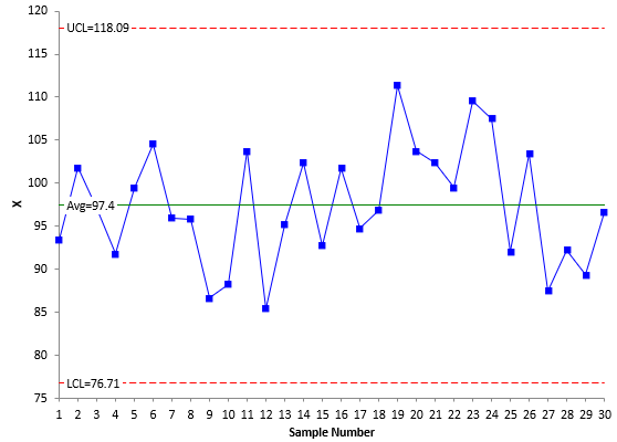
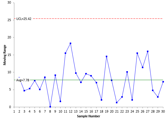
The averages and control limits can then be added to the charts. Figure 1 is the X chart with the average being the centerline. Figure 2 is the mR chart with the average moving range being the centerline.
Figure 1: X Chart
Figure 2: mR Chart
Both charts are in statistical control – there are no points beyond the control limits or patterns in the data (e.g., 8 points in a row below the average). Now let’s compare the difference when the median values are used.
Individuals Control Charts Using Medians
You can use the median for the X values and the moving range values in place of the averages. The charts look the same, but have different center lines – and therefore, different control limits. For a process that is in control, there is not much difference between the two.
The control limits based on the medians are given below:
UCLx = Median X Value + 3.145(Median Moving Range)
LCLx =Median X Value – 3.145(Median Moving Range)
UCLr = 3.865(Median Moving Range)
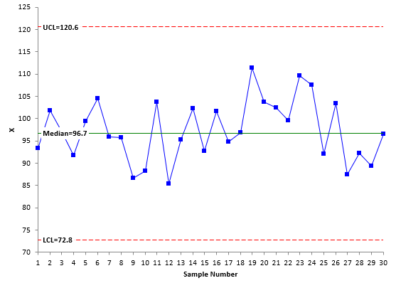
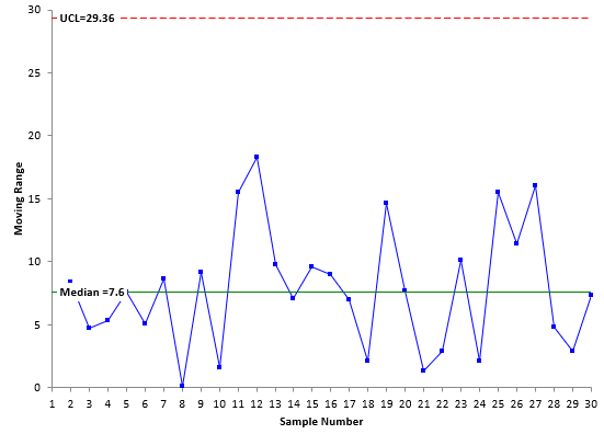
Figures 3 and 4 show the X chart and mR chart, respectively, using the median values.
Figure 3: X Chart with Median X Value as Centerline
Figure 4: mR Chart with Median Moving Range as Centerline
If you compare Figures 1 and 3 and Figures 2 and 4, you will see that they look essentially the same. The only minor difference is the location of the centerlines and control limits. This is not surprising for a process that is in statistical control. Table 2 compares the results.
Table 2: Comparison of Average vs Median Results
| X Chart | mR Chart | |||
|---|---|---|---|---|
| Average | Median | Average | Median | |
| Centerline | 97.4 | 96.7 | 7.78 | 7.6 |
| UCL | 118.09 | 120.6 | 25.42 | 29.36 |
| LCL | 76.71 | 72.8 |
So, for a straightforward case like this, the two methods give similar results. But what about times when there are out of control points?
Individuals Control Charts with Inflated Average Moving Ranges
Suppose you run a customer service center and are monitoring the time it takes to complete calls. There is a key performance indicator (KPI) for the average time it takes to complete a call. Table 3 contains the data for the time it took to complete the last 150 calls in minutes. The data is in columns starting with X1 which lists the first 30 data points, then X31 which lists the next 30 data points starting with the 31st point, etc.
Table 3: Customer Service Call Data
| X1 | X31 | X61 | X91 | X121 |
|---|---|---|---|---|
| 5.51 | 5.31 | 17.14 | 6.00 | 7.01 |
| 11.87 | 2.65 | 7.73 | 1.33 | 5.82 |
| 4.31 | 17.71 | 1.23 | 6.23 | 1.64 |
| 11.15 | 0.53 | 6.80 | 8.29 | 4.71 |
| 5.24 | 0.62 | 6.37 | 12.92 | 21.67 |
| 6.56 | 0.35 | 0.75 | 7.30 | 21.99 |
| 0.47 | 1.20 | 10.57 | 1.86 | 4.92 |
| 14.14 | 15.21 | 0.57 | 3.83 | 7.82 |
| 12.11 | 10.06 | 12.76 | 3.97 | 16.04 |
| 8.69 | 15.43 | 16.70 | 3.56 | 4.17 |
| 0.12 | 4.61 | 3.75 | 4.86 | 12.25 |
| 39.00 | 9.31 | 16.96 | 18.53 | 3.88 |
| 0.20 | 8.94 | 0.81 | 0.26 | 15.07 |
| 13.54 | 32.49 | 30.80 | 1.50 | 1.71 |
| 2.72 | 0.44 | 3.22 | 11.23 | 9.38 |
| 4.11 | 0.90 | 2.56 | 0.03 | 1.75 |
| 3.17 | 38.45 | 9.95 | 36.38 | 4.26 |
| 6.41 | 0.23 | 1.14 | 2.84 | 2.80 |
| 7.59 | 10.18 | 7.43 | 3.69 | 8.34 |
| 18.21 | 6.88 | 4.82 | 4.40 | 3.14 |
| 2.97 | 2.53 | 3.80 | 2.44 | 11.50 |
| 3.30 | 20.48 | 7.38 | 10.89 | 4.76 |
| 5.86 | 27.55 | 21.20 | 0.29 | 8.53 |
| 9.88 | 3.61 | 1.92 | 17.90 | 11.73 |
| 7.51 | 19.45 | 7.87 | 7.09 | 9.48 |
| 1.54 | 0.00 | 3.94 | 2.19 | 20.07 |
| 5.18 | 2.49 | 6.76 | 2.68 | 2.26 |
| 14.53 | 5.02 | 0.21 | 9.11 | 6.04 |
| 2.03 | 16.28 | 20.76 | 2.07 | 9.04 |
| 7.22 | 1.10 | 5.41 | 3.04 | 9.77 |
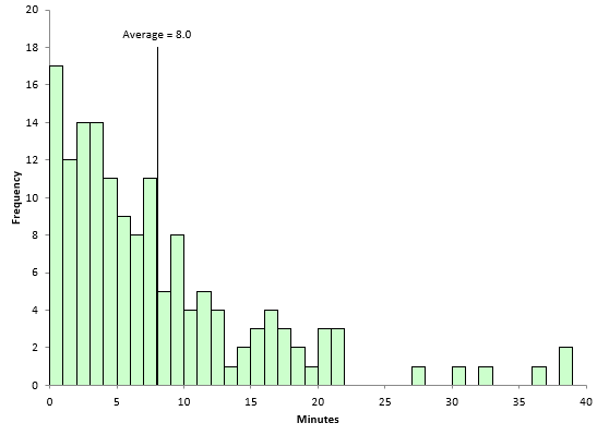
A histogram of the time to complete the calls is shown below.
Figure 5: Histogram of Time to Complete Customer Service Calls
The average (8.0) is shown in Figure 5. You can see the data are skewed to the right. There are 54 results above the average and 96 results below the average. The X and mR charts for the data are shown in Figures 6 and 7.
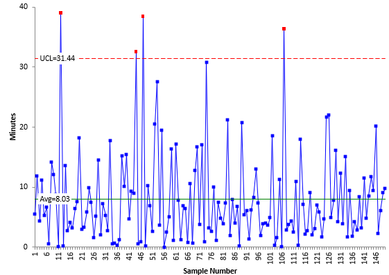
Figure 6: X Chart for Customer Service Call Data
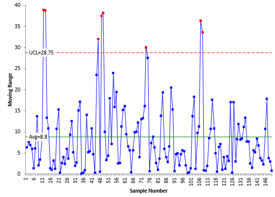
Figure 7: mR Chart for Customer Service Call Data
The X chart does not have a LCL since it is less than zero and that is not possible with time values. The mR based on the range between consecutive points never has a LCL. The X chart has 4 out of control points. The mR chart has 8 points above the UCL. A few are quite a bit above the UCL. This has the effect of inflating R – and thus increasing the width of the control limits on the X chart – leading to potential missed signals.
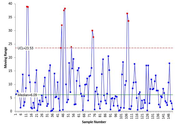
What happens if we use the median moving range in place of R? The median moving range should not be impacted as much by the large range values in Figure 7. Figure 8 is the mR chart using the median moving range.
Figure 8: mR Chart with Median Moving Range for Customer Service Call Data
Compare Figures 7 and 8. Again the plotted points are the same. The differences are in the centerline and the UCL. The median moving range in Figure 8 is 6.09, significantly less than R of 8.8. The UCL based on the median moving range is 23.53, significantly less than the UCL based on R (28.75). The mR chart now has 11 out of control points, 3 more than when R is used.
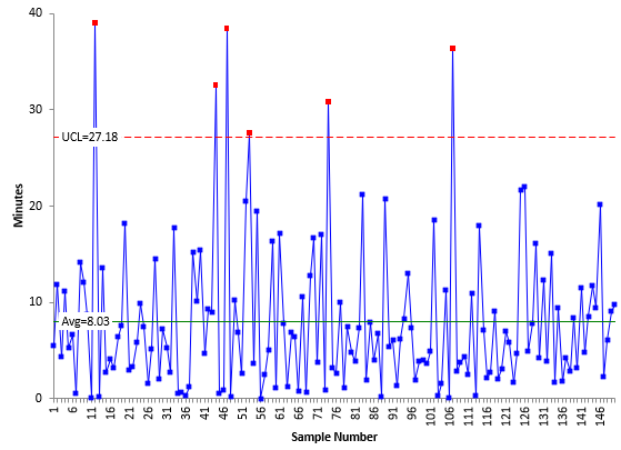
Figure 9 shows the X chart with the control limits based on the median moving range. Note in Figure 9, the average of the X values is still used, not the median X value.
Figure 9: X Chart for Customer Service Call Data with Limits Based on Median mR
Compare Figure 6 to Figure 9. The only difference is the location of the UCL. In Figure 6, the UCL is 31.44 and is based on R. In Figure 9, the UCL is 27.18 and is based on the median moving range. Since the UCL is less with the median moving range, there is the opportunity to find additional signals. There are now six out of control points in Figure 9. So, using the median moving range did give 2 additional signals in the X chart.
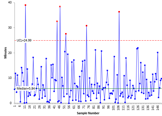
You might ask about using the median X value as the centerline on the X chart as we did in the first examples above. The average of the X values is not prone to inflation as much as the moving range values so there is less to be gained by using the median X value in place of the average. Figure 10 shows the X chart with the centerline being the median.
Figure 10: X Chart with Median X Value Used as Centerline for Customer Call Data
Comparing Figures 9 and 10, you can see that the median X value (5.83) is less than the average (8.03). The UCL is also smaller in Figure 10 then in Figure 9, 24.99 compared to 27.18. In this example, this change did not pick up any additional signals. Table 4 summarizes the differences in the approaches.
Table 4: Individual Charts Summary
| X Chart | mR Chart | |||||
|---|---|---|---|---|---|---|
| Limits Based On | Centerline | UCL | Out of Control | Centerline | UCL | Out of Control |
| X,R | 8.03 | 31.44 | 4 | 8.8 | 28.75 | 8 |
| X, Median Moving Range | 8.03 | 27.18 | 6 | 6.09 | 23.53 | 11 |
| Median X Value, Median Moving Range | 5.84 | 24.99 | 6 | 6.09 | 23.53 | 11 |
You can see how the centerline and UCL decrease when you used the median average range and out of control signals increase.
Summary
In this publication, we reviewed the individuals control chart and then introduced how the median X value and median moving range could be used in placed of the traditional centerlines on the X and mR charts. Sometimes R is inflated due to large, out of control moving range values. This potentially masks some signals on the X chart since the control limits on the X chart are based on R. If this is the case, you can use the median moving range. It is not impacted as much by outliers as R. You can also use the median X value.
