January 2016

The data indicated that there were periods of stability – where the temperature neither increased or decreased – until around 1997. Since then, there appears to have been a steady upward trend in the global temperature on almost a yearly basis.
Does this mean that we can’t use control charts anymore? No, not at all. In fact, we used a trend control chart last month to monitor the data from 1997 on. In this month’s publication, we will examine how you construct and interpret a trend control chart using a slightly different set of global temperature data.
In this issue:
- Classical Shewhart Control Charts
- Trend Control Charts
- Global Temperature Data
- Classical Control Chart Approach
- Trend Control Chart Approach
- Summary
- Quick Links
You may download a pdf version of this publication at this link. Please feel free to leave a comment at the end of the newsletter
Classical Shewhart Control Charts

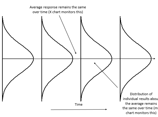
If it is in statistical control, we typically think that the process has one average and one measure of variation. The “one” average comes from the center line on the X chart. The measure of variation (the estimated standard deviation) comes from the average range on the mR chart. Of course, no process is unwavering, but it is helpful to think about statistical control, in the classical sense, as having one average and one measure of variation. This is shown in Figure 1. But what about processes where you don’t expect there to be just “one” average? That is where the trend control chart comes in.
Figure 1: In Control Process
Trend Control Charts
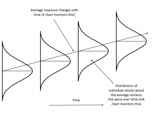
There are processes where you don’t expect the average to stay the same over time. You expect the average to move up or down. Examples include catalyst activity, financial items affected by inflation, and tool wear. If these parameters are plotted using the classical Shewhart control charts, the process will appear out of control because the average is not staying the same. But the process is not out of control because the average naturally moves up or down over time. This is shown in Figure 2.
Figure 2: Variation in a Process with a Trend
Trend control charts provide a method of handling this type of situation. A trend control chart still consists of two charts. One is the moving range chart. This is identical to the moving range used in the classical Shewhart control charts. The other is the X chart, but in this X chart, the average is not horizontal but moves up or down. The average represents the best-fit line for the data. The process for creating a trend control chart is shown below using the global temperature data.
Global Temperature Data

There is also the LOTI (land-ocean temperature index). According to the website, LOTI “provides a more realistic representation of the global mean trends than dTs; it slightly underestimates warming or cooling trends, since the much larger heat capacity of water compared to air causes a slower and diminished reaction to changes; dTs on the other hand overestimates trends, since it disregards most of the dampening effects of the oceans that cover about two thirds of the earth’s surface.”
This month we will use the LOTI data. It, like the dTs data, is reported as anomalies (deviations), not an absolute temperature. The website has this statement as well: “Temperature anomalies are computed relative to the base period 1951-1980. The reason to work with anomalies, rather than absolute temperature, is that absolute temperature varies markedly in short distances, while monthly or annual temperature anomalies are representative of a much larger region.” In last month’s publication, we converted these anomalies from the baseline period to an absolute temperature by using 14 °C as the baseline temperature. It is sometimes easier to understand an absolute temperature than the anomalies. But 14 is not absolute. Like everything, there is variation.
This time, however, we will use the anomalies as given on the website. But, we will refer them as deviations from here on. For example, for 2015, the deviation in temperature from the baseline period was reported as 87. You divide this by 100 to get the deviations in degrees Celsius. So, the deviation in 2015 from the baseline period was 87/100 or 0.87 °C. According to the press release on 1/20/2016, this is the largest increase in one year ever.
Our analysis last month showed that there was a long period of stability from 1936 to 1976. The temperature then began to increase in 1977. We will use the data from 1977 to 2015 in our trend control chart discussion. These data are shown in Table 1.
Table 1: Temperature Deviations Based on Baseline Period of 1951 to 1980
| Year | Deviation | Year | Deviation | |
| 1977 | 18 | 1997 | 47 | |
| 1978 | 7 | 1998 | 63 | |
| 1979 | 17 | 1999 | 42 | |
| 1980 | 28 | 2000 | 42 | |
| 1981 | 33 | 2001 | 54 | |
| 1982 | 13 | 2002 | 63 | |
| 1983 | 31 | 2003 | 62 | |
| 1984 | 16 | 2004 | 54 | |
| 1985 | 12 | 2005 | 69 | |
| 1986 | 19 | 2006 | 63 | |
| 1987 | 34 | 2007 | 66 | |
| 1988 | 40 | 2008 | 53 | |
| 1989 | 29 | 2009 | 64 | |
| 1990 | 44 | 2010 | 72 | |
| 1991 | 42 | 2011 | 60 | |
| 1992 | 23 | 2012 | 63 | |
| 1993 | 24 | 2013 | 65 | |
| 1994 | 32 | 2014 | 74 | |
| 1995 | 46 | 2015 | 87 | |
| 1996 | 34 |
Classical Control Chart Approach
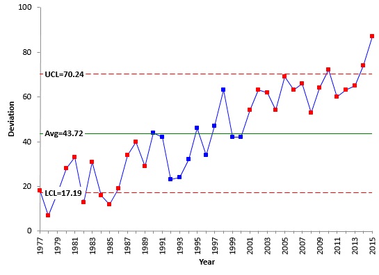
The data in Table 1 were used to construct an individuals control chart. The X control chart for the data is shown in Figure 3. You can easily see that the global temperature deviation is not consistent over time. It appears to be steadily increasing. There are runs above and below the average as well as points that are beyond the control limits. This X control chart is not very useful for predicting what will occur in the future.
Figure 3: X Chart for Global Temperature Deviations by Year
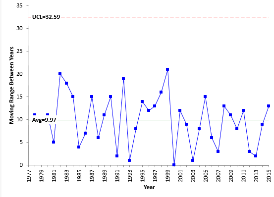
Figure 4 shows the moving range control chart. The moving range is in statistical control. It is consistent and predictable. This means, that even though the average is changing over time, the variation about that average (the width of the histogram) is staying the same. As long as this is true, we can use the trend control chart approach because the within variation (the moving range) is consistent over time.
Figure 4: mR Chart of Global Temperature Deviation by Year
The problem is the X control chart. The control limits for the X control chart are given below.
UCLx = X + 2.66R
LCLx = X – 2.66R
Note that the control limits are based on the overall average (X) and the average range (R). The problem is the average in the global temperature deviations. It looks to be increasing in a predictable pattern. Let’s check this with the trend control chart.
Trend Control Chart Approach

Xt = mt + b
where (for our example) Xt is yearly temperature deviation, t is the year, m is the slope of the line and b is the y-intercept. You then substitute this equation for the average in the control limit equations. So, the control limits for the trend control chart are given by:
UCLx = mt + b + 2.66R
LCLx = mt + b – 2.66R
There are a number of ways to find the best-fit equation. The results below are from the SPC for Excel program. You can also use Excel’s built-in regression function. The best-fit equation is:
Global Temperature Deviation = 1.631(Year) – 3211.3
The slope represents the rate of change in the global temperature deviation per year for this time period. That rate of change is given by 1.631. Remember that to convert this to degrees Celsius, you need to divide by 100. So the rate of change is 0.01631 °C per year.
You must ask a question at this point about this best-fit equation. “Is it statistically significant?” You judge this by the p-value from the regression. If the p-value is less than 0.05, you conclude it is statistically significant. The p-value for this regression is much lower than 0.05, so it is statistically significant. For more information on regression, please see our publication at this link.
One more questions to ask. “Is the statistically significant correlation between the global temperature deviation and the year “worth” anything in real life?” You get this from the R-squared value. R-squared for this regression is 82.37%, which means that 82.37% of the variation in global temperature deviation can be explained by the increasing year number. That is a pretty good percentage. So, this best-fit equation can be used to help analyze the increase in global temperature deviation from year to year.
The control limits become:
UCLx = b + mt + 2.66R = -3211.3 + 1.631(Year) + 2.66(10)
LCLx = b + mt – 2.66R = -3211.3 + 1.631(Year) – 2.66(10)
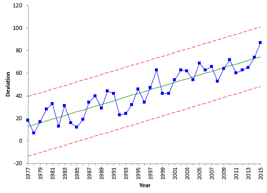
Note that the control limits will trend with the average and the distance between the average and the control limits will be 2.66 times R. Figure 5 shows the trend control chart for the global temperature deviation.
Figure 5: Trend Control Chart for Global Temperature Deviation
You can use the best-fit equation to determine the values for the average, UCL and LCL in 2015.
UCL = 101.8
Average = 75.2
LCL = 48.6
When you look at the trend control chart, it appears to be in statistical control. The usual out of control tests apply to the trend control chart – points beyond the limits, zones tests, etc.
You can now use the trend control chart to predict, within a range, what the deviation in the global temperature will be in 2016.
UCL = 103.4
2016 Prediction = 76.8
LCL = 50.2

The trend control chart performs just like a classical control chart. It monitors the process for any special causes of variation and, if it is in statistical control, it can be used to predict future values- at least, within a range.
Summary
This month we took a look at how to handle data that is increasing or decreasing in a predictable fashion using a trend control chart. The calculations involve determining the best-fit line for the data and using that as the center line on the X chart. The center line and the control limits trend either up or down on a trend control chart. The global temperature deviation per year was used as an example.
You deserve my Congratulations for your (pedagogical) work.I suggest you illustrate this and other examples with your software. You may also provide a trial/student version. If so, I can use it, and promote your software, in my classes.Best regards
Thanks for your comment. All the charts in our publications are made using the SPC for Excel software. And we do have free 20-day demo of the software here:https://www.spcforexcel.com/spc-software/demo
We do a studenet version that can be rented for 6 monhts. Please contact me if you interested.
Bill
This sentence, “R-squared for this regression is 82.37%, which means that 82.37% of the variation in global temperature deviation can be explained by the increasing year number“, I suggest is better stated as,” …82.37% of the variation in gobal temperature deviation is accounted for by the increasing year number.”Isn’t R-squared an accounting? Or are accounting and explaining synonyms?
I think, in this case, they are synonyms. But I like your sentence better.
Hello,i am trying to create a Trend Control chart and was using your above example to replicate the process. I am new to control chart and was hoping if someone could explain how the Upper and lower limit was calculated for the above trend control chart.As stated above, the UCL is calculated using UCLx = b + mt + 2.66 = -3211.3 + 1.631(Year) + 2.66(10) (here,y-intercept has a value of -3211.3, given the y-intercept has such a low value does that not make the UCLx =3301.509 for 2015?? if the t = 39 (3211.3+1.631*(39)+2.66*(10)) Could you also explain how the R for the above example is 10.your response will be much appreicated.
The SPC for Excel software, when calculating a trend, assumes the x values are 1, 2, 3, 4, etc. Not the actual values used (in this exmaple the years). So the equation will be different since I used excel's regression to use the acutal year number and not 1, 2, 3, etc.). Probably need to change that. Rbar is 10. It is the average range for the moving ranges between consecutive points.