Our last blog – Are My Data Normally Distributed?– involved using a normal probability plot to answer that question. Essentially, if the data fell along a straight line, we would conclude that the data came from a normal distribution. If it did not fall along a straight line, we would conclude that the data did not come from a normal distribution.
If you and I look at a normal probability plot, we might not agree if something “falls along a straight line or not.” For this reason, it is much easier if we have a statistic to examine. Enter the Anderson-Darling statistic.
The Anderson-Darling test was developed in 1952 by Theodore Anderson and Donald Darling. It is a statistical test of whether a dataset comes from a certain probability distribution, e.g., the normal distribution. The test involves calculating the Anderson-Darling statistic. The two hypotheses for the Anderson-Darling test for the normal distribution are given below:
H0: The data follows the normal distribution
H1: The data do not follow the normal distribution
You can determine a p-value for the Anderson-Darling statistic and use that value to help you determine if the test is significant or not. Remember the p-value is the probability of getting a result that is more extreme if the null hypothesis is true. If the p value is low (e.g., <=0.05), you conclude that the data do not follow the normal distribution.
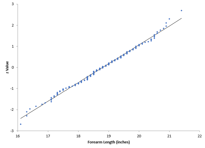
Our last blog showed two normal probability plots. The first one is shown below. The data appear to fall in a straight line – so you assume that the data are from a normal distribution. We will not go through the calculation for the Anderson-Darling statistic here. Details of the calculation are available in our SPC Knowledge Base article “Anderson-Darling Test for Normality”. This article also contains the data used for the charts below.
The value of the Anderson-Darling statistic, AD*, for the above plot is 0.2383 and the p-value is 0.782. Since the p-value is greater than 0.05, we conclude that the data came from a normal distribution. You will see two different Anderson-Darling statistics, AD and AD*. AD* is adjusted to account for a small sample size.
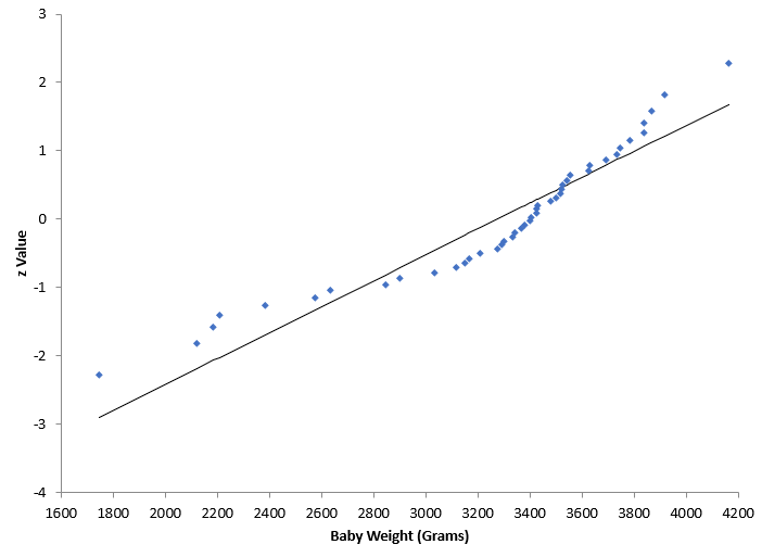
The second normal probability plot is shown below. It does not look like the data falls along a straight line.
The value of AD* is 1.7481 and the p-value is 0.0002. Since the p-value is much less than 0.05, we conclude that the data does not come from a normal distribution.
You can use the normal probability plot, along with the Anderson-Darling statistic and the resulting p-value to determine if a given dataset came from a normal distribution.
The normal probability plots above were made using SPC for Excel, a simple but powerful software for statistical analysis in the Excel environment. The software also calculated the Anderson-Darling statistic as well as the p-value.

