This is the second in a four-part series introducing control charts. The first blog addressed the question of what a control chart is. This blog will answer the following question:
What is variation and how does it relate to a control chart?
Understanding variation is the key to effectively using a control chart. A control chart provides a method for your process to communicate with you – to tell you if the process is doing what you designed it to do (only common causes of variation are present) or if there is a problem (special causes of variation are present).
Think about a process you do on a regular basis – like getting to work. How long does that take you? There is some “average” time it takes you. Maybe that is 30 minutes – some days a little faster, some days a little slower. Perhaps the range of your variation is from 25 to 35 minutes.
If you are within this range, everything is normal. This “normal” variation is due to common causes of variation. Common causes of variation are always present in a process. This type of variation is consistent and predictable. You don’t know exactly how long it will take to get to work tomorrow, but, if the process stays the same, it will take between 25 and 35 minutes.
Sometimes things happen in a process that are not “normal” – not part of the way the process should operate. Suppose you get a flat tire on the way to work. Or the bus breaks down. How long will it take you to get to work? Definitely outside the normal range of 25 to 35 minutes. This is a special cause of variation. Something that is not supposed to happen in the process has happened. Special causes are not predictable and are sporadic in nature.
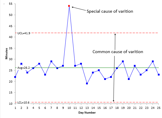
The only way to effectively separate common causes from special causes is through the use of a control chart. The control chart below was shown in our last blog using the time it takes to get to work. The data points, average, upper control limit (UCL) and lower control limit (LCL) are plotted. The control limits help separate common causes from special causes. The UCL is the largest number you would expect if you just had common cause of variation present. The LCL is the smallest number you would expect. As long as there are no points beyond these limits (and no patterns), there are only common causes of variation present.
The figure shows one special cause of variation – a point beyond the control limits – perhaps a flat tire on the way to work. It also shows the range of common causes of variation, which is the distance between the UCL and the LCL.
So why do we care if a point is due to a special cause or a common cause of variation? This gets to the purpose of a control chart. It drives what we do for process improvement. This is the topic of our next blog.
Our SPC Knowledge Base provides more details on interpreting control charts for the presence of special causes of variation.
The control chart above was made using SPC for Excel, a simple but powerful software for statistical analysis in the Excel environment.
