This is the start of a four-part blog on control charts. The blogs will answer the following questions:
- What is a control chart?
- What is variation and how does it relate to a control chart?
- What is a control chart used for?
- Where is a control chart used?
Control charts are at the heart of statistical process control (SPC). So maybe we should start with answering what a process is. A process is simply what we do. It can be filling out an expense report, checking a person into a hospital, driving to work, filling a prescription, etc. All these processes generate an output – either a product or service. In addition, the processes generate data. SPC is simply taking that data the process generates and using it to control and improve the process.
A control chart is used to monitor a process variable over time. That variable can be in any type of company or organization – service, manufacturing, non-profit, healthcare, etc. It provides a picture of the process variable over time and represents the way the process communicates with you. By listening to what your process is telling you through a control chart, you will know if the process is operating as it was designed to do or if the process has a problem.
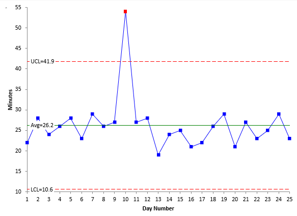
Let’s take the simple example of driving to work. A possible control chart is shown below.
The process variable (the time to get to work) is plotted over time. Each day, the time to get to work is measured and plotted on the chart. After sufficient points, the process average is calculated. It is plotted on the chart as shown above. Then the upper control limit (UCL) and the lower control limit (LCL) are calculated. These are also plotted on the chart.
What are the UCL and LCL? These are key to interpreting a control chart and understanding variation – the topic of our next blog.
In the meantime, if you want more detailed information on control charts, please visit our SPC Knowledge Base.
The control chart above was made using SPC for Excel, a simple but powerful software for statistical analysis in the Excel environment.
