January 2017
(Note: all the previous SPC Knowledge Base in the control charts basics category are listed on the right-hand side. Select this link for information on the SPC for Excel software.)

“What is this control chart telling me about my process?”
There are 8 basic out of control tests you can use. Just one problem. All 8 tests don’t apply to each control chart. So, which tests apply to which control charts? This month’ publication answers that question.
Here is the key to effectively using control charts – the control chart is the way the process communicates with you. Through the control chart, the process will let you know if everything is “under control” or if there is a problem present. Potential problems include large or small shifts, upward or downward trends, points alternating up or down over time and the presence of mixtures. Applying the correct tests to interpret your chart will help you figure out what the control chart is trying to tell you.
In this issue:
You may also download a pdf copy of this publication at this link. Please feel free to leave a comment at the end of the publication.
Out of Control Tests Review
One of our publications examined the 8 rules that you can use to help you interpret what your control chart is communicating to you. These rules help you identify when the variation on your control chart is no longer random, but forms a pattern that is described by one or more of these eight rules. These patterns give you insights into what may be causing the “special causes” – the problem in your process. Part of that publication is used in this review.
If a process is in statistical control, most of the points will be near the average, some will be closer to the control limits and no points will be beyond the control limits. The 8 control chart rules listed in Table 1 give you indications that there are special causes of variation present. Again, these represent patterns.
Table 1: Control Chart Rules
|
Rule |
Rule Name |
Pattern |
|
1 |
Beyond Limits |
One or more points beyond the control limits |
|
2 |
Zone A |
2 out of 3 consecutive points in Zone A or beyond |
|
3 |
Zone B |
4 out of 5 consecutive points in Zone B or beyond |
|
4 |
Zone C |
7 or more consecutive points on one side of the average (in Zone C or beyond) |
|
5 |
Trend |
7 consecutive points trending up or trending down |
|
6 |
Mixture |
8 consecutive points with no points in Zone C |
|
7 |
Stratification |
15 consecutive points in Zone C |
|
8 |
Over-control |
14 consecutive points alternating up and down |
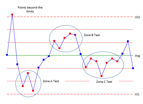
It should be noted that the numbers can be different depending upon the source. For example, some sources will use 8 consecutive points on one side of the average (Zone C test) instead of the 7 shown in the table above. But they are all very similar. Figures 1 through 3 illustrate the patterns. Figure 1 shows the patterns for Rules 1 to 4.
Figure 1: Zone Tests (Rules 1 to 4)
Rules 1 (points beyond the control limits) and 2 (zone A test) represent sudden, large shifts from the average. These are often fleeting – a one-time occurrence of a special cause – like the flat tire when driving to work.
Rules 3 (zone B) and 4 (Zone C) represent smaller shifts that are maintained over time. A change in raw material could cause these smaller shifts. The key is that the shifts are maintained over time – at least over a longer time frame than Rules 1 and 2.
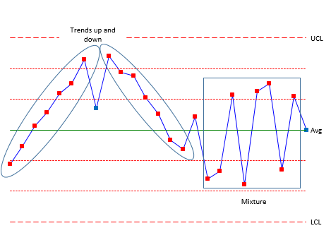
Figure 2: Rules 5 and 6
Figure 2 shows Rules 5 and 6. Rule 5 (trending up or trending down) represents a process that is trending in one direction. For example, tool wearing could cause this type of trend. Rule 6 (mixture) occurs when you have more than one process present and are sampling each process by itself. Hence the mixture term. For example, you might be taking data from four different shifts. Shifts 1 and 2 operate at a different average than shifts 3 and 4. The control chart could have shifts 1 and 2 in zone B or beyond above the average and shifts 3 and 4 in zone B below the average – with nothing in zone C.
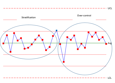
Figure 3 shows rules 7 and 8. Rule 7 (stratification) also occurs when you have multiple processes but you are including all the processes in a subgroup. This can lead to the data “hugging” the average – all the points in zone C with no points beyond zone C.
Figure 3: Rules 7 and 8
Rule 8 (over-control) is often due to over adjustment. This is often called “tampering” with the process. Adjusting a process that is in statistical control increases the process variation. For example, an operator is trying to hit a certain value. If the result is above that value, the operator makes an adjustment to lower the value. If the result is below that value, the operator makes an adjust to raise the value. This results in a saw-tooth pattern.
Rules 6 and 7, in particular, often occur because of the way the data are subgrouped. Rational subgrouping is an important part of setting up an effective control chart. A previous publication demonstrates how mixture and stratification can occur based on the subgrouping selected. These rules represent different situations – patterns- on a control chart. It should be noted that not all rules apply to all types of control charts. Table 2 summaries the rules by the type of pattern.
Table 2: Rules by Type of Pattern
|
Pattern Description |
Rules |
|
Large shifts from the average |
1, 2 |
|
Small shifts from the average |
3, 4 |
|
Trends |
5 |
|
Mixtures |
6 |
|
Stratifications |
7 |
|
Over-control |
8 |
Out of Control Tests by Control Chart
The table below shows which out of control tests apply to which control charts.
Table 3: Out of Control Tests by Control Chart
| Control chart | Beyond Limits | Zone A | Zone B | Zone C | Trend | Mixture | Strat. | Over-control |
| Subgroup Averages (X) | x | x | x | x | x | x | x | x |
| Subgroup Ranges (R) | x | x | x | x | ||||
| Subgroup Standard Deviations (s) | x | x | x | x | ||||
| Individuals (X) | x | x | x | x | x | x | x | x |
| Moving Range (mR) | x | x | x | x | ||||
| z | x | x | x | x | x | x | x | x |
| p | x | x | x | x | ||||
| np | x | x | x | x | ||||
| c | x | x | x | x | ||||
| u | x | x | x | x | ||||
| g | x | x | x | x | ||||
| CUSUM | x | |||||||
| EWMA | x | |||||||
| Non-Normal Individuals (X) | x | |||||||
| Moving Average (X) | x |
The zones tests along with the tests for mixture and stratification are based on having a somewhat symmetrical distribution (e.g., normal). The X chart usually meets this requirement since subgroup averages tend to be normally distributed as the subgroup size increases (central limit theorem). The individuals chart may or may not meet this symmetrical requirement. Care should be taken in applying the zones tests to individual values if the distribution is skewed heavily. You may get some false signals.
The moving range chart reuses data. With a moving range of 2, each point is used twice (except the first point) in calculating the moving range. When applying the Zone C test, you need to increase the number in a row above or below the average to account for this. The same is true for the trend test. If the X chart is using 7 points in a row for zone C, the moving range could be set to (2)(7)-1 = 13.
One major point still needs to be made. You know your process. Look at the control chart. Does something look odd to you even though none of the above tests are violated? If so, there is probably something going on the process. Check it out.
Summary
This publication looked at which out of control tests apply to which control charts when identifying the presence of a special cause of variation. Not all 8 tests apply to all control charts.


Hi Bill, as always a good read. Can you supply the references for the different e=tests please?Thank you and Happy New Year,Martin
Thank you. Here are two references for the out of control tests:
Western Electric Company (1956), Statistical Quality Control Handbook
Douglas Mongtomery. Introduction to Statistical Quality Control
Thank you for this great read sir. i've searched for so long to find such material to support my spc procedures. Finally a good find. Hope you continue these. Really appreciate it.
Bill, both of your references actually state that 8 successive points in Zone C or beyond (on the same side) is a signal for a non-random pattern.Using the 7 in a row rule gives us a 1 in 64 asymptotic risk of false positives if we have random data — doesn't that seem rather high to you? Wikipedia even claims that the WECO rule is 9 in a row, which doesn't match their 1956 handbook, athough 9 in a row is more typically in use today (MINITAB default).
Hi Dale. 8 is the most common number. The WECO rule is 8. My book has it as 8. But I shifted it to 7 simply so it matched the rule of seven tests: 7 trending up or down in a row, 7 above or below the average in a row. I taught this as a good initial set of rules for operators back when we had to do things manually. Start with that and move to the zones later and wanted the est for zone C to match the 7 in a row.
The probably of getting this pattern with 7 is .007813 – still pretty small. With 8 it is .00396 which is closer .0027 of points beyond the control limits. The software allows you to set the value for the number of points.
Hi, Bill. Actually, the odds of seeing 7 random points in row above or below the established mean is 1 in 64.In Advanced Topics in Statistical Process Control, Donald J. Wheeler claims to personally prefer “nine in a row.” He mentions that Irving Burr expresses the decision rule as “8 to 10 in a row (take your choice).” Wheeler notes “It should be added that virtually all modern authors agree that Grant’s rule [seven in a row] is not sufficiently conservative for good practice.”It’s good to have flexible software.
Thanks for the reply. 7 in a row above the average is .5^7 which is 1 in 128. Unless I am missing something there.
Don't forget the either part of the rule. 1 in 128 for 7 above <em><strong>plus</strong></em> 1 in 128 for 7 below equals 1 in 64 for 7 in a row on either side of the centerline.
I will respectively disagree on that. You are looking at 7 in a row above the average or 7 in a row below the average. Not the sum of both.
“If two events are mutually exclusive, then the probability of either occurring is the sum of the probabilities of each occurring.”As an experiment, I ran the 7-in-a-row-on-same-side-of-center-line rule only on a million random normal numbers using Minitab. It took a couple of minutes, but it flagged 15,617 points, which is really close to the theoretical 1 in 64 value of 15,625.
Hi!Could you explain further why only the "beyond limits" rule applies to the Moving Average?Planning to create a control chart implementing WECO rules on a moving average.Thanks!
It is because you are reusing data with the moving averages. For example, each result is used in a subgroup mutliple times. This means that the data are correlated – they are being reused. So the runs don't apply. Only point beyond the control limit. Moving average/range charts often look like cycles.
How would you establish control charts for processes for which it is hard to assess whether they are in control or not? When talking complaint data, it is not straightforward to estimate whether it is in control or not (how many complaints are 'normal'?). I currently have a dataset which is likely out of control (many complaints), but I'm not sure how to establish a good mean and standard deviation to prove this using a control chart, as the data is so variable. If I take months with many complaints as part of the data, these months will hugely influence the mean and SD, and thus 'allow' for more complaints in subsequent months, which is where I'm getting quite confused. Thanks!
Can you email the data and I will take a look at. Hard to know without seeing the data. Thanks. bill@www.spcforexcel.com
Good day
I am struggling to get a formula for excel to determine when 10 points are on the same side of the mean in a QC graph. Any ideas?
Buy our software and it will do it for you! Try this: =COUNTIF(B1:B11,”>”&AVERAGE(B1:B11))