This is the third in a four-part series introducing control charts. The first blog addressed the question of what a control chart is. The second blog explored the relationship between variation and control charts. This blog begins to answer the following question:
What is the purpose of a control chart?
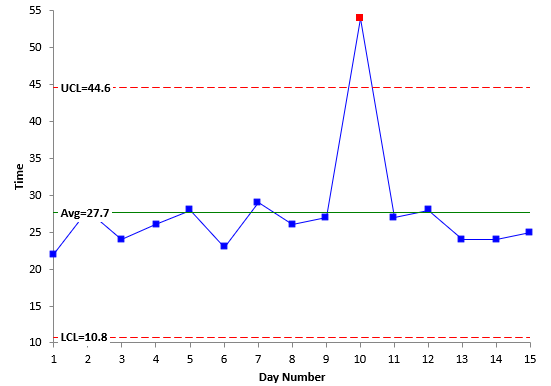
We will continue with the driving to work example shown in the last two blogs to explore three different purposes for a control chart. Suppose your driving to work control chart looks like the one below.
There is a point beyond the control limits – a special cause. This is one purpose of a control chart –
To monitor a process for those special causes of variation that can occur and remove them, so they don’t occur again.
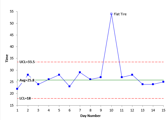
If you know the reason for the special cause, you can remove it from the calculations. This gives the following control chart:
The above process is essentially in statistical control. You found the reason for the out of control point and recalculated the average and control limits. Note that the average has changed by removing the special cause point from 27.7 to 25.8. This leads to another purpose of a control chart:
To estimate the process average and the process standard deviation
You estimate the average from the X chart in this example and the process standard deviation from a moving range chart (not shown here). Once your process is stable (in statistical control) with respect to the average and the process standard deviation, you can calculate your process capability. So, an in-control process allows you to move on to process capability.
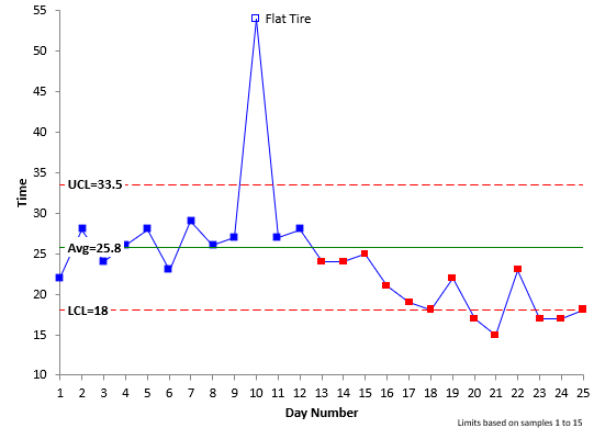
If you want to improve a variable that is in statistical control (e.g., reduce the time it takes to get to work), you must fundamentally change your process. Suppose you decide to get up 30 minutes earlier and leave the house 30 minutes earlier to avoid some of the rush hour traffic. You do that for two weeks. The resulting control chart is shown below with the average and control limits set using days 1 to 15 as the baseline data.
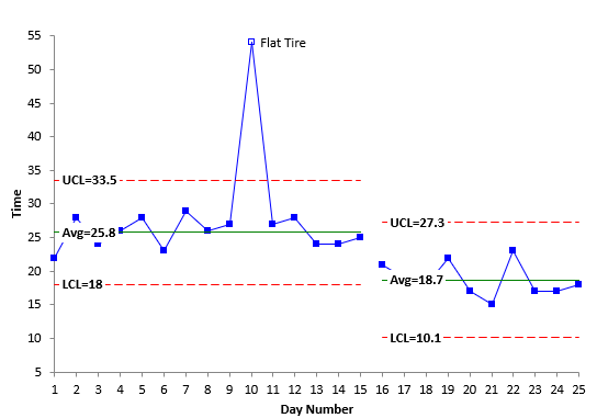
The control chart now shows a run below the average. It is obvious that leaving the house earlier has reduced the time it takes to get to work. The calculations can now be redone to reflect the new average and new variation in the data. The average has decreased to 18.7 from 25.8.
This is the third purpose of a control chart:
To judge the impact of your process improvement efforts
In this example, the process changes worked, new control limits were calculated, and the process can be monitored into the future for the appearance of any special causes.
Please see our SPC Knowledge Base for more information on the purpose of control charts.
Our next blog will give some examples of where control charts can be used.
The control charts above was made using SPC for Excel, a simple but powerful software for statistical analysis in the Excel environment.


