September 2020
(Note: all the previous SPC Knowledge Base in the attribute control charts category are listed on the right-hand side. Select this link for information on the SPC for Excel software.)
Have you ever run into the situation where your control limits are very tight and most of the points are out of control? This can happen with u control charts, particularly if your subgroup size is large. One option to handle this is to use an individuals control chart instead of the u control chart. A better option though is to use the Laney u’ control chart. This month’s publication introduces the Laney u’ chart.
In this issue:
- Background Information
- The Data
- Using the u Control Chart
- Using the Individuals Control Chart
- Using the Laney u’ Control Chart
- Summary
- Quick Links
Please feel free to leave a comment at the end of this publication. You can download a pdf copy at this link.
Background Information
The classical u control chart is used to monitor data that are counts. The u control chart is based on certain assumptions. For example, it assumes that you have a Poisson distribution. There are times, though, when the u control chart gives misleading information. This is particularly true when you have large subgroup sizes.
In 2002, David B. Laney published an article in Quality Engineering that described a new approach to handle the situations when the sample size is large. His article is based on the p control chart. Please see our SPC Knowledge Base article, Laney p’ Control Chart, for more information. The approach is essentially the same with the Laney u’ control chart.
In this article, we will start with a set of data and use a u control chart to analyze the data. The control chart will have very tight limits with many out of control points. Then we will try the individuals control chart. This chart works better but has flat control limits – and you lose the information about the varying subgroup size. Then we will introduce the Laney u ‘ control chart and demonstrate how it solves the issue of large subgroup sizes.
The Data
A hospital group is monitoring the error rate for medicines given to patients. The group involves several hospitals. The data recorded each week is the number of patients given medicine and the number of errors. The errors can include giving the wrong dosage, giving the wrong medicine, not giving the medicine, etc. The data for 25 weeks are shown below.
Table 1: Patients and Errors Data
| Week | Patients | Errors | u | Week | Patients | Errors | u | |
|---|---|---|---|---|---|---|---|---|
| 1 | 6566 | 98 | 0.01493 | 14 | 6598 | 107 | 0.01622 | |
| 2 | 9671 | 36 | 0.00372 | 15 | 10029 | 43 | 0.00429 | |
| 3 | 8129 | 104 | 0.01279 | 16 | 8192 | 50 | 0.00610 | |
| 4 | 7757 | 90 | 0.01160 | 17 | 9417 | 102 | 0.01083 | |
| 5 | 7880 | 53 | 0.00673 | 18 | 7130 | 63 | 0.00884 | |
| 6 | 9102 | 93 | 0.01022 | 19 | 5455 | 58 | 0.01063 | |
| 7 | 7201 | 180 | 0.02500 | 20 | 5946 | 52 | 0.00875 | |
| 8 | 7940 | 51 | 0.00642 | 21 | 10222 | 99 | 0.00968 | |
| 9 | 8486 | 64 | 0.00754 | 22 | 8154 | 43 | 0.00527 | |
| 10 | 9858 | 116 | 0.01177 | 23 | 5114 | 46 | 0.00899 | |
| 11 | 9226 | 91 | 0.00986 | 24 | 6256 | 87 | 0.01391 | |
| 12 | 10496 | 69 | 0.00657 | 25 | 6466 | 84 | 0.01299 | |
| 13 | 9427 | 43 | 0.00456 |
NOTE: The u values given above are rounded to five decimal places. To get the identical results in the charts below, you will need to use u = c/n for each u value – in other words, do not round.
Using the u Control Chart
The classical approach to monitoring these types of data over time is with a u control chart. The u control chart monitors the number of defects (c) in a given area where the defects have an opportunity to occur (n). In this case, the given area is the number of patients each week. The defects are errors in administering a patient’s medicine each week. The value of u is given by c/n. With u control charts, you can have an inspection unit that is made up of a certain number of patients (e.g., 1000). For this article, we will simply use an inspection unit of 1.
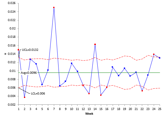
Each week the value of u is calculated. For week 1, c = 98 and n = 6566. This gives u = 98/6566 = 0.0149. The values of u are plotted overtime and, when enough data are available, the overall average and control limits are calculated and added to the u control chart. Figure 1 shows the u control chart based on the data in Table 1.
Figure 1: u Control Chart for Patients/Errors Data
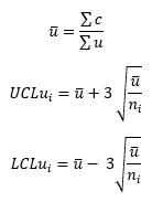
As you can see from the chart, ten out of 25 points are out of control. One reason this occurs is the large subgroup size. The average and control limits, based on the assumption of a Poisson distribution, are given by:
where u is the average and LCLui and UCLui are the lower and upper control limits. Please see our SPC Knowledge Base article, u Control Charts, for more information. The u control limits vary as the subgroup size varies. Also, the control limits become very tight as ni gets larger – the LCLui and the UCLui get closer together. This is why so many points are beyond the control limits. Let us see what impact using an individuals control chart will have.
Using the Individuals Control Chart
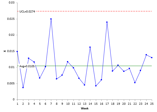
In the past, the individuals control chart has been used to address the issue of large subgroup sizes with attributes charts. The individuals control chart is really two charts, the X control chart and the moving range chart. Each individual u value is plotted on the X chart while the range between consecutive u points are plotted on the moving range chart. Once enough data are available, the overall average and X control limits are added to the X chart, and the average moving range and moving range control limits are added to the moving range chart. Figure 2 is a plot of the X chart for the data in Table 1. We will not show the moving range chart here.
Figure 2: X Chart for Patients/Errors Data
This control chart looks entirely different from the u control chart in Figure 1. Instead of a lot of out of control points, there are none! The control limits with the X control chart are constant. They are given by:
X= (ΣX)/k
UCLx =X + 2.66mR
LCLx =X– 2.66mR
where X is the individual u values, k is the number of data points, X is the overall average, mR is the average moving range and LCLx and UCLx are the lower and upper control limits. Please see our SPC Knowledge Base article, Individuals Control Charts, for more information.
The control limits make a lot more sense. There is nothing wrong with this approach – using the individuals control chart. There is only one criticism about the individuals control chart in this situation – it does not account for varying subgroup sizes. Often that will not be an issue, but there are times when it can be – particularly with large subgroup sizes. The Laney u’ control chart takes care of this potential problem.
Using the Laney u’ Control Chart
The Laney u’ control chart, like the other two, plot the values of u over time. The overall average is calculated using the same equation as for the u control chart above. Then things get a little different. The Laney u’ control chart is produced by combining z values with the individuals control chart.
A z value is calculated for each point. A z value tells you the number of sample standard deviations between the point and the overall average. The z value for point i is given by:
This is done for each u value. The results are shown in Table 2.
Table 2: Calculations for the Laney u’ Chart
| Week | u | z | mR | UCL | LCL |
|---|---|---|---|---|---|
| 1 | 0.01493 | 4.42997 | 0.02497 | -0.00582 | |
| 2 | 0.00372 | -5.88223 | 10.31220 | 0.02226 | -0.00311 |
| 3 | 0.01279 | 2.96505 | 8.84728 | 0.02341 | -0.00426 |
| 4 | 0.01160 | 1.82421 | 1.14084 | 0.02374 | -0.00459 |
| 5 | 0.00673 | -2.58514 | 4.40935 | 0.02363 | -0.00448 |
| 6 | 0.01022 | 0.62583 | 3.21097 | 0.02265 | -0.00350 |
| 7 | 0.02500 | 13.37281 | 12.74698 | 0.02428 | -0.00513 |
| 8 | 0.00642 | -2.87061 | 16.24343 | 0.02358 | -0.00443 |
| 9 | 0.00754 | -1.91458 | 0.95603 | 0.02312 | -0.00397 |
| 10 | 0.01177 | 2.22355 | 4.13813 | 0.02214 | -0.00299 |
| 11 | 0.00986 | 0.28250 | 1.94104 | 0.02257 | -0.00341 |
| 12 | 0.00657 | -3.14264 | 3.42514 | 0.02175 | -0.00260 |
| 13 | 0.00456 | -4.97519 | 1.83255 | 0.02243 | -0.00328 |
| 14 | 0.01622 | 5.51294 | 10.48813 | 0.02494 | -0.00578 |
| 15 | 0.00429 | -5.41180 | 10.92473 | 0.02203 | -0.00288 |
| 16 | 0.00610 | -3.21148 | 2.20032 | 0.02336 | -0.00421 |
| 17 | 0.01083 | 1.24541 | 4.45688 | 0.02243 | -0.00328 |
| 18 | 0.00884 | -0.63830 | 1.88371 | 0.02435 | -0.00520 |
| 19 | 0.01063 | 0.79766 | 1.43596 | 0.02647 | -0.00732 |
| 20 | 0.00875 | -0.65424 | 1.45190 | 0.02576 | -0.00661 |
| 21 | 0.00968 | 0.11300 | 0.76724 | 0.02192 | -0.00277 |
| 22 | 0.00527 | -3.96996 | 4.08296 | 0.02339 | -0.00424 |
| 23 | 0.00899 | -0.42438 | 3.54558 | 0.02702 | -0.00787 |
| 24 | 0.01391 | 3.50071 | 3.92509 | 0.02535 | -0.00620 |
| 25 | 0.01299 | 2.80658 | 0.69413 | 0.02509 | -0.00594 |
The next step is to calculate the moving range between consecutive z values – just like we do with X values in the individuals control chart. The moving ranges are shown in Table 2. The average moving range is then calculated.
mR= (ΣmR)/(k-1)
where k is the number of data points. The moving range is 4.79419. The next step is to estimate sigma for the z values in Table 2. This is done by dividing the average moving range by 1.128, again just like in the individuals control chart. Sigma for the z values is:
σz= mR/1.128 = 4.25017
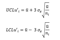
This value of σz is used to adjust the u control chart limits, as shown below.
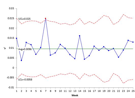
The control limits are shown in Table 2 as well. Plotting the u values, the overall average, and the control limits give the Laney u’ control chart shown in Figure 3.
Figure 3: Laney u’ Control Chart for Patients/Errors Data
Take a close look at Figure 3. A couple of items to notice. First, the control limits vary because the subgroup size (number of patients) varies each week – just like the u control chart. Now note that there is one out of control point with Laney u’ control chart while the u control chart had many. The individuals control chart did not have any. The reason the Laney u’ control chart picks it up is that it is accounting for the varying subgroup size – which the individuals control chart does not. In this situation, the Laney u’ control chart is a better than the individuals control chart.
Summary
This publication introduced the Laney u’ control chart. This control chart is especially useful in handling large subgroup sizes that lead to very narrow limits on the traditional u control chart. It does this by combining the calculation of z values with the X control chart as shown above. The Laney u’ control chart is a better choice when you have large subgroup sizes.
