November 2010
Process improvement tools should often be used together. This newsletter examines how Pareto diagrams and control charts can be used together to help tunnel down into the process to find the root cause of problems. The process starts at the top level by defining a problem – such as problems with deliveries to a major customer. Data are then collected for delivery problems and reasons for the deliveries problems. The delivery data are examined using a control chart to determine if you are dealing with special causes of variation or just common causes of variation. The Pareto diagram is then used to determine the major reason for delivery problems.
Then, the process of tunneling down into the process begins. This is done by taking the highest bar on the Pareto diagram and collecting data on what causes that problem to occur – again both in Pareto and control chart form. This tunneling down helps you find the root cause of the problem.
In this issue
- The Problem
- The Causes of the Problem
- The Initial Control Chart
- The Initial Pareto Diagram
- Tunneling Down into the Data
- Summary
- Quick Links
The Problem
A major customer has been complaining about the inconsistency of our deliveries. These inconsistencies include on-time delivery as well as complete and correct shipments. A process improvement team has been put together to work on this problem. The first step was to define the problem – which has really been done for us. There is an issue with our delivery process. But without data, it is difficult to define a problem. The first step is to collect data on the delivery process.
The first step in doing this is to define what a complete delivery is. This is not as easy as it seems when you have one customer, much less multiple customers. In this case, we are dealing only with one customer. We make multiple deliveries per week to the customer’s central warehouse from our different plant warehouses. Working with the customer, we developed the following “operational definition” of a “complete” shipment:
A shipment is complete if it is on-time and if all line-items are filled completely.
On-time is defined as being at the customer’s central warehouse by 3 PM on the due date, which was agreed to by our sales force and the customer’s purchasing department at the time of the order. A line-item is filled completely if the exact number ordered is there. For example, if the customer ordered 100 gloves (one line item) and there are 100 gloves in the delivery truck, the line-item is complete. However, if there are only 95 gloves, the line item is not complete.
Please note that this operational definition is not really complete. It does not define who will do the test and how the test is applied. According to Dr. W. Edwards Deming, an operational definition includes:
- a written statement (and/or a series of examples) of criteria or guidelines to be applied to an object or to a group.
- a test of the object or group for conformance with the guidelines that includes specifics such as how to sample, how to test, and how to measure.
- a decision: yes, the object or the group did meet the guidelines; no, the object or group did not meet the guidelines; or the number of times the object or group did not meet the guidelines.
For more information on operational definitions, please see our March 2004 newsletter.
The Causes of the Problem
Whenever you are monitoring a problem over time, you will also want to collect data on the causes of the problem – what causes delivery problems in our example. The first step is to develop a list of reasons for problem deliveries. The team brainstormed a list of possible problems. The list is shown below.
- Line item not complete
- Sales person ordered the wrong item
- Customer ordered the wrong item
- Warehouse picked the wrong item
- Delivery arrives after 3 PM
- Over-shipment
Note that you will require operational definitions for each of these items as well. Once the operational definitions are place, you are ready to begin the data collection – and this can take some time.
The Initial Control Chart
The initial date for correct shipments is shown in the table below. Each week the number of deliveries is determined. Based on the operational definition above, each delivery is rated as correct or not correct. During week number 1, there were 15 deliveries. All 15 were correct. So, the % correct for that week was 100%. During week number 2, there were 18 deliveries of which 16 were correct. So, the % correct for that week was 88.9%.
Table 1: Complete Shipments Data
| Week Number | Number of Deliveries | Number Correct | % Correct |
| 1 | 15 | 15 | 100.0% |
| 2 | 18 | 16 | 88.9% |
| 3 | 17 | 15 | 88.2% |
| 4 | 17 | 16 | 94.1% |
| 5 | 21 | 21 | 100.0% |
| 6 | 20 | 18 | 90.0% |
| 7 | 19 | 16 | 84.2% |
| 8 | 15 | 14 | 93.3% |
| 9 | 13 | 12 | 92.3% |
| 10 | 19 | 19 | 100.0% |
| 11 | 23 | 19 | 82.6% |
| 12 | 20 | 19 | 95.0% |
| 13 | 21 | 21 | 100.0% |
| 14 | 19 | 19 | 100.0% |
| 15 | 20 | 20 | 100.0% |
| 16 | 17 | 16 | 94.1% |
| 17 | 18 | 16 | 88.9% |
| 18 | 19 | 18 | 94.7% |
| 19 | 21 | 19 | 90.5% |
| 20 | 22 | 21 | 95.5% |
The team decides to use an X-mR chart (individuals control chart) to examine the data. During these 20 weeks, there were 374 deliveries to the customer’s central warehouse. Of these, 350 were complete. The X control chart is shown below (we will neglect the moving range chart in this newsletter).
Figure 1: X Chart for % Complete Shipments
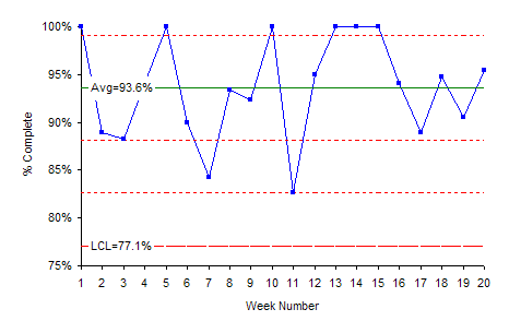
The X chart is in statistical control. This means that we can predict what the process will do in the future. We will average about 93.6% complete deliveries each week. Some weeks it may be as high as 100%. Other weeks, it may be as low as 77.1% (the lower control limit). All this variation is due to common causes – the normal variation in the process. For more information on individuals control charts, please see our October 2006 newsletter. We also have several newsletters on understanding variation – particularly common and special causes of variation. Our latest one is our February 2009 newsletter on the red bead experiment.
The Initial Pareto Diagram
Each time there was a problem with a delivery, a team member was notified and this person determined the problem with the delivery by talking to the customer and others in our organization. The data she collected are shown below. The table lists the delivery problem (e.g., line item not complete) and the frequency – how often it occurred during the 20 weeks of data collection. The problem “line item not complete” occurred2 times during the data collection.
Table 2: Delivery Problems Data
| Reason | Frequency |
| Line item not complete | 2 |
| Sales person ordered the wrong item | 5 |
| Customer ordered the wrong item | 4 |
| Warehouse picked the wrong item | 1 |
| Delivery arrives after 3 PM | 11 |
| Over-shipment | 1 |
The Pareto diagram for these data is shown below.
Figure 2: Pareto Diagram on Delivery Problems
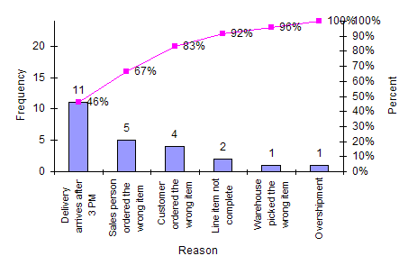
The Pareto diagram is used to separate the “vital few” from the “trivial many” problems. The first bar has the highest frequency of occurrence. The problem “Delivery arrives after 3 PM” occurred 11 times. This represents 46% of the delivery problems. This is where we need to focus our attention and begin to tunnel down into the first bar of the Pareto diagram. For more information on Pareto diagrams, please see our June 2004 newsletter.
Tunneling Down into the Data
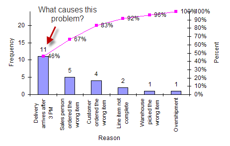
The next step is to take the highest bar on the Pareto diagram and tunnel down into reasons why this problem occurs. Quite often you will find that there is one overriding issue that causes this problem to be so large.
Figure 3: Tunneling Down
Now additional data will usually need to be collected on the % of late deliveries and reasons for late deliveries. However, this team was able to go back through the historical data and determine which deliveries were late. The data are given in the table below. During week number 1, there were no late deliveries. However, during week 2, there were 2 late deliveries out of 18. So, 11.1% of deliveries were late during week 2.
Table 3: Late Deliveries Data
| Week Number | Number of Deliveries | Number Late | % Late |
| 1 | 15 | 0 | 0.0% |
| 2 | 18 | 2 | 11.1% |
| 3 | 17 | 0 | 0.0% |
| 4 | 17 | 1 | 5.9% |
| 5 | 21 | 0 | 0.0% |
| 6 | 20 | 1 | 5.0% |
| 7 | 19 | 0 | 0.0% |
| 8 | 15 | 1 | 6.7% |
| 9 | 13 | 1 | 7.7% |
| 10 | 19 | 0 | 0.0% |
| 11 | 23 | 2 | 8.7% |
| 12 | 20 | 1 | 5.0% |
| 13 | 21 | 0 | 0.0% |
| 14 | 19 | 0 | 0.0% |
| 15 | 20 | 0 | 0.0% |
| 16 | 17 | 0 | 0.0% |
| 17 | 18 | 0 | 0.0% |
| 18 | 19 | 1 | 5.3% |
| 19 | 21 | 1 | 4.8% |
| 20 | 22 | 0 | 0.0% |
The X-mR chart was again used to analyze this data for statistical control. The X control chart is shown in Figure 4 below.
Figure 4: X Chart for Late Deliveries
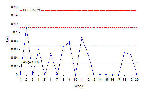
This chart is in statistical control. On average, 3% of our deliveries will be late. Some weeks it might as high as 15%; other weeks there will be no late deliveries. This is just the normal variation in the process. If the control chart had contained a special cause of variation (e.g., point above the upper control limit), there would be a special cause present. In that case, the reason for the special cause should be found and eliminated. For example, suppose week 2 had 20% late deliveries. This would be beyond the upper control limit. A special cause existed during that week. In this case, we would examine the data for week 2 and find out what caused it to be so high.
The team also had collected data on reasons for late deliveries. These data are shown in the table below.
Table 4: Reasons for Late Deliveries
| Reason | Frequency |
| Sales entered order too late in the day | 9 |
| Lack of people in warehouse | 1 |
| Delivery truck broke down | 1 |
The Pareto diagram for these data is shown below.
Figure 5: Pareto Diagram on Reasons for Late Deliveries
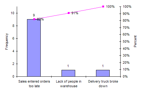
It is easy to see from this Pareto diagram that the major reason for late deliveries is that sales entered the orders too late in the day. Now that this cause has been identified, the process should be changed so that sales will not enter the orders too late. If that occurs, this will eliminate 9 of the 24 reasons for deliveries not being complete.
Summary
This newsletter examined how to tunnel down into the data to find root causes of a problem by combining the use of control charts with Pareto diagrams. This tunneling down into the data is not always easy but is necessary if data-based decisions are going to be made.