January 2020
(Note: all the previous SPC Knowledge Base in the bar charts category are listed on the right-hand side. Select this link for information on the SPC for Excel software.)
Welcome to our first publication of 2020. This marks the start of our 17th year of producing these monthly publications for our SPC Knowledge Base – over 192 publications on a variety of statistical topics. We hope you have found this free knowledge beneficial. Best wishes in 2020! Now on to this month’s publication!

All companies have problems – lots of them it seems. There is not enough time in a day to work on everything. The Pareto diagram provides a data-based approach to determine which problem to work on first so we can get the most return for our investment.
The Pareto diagram is often, though, just the first step in problem-solving – in identifying the major issue. You must do more work to find out what is causing the problem. Sometimes, you can tunnel down into the data using two variations on the Pareto diagram: variable Pareto diagrams and two-level Pareto diagrams. This publication introduces these two variations.
A variable Pareto diagram is multiple Pareto diagrams – one for each variable – that allows you to quickly see what is going on across the variables. A two-level Pareto diagram is actually several Pareto diagrams in one.
In this issue:
- Review of the Classical Pareto Diagram
- Variable Pareto Diagrams
- Two-Level Pareto Diagrams
- Summary
- Quick Links
Please feel free to leave a comment at the bottom of this publication. You can download a pdf copy at this link.
Review of the Classical Pareto Diagram
The 80/20 rule or the Pareto principle is at the heart of the Pareto diagram. The 80/20 rule applies in many places – 20% of our customers are responsible for 80% of the customer complaints, 20% of the workforce account for 80% of employee issues. The Pareto chart is one method of separating that 20% – the vital few – from the 80% – the trivial many. This allows us to focus our time, energy, and resources where we will get the most return for our investment.
The Pareto diagram is a bar chart. Suppose you want to determine which shift has the most defects. There are four shifts: days, afternoons, nights and weekends. There are six types of defects that can be found in the final product: surface scratch, dent, miscellaneous, pinhole, deep gouge, and small hole. To find out which shift produced the most defects, data was collected for the last 100 defects reported. The defects are reported by shift and type of defect.
You can download the data used in this publication at this link. All the charts in this publication were produced using the SPC for Excel software.
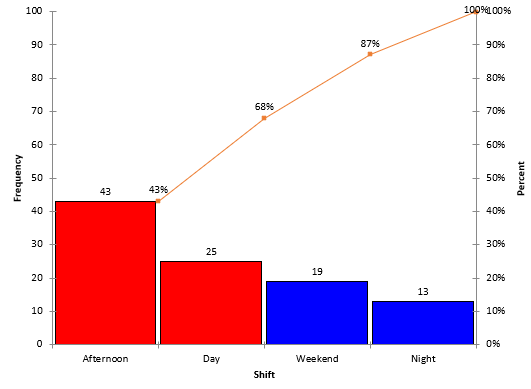
The Pareto diagram for the number of defects by shift is shown in Figure 1. This is the classical Pareto diagram.
Figure 1: Defects by Shift Pareto Diagram
The number of defects is counted for each shift and placed on the chart in decreasing frequency order. Bars are drawn. The height of each bar represents the number of defects for each shift, which is on the left vertical axis. The afternoon shift has the most defects, 43, followed by the day shift, weekend shift and night shift.
The line on the chart is the cumulative line. It shows the cumulative % of defects and is plotted versus the right vertical axis. There are 100 total defects. The afternoon shift is responsible for 43% of the total defects (43/100); the afternoon and day shifts account for 43 + 25 = 68 defects or 68% of the total defects (68/100), etc.
It is easy to tell which shift creates the most defects with this classical Pareto diagram. It is the day shift.
For more information on the classical Pareto diagram, please see our SPC Knowledge Base publication on Pareto Diagrams.
Variable Pareto Diagrams
Figure 1, while giving you some information, doesn’t give you knowledge of where to start looking for problems on the day shift. You need to tunnel down into the data. The variable Pareto diagram gives you the ability to do this. Essentially the variable Pareto diagram takes the data by shift and by defects and creates a pseudo-Pareto diagram for each variable.
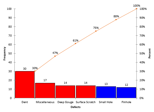
I say pseudo because the Pareto diagram for each variable is not sorted from largest to smallest. Instead, the ranking is the same on each variable Pareto diagram and follows the overall defect Pareto diagram ranking. The classical Pareto diagram by defects is shown in Figure 2.
Figure 2: Pareto Diagram for Defects
This chart shows the rankings of defects by frequency of occurrence with “Dent” being the most to “Pinhole” being the least. This ranking is used on each of the variable Pareto diagrams.
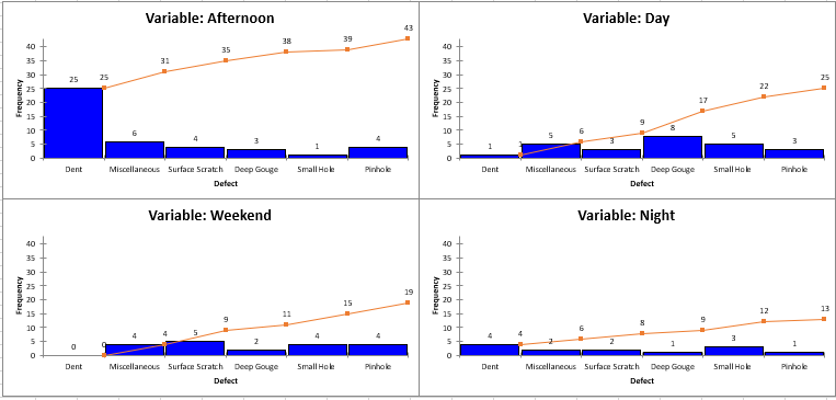
The variable Pareto diagram is really a separate Pareto diagram for each shift, using the rankings from the Pareto diagram for defects in Figure 2. The variable Pareto diagram for this example is shown below.
Figure 3: Variable Pareto Diagram for Defects by Shift
There is a Pareto Diagram of each variable. Remember, the x-axis is the same for each variable Pareto diagram, starting with Dent and ending with Pinhole. The variables are also listed starting with the one with most defects (Afternoon) and ending with the one with the least defects (Night).
It is very easy now to see what is going on with the data set up this way. It is easy to see that most “Dents” occur on the afternoon shift: 25 compared to a total of 5 on the other three shifts. This is where you need to begin to look at what causes those “Dents” on the afternoon shift.
For this to be the most useful, the reasons for defects must be the same for each variable (shift).
This is the advantage of using the variable Pareto diagram. You could also use something other than frequency of occurrence for the defects. For example, if you know how much each defect costs you, you could create the variable Pareto diagram using cost instead of frequency. We will do something like this below with the two-level Pareto diagram.
Two-Level Pareto Diagram
There are situations where you might not have the same defects for each variable. For example, suppose you are monitoring reasons for downtime. You might have reasons for downtime defined by general levels like production, maintenance, and operations. Each of these general levels have their own set of reasons for downtimes. So, the variable Pareto diagram will not work. In this case, you can use a two-level Pareto diagram. The data used below is in the same workbook cited for download above.
In this example, data are collected by general level, by reason for downtime and by length of downtime in hours. The two- level Pareto diagram essentially places a Pareto diagram for each general level into one single Pareto diagram. In this example, there are three general levels so there will be three Pareto diagrams in one with the two-level Pareto diagram.
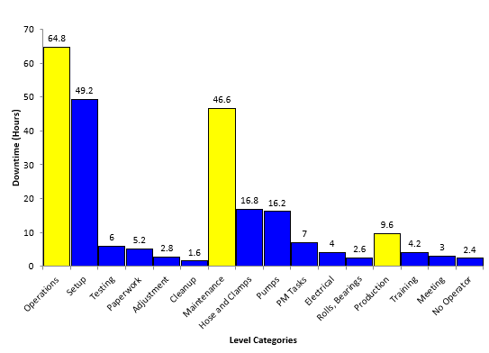
The resulting two-level Pareto Diagram is shown in Figure 4.
Figure 4: Two-Level Pareto Diagram
In the two-level Pareto diagram, the top levels are shown in the same color (yellow in this case). The yellow bars “split” the individual Pareto diagrams. Operations had the most downtime (64.8 hours) and is listed first. The next yellow bar is the downtime due to maintenance (46.6 hours), followed by the last yellow bar for production (9.6 hours of downtime).
The reasons for downtime in each level are shown in a different color (blue in this case). Under each level, the reasons for downtime are sorted from the most frequent to the least frequent. The largest downtime reason in operations is setup with 49.2 hours, down to cleanup with 1.6 hours.
The two-level Pareto diagram has the advantage of showing multiple Pareto diagrams in one and allows the easy comparison between the different levels. Of course, you can have more than two levels on a multi-level Pareto diagram, but that often leads to too many bars on the Pareto diagram.
Summary
This publication introduced the variable Pareto diagram and the two-level Pareto diagram. Both diagrams allow you to tunnel down further in the data to determine where you want to start your process improvement efforts. The variable Pareto diagram produces a pseudo-Pareto diagram for each variable, sorted in decreasing order based on the total number of defects for all variables. The two-level Pareto diagram provides “Pareto diagrams within one Pareto diagram.” There is one Pareto diagram for each variable in the diagram.


