March 2023
 You manage a process that produces a product for a major customer. The process is in statistical control. Each month, you create a report for management that includes a histogram of the key product characteristic as part of a process capability analysis. How many data points do you need to make a meaningful histogram? Your software makes a histogram with any number of points, so that is not an issue. You have been told that 30 is a good number to use for process capability studies. And since the process is in statistical control, the histogram should look pretty much the same each month, correct?
Of course, management is happy when that report shows nothing out of specifications for the month; they are not so happy when parts of the histogram exceed the specification limits.
The problem is that the histograms don’t look the same each month- even when the process is in statistical control. Why is that? It is our old friend variation being present in the process. How do we get to a point where the histogram is really a true picture of our entire process? Unless you are doing 100% inspection, the answer is that your probably can’t. This publication examines the impact of process variation on histograms. And shows how the Agresti-Coull Interval can be used to provide more insights into how much of the production is out of specifications.
In this issue:
Please feel free to leave a comment at the end of this publication. You may download a pdf copy of this publication at this link.
Histogram Review
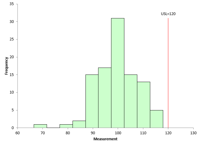
A histogram is a picture of how your process data stacks up over time. An example of a histogram is shown in Figure 1. This histogram is the first histogram in our analysis below.
Figure 1: Month 1 Histogram

This histogram contains 100 points – a lot of data. The histogram is composed of bars or classes that represent how often data falls into a range of measurements. The x-axis represents that range of measurements (e.g., 95 – 100). The y-axis is the number of data points that fall in that range (the frequency). This histogram has the upper specification limit (USL) added. It is easy to see that part of the histogram extends beyond the USL – meaning there is out of specifications material above the USL. Our example above only has an USL.
A histogram tells us four things:
- What the most common value is
- The amount of variation present
- The shape of the variation
- The relationship of the data to the specifications
The most common value in Figure 1 is around 95 to 100. This is called the mode – the highest bar on the histogram. The variation in the histogram runs from around 75 to less than 125. The distribution may or may not be bell shaped (normally distributed).
Histograms can also detect problems in a process. For more general information on histograms, please see our two-part series on histograms in our SPC Knowledge Base, our video on histograms, or our most recent publication on histograms showing the impact of bar width on histograms.
All the histograms used in this publication were made using the SPC for Excel software.
Our Data
An example is needed to explore the impact of variation and sample size on histograms. To simulate the results, 10,000 random numbers were generated for a normal distribution using the SPC for Excel software. These 10,000 points represent our process’ population – all the possible outcomes from the process. You can download an Excel workbook with the code used to run the simulation at this link.
The parameters used to generate the results were an average = 100 and a standard deviation = 10. The actual average of the 10,000 points is 99.95 with a standard deviation of 9.98, so very close to the parameters used. Figure 2 is a histogram of the 10,000 points.
Figure 2: Population Histogram

Figure 2 also shows the upper specification limit (USL) for the product. Our customer’s USL is 120. You can see that part of the histogram extends beyond the USL, meaning that our process is producing some material above the USL. In the population, there are 227 points that are above the USL of 120. This gives a population % out of specifications of
p = OOS/n = 227/10000 = 2.27%.
where OOS = number of out of specification points and n = the number of points on the histogram.
These 10,000 data points – our population – are used below to simulate what variation does to the histogram and how sample size impacts the histogram.
The Impact of Variation on Histograms
Suppose the data that goes into the monthly report comes from 100 samples taken during the month. The data are in statistical control. To create our process histograms, 100 points from the population of 10,000 in Figure 2 were randomly selected, and a histogram created for those 100 points. The first month histogram based on these 100 points is shown in Figure 1.
Figure 1 shows that 3 points out of the 100 points are out of specification. This gives us an out of specifications percentage of 3.
If this was 100% inspection, we would be done with the histogram. The % out of specifications is 3%. But we are not doing 100% inspection. In our process, we are taking samples. Not every possible outcome can be measured from a process. Instead, samples are taken from the process. These samples, we hope, represent the material that is not being measured, i.e., we want to be able to make some conclusions on the material not being measured based on the material being measured. This extrapolation is only valid if the process is in statistical control.
Figure 1 has 3% of the data out of specifications. And since the process is in statistical control, you can expect to get the same results in future months, correct? No that is not correct. Remember variation. Just because a process is in statistical control, doesn’t mean you are going to get the exact same results in the future. The next 100 samples will probably not be the same 100 samples selected for Figure 1. Will there be out of specifications material in the next 100 samples? Maybe but maybe not.
Figure 3 is the Month 2 histogram. Again, 100 points were randomly selected from the population shown in Figure 2, and a histogram was constructed.
Figure 3: Month 2 Histogram
There are no samples that are out of specifications in Figure 3. Management is happy that there was an improvement from last month.
What would happen if we continued to pull 100 randomly selected points from our population and examined the out of specifications results? This was done 100 times. The number of out of specification points was determined for each of the 100 histograms. The number of out of specification points varied from 0 to 7. Can you imagine management’s response if you show a histogram with no out of specification points one month and then one with 7% out of specifications the next month? They would be wondering what you are doing!
The histogram in Figure 4 shows the number of out of specification points for the 100 times the simulation was run.
Figure 4: Number of Out of Specifications in 100 Points Histograms

14 times out of 100, the histogram shows no out of specification points. The most common was 2 points beyond the USL, which occurred 36 times. There were 5, 6, and 7 out of specification points one time each.
Does this mean that our process produces 0 to 7% out of specifications? For histograms using 100 points, the answer is pretty much yes. The results can be significantly different than the population % out of specification of 2.27.
Each time you make a histogram, you can estimate the percentage of material that could be out of specifications in an attempt to account for variation. One technique that can be used is the Agresti-Coull interval estimate:

where p ̃ = the Wilson point estimate, OOS = number of out of specification points, and n = number of points in the histogram. The 95% confidence interval for the point estimate is given by:

(Reference: What is the Fraction Nonconforming? By Dr Donald Wheeler, November 2021, www.spcpress.com.)
Consider the histogram in Figure 1. There are three out of specification points. The equations become:

For Figure 1, the Wilson point estimate is 4.81% while the 95% confidence interval is 0.70 to 8.92%. This means that, based on the data in Figure 1, the % out of specifications can range from 0.70 to 8.92%. Quite a range of possible results – all because of variation.
The histogram in Figure 3 has no out of specification points. Does that mean that there is no interval in this case? The answer to that is no. There is still an interval that can be calculated. In Figure 3, Y = 0 so:

The lower limit in this calculation is below 0, so it is entered as 0 since it can’t be negative. What does this mean? This means that with a histogram containing 100 points with no points beyond the specifications, there is a possibility of having 0 to 4.56% out of specifications in the process.
Figure 5 shows the values of p ̃ and the 95% estimate intervals for the 100 histograms made during this simulation.
Figure 5: Wilson Point Estimate and 95% Estimate Interval

You can see there is a lot of variation in the results even when using 100 data points on a histogram. The value of p ̃ varies from about 2% to almost 8% on the individual histograms. The upper interval gets above 14%., with the lower interval getting as above 2%. The average out of specification for the 100 histograms was 2.06%, close to the population value of 2.27%.
100 points is a lot of points to put on a histogram. And you still get a lot of variation in the result as shown above.
So, what do you do? You have to realize the limitations that a histogram has, even if you have lots of data, which to most people is 100 data points. If you are anywhere near the specification, a single histogram is not a good indicator of how much out of specification material the process will generate. To get a better estimate of that, you need to use something like the Agresti-Coull interval.
Summary
This publication used a simulation to see how variation impacts a histogram with 100 points. There is a lot of differences in histograms pulled from the same population. You cannot rely on a single histogram to estimate how much material is out of specifications. You must take into account variation using an approach like Agresti-Coull.