April 2026
 Statistical Process Control (SPC) is being used more and more in healthcare. This publication provides an example of where the individuals control chart (X-mR) can be used in a clinical laboratory setting: monitoring the daily blood culture turnaround time (TAT) at a 200 bed community hospital. Control charts and the calculations for the X-mR chart are reviewed. The example control chart is made. There are some out of control points. How to remove these from the calculations is discussed and a new control chart for the TAT is generated.
In this issue:
Please feel free to leave a comment at the end of the publication. You can download a pdf copy of this publication at this link.
See what your laboratory data looks like in SPC for Excel! Try the free 30-day demo now!
The Data
The data used for this analysis is shown in Table 1. It shows 25 consecutive weekdays at a 200 bed community hospital running about 150 blood culture sets per 1000 patient days.
Table 1: TAT Data
| Day | Median TAT | Day | Median TAT | |
| 1 | 58 | 14 | 72 | |
| 2 | 54 | 15 | 68 | |
| 3 | 61 | 16 | 76 | |
| 4 | 55 | 17 | 91 | |
| 5 | 50 | 18 | 98 | |
| 6 | 63 | 19 | 94 | |
| 7 | 57 | 20 | 62 | |
| 8 | 59 | 21 | 58 | |
| 9 | 53 | 22 | 55 | |
| 10 | 48 | 23 | 61 | |
| 11 | 66 | 24 | 52 | |
| 12 | 60 | 25 | 49 | |
| 13 | 64 |
The data gives the median turnaround time for each day for 25 days. We will use this data to construct a control chart to monitor the TAT. We will start with a brief review of variation and control charts.
Control Chart Review
A control chart monitors variation in a process over time. It separates common causes of variation from special causes of variation. Common causes of variation represent the “noise” in the process. It is the normal or natural variation that exists in the process. It exists because of the way you designed the process and manage it on a day-to-day basis.
A good example of this is the time it takes you to get to work in the morning. There is a certain amount of “normal variation” in that process. There is an average time it takes to get to work with some variation about that average. Maybe that variation is 15 to 25 minutes. This variation is normal for you, and you expect it. This is common causes of variation – the normal variation in the process.
A special cause of variation represents a “signal” that something has changed in the process. For example, if you get a flat tire on the way to work, you will not be getting to work in your normal time variation of 15 to 25 minutes. It will be much later, most likely. This is a special cause of variation in the process. It is not part of the way the process is designed and is managed. It is not supposed to be there.
A control chart separates the common causes of variation from the special causes of variation. All processes have noise – the common causes of variation. Some processes have signals – the special causes of variation that indicate something has changed. When a special cause of variation exists, you should find the reason for the special cause and remove it from the process – hopefully preventing it from coming back again. For more information on variation, please see our SPC Knowledge Base articles at this link.
A control chart is the only effective way to separate the signals from the noise. This is done by plotting the data (like the time to get to work) over time. Once you have enough data, you calculate the average and the control limits. There are usually two control limits. One is the upper control limit (UCL). This is the largest value you would expect if you just had common causes of variation present. The other is the lower control limit (LCL). This is the smallest value you would expect if you just had common causes of variation present.
After you have plotted the average and control limits, you interpret the control charts. If there are no points beyond the control limits or patterns (like 8 in a row above the average), the process only has common causes of variation (noise) present. The process is said to be in statistical control. If there is a point beyond the control limits or patterns present, then the process is sending a signal that something has changed.
Daily Blood Culture TAT Control Chart
We will use an individuals control chart to analyze the daily median TAT. Two charts are included in the X-mR control chart: the X chart where the median TAT is plotted daily and the moving range chart where the range between consecutive median TATs is plotted. For example, the first two TAT samples are 58 and 54. The moving range is |58 – 54| = 4. There is one less moving range value than number of samples (k).
Once the data are plotted, the overall averages and control limits are calculated and added to the control chart. The calculations are shown below based on the data in Table 1.
Overall Average = X = ∑X/k = 1584/25 = 63.4
Average Moving Range = R = ∑R/(k-1) = 185/(25-1) = 7.7
Upper Control Limit on X Chart = UCLx = X +2 .66R = 63.4 + 2.66(7.7) = 83.9
Lower Control Limit on X Chart = LCLx = X – 2.66R = 63.4 – 2.66(7.7) = 42.9
Upper Control Limit on mR Chart = UCLr = 3.27R = 3.27(7.7) = 25.2
Lower Control Limit on mR Chart = LCLr = None
The control charts are shown in Figure 1 for the X chart and Figure 2 for the moving range chart. All control charts in this publication were made with the SPC for Excel software.
Figure 1: X Chart for Median TAT
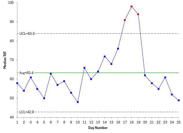
Figure 2: Moving Range Chart for Median TAT
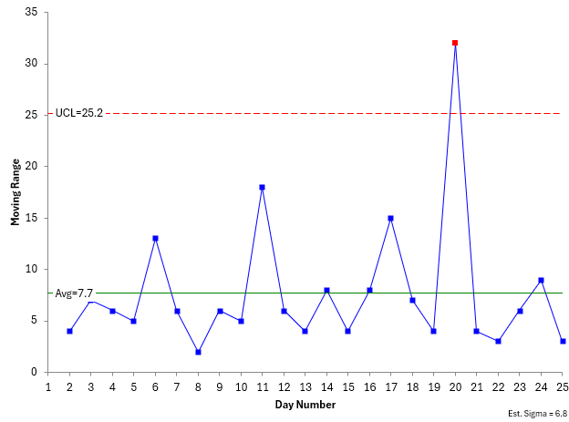
The next step is to interpret the control chart. There are multiple tests for out of control points. For more information on interpreting control charts, please see our SPC Knowledge Base article on Control Chart Rules and Interpretation. The out of control test we will focus on here is points beyond the control limits.
The moving range chart has one out of control point while the X chart has three consecutive points that are out control. This means that there is a special cause of variation present. You should find out what the special cause is and remove it. In this example, possible issues with reagents could be the special cause.
Suppose the special cause of variation was found and removed. What do you do with the control chart? The average and control limits contain the special cause. Wouldn’t it be better to remove them from the calculations?
The rule of thumb is that, if you know the reason for the special cause and have removed it, you can recalculate the control limits without the out of control points. This has been done in Figures 3 and 4 below.
Figure 3: Recalculated X Chart for Median TAT
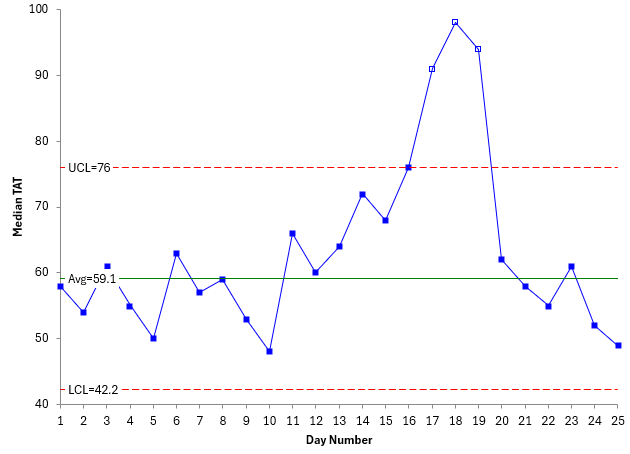
Figure 4: Recalculated mR Chart for Median TAT
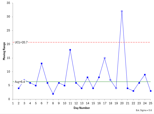
The averages on both updated charts in Figures 3 and 4 are less than the averages in Figures 1 and 2 since the out of control points are removed from the calculations. The points should be plotted even if they are not in the calculations. The SPC for Excel software shows points not included in the calculations as a square without any fill. You can now set these control limits and monitor the process versus them in the future.
Summary
This publication presented an example of SPC in a clinical laboratory: monitoring the daily median turnaround time for blood samples. A review of control charts was given and then the data were plotted as a X-mR chart. The calculations were reviewed. The process had points out of control. Since the reason for known for the special cause, these points were removed from the calculations and the control chart remade. These control limits can be set to judge future performance for the median TAT.
The SPC for Excel software handles all your control chart needs – from creating to interpreting the control charts!