May 2020
(Note: all the previous SPC Knowledge Base in the control chart examples category are listed on the right-hand side. Select this link for information on the SPC for Excel software.)

This is not the case with COVID-19 data. These data are coming from many sources with many different operational definitions. The testing is different from place to place. The data are definitely questionable. I wish it were better, but it is all we have. Because it is questionable, do we toss it all out and go forward without any data? Why is it good enough to use on some charts, like a semi-log plot, but not on control charts?
Part of the problem with using these types of data on control charts is that some do not know how to interpret a control chart. They use one set of control limits and focus on the out of control points. They do not focus on the patterns in the data that would indicate changes in the process – moving up or moving down within the control limits. Nor do they understand how to split the control limits to really see what is happening with the data.
This month’s publication takes a deeper look at how to do this using control charts and updates the data from our last publication. In this issue:
- Data Source
- Background
- Control Chart Approach to the COVID-19 Data
- Number of Cases
- % of Tests That are Positive
- COVID-19 Deaths
- Summary
- Quick Links
You may leave a comment at the end of this publication. You may download a pdf copy of this publication at this link.
Data Source
The data used in this analysis comes from The COVID Tracking Project website. The website updates data daily for the United States and the individual states. The figures below are for data for all the United States. The same approach can be used for the states and individual counties.
Background
Dr. Donald Wheeler recently co-authored two articles on the COVID-19 data published on the Quality Digest website. Both articles are highly informative. I believe I was first introduced to Dr. Wheeler at a four-day seminar by Dr. W. Edwards Deming back in the early 1980s. Dr. Wheeler was assisting Dr. Deming. I have copies of most of Dr. Wheeler’s books in my library – as should you if you do not (www.spcpress.com). I have learned much from his books and articles over the years. There is no one better in my book in terms of understanding variation and control charts.
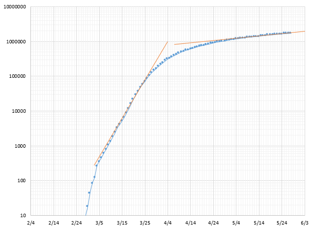
If there was one person that I think would use control charts to analyze data, it would be Dr. Wheeler. But neither article had a control chart in it. Instead, Dr. Wheeler uses a semi-log plot to look at the number of cases and deaths over time. The example below is a semi-log plot for the number of cases in the United States using the COVID Tracking Project data. The template for the chart was from the download provided in the first article by Dr. Wheeler on Quality Digest.
Figure 1: Semi-Log Plot of Total Number of Cases per Day
The COVID-19 virus grows exponentially. From the article:
“When working with exponential growth phenomena, the primary graph has always been the semi-log plot. The actual counts are plotted on a logarithmic scale while the dates are plotted on a linear scale. This plot preserves the nature and interpretability of the data since it plots the actual values, but it turns the exponential growth curves into straight lines. Since it is much easier to see when the slope of straight line changes than it is to tell when a curved line changes shape, the semi-log plot is more easily understood. Moreover, it is easier to extend a straight line to make reasonable, data-based short-term predictions than it is to try to extend an exponential growth curve on a traditional graph.”
The orange lines on the chart are used to predict what would happen if there are no further changes – that is, the rate continues as it is. For example, back in March, this chart was predicting that the 1 millionth case would happen on April 4 – if nothing changed. But it did, e.g., we closed things, began social distancing, and wore masks. The rate of infection from the virus slowed down and the actual 1 millionth case occurred around April 28.
The co-authors clearly explained what the semi-log plot gives in the article. But no control charts? So, I emailed Dr. Wheeler, showed him examples of what I had done and asked why he was not using control charts. Here is his answer (used with his permission):
“Many years ago, I tried this approach with the Mad Cow Disease epidemic in England in 2001. It looked very much like what you sent. Then, when I was finished, I asked myself if this analysis had added insights that were not available from the data themselves, and frankly, had to admit that it did not.
With an epidemic the one constant is change. We know that things are changing. The question is not “Has a change occurred?” but rather “How much of a change has occurred?”
TO answer this question, we need to place the daily numbers you were using in context by looking at the totals to date. When we plot these on a semi-log plot, we SEE the growth rate as the angle of the plotted curve. We SEE where we have been. We SEE changes in growth rate as changes in slope of this curve. We can PROJECT the slope of the curve to predict the near-term future. What more do you need to know about an epidemic?
The best analysis is always the simplest analysis that provides the needed insight.”
I don’t disagree with Dr. Wheeler and I love that last line of his quote. He has said that many times before. But I think control charts are a way to provide some insight as well. Things change quickly with the epidemic – that is a constant. You are expecting changes to occur – quickly – and that impacts how you use the control chart. Plus, there are some key metrics, such as % of positive tests, that need to be charted over time and are not well suited for the semi-log plot.

- Downward trajectory of documented cases within a 14-day period OR downward trajectory of positive tests as a percent of total tests within a 14-day period (flat or increasing volume of tests)
You are looking for downward patterns in the number of cases and % of positive tests. It appears to me that the simplest analysis to get that insight is through a time series chart – a control chart.
Control Chart Approach to the COVID-19 Data
It is easy to make a control chart. Enter your data into a software package and your control chart is generated automatically. Far too often, people stop here. They keep their one set of control limits and focus only on the out of control points.
You cannot do that with the COVID-19 data (and probably should not with your process data). The COVID-19 data changes too fast. At this point, you need to begin to think about what the control chart is telling you – when did a change occur – then you can begin to estimate how much of a change there is. But remember, with the rapidly changing epidemic and when the quality of the data are suspect, the predictions are not precise – the predictions are just a guide to tell you if things are improving or if things are getting worse and a general estimate of the change.
Once you identify these areas, you can split the control limits and begin to learn more about what the data are telling you through the control chart. If you look at enough control charts over time, you will be able to decide for yourself where the process changes. And, with these type of data, changes occur frequently.
Follow these general steps in using control charts with the COVID-19 data:
- Create the control chart for the metric.
- Generally, do not worry about out of control points.
- Look at the patterns within the control limits and the entire dataset.
- Decide where the process has shifted.
- Do not be afraid of trends but make sure it is a true trend and not one made by a series of step changes (see this article by Davis Balestracci for an example of this).
- Split the control limits at the point where the process shifted.
- Once a stable period of results are found, set the control limits to judge future performance – remember, with the rapidly changing epidemic, it won’t be long before a change is seen (two to four weeks based on the charts below).
The data for number of cases in the United States will be used to demonstrate this approach
Number of Cases
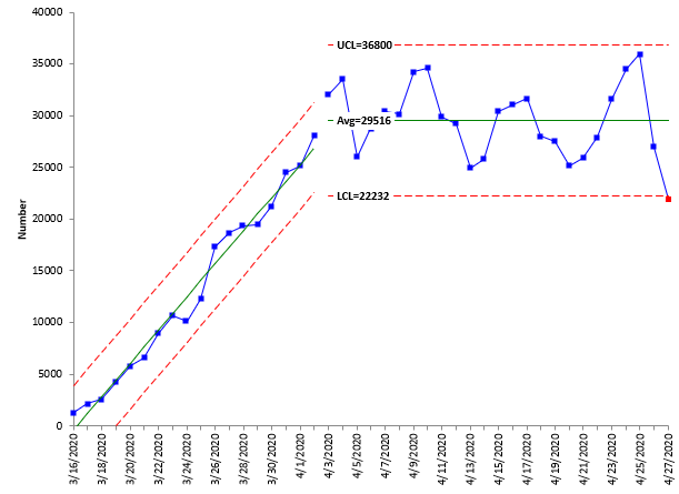
In last month’s publication, the following chart was used to demonstrate the splitting of control limits.
Figure 2: Number of COVID-19 Cases in the United States
The chart shows a trend from 3/16/20 through about 4/3/20. Do not be afraid of using a trend on a control chart if it is there – as it is clear in the control chart above. After 4/3/20, the number of cases then appears to stabilize with an out of control point on 4/27/20.
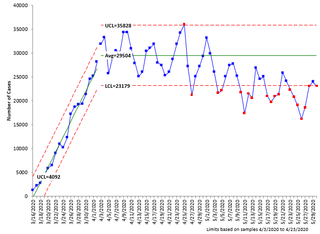
The next step is to set the stable portion of the control chart as a baseline and then monitor the data for changes versus that baseline. Figure 3 shows the control chart with control limits based on the time from 4/3/20 – 4/23/20 and including the data through 5/30/20.
Figure 3: Number of COVID Cases in the United States with Baseline Control Limits Set
Figure 3 shows that the number of cases is slowly decreasing, as evident by the out of control points in red – although the decrease is much smaller than the trend at the start of the control chart. But it does show that the number of cases is generally decreasing.
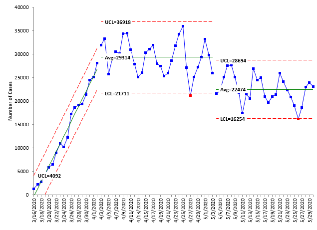
The control chart indicates that it is time to split the control limits. It appears that around 5/4/20, the pattern shifted down slightly. Everything since then has been below the average based on the baseline data from 4/3/20 to 4/23/20. Figure 4 shows the control chart with the limits split at 5/4/20.
Figure 4: Number of COVID-19 Cases in the United States with Control Limits Split 5/4/20
The pattern is stable now for the time from 5/4/20. The control chart indicates that the number of cases has decreased on average by about 7000 in the two time periods.
% of Tests That are Positive
One useful metric in the COVID-19 data is the % of tests that are positive. Early in the pandemic, the tests were primarily given to people with strong symptoms, primarily due to the lack of tests. So, in this case, you would expect that the more tests that are given, the more positives there are. That was true then, but it is no longer true.
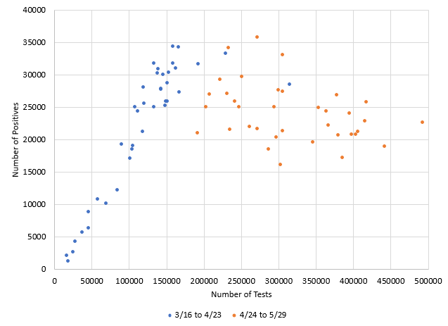
Figure 5 shows a scatter diagram of the number of tests versus the number of positives. The blue points represent the time from 3/16/20 to 4/23/20. There is a strong positive correlation between the two variables during this time– the more tests, the more positives. But that pattern no longer exists in the time from 4/24/20 – 5/29/20. There is no longer a correlation when you look at the orange points.
Figure 5: Scatter Diagram of Number of Tests versus Number of Positives by Time
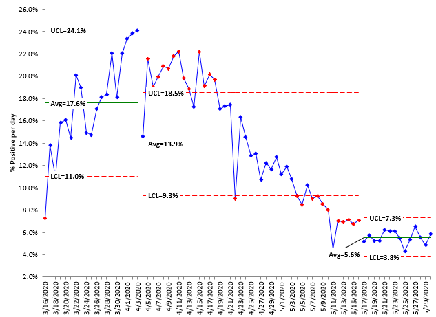
The number of tests has been increasing in the United States reaching a record high of almost 500,000 on one day. But the number of cases, as shown above, are no longer increasing. Figure 6 is the control chart for the % positives over time.
Figure 6: % Positives for COVID-19 in the United States
There is an upward trend followed by a downward trend. The downward trend lasted more than 14 days. But it has not continued. It appears to have leveled off the last ten days or so around 5.6% – a stable pattern not seen before in the data.
COVID-19 Deaths
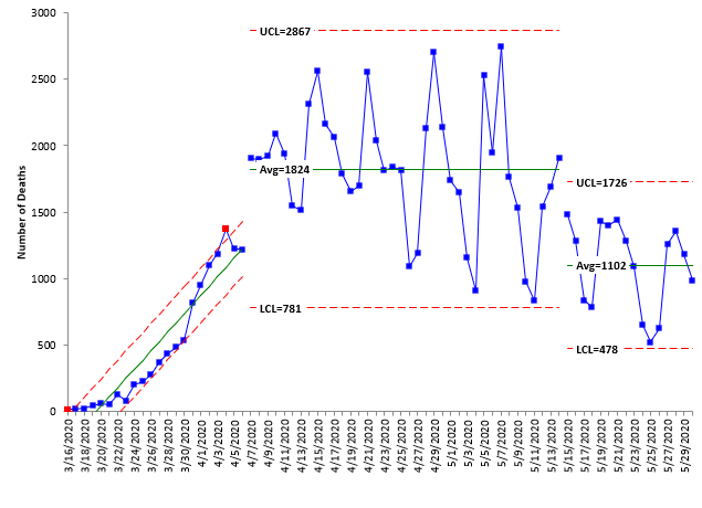
Figure 7 shows the control chart for COVID-19 deaths. The control chart shows three patterns; the first one is a trend going upward seen in the earlier charts as the virus increased it presence. Then there is a period of stability – although with wide variation – perhaps more of how often the data are reported. Then the last period where there has been a detectable decrease in the number of deaths. Unfortunately, it is not continuing to decrease, but appears to have leveled off around 1102 deaths per day.
Figure 7: COVID-19 Deaths
Summary
There have been lots of models about the COVID-19 virus and predicting what will happen in the future, e.g., when to reopen again. This is what Governor Cuomo recently said when asked about re-opening and the models:
“People can speculate, people can guess, ‘I think next week, I think two weeks, I think a month,'” said New York Governor Andrew Cuomo during a Memorial Day press briefing at the U.S.S. Intrepid Sea, Air & Space Museum. “I’m out of that business because we all failed at that business, right? All the early national experts: ‘Here’s my projection model. Here’s my projection model.’ They were all wrong.” Cuomo then added pointedly: “They were all wrong.” (mynbc15.com)
The models have failed in the long term. The best you can do is figure out what will be happening in the short term. Both the semi-log plot and control charts can help you see what changes have occurred and where you are – at least for the moment. It may be the best we can do. But the control chart approach will allow you to easily see when you have a 14 day downward trend in the number of cases and the % positives.
Thank you for all these interesting insights into control charts – I look forward to each monthly installment.For this sort of data – the US covid death rate for example – it always surprises me that you do not mention cusum analysis. The breakpoints, change of slope in the data, are really clearly visible; much more so than in a semi-log plot and the means, probabilities of a change and the variability within each range are easily calculated.I'm long retired but for many years as a QC manager, cusum coupled with Shewhart analysis served me well in monitoring the factory and getting to the root of problems. It would be very interesting to read your view on cusum in one of these monthly educational documents.
Thanks for your kind comments. I usually stay away from CUSUM because it doesn't plot the actual data. Have you do a CUSUM chart? If so, I would like to see what you have done. bill@www.spcforexcel.com