March 2016
Control charts are a valuable tool for monitoring process performance. However, you have to be able to interpret the control chart for it to be of any value to you. Is communication important in your life? Of course it is – both at work and at home. Here is the key to effectively using control charts – the control chart is the way the process communicates with you. Through the control chart, the process will let you know if everything is “under control” or if there is a problem present. Potential problems include large or small shifts, upward or downward trends, points alternating up or down over time and the presence of mixtures.
This month’s publication examines 8 rules that you can use to help you interpret what your control chart is communicating to you. These rules help you identify when the variation on your control chart is no longer random, but forms a pattern that is described by one or more of these eight rules. These patterns give you insights into what may be causing the “special causes” – the problem in your process.
In this issue:
- Variation Review
- Control Chart Review
- The 8 Control Chart Rules
- Possible Causes by Pattern
- Summary
- Video: Interpreting Control Charts
- Quick Links
You may download a pdf copy of this publication at this link. You may also leave a comment at the end of the publication.

Variation Review
We have covered variation in 11 publications over the years. Here is an excerpt from one:

Variation comes from two sources, common and special causes. Think about how long it takes you to get to work in the morning. Maybe it takes you 30 minutes on average. Some days it may take a little longer, some days a little shorter. But as long as you are within a certain range, you are not concerned. The range may be from 25 to 35 minutes. This variation represents common cause variation — it is the variation that is always present in the process. And this type of variation is consistent and predictable. You don’t know how long it will take to get to work tomorrow, but you know that it will be between 25 and 35 minutes as long as the process remains the same.
Now, suppose you have a flat tire when driving to work. How long will it take you to get to work? Definitely longer than the 25 to 35 minutes in your “normal” variation. Maybe it takes you an hour longer. This is a special cause of variation. Something is different. Something happened that was not supposed to happen. It is not part of the normal process. Special causes are not predictable and are sporadic in nature.

It has been estimated that 94% of the problems a company faces are due to common causes. Only 6% are due to special causes (that may or may not be people related). So, if you always blame problems on people, you will be wrong at least 85% of the time. It is the process most of the time that needs to be changed. Management must set up the system to allow the processes to be changed.”
Control Chart Review
The only effective way to separate common causes from special causes of variation is through the use of control charts. A control chart monitors a process variable over time – e.g., the time to get to work. The average is calculated after you have sufficient data. The control limits are calculated – an upper control limit (UCL) and a lower control limit (LCL). The UCL is the largest value you would expect from a process with just common causes of variation present. The LCL is the smallest value you would expect with just common cause of variation present. As long as the all the points are within the limits and there are no patterns, only common causes of variation are present. The process is said to be “in control.”

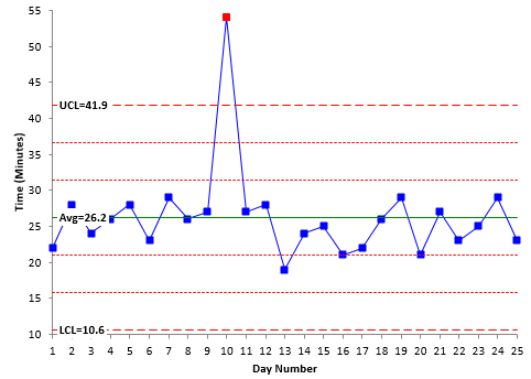
Figure 1: Control Chart Example
There is one point beyond the UCL in Figure 1. This is the first pattern that signifies an out of control point – a special cause of variation. One possible cause is the flat tire. There are many other possible causes as well – car break down, bad weather, etc.

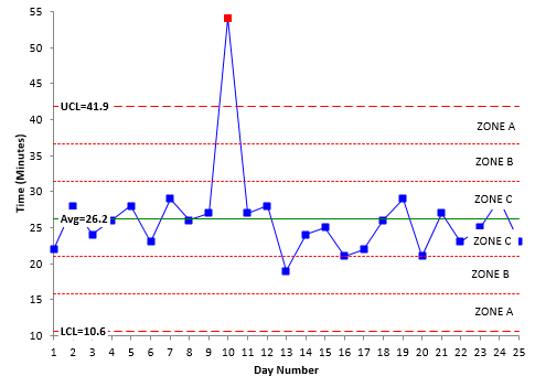
Some of these patterns depend on “zones” in a control chart. To see if these patterns exits, a control chart is divided into three equal zones above and below the average. This is shown in Figure 2.
Figure 2: Control Chart Divided into Zones
Zone C is the zone closest to the average. It represents the area from the average to one sigma above the average. There is a corresponding zone C below the average. Zone B is the zone from one sigma to two sigma above the average. Again, there is a corresponding Zone B below the average. Zone A is the zone from two sigma to three sigma above the average – as well as below the average.
The 8 Control Chart Rules
If a process is in statistical control, most of the points will be near the average, some will be closer to the control limits and no points will be beyond the control limits. The 8 control chart rules listed in Table 1 give you indications that there are special causes of variation present. Again, these represent patterns.
Table 1: Control Chart Rules
|
Rule |
Rule Name |
Pattern |
|
1 |
Beyond Limits |
One or more points beyond the control limits |
|
2 |
Zone A |
2 out of 3 consecutive points in Zone A or beyond |
|
3 |
Zone B |
4 out of 5 consecutive points in Zone B or beyond |
|
4 |
Zone C |
7 or more consecutive points on one side of the average (in Zone C or beyond) |
|
5 |
Trend |
7 consecutive points trending up or trending down |
|
6 |
Mixture |
8 consecutive points with no points in Zone C |
|
7 |
Stratification |
15 consecutive points in Zone C |
|
8 |
Over-control |
14 consecutive points alternating up and down |
Our SPC for Excel software handles all these out of control tests.
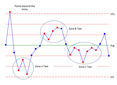
It should be noted that the numbers can be different depending upon the source. For example, some sources will use 8 consecutive points on one side of the average (Zone C test) instead of the 7 shown in the table above. But they are all very similar. Figures 3 through 5 illustrate the patterns. Figure 3 shows the patterns for Rules 1 to 4.
Figure 3: Zone Tests (Rules 1 to 4)
Rules 1 (points beyond the control limits) and 2 (zone A test) represent sudden, large shifts from the average. These are often fleeting – a one-time occurrence of a special cause – like the flat tire when driving to work.
Rules 3 (zone B) and 4 (Zone C) represent smaller shifts that are maintained over time. A change in raw material could cause these smaller shifts. The key is that the shifts are maintained over time – at least over a longer time frame than Rules 1 and 2.
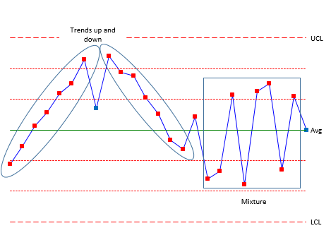
Figure 4 shows Rules 5 and 6. Rule 5 (trending up or trending down) represents a process that is trending in one direction. For example, tool wearing could cause this type of trend. Rule 6 (mixture) occurs when you have more than one process present and are sampling each process by itself. Hence the mixture term. For example, you might be taking data from four different shifts. Shifts 1 and 2 operate at a different average than shifts 3 and 4. The control chart could have shifts 1 and 2 in zone B or beyond above the average and shifts 3 and 4 in zone B below the average – with nothing in zone C.
Figure 4: Rules 5 and 6
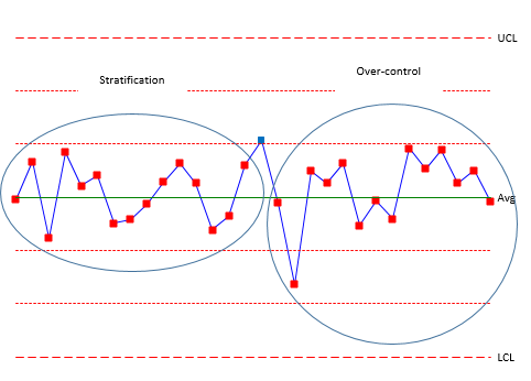
Figure 5 shows rules 7 and 8. Rule 7 (stratification) also occurs when you have multiple processes but you are including all the processes in a subgroup. This can lead to the data “hugging” the average – all the points in zone C with no points beyond zone C. Rule 8 (over-control) is often due to over adjustment. This is often called “tampering” with the process. Adjusting a process that is in statistical control actually increases the process variation. For example, an operator is trying to hit a certain value. If the result is above that value, the operator makes an adjustment to lower the value. If the result is below that value, the operator makes an adjust to raise the value. This results in a saw-tooth pattern.
Figure 5: Rules 7 and 8
Rules 6 and 7, in particular, often occur because of the way the data are subgrouped. Rational subgrouping is an important part of setting up an effective control chart. A previous publication demonstrates how mixture and stratification can occur based on the subgrouping selected.
These rules represent different situations – patterns = on a control chart. It should be noted that not all rules apply to all types of control charts. Table 2 summaries the rules by the type of pattern.
Table 2: Rules by Type of Pattern
|
Pattern Description |
Rules |
|
Large shifts from the average |
1, 2 |
|
Small shifts from the average |
3, 4 |
|
Trends |
5 |
|
Mixtures |
6 |
|
Stratifications |
7 |
|
Over-control |
8 |
Possible Causes by Pattern
It is difficult to list possible causes for each pattern because special causes (just like common causes) are very dependent on the type of process. Manufacturing processes have different issues that service processes. Different types of control chart look at different sources of variation. Still, it is helpful to show some possible causes by pattern description. Table 3 attempts to do this based on the type of pattern.
Table 3: Possible Causes by Pattern
|
Pattern Description |
Rules |
Possible Causes |
|
Large shifts from the average |
1, 2 |
New person doing the job Wrong setup Measurement error Process step skipped Process step not completed Power failure Equipment breakdown |
|
Small shifts from the average |
3, 4 |
Raw material change Change in work instruction Different measurement device/calibration Different shift Person gains greater skills in doing the job Change in maintenance program Change in setup procedure |
|
Trends |
5 |
Tooling wear Temperature effects (cooling, heating) |
|
Mixtures |
6 |
More than one process present (e.g. shifts, machines, raw material.) |
|
Stratifications |
7 |
More than one process present (e.g. shifts, machines, raw materials) |
|
Over-control |
8 |
Tampering by operator Alternating raw materials |
Table 3 provides some guidance on what you should be thinking about as you try to find the reasons for special causes. For example, if Rule 1 or Rule 2 is violated, you should be asking “what in this process could cause a large shift from the average?”. Or if Rule 6 occurs, you should be asking “what in this process could cause there to be more than one process present?” These type of questions can help guide brainstorming sessions to find the reasons for the special cause of variation. The type of pattern can guide your analysis of the out of control point.
Summary
This publication took a look at the 8 control chart rules for identifying the presence of a special cause of variation. The rules describe certain patterns of variation that will give you insights on where to look for the special cause of variation. No one table can give you the reasons for out of control points in your process. You have to use your own knowledge (and that of those closest to the process) to discover the reason. Our SPC for Excel software handles all the out of control charts.
Video: Interpeting Control Charts
Hi! Your page has been significantly helpful. Can you tell me how these rules would apply for an individuals-moving range chart? Can these zones still be created? Thanks in advance!
The zones test can be applied to the individuals chart; not the moving range chart. I probably need to do an article of what rules apply to which charts. But all apply the individuals chart. On the moving range, points beyond the limits, a run below or above the average (twice as long as individuals chart since each data point is reused in the moving range, overcontrol, an seven trending up or down.
Hi Bill – useful stuff. However, I'm struggling to understand which Control Chart rules I should apply. For example, do I use Westgard, Nelson, WECO etc. – none of which seem to be the rules you've listed above. Are you able to shed any light on which rules to use on an individuals chart? Thanks.
Of course, points beyond the control limits always apply. With the X chart for individuals, you apply all the rules listed in the article. However, with the moving range chart, you only use points beyond the control limts, and long runs above or below the average range or trending up or down. This is because you are reusing the data. I will do the next publication on which tests apply to which charts. Software, like SPC for Excel, will automatically select the appropraite tests for the control chart although you can change those options.
Sorry…I suppose what I was really trying to say is that there are slight variations to the available sets of rules. As I’m only just entering the world of SPC charts, my understanding is that WECO is the original set of rules (pretty much a cornerstone for all rule sets) and since then, newer iterations such as Nelson and Westgard have been developed. Therefore, I’m confused on which set of rules I should use. In Rule 5 above, you state the need to observe at least 7 consecutive points whereas Nelson rules (rule 3) state the requirement to observe at least 6. Is there a “correct” choice, or does it come down to how long you wish to observe a trend for before determining it to be out of control? Thanks.
Yes, there are slight variations in the rules. Some have 7, others 6, others 8. There is not a correct choice as such. You are correct – it is how "sure" you want to be that there is signal. Suppose we were tossing a coin and you paid me a dollar each time it was heads and I paid you a dollar each times it was tails. If I got six heads in a row, you would start wondering about the coin. 7 times in a row you would wonder even more. By 8 times, I am sure you think the coin is not a true coin.
For example, consider a run above the average. What is the probablity of getting 6 points in a row above the average? It is 1.56% (simply .5^6). For 7 points, it is 0.78%. For 8 points it is 0.39%. It is really your choice. The probability of getting a point beyond the control limits for a true normal distribution (doesn't exist) is 0.27%. So, picking something around there for the other tests is a good way to approach this – so 7 or 8 points looks good to me.
Hi Bill,Thanks for your page. It is indeed very useful. Tell me, when is it possible for a control chart which is in control to be actually out of control?Regards, John
Thanks John. Not sure I fully understand your question. There is no way to assign a probability to a point being a special cause or not. A point beyond the control limits could just be common cause of variation. And just because a point is within the control limits does notmean there is a not a special cause of variation present. The rules simply give a way of reacting to certain conditions that most likely are out of control points.
Your explanation in this article is really quite good, with one exception. Nowwhere in the article do you mention that the rules you are applying are intended only for use with averages; usually of n=2 to 5 individual points. This is vitally important. Grouped means (histograms) are always normal distributions, whereas grouped individuals are totally unpredictable. They can result in a wide variety of distributions, usually not normally distributed. The makes control charting of individuals very risky, because the distribution is not normal, most of the time. The Shewart control chart was derived soley for averages, because they are always normal distributions, therebye predictable.
Hi! I work with pharmaceutical compressing process to create tablets, and I have some doubts about our chart crontol. From time to time we take some tablets samples and we analize some parameters like weight. The problem is: my samples have 30 tablets each, and I can't take the individual tablets in the exactly moment they leave the machine. So, how can I analize some events like shifts if I don't have the time precision of wich tablet? I'm from Brazil and we don't have here enought information about the topic. I really could use some help. =) Could you contact me? Kind Regrats!
thanks for great explain, would u help to Calculate the probability that an in-control process will yield the “Simplified” Runs Rule violation of having 2 consecutive points at 1.5sigma or beyond
If you have Excel, you can use the NORMSDIST(z) function (or NORM.S.DIST for Excel 2001 and later) to determine this. For example, the probability of getting a point below 1.5 sigma is NORMSDIST(-1.5) = 0.0668 or about 6.68%. The probability of geting two beyond 1.5 sigma on the same side of the average is 0.0668^2 or .0045.
thanks for this article it’s really helpful. I wonder is there a standard to define when a process is back in control? How many points ‘under control’ would we need to observe after a special cause event to think it was back in control. I am trying to develop a simple “in control? Yes/No” indicator to sit along side our SPC charts. I don’t want to be continually alerting that there was a single blip 8 months ago for example. Any advice? Thanks
It is back in control, in my opinion, if the next point is back within the control limits – if it is a fleeting special cause of variation that comes and goes. But suppose that out of control point stays around. You have a point above the upper control limit. The next point is back within the limits but it is above the upper control limit. If it stays about the average for a run and you can't find out why, then you have re-calculate the control limits or adjust the process to bring it back into control. This link has more details:
<span style="font-size: 13.008px;">https://www.spcforexcel.com/knowledge/control-chart-basics/when-calculate-lock-and-recalculate-control-limits</span>
Dear Bill, thank you for the nice and clear explanation. I have one question, Shewhart control chart can still be created if the data are not normal, right? What about these interpretations, they can only be used if the data are normal? or can some of them be applied in case of non normality of the available whole data for the analysis? Thank you.
Thank you. The data does not have to be normally distributed to use a control chart. Most Xbar data is symmetrical assuming the subgroup size is large enough. The zones tests require some symmetry about the average, but basically, you should not worry about normality. You know your process and will know if a control chart is signalling a special case most likely.
the method of calculation and underlying statistical basis for establishing the UCL & LCL is not clear in your article. what are the calculations, and on what are they based?? thanks.
Hello,
The calculations vary based on the type of control chart. Please see this link for the various variable control charts:
https://www.spcforexcel.com/spc-for-excel-publications-category#variable
This link explains in genearl were they come from:
https://www.spcforexcel.com/knowledge/control-chart-basics/control-limits
Hi Dr. Bill.Your info is really helpful. I just started to work on Control Chart that why have some basic question.We have a #4 trend for almost 2 years. I checked all the samples, Technician, collecting data process and machine are OK. I just keep an eye on it. I have questions:1. If we have to make comment on this trend like ” In control “ or “ Out of Control”. Can we say “Our Control chart is IN CONTROL, we need to keep an eye on it and react whenever we got outliner“ ?2. If all condition is the same but the trend Is #4 for long time. Do we need to recalculate Control limit? What can I say to convince other ones to recalculate Control limit?Thx Dr. Mike Nguyen
If you have a long run above the average (or below), it means that something has changed to cause the average to move up or down. It is "out of contorl". If you can't find what happened – and it doesn't bascially change the product, then you can recalculate the control limits starting with the shift changed. And use those for the future.
Texts over the years have allowed e.g. 1 in 25 or 2 in ~50 points outside Control Limits w/o stating "out of control." In your experience with data or reference material texts have you encountered any rule re: % of points beyond limits. At times I will deal with >50 or 100 Control Chart points. Thanks…
A rough rule i have used over the years is that a process is pretty stable if less than 5% of thepoints are out of control. That is close to what you reference.
Is there a hirearchy for these rules? In other words, how would they be ranked in order of statictical significance?
You can theortically put a statistical probability to each rule assuming a normal distribution – they are all about the same probability. In practical terms, start with the points beyond the control limits, then add the test for zone C later and then zone A and B after that. This approach seems to work well.
Dr, McNeese: My background is in electromagnetic fields and measurements of such for safety purposes. The issue of how often instruments that are used for these measurements should be recalibrated is a common question. A presentation available on the web at http://aashtoresource.org/docs/default-source/newsletter/calibrationintervalspresentation.pdf suggests the use of control charts as one possible approach to assessing the need for recalibrating an instrument. Being totally unfamiliar with control charts, I am confused and hope you can shed some light on this matter. For instruments that are typicaly recalibrated once per year, how would control charts be used to suggest that either a longer, or shorter, recalibration interval might be acceptable? The primary objective is to determine an appropriate recalibration interval. If I follow the suggestion, it would seem that long term experience from repetititve calibrations would be required to accumulate sufficient data before one could deduce whether shorter or longer recal intervals were appropriate. Thank you for your insight.
Hello Richard,
You are correct that it takes experience to judge how often to check the calibration of an instrument. If it is critical to production, you should check it more frequently. For example, when I ran a QC lab years ago, we checked each crtiical test at the start of each shift. There are probably istruments that don't move too much or don't move in such a way to impact production – you might check those for calibration monthly or longer – it all depends on the situation. Your knowledge of the process is a key in deciding.
if all the observations are within control limits, does that guarantee that the process variation contains only randomness?
No, it does not. It is possible there are special causes of variation present even if the point is witin the control limits, just as it is possible that an out of control point could be due to common causes. The control limits provide an economic way of being fairly sure there is a special cause of variation before you spend time and money looking for it.
Hi Bill, can you help me answer this question? Thank you so much.Control charts are used to monitor and control a process. They use control limits to define the range of natural variation in a process. If a sample is taken and the plot point falls outside of the control limits what does this signify? the process is in control. the process is out of control and should be checked for natural variation. the process should be monitored for future results. the process is out of control and should be checked for assignable variation.
Am I taking a test for you? The process is out of control and should be checked for assignable cause variation. Please read this article
Nicely presented
Hi Bill, I learned that we need to interpret control charts based on the 68-95-99 rule; and I would like to know, in your opinion, if there are no points outside the 3 Sigma limit (all points with 3Sigma each side), is a process still considered in control, if for example: only 1 of 3 consecutive points fall within 1 Sigma either side of the average.. meaning two of the three are either in the 2 or 3 sigma zones. If we have 100 points of data, we would expect 68 of them to be within 1Sigma from the average, if this is not true, but the process has no data point outside the 3Sigma, is the process considered "not in control"?Thank you.
I would not worry too much about probabilities – like 68 points out of 100 should be within one sigma of the average. That is true for a perfect normal distribution but there are not no perfect normal distributions in real life processes. If there are no points beyond the limits and none of teh zones tests have been violated, then the process is in statistical control.
Hi. Why aren't these rules applicable for the CUSUM and EWMA charts?
because the CUSUM and EWMA are only looking for a signal that goes beyond hte limits – the values are not symmetrical
HI SIR, , i HAVE GONE THROUGH THE EIGHT RULES OF CONTROL CHART . BUT IN THAT CONTEXT , WHAT IS THE IDEAL CONTOL CHART OR IS THERE ANY PICTURE OF THAT.
I am assuming you mean a control chart that is in control. A control chart likes that will have most points near the middle, a few near the control limits, no beyond the control limits and no patterns.
Hi there,Thank you for this really great article, I have returned to it so many times since I became aware of run charts. Given that Covid had such an impact on data all over the world would you consider this to be a "fleeting" change and control for it with process shifts or "the new normal" and leave the data as is? I work in the world of crime data so shops closing nd people staying at home impacted Theft from shop and Burglary. TIA
Well, I wish the crystal ball to see into the future. I think for now it is the new normal – at least until a vaccine is found and adminstered or better treatment is found and people get back to work like they were before the virus. I think is good you are applying the control charts to crime data.
Thanks and here's hoping vaccines bring about normality again!
If I am plotting c chart for customer complaints, and 0 being my lower control limit. If i have 4 consecutive points touching LCL, then should I assume my process is in control?
If the LCL is below zero, then there really is not a lower control limit. I don't set it to 0. Yes 4 points in a row at zero is in statistical control. You need 7 to 9 below the average to be an out of control situation.
if the trending days are 5 in the same direction then the 6th day comes in the the opposite direction slightly less or the same value of the 5th day what should I do:- Exclude this point and continuou counting from the 7 th day as number 6 in the trend OR -Restart counting from day 7 ?Thanks in advance
Once a trend is broken, you start over with one point.
Also if the trending line is zigzag up then down then more up then down .How will I count the 7 trending points.?Thanks
Not sure I understand but if it zig-zags, it is not a trend, each point must be above the last one for an upward trend.
Hi Bill, thanks for the great posting! I got several questions: Is it possible that a single point triggers several rules all at the same time? If it is possible, how can I tell which rule was triggered first? In other word, is there any hierarchy or ranking among these eight rules?
Hello,
Thanks for the comment. The only hierarchy I pay attention really is point beyond the control limits. If that occurs, you work to find out what caused that. A point beyond the limit can change the location of the average and sigma lines making the other tests not really valid. After that, I would probably look at runs above the average if I have to pick another one (zone C).
U chart can be used in both when we have the same sample size or different sample sizes. Why do we still use c chart when we have the same sample size
It is easier to explain and you don't have to select an inspection unit. But there is no need to use it since the u chart works also.
Hello Sirs and All…Can a high or increasing yield be a problem in SPC?Does it make sence to make a control chart for high yield?Example>>> LCL = 85% UCL = 95% CL=90% >>> Yield became higher than the UCL. Is this considered yield is out of control?
Yes you can have a control chart on high yield. If the result is above the UCL, it is out of control – but on the good side. IF you can find out what happened and make it part of the process, then you have improved it.
Are these rules meant to only be used for Xbar charts or can they be used for range and standard deviation control charts as well?
Please see table 3 in this article: https://www.spcforexcel.com/knowledge/control-chart-basics/applying-out-of-control-tests
Hi Bill,Nice article, I got clarifications of some finer points. I have a question that is how do you arrive at 2 out of 3 or 4 out of 5 points for different zones to come to conclusion that they could be likely assignable causes. How do you assign propability of occurances of these 2 cases.
You can estimate the probabilities using a normal distribution. The tests for zone A and zone B give about the same probability as a point beyond the control limits. The probability of getting a point beyond the upper control limit is 0.00135. The probability of getting one point in zone A or beyond is 0.0228. The probability of getting two points in a row in zone A or beyond is then (0.0228)(0.0228) = 0.00052. Note that this probability is smaller than the probability of getting one point beyond one of the control limits. Thus, if two points in a row fall in zone A or beyond, it is a stronger indication of an out of control situation than a point beyond the control limits.
<br />Since this probability is so small, the requirement can be loosen somewhat by saying two out of three consecutive points in zone A or beyond. The probability of getting a point somewhere else on the chart besides zone A or beyond is 1 – 0.0228 = 0.9772. The probability of getting two out of three consecutive points in zone A or beyond is then (0.0228)(0.0228)(0.9972)(3) = 0.00156 (or one out of 640). You multiply by 3 because the point not in zone A could be the first, second or third point. The probability of obtaining this pattern for a process that is in control is then 0.00156, a small number.
A similar approach can be used for zone B.
If I plot control chart which has only upper limit, is my process in control? How will I summarize on the trend reporting?
Many Thanks for the content!!!
Really useful. Having difficulty as every chart I tend to create (usually to be used for assurance rather than improvement) the process limits are always hugely wide. Its normally small numbers used and there is no baseline being applied.
Please send me an example. bill@www.spcforexcel.com
Hello, Sir. Your data center line will always depend on your data mean? What if moving data? Does the mean or center line will also change? Thanks.
Your average only "changes" if the control chart shows that has been a significant change in the process. Then you recalculate the average and limits and interpret that process again.
Taking a course on SPC, and they didn’t explain why stratification is undesirable. Having read this page, now I understand why. Thanks!
My UCL is Higher than USL in process and in some grapf LSL Is above LCL. How it is possible and why it happens?
If my ucl and lcl is crossing USL and LSL what is means?
Control limits are set by the data and how you sample the process. Spec limits are set by an individual, customer, etc. They are completely independent. Specs should only be added to individuals control chart, not those with subgroups.