October 2023
Sometimes data trends – either up or down. How do control charts handle data with trends? Most control charts you see have straight lines for the average and the control limits. With those, a trend is considered to be an out of control situation. But what about when trending up is part of the process – like we hope sales does. Or when trending down is part of the process – like tool wear. If a trend is predictable and consistent, a control chart can be used to monitor the process for changes in that trend.
This publication examines how to use control charts with trending data. We will look at data that has an upward trend, followed by several downward trends, and ending with no trend. The data are real. We are examining violent crime rates in the United States. If you just look at the raw data, you wonder how on earth a control chart can apply in this situation. Nothing like real life data to challenge you.
In this issue:
- The Data
- Individuals Control Charts
- Trend Control Charts
- The Crime Data as a Control Chart
- Summary
- Quick Links
Feel free to leave a comment below. You can download a pdf copy of this publication at this link.
The Data
The data is from the Federal Bureau of Investigation’s Crime Data Explorer website. You can reach it at this link. The data are given as the rate of violent crime occurrences per 100,000 population in the United States. More information on how the data are obtained is found on the website. The data are given each year from 1985 to 2022. The data are shown in Table 1.
Table 1: Yearly Rate of Violent Crime in the United States
| Year | Rate | Year | Rate | Year | Rate | ||
| 1985 | 558.1 | 1998 | 567.6 | 2011 | 387.1 | ||
| 1986 | 620.1 | 1999 | 523.0 | 2012 | 387.8 | ||
| 1987 | 612.5 | 2000 | 506.5 | 2013 | 369.1 | ||
| 1988 | 640.6 | 2001 | 504.5 | 2014 | 361.6 | ||
| 1989 | 666.9 | 2002 | 494.4 | 2015 | 373.7 | ||
| 1990 | 729.6 | 2003 | 475.8 | 2016 | 397.5 | ||
| 1991 | 758.2 | 2004 | 463.2 | 2017 | 394.9 | ||
| 1992 | 757.7 | 2005 | 469.0 | 2018 | 383.4 | ||
| 1993 | 747.1 | 2006 | 479.3 | 2019 | 380.8 | ||
| 1994 | 713.6 | 2007 | 471.8 | 2020 | 398.5 | ||
| 1995 | 684.5 | 2008 | 458.6 | 2021 | 387.0 | ||
| 1996 | 636.6 | 2009 | 431.9 | 2022 | 380.7 | ||
| 1997 | 611.0 | 2010 | 404.5 |
The first thing to do when you are looking at a data set is to simply plot it as a time series. What does the data look like over time? This is done in Figure 1. All the charts in this publication were made with the SPC for Excel software.
Figure 1: Rate of Violent Crime in USA from 1985 – 2022
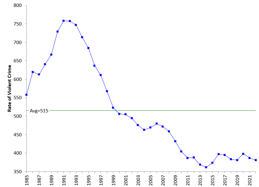
The average is 515. This average doesn’t mean much with this set of data. It is not in control. Well, you will see that segments of this chart are in statistical control. How are we going to make a control chart out of this data? The rate increases, then decreases, and then levels out. Let’s see how to approach this data. But first, we will take a look at individuals control charts and trend control charts.
Individuals Control Chart
We will be using a combination of individuals control charts and trend control charts to analyze this data. With the individuals control chart, the individuals values are plotted on the X chart, while the range between consecutive points are plotted on the moving range (mR) chart. We will only focus on the X chart here. The control limit equations for the standard individuals control chart are given by:
UCLx = X + 2.66R̅
LCLx = X – 2.66R̅
where is the overall average and R̅ is the average moving range. These equations are not much help with the data in Figure 1 because of the trends. Figure 2 is the individuals chart for the data in Table 1.
Figure 2: Individuals Control Chart for the Rate of Violent Crime
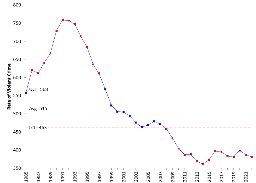
The red points are out of control points. The only test used in this figure is points beyond the control limits. This chart is not much help in explaining what is happening to the data.
Trend Control Charts
The trend control chart helps handle situations where the data are increasing or decreasing in a predictable fashion. The first step is to determine the best-fit line of the data. This equation has the following form:
Xt = mt + b
where (for our example) Xt is yearly violent crime rate, t is the year, m is the slope of the line and b is the y-intercept. You then substitute this equation for the average in the individuals control chart’s control limit equations. So, the control limits for the trend control chart are given by:
UCLx = mt + b + 2.66R̅
LCLx = mt + b – 2.66R̅
We will use this to begin to address the trends in Figure 1. The SPC for Excel has the option to automatically check for trends. It considers a trend to exist if the trend is statistically significant at 0.05.
The Crime Data as a Control Chart
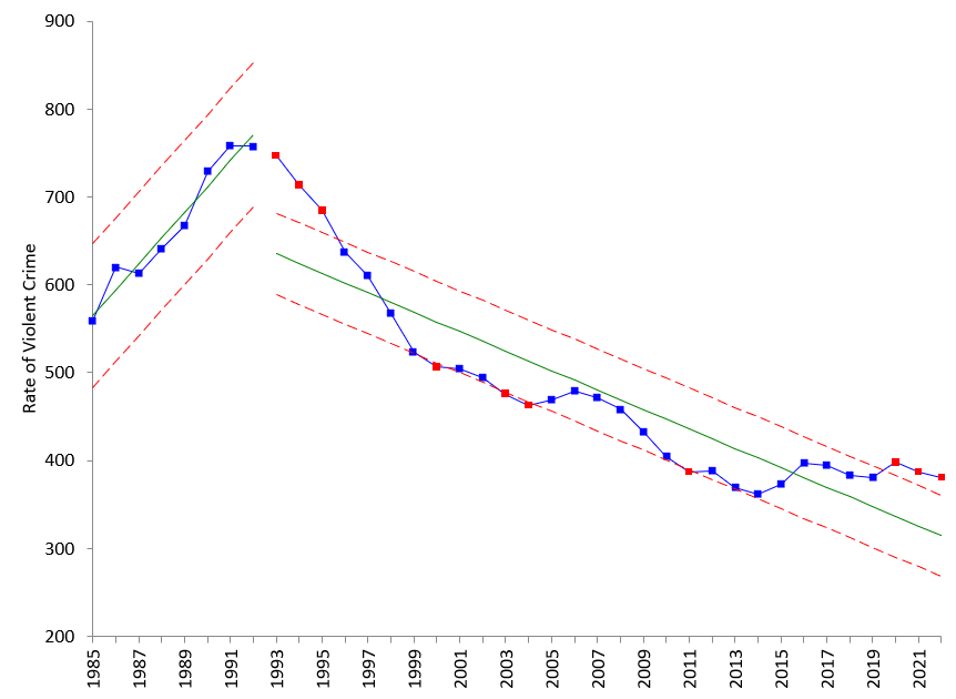
There is an obvious upward trend at the start of the data. The upward trend starts in 1985, the start of our data and runs to 1992. If we set the control chart to base the control limits at the start of the chart on those years and split the rest of the control chart, you will get the control chart in Figure 3.
Figure 3: Control Chart with Initial Trend
The time period from 1985 to 1992 is in statistical control. The rate of violent crime is increasing at a predictable rate. Then in 1993 the trend reversed and started to decrease. You can see it seems to fall predictably until the year 2000. Then it looks like the trend changes; it is not as steep. So, it appears to make sense to split the limits at the year 2000. This is shown in Figure 4.
Figure 4: Control Chart with Control Limits Split at 2000
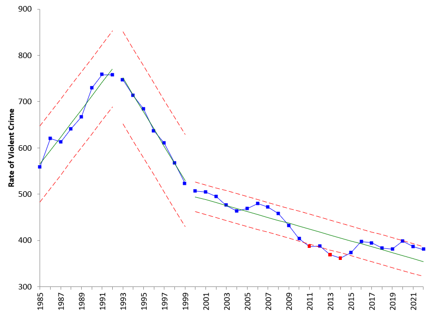
Now the first two trends are in statistical control. It would be interesting to find out what happened to move the trend from an upward to downward trend. The last trend starting in the year 2000 is consistent until there is an out of control point in 2010. This suggests another place to split control limits. This is done in Figure 5.
Figure 5: Control Chart with Control Limits Split at 2010
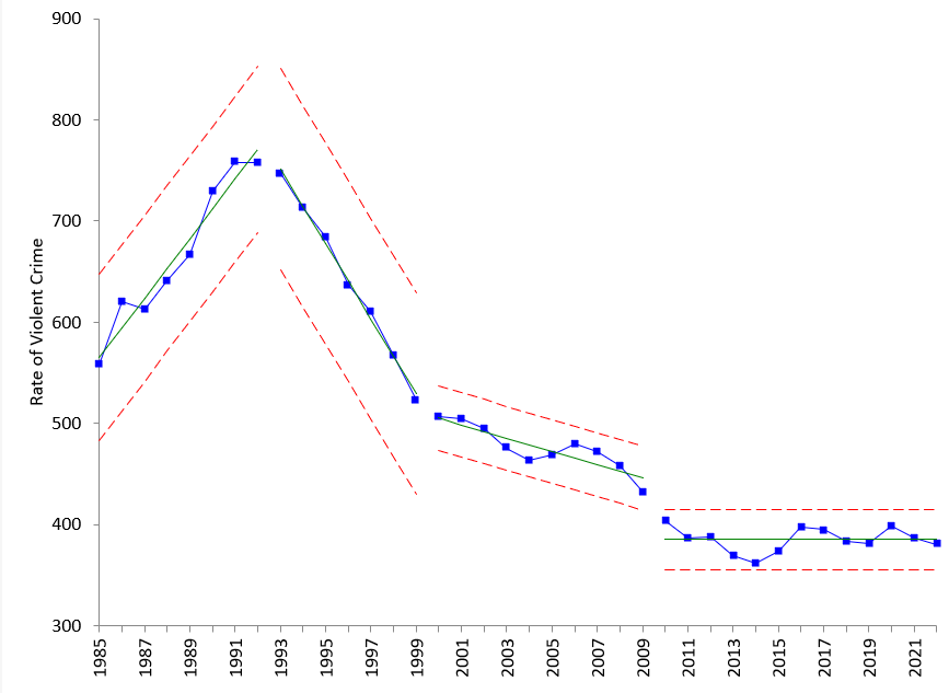
There was no trend found after 2010. Since 2010, the rate of violent crime in the USA has not gotten worse but has not gotten better either. It is in statistical control. So, you no doubt will hear that the violent crime rate has decreased – it has over the past two years, but it is not statistically significant. When talking about if something has increased or decreased, you need to look at the data over a longer period of time than 2 or 3 points.
Summary
Control charts can handle data with trends. It involves using the software to identify significant trends and splitting the control limits where appropriate to see what the process is doing. The rate of violent crime data showed an upward trend and downward trends followed by the last 13 neither trending up or down. So for the past 13 years, the rate of violent crimes in the USA has not increased or decreased.