November/December 2023
 There are times when we want to know if two or more processes are the same or different. Are the process means the same? Do the processes have the same variation? Suppose we want to know if two processes have the same means. To find this out, we quite often take samples from the two processes and perform a statistical test to determine if there is a statistically significant difference between the two process means.
But we often don’t think about the stability of the two processes when doing this. If the processes are not consistent and predictable (in statistical control), then we may not get similar results and reach the same conclusion again if we repeat the test.
This publication examines how failing to consider the stability of processes can lead to wrong conclusions. In this issue:
- Hypothesis Testing Overview
- Control Chart Overview
- Hypothesis Testing and Stable Processes
- Hypothesis Testing and Unstable Processes
- Summary
- Quick Links
You can download a pdf copy of this publication at this link. Please feel free to leave a comment at the end of the publication.
Hypothesis Testing Overview
 What is hypothesis testing? Pretty much what it says. Testing a hypothesis. So, what is a hypothesis? It is simply a statement. It might be true, or it might not be true. The hypothesis might be that the flu vaccine prevents your chance of getting the flu. Or it might be that the flu vaccine does not lower your chance of getting the flu. Both are just statements. That is why we test the hypothesis – to find out which may be true, and which may be false.
A hypothesis is just a statement of theory. A certain energy drink gives you more energy. Or it doesn’t give you more energy. The hypothesis is the starting point. We have to test the hypothesis and reach a decision if we believe the hypothesis is true or false.
There are five basic steps in hypothesis testing:
- Formulate the null hypothesis and the alternative hypothesis
- Determine the significance level
- Collect the data and calculate the sample statistics
- Perform the statistical analysis
- Compare the p value to the desired significance level
Suppose we take the simple case of wanting to determine if two processes produce the “same” mean. Perhaps we are evaluating two suppliers who produce the “same” product. We want to find out if that is true. If they are the same, we would like to use the “less expensive” supplier’s product in our process.
The first step is to formulate the null hypothesis and the alternate hypothesis. These are opposites. We will denote the two supplier processes by Process 1 and Process 2. The means for the two processes are m1 and m2. We select the null hypothesis (H0) to be the following:
H0: m1 – m2 = 0
It states that the difference between the two means is 0. The alternate hypothesis (H1) is the opposite – the difference in the two means is not 0 and is given by:
H1: m1 – m2 ≠ 0
The next step is to determine the significance level you want. The significance level is the probability of rejecting the null hypothesis when it is true – the chance you will make a mistake and select the wrong hypothesis. This probability is denoted by α. A typical value of α is 0.05. This means that there is only a 5% chance of rejecting the null hypothesis when it is actually true.
The next step is to collect the data and then calculate some sample statistics, in particular the sample average and sample standard deviation. We decided to take 15 samples from Process 1 and 15 samples from Process 2. The data are shown in Table 1.
Table 1: Data for Process 1 and Process 2
| Process 1 | Process 2 |
|---|---|
| 48.6 | 47.6 |
| 48.9 | 48.1 |
| 50.1 | 48.1 |
| 48.8 | 47.8 |
| 49.9 | 47.5 |
| 48.9 | 48.0 |
| 49.4 | 47.8 |
| 47.6 | 49.5 |
| 49.4 | 49.9 |
| 49.3 | 50.1 |
| 49.1 | 49.7 |
| 49.9 | 49.7 |
| 49.6 | 51.1 |
| 48.8 | 48.3 |
| 49.2 | 50.0 |
The next step is to perform a statistical test to determine if the means are the same or not. We will use the 95% two-sided hypothesis test for the difference in two means. We will not go through the calculations here but just the analysis results from using the SPC for Excel software. If you want more detail on the calculations, please see the two articles in our SPC Knowledge Base: Comparing Two Processes and Hypothesis Testing.
The analysis output from the SPC for Excel software is shown below in Table 2.
Table 2: Output for the Difference in Two Means Hypothesis Test
| Process 1 | Process 2 | |
|---|---|---|
| Mean | 49.17 | 48.88 |
| Standard Deviation | 0.624 | 1.154 |
| Variance | 0.390 | 1.332 |
| Sample Size | 15 | 15 |
| Difference in Means | 0.287 | |
| Equal Variances? | No | |
| Pooled Variance | 0.115 | |
| Pooled Standard Deviation | 0.339 | |
| Degrees of Freedom | 21 | |
| Alpha | 0.05 | |
| t(0.025, 21) | 2.08 | |
| Lower Confidence Level | -0.418 | |
| Upper Confidence Level | 0.991 | |
| t | 0.846 | |
| p Value | 0.4069 |
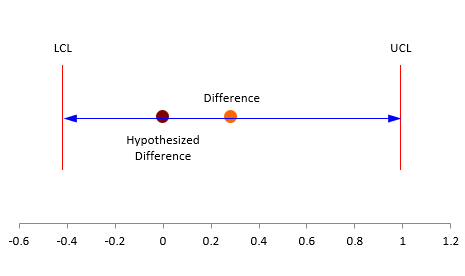
Two of the key results to look at are the lower and upper confidence limits. If the interval contains zero, you conclude that there is no evidence that the two processes are operating at different means. If the confidence interval does not include 0, you conclude that the two processes are operating at different means. In this example, the confidence interval is -0.418 to 0.991. This does include zero, so you conclude that there is no evidence that the two processes operate at different means.
Another result to look at is the p-value. The results include the calculation of a t value (0.846). It is calculated by dividing the difference in the means by the pooled standard deviation. The p-value represents the probability of getting the p-value calculated in the table if the null hypothesis is true. If the p-value is small (less than the alpha we selected), we conclude that null hypothesis is false and reject it. If it is large (larger than the alpha we selected), then we conclude the null hypothesis is true. The p-value for this example is 0.4069 which is larger than 0.05. We conclude that is no evidence suggesting that the two processes operate at different means. We accept the null hypothesis – there is evidence to reject it.
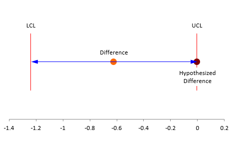
The figure below shows the hypothesized mean, the actual difference between in the means and the confidence limits.
Figure 1: Difference in Two Means
But, what about the stability of the processes? Should we worry? Yes, we should.
Control Charts Overview
 The hypothesis testing process above did not include control charts at all. Do you need to be concerned about using control charts in conjunction with hypothesis testing. The answer is yes, you do need to be concerned about whether the two processes are consistent and predictable.
A control chart monitors variation in a process over time. It separates common causes of variation from special causes of variation. Common causes of variation represent the “noise” in the process. It is the normal or natural variation that exists in the process. It exists because of the way you designed the process and manage it on a day to day basis. A special cause of variation represents a “signal” that something has changed in the process. It is not supposed to be there.
A control chart separates the common causes of variation from the special causes of variation. All processes have noise – the common causes of variation. Some processes have signals – the special causes of variation that indicate something has changed. When a special cause of variation exists, you should find the reason for the special cause and remove it from the process – hopefully preventing it from coming back again. For more information on variation, please see our SPC Knowledge Base articles at this link.
A control chart is the only effective way to separate the signals from the noise. This is done by plotting the data (like the time it takes to get to work) over time. Once you have enough data, you calculate the average and the control limits. There are usually two control limits. One is the upper control limit (UCL). This is the largest value you would expect if you just had common causes of variation present. The other is the lower control limit (LCL). This is the smallest value you would expect if you just had common causes of variation present.
After you have plotted the average and control limits, you interpret the control charts. If there are no points beyond the control limits or patterns (like 8 in a row above or below the average), the process only has common causes of variation (noise) present. The process is said to be in statistical control. If there is a point beyond the control limits or patterns present, then the process is sending a signal that something has changed. You can see one of our videos on control chart interpretation at this link.
We will use the Process 1 and Process 2 data in Table 1 to create controls charts for each process.
Hypothesis Testing and Stable Processes
We will use the individuals (X-mR) control chart to analyze the results here. We will only show the X chart. Figure 2 is the X chart for Process 1 using the data in Table 1.
Figure 2: X Chart for Process 1
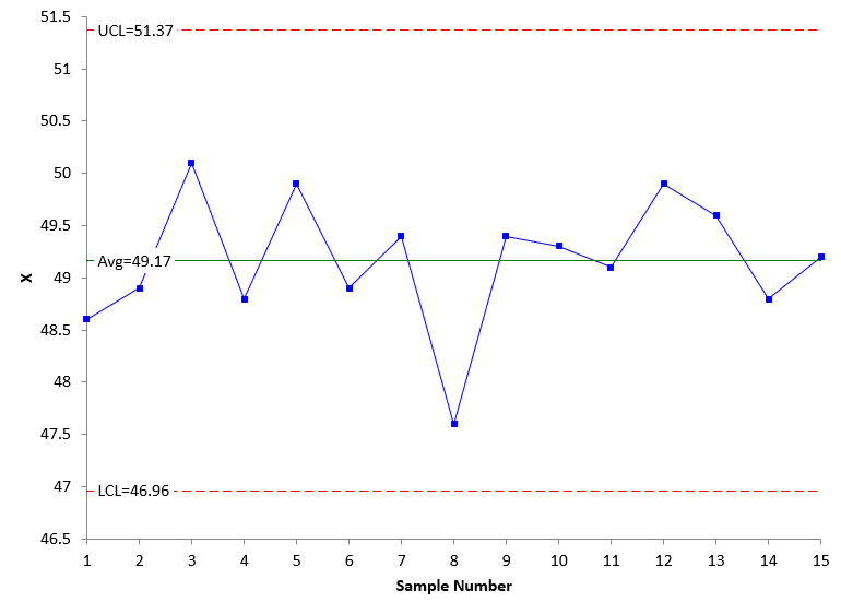
The control chart in Figure 2 is in statistical control. There are no points beyond the control limits and no patterns. The process is consistent and predictable. We will most likely get similar results if we take another 15 samples from the process.
Figure 3 is the X chart for Process 2 using the data in Table 1.
Figure 3: X Chart for Process 2
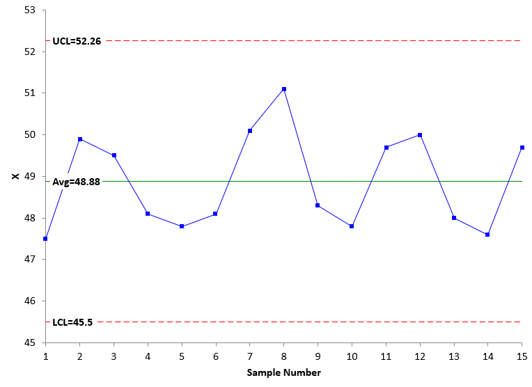
Figure 3 is also in statistical control. There are no points beyond the control limits and no patterns. We will most likely get similar results if we take another 15 samples from Process 2.
This also means that our hypothesis testing on if the two means are the same or not will also generate similar results. We have some faith in the hypothesis test.
Hypothesis Testing and Unstable Processes
But what happens if one or both processes are unstable? Out of statistical control. Well, we don’t know what will happen if we run the hypothesis test again. Consider the data in Table 3.
Table 3: Process 1 and Process 2 Data with Unstable Process 2
| Process 1 | Process 2 |
|---|---|
| 48.6 | 47.6 |
| 48.9 | 48.1 |
| 50.1 | 48.1 |
| 48.8 | 47.8 |
| 49.9 | 47.5 |
| 48.9 | 48.0 |
| 49.4 | 47.8 |
| 47.6 | 49.5 |
| 49.4 | 49.9 |
| 49.3 | 50.1 |
| 49.1 | 49.7 |
| 49.9 | 49.7 |
| 49.6 | 51.1 |
| 48.8 | 48.3 |
| 49.2 | 50.0 |
The same data is present in Table 3 as in Table 1. Process 1 in both tables is identical in sample order. However, in Table 3, the data for Process 2, while the same, has been re-organized to represent a process that has changed. Note that since the data is the same for both processes (just in a different order for Process 2), the hypothesis test will not change. It will still show that there is no difference between the two means. We would accept that and move on, perhaps selecting Process 2 if it were cheaper if we don’t consider control charts.
But we just made a big mistake. We didn’t check the stability of Process 2. Figure 4 shows the X chart for Process 2 data in Table 3.
Figure 4: X Chart for Process 2 with Table 3 Data
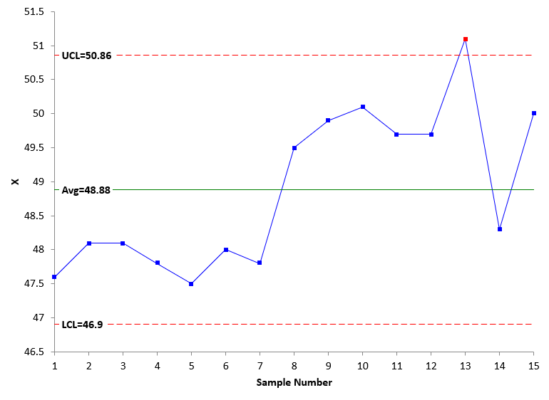
What do you see in Figure 4? Process 2 shifted upward at sample 8. It looks like something has changed in the process. We don’t know for sure where Process 2 will operate. Will it operate at the higher average? At the lower average? The point is we don’t know for sure because the process is out of control. We can make the wrong decision simply because we did not check stability.
Let’s assume that the process has changed and is now represented by the points from sample 8 on. What will the hypothesis test tell us now? The results are shown in Table 4 below.
Table 4: Hypothesis Test Between Process 1 and Last 8 samples in Process 2
| Process 1 | Process 2 | |
|---|---|---|
| Mean | 49.17 | 49.79 |
| Standard Deviation | 0.624 | 0.774 |
| Variance | 0.390 | 0.598 |
| Sample Size | 15 | 8 |
| Difference in Means | -0.621 | |
| Equal Variances? | Yes | |
| Pooled Variance | 0.459 | |
| Pooled Standard Deviation | 0.678 | |
| Degrees of Freedom | 21 | |
| Alpha | 0.05 | |
| t(0.025, 21) | 2.08 | |
| Lower Confidence Level | -1.238 | |
| Upper Confidence Level | -0.004 | |
| t | -2.093 | |
| p Value | 0.0487 |
The p value is 0.0487, just below the 0.05 value of alpha we selected. This means the null hypothesis is rejected. There is evidence that the difference in means is not equal to 0. It is very close. You can see this in Figure 5.
Figure 5: Difference in Two Means Using Process 1 Samples and the Last 8 Samples of Process 2
You can see that the data in Table 3 would have shown that there is no difference in the two processes, when in fact, Process 2 had shifted. Without at least plotting the data over time, we would have concluded that the two processes are the same when in fact they are not. All you have to do is plot the data over time. So simple.
Summary
This publication examined control charts and hypothesis testing. You don’t often think about process stability when doing statistical testing, like hypothesis testing. But as this article showed, you need to worry about that, or you could make the wrong conclusion. All you have to do is to plot the data over time either as a run chart or control chart. And look at the chart. Does it look stable to you? If it does, then you will probably get similar results if you repeat the test. But if the process is not stable, you probably won’t.
"These percentages can also be viewed as probabilities, e.g., the probability of getting a result that is less than -1.5 standard deviations below the average is 0.668."Should this be 0.0668, not 0.668?
Hello,
Your are correct. Had it 0.0668 in several places, but had it 0.668 in that one place. Proved once again that 100% inspection does not guarantee no mistakes. Thanks for pointing it out to me.
Wonderful explanation.
Well explained. Best simplified i ever read