June 2021
(Note: all the previous SPC Knowledge Base in the control chart examples category are listed on the right-hand side. Select this link for information on the SPC for Excel software.)

Some companies include looking at the results over time. It might be this year’s results as a run chart with the year-to-date average. Other companies use control charts to monitor the results over time, often the individuals (X-mR) control chart.
One use of control charts is to detect when something in a process has changed. All data contains noise, often referred to as common causes of variation. Some data contains signals, often referred to as special causes of variation. A control chart separates the signals from the noise. It sounds like a perfect tool for dashboards and their KPIs, doesn’t it? Well, it depends. It depends on the noise in the data. There can be too much noise and the control chart has limited benefit to you.
This publication examines what happens to KPIs on dashboards (or any metric) when there is too much noise in the process. In this publication:
- Introduction
- How Individuals Control Charts Work
- The Sales KPI Data and Noise
- The Individual Subsidiaries
- Summary
- Quick Links
You may download a pdf copy of this publication at this link. Please feel free to leave a comment below.
Introduction
Dashboards are intended to provide leadership with information so they can make decisions about how to run a company. Wikipedia defines a dashboard as the following:
“A dashboard is a type of graphical user interface which often provides at-a-glance views of key performance indicators relevant to a particular objective or business process. In other usage, “dashboard” is another name for “progress report” or “report” and considered a form of data visualization.”
So, it is intended to be visual. There are all sorts of visuals on dashboards: stop lights, speedometers, bar charts, run charts, etc. – all very dependent on the type of company and how leadership likes to examine the data. There may well be different dashboards for different levels in the organization, although they all should be linked. For more information on KPIs and linking, please see our SPC Knowledge Base publication KPIs, Control Charts and Linking of Measurements.
As is well known, control charts are used to separate the signals from the noise in the process. Perfect tool for dashboards it seems. Is that always true?
How Individuals Control Charts Work
The mechanics of creating a X-mR chart are simple. You plot the individual values on the X chart and the moving range between consecutive points on the mR chart. You then calculate the average X and the average mR and plot them on their respective charts. Last, you calculate the control limits for the X chart and for the mR chart and plot those on their respective charts. You have your X-mR chart. Now you are ready to interpret it. Simple, correct?
Not quite. You may have to think about a few things. Dr. Donald Wheeler (www.spcpress.com) writes that there are two principles that need to be considered when creating an effective X-mR chart:
- “The first principle for an effective X-mR Chart is that successive values need to be logically comparable.”
- “The second is that the moving ranges need to isolate and capture the local, short-term, routine variation that is inherent in the data.”
What makes the X-mR chart so great is that, using the data in the time-order it was produced, usually takes care of these two principles. But not always.
There are situations that may occur where the control limits are too wide to be useful. This can occur when the two principles above are not met.
The Sales KPI Data and Noise
Sales is a metric that is often used on dashboards. Sales definitely impact how a company is doing. At the top level of the organization, leaders look at sales throughout the company. This often entails combining the sales, for example, from multiple salespeople, subsidiaries, locations, states, etc.
Suppose there are five subsidiaries that make up a company. Executive leadership has sales as one of the KPIs for the company. Data for total sales for the last 24 months are shown in Table 1.
Table 1: Total Sales Data
| Month | Sales | Month | Sales | |
|---|---|---|---|---|
| 1 | 9037 | 13 | 8750 | |
| 2 | 8874 | 14 | 9231 | |
| 3 | 8941 | 15 | 9145 | |
| 4 | 9288 | 16 | 9063 | |
| 5 | 9206 | 17 | 9160 | |
| 6 | 8748 | 18 | 8917 | |
| 7 | 8782 | 19 | 9051 | |
| 8 | 9245 | 20 | 9172 | |
| 9 | 8834 | 21 | 8875 | |
| 10 | 9161 | 22 | 8791 | |
| 11 | 8873 | 23 | 9342 | |
| 12 | 9166 | 24 | 9025 |
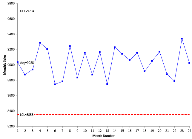
Leadership at this company understands that control charts are used to detect signals from the process that something has changed and wanted the data displayed as control charts. The individuals control chart was chosen since this was monthly data being examined. The X chart for total sales is shown in Figure 1. The moving range chart will not be shown here (although it should be used with the X chart).
Figure 1: X Chart for Total Sales
The chart in Figure 1 is in statistical control. There are no points beyond the control limits or patterns like 8 points in a row below the average. What do you think of this chart? The control limits are very wide – there is nothing near one of the control limits. What good is this control chart in determining what needs to be done to improve sales? The reality is not very much. At best, it simply tells you that you should not respond to any of these ups and downs on the chart.
The reason this occurs is that dashboards at high levels in an organization tend to roll up data into aggregated metrics. In this example, the data from the five subsidiaries were rolled up into total sales. When you do this, you rollup the noise (common causes variation) from each entity. The resulting data has a lot of noise in it and the control limits become wide.
The best way to handle this situation is to have, in addition to the total sales, the sales broken down by entity (subsidiary in this case). This is shown below.
The Individual Subsidiaries
The sales information for each subsidiary is shown in Table 2.
Table 2: Sales Data by Subsidiary
| Month | Subsidiary 1 | Subsidiary 2 | Subsidiary 3 | Subsidiary 4 | Subsidiary 5 |
|---|---|---|---|---|---|
| 1 | 2322 | 1627 | 1338 | 1159 | 2591 |
| 2 | 2336 | 1597 | 1359 | 1137 | 2445 |
| 3 | 2308 | 1609 | 1375 | 1142 | 2507 |
| 4 | 2311 | 1672 | 1445 | 1162 | 2698 |
| 5 | 2293 | 1934 | 1313 | 1138 | 2528 |
| 6 | 2290 | 1345 | 1393 | 1154 | 2566 |
| 7 | 2290 | 1581 | 1356 | 1148 | 2407 |
| 8 | 2286 | 1664 | 1381 | 1143 | 2771 |
| 9 | 2292 | 1590 | 1385 | 1153 | 2414 |
| 10 | 2302 | 1649 | 1325 | 1173 | 2712 |
| 11 | 2266 | 1597 | 1374 | 1154 | 2482 |
| 12 | 2235 | 1650 | 1317 | 1175 | 2789 |
| 13 | 2259 | 1575 | 1387 | 1189 | 2340 |
| 14 | 2263 | 1662 | 1376 | 1191 | 2739 |
| 15 | 2256 | 1943 | 1401 | 1191 | 2354 |
| 16 | 2229 | 1413 | 1319 | 1178 | 2924 |
| 17 | 2219 | 1649 | 1354 | 1177 | 2761 |
| 18 | 2187 | 1605 | 1341 | 1192 | 2592 |
| 19 | 2198 | 1629 | 1372 | 1202 | 2650 |
| 20 | 2218 | 1651 | 1265 | 1192 | 2846 |
| 21 | 2209 | 1598 | 1374 | 1214 | 2480 |
| 22 | 2219 | 1582 | 1312 | 1197 | 2481 |
| 23 | 2188 | 1948 | 1331 | 1207 | 2668 |
| 24 | 2196 | 1342 | 1331 | 1200 | 2956 |
The X charts for the five subsidiaries are shown below. Remember, these five sales datasets were rolled up to give the chart in Figure 1.
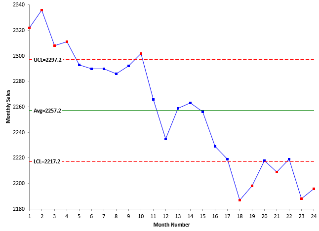
Figure 2: Subsidiary 1 X Chart
Subsidiary 1 is having a rough time. Sales are decreasing over the past 24 months. The decrease may have leveled off over the last 7 months. This decrease was masked in the data in Figure 1 because of the noise generated by rolling up the data.
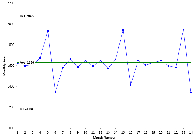
Figure 3: Subsidiary 2 X Chart
Subsidiary 2 appears to be fairly stable over the last 24 months. There is one pattern though that is probably worth investigating. Notice how three times sales are up one month, followed by a month when sales are down. This could be simply a billing issue, but it is most likely a special cause – even if it does not fail one of the out of control tests.
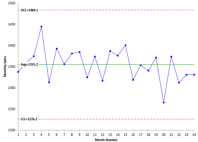
Figure 4: Subsidiary 3 X Chart
Subsidiary 3 sales numbers appear to be very stable. The last three months are below average, but there is no signal yet from the control chart.
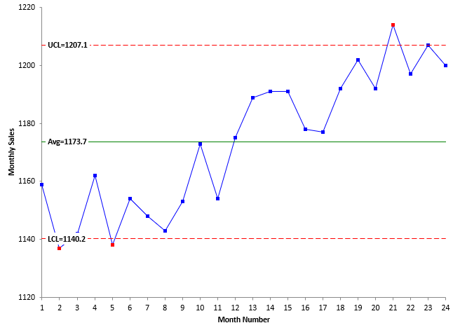
Figure 5: Subsidiary 4 X Chart
Subsidiary 4 sales numbers are increasing in the second part of the chart. This, of course, is good. This good result was masked by the noise in Figure 1 though.
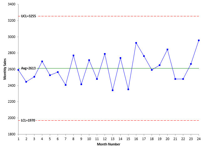
Figure 6: Subsidiary 5 X Chart
Subsidiary 5 sales appears to be stable over the last 24 months.
Looking at the individual subsidiaries give an entirely different story than looking at total sales as shown in Figure 1. Quite often, when you roll up metrics into a larger metric, you are masking potential signals in the data. You are increasing the noise when you do this.
When you look at the individual subsidiaries, you are ensuring that you are meeting the two key principles on what makes an effective X-mR chart: successive values are logically comparable, and the moving range is capturing the normal variation in each subsidiary.
Summary
This publication examined how rolling up data, as is often done in dashboards, can lead to control charts with wide control limits. This is due to the fact you are increasing the noise in the data as you roll it up. The example used was a sales KPI. The monthly total sales were plotted over time. The resulting chart had wide control limits due to the increase in noise. It was of little use in determining what needs to be done to improve sales or to see the impact of things tried to increase sales.
To get around this problem, each entity, subsidiary in the example, should be examined by itself using a control chart. This way, you meet the two key principles for what makes an individual chart effective.
hello, how can i solve this problem with this page showing? eye
What is the problem? What are you using to view the page? Bill