July 2011 
This month’s newsletter takes a look at Key Process Indicators (KPIs), using control charts to monitor these KPIs, and how to link the KPIs down through the organization to performance measures for those closest to the process. Many organizations have KPIs now – a few (or, too often, many) key metrics that are tracked by leadership to “judge” how the organization is performing.
Many organizations use the KPIs in a balanced scorecard that show how the organization is performing versus goals. Sometimes the KPIs are color-coded as green, yellow or red to make it easier for leadership to see if the KPI is where it is needs to be. Green means the KPI is doing well, yellow means that the KPI may be headed for trouble, and red means that action needs to be taken to improve the KPI. I am amazed at how often we think we have to make things “easy” for leadership.
In this newsletter, we will assume that our company has already selected our KPIs. These KPIs are real-life examples. There are many resources for selecting KPIs. One very good website for developing and using KPIs and performance measures is www.staceybarr.com. Stacey Barr is a performance measurement specialist, and her website has a lot of great information on how to select, develop, and use KPIs and performance measures.
What we will cover in this newsletter is how to monitor the KPIs over time and how to develop performance measures throughout the organization that link to the KPIs. In this issue:
- Our Company’s KPIs
- Displaying KPIs
- KPIs and Control Charts
- Why Leadership Doesn’t Use Control Charts
- Linking Measurements to KPIs
- Summary
- Quick Links
Please feel free to add your comments at the end of the newsletter.
Our Company’s KPI
One company, some years ago, developed KPIs for leadership to monitor on a monthly basis. We will use these five KPIs as our company’s KPIs to demonstrate some points. The five KPIs were:
- Revenue per Day
- SG&A as % of Sales
- Operating Income as % of Sales
- Economic Profit
- Gross Margin Dollars
Point number one – this company did many things right, but not setting up the KPIs. If you explore the link above, you will find that Stacey Barr has an article on the ten biggest mistakes in managing organizational measures. Number one is to “rely just on financial statements.” She goes on to say:
“Profit and loss, revenue and expenses – these are measures of important things to a business. But they are information that is too little and too late. Too little in the sense that other results matter too, such as customer satisfaction, customer loyalty, customer advocacy. Too late in the sense that by the time you see bad results, the damage is already done. Wouldn’t it be better to know that profit was likely to fall before it actually did fall, and in time to prevent it from falling?”
How true. But to this company’s credit, they did a few other things correctly. First, they examined the results using control charts. Stacey Barr has the number 6 biggest mistake as “using tables, instead of graphs, to report performance.” I would go a step further and say that the best approach is to use control charts. Our March 2011 newsletter took an in-depth look at the purpose of control charts. If you haven’t read it, I recommend you do.
We will use the “Operating Income as % of Sales” as an example in this newsletter. Leadership has set the goal to be 7%. How do we know how we are performing? Are we making our goal? Are we getting better? Getting worse? We will start with different ways organizations may examine the results.
Displaying KPIs 

To be fair, there are lots of fancy scorecards available for displaying KPIs. We will focus on a few simple things that are done. For years, companies have used their “monthly report” to monitor results. Some companies still use a version of this for their KPI reporting. Let’s look at the 2009-2010 results for our company’s KPI. The results are shown in the table below. See anything from this table of numbers?
Table 1: KPI Results for % Operating Income
| Month | Income | Expenses | % Operating Income |
| Jan-09 | 84.294 | 78.646 | 6.7% |
| Feb-09 | 98.895 | 84.357 | 14.7% |
| Mar-09 | 96.666 | 87.788 | 9.2% |
| Apr-09 | 81.652 | 73.323 | 10.2% |
| May-09 | 81.991 | 70.758 | 13.7% |
| Jun-09 | 114.518 | 101.577 | 11.3% |
| Jul-09 | 86.771 | 77.573 | 10.6% |
| Aug-09 | 93.539 | 85.419 | 8.7% |
| Sep-09 | 73.346 | 64.471 | 12.1% |
| Oct-09 | 117.421 | 103.448 | 11.9% |
| Nov-09 | 93.754 | 85.222 | 9.1% |
| Dec-09 | 97.517 | 89.131 | 8.6% |
| Jan-10 | 102.478 | 96.124 | 6.2% |
| Feb-10 | 96.976 | 84.175 | 13.2% |
| Mar-10 | 111.496 | 97.113 | 12.9% |
| Apr-10 | 99.832 | 92.345 | 7.5% |
| May-10 | 116.298 | 101.644 | 12.6% |
| Jun-10 | 107.458 | 96.158 | 10.5% |
| Jul-10 | 98.752 | 89.398 | 9.5% |
| Aug-10 | 101.072 | 91.571 | 9.4% |
| Sep-10 | 95.458 | 87.076 | 8.8% |
| Oct-10 | 119.431 | 109.311 | 8.5% |
| Nov-10 | 83.07 | 76.132 | 8.4% |
| Dec-10 | 103.422 | 91.322 | 11.7% |
Quite often, organizations simply compare this month’s result and the year-to-date result to budget and the previous year. The data for December 2010 are shown in the table below.
Table 2: Results for December 2010
| KPI | Month | Current Month | Month Budget | Month Variance | YTD | Last Year | LYTD |
| % Operating Income | Dec-10 | 11.7% | 7.0% | 4.7% | 10.0% | 8.6% | 10.4% |
Things look pretty good for this month. The budget for % operating income is 7%. We easily beat that in December 2010. Year-to-date is well above budget. We beat last year’s December, but are a little down compared to the last year-to-date number. All looks pretty good. At least for this month.
Dr. Donald Wheeler has an excellent book called Understanding Variation, available at this link. He shows, in detail, how the monthly report is an extremely poor method to use to manage an organization. The monthly report approach does not tell you anything about the underlying process behavior. This is a great book and should be a “must-read” for all leadership in any company.
Other organizations use some form of a balanced scorecard to monitor results. A color-coding system is sometimes used to determine if the KPI is getting into danger territory. It is pretty arbitrary where the boundaries are set. Suppose we decide to set the following for our % operating income:
- Over 7.5% – Green
- 7.0 to 7.5% – Yellow
- Below 7.0 – Red
The table below is what the last three months would like for this system (remember, most companies only look at one month at a time).
Table 3: Color Coding KPIs
| KPI | Month | Current Month |
| % Operating Income | Oct-10 | 8.5% |
| % Operating Income | Nov-10 | 8.4% |
| % Operating Income | Dec-10 | 11.7% |
Many scorecards don’t show anything but the value and the color to make it easier for leadership to see where there are problems. Sometimes, there will be an arrow next to the value. If the arrow is going up, it means that this month’s result is better than last month’s result. If the arrow is going down, it means this month’s result is worse than last month’s result. Guess what? The arrow will most likely go one of those ways. This is simply called variation! What does your company do? Some form of these?
The problem with these approaches is that they do not examine the underlying process that generates the results. You have no idea of what is happening to the KPI – just if it is meeting some preset specification that leadership developed. This hampers finding problems early and working on real process improvement.
KPIs and Control Charts
Dr. W. Edwards Deming said:
“Understanding variation is the key to success in quality and business.”
Understanding variation is the key to effectively using control charts. A control chart is a time-series chart of the data. The data are plotted over time. The average is calculated and added to the chart. There are two other lines that added to the control chart – the lower and upper control limits. The control limits define the natural variation in the process. The lowest value the process will generate is called the lower control limit. The largest value the process will generate is called the upper control limit. These control limit values are determined from the process itself – they are not set arbitrarily by leadership. Dr. Wheeler now refers to these limits as the natural process limits and to control charts as process behavior charts to emphasize that it is not about “controlling” but about “process.”
So, what does the control chart for % operating income look like? We will use the X-mR control chart. The individuals control chart is usually the best option to use for monitoring KPI data that is taken monthly. Only the X (individuals) chart will be used here.
We will build this chart in steps, starting with the 2009 data. The first step is to simply plot the data over time. This chart is shown below.
Figure 1: Run Chart for % Operating Income
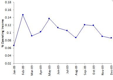
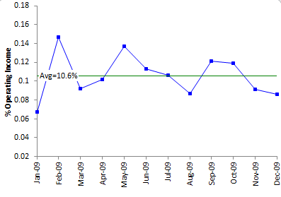
What does the chart tell you about the 2009 results? Some months are better than others. Are we decreasing at the end of the year? Let’s add the average line. The chart now looks like the following.
Figure 2: Run Chart for % Operating Income with Average Line
Six points above the average, six points below the average. About “normal.” The last two months are below the average. Is something wrong? Now let’s add the control limits and see what they mean. For the control limit equations for the individuals control chart, please see our October 2006 newsletter. The control chart is shown below.
Figure 3: % Operating Income as Control Chart (2009 Data)
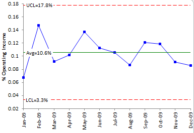
Based on the data, the largest value you would expect this process to generate is 17.8% operating income. The smallest value you would expect this process to generate is 3.3%. As long as all the points are within the control limits and there are no patterns, the process is said to be in statistical control. Only natural variation (called common causes) is present. You can predict what will happen in the future – the % operating income will average 10.6%, with a range of 3.3 to 17.8%. If there are points beyond the control limits or patterns present, special causes of variation are present. These are not part of the way the process was designed to operate.
Now, let’s add the data for 2010 to the control chart. The control chart is shown below.
Figure 4: % Operating Income Control Chart (Control Limits Based on 2009 Data)
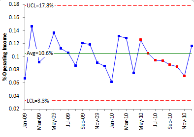
This control chart shows a problem – there are seven points in a row trending down. Something has happened to cause the % operating income to drop each of those seven months. A special cause of variation was present. The objective is to find out what caused this drop and remove it from the process. This is much more information than you have by examining a table of numbers or one of the scorecards. So, why doesn’t leadership use control charts?
Why Doesn’t Leadership Use Control Charts?
In the vast majority of companies, leadership does not use control charts to monitor what is important to them. Why not? Here are some of the reasons I think that leadership doesn’t use control charts.
- Leadership doesn’t fully understand variation and thinks that control charts are for those closest to the process.
- It takes more time – you have to look at a chart for each KPI and interpret it. Definitely not as easy as looking at green, yellow and red.
- Leadership doesn’t think they need a chart of any type to tell them when there is a problem.
- Leadership doesn’t like the width of the control limits. Look at the last control chart – limits from 3.3 to 17.8%.
- It takes too long for some signals to occur, like seven points in a row. Leadership wants to take action sooner – even if it means creating more variation in the process by tampering with an in-control process.
- Leadership doesn’t understand that to improve a stable process, you have to fundamentally change it.
How do you overcome these issues? It is definitely not easy. The best approach is to provide both options to leadership – their usual scorecard but with the ability to see the control chart. Overtime, they will see the value of using the control chart – at least some will. What are your thoughts?
Linking Measurements to the KPIs
Almost all KPIs at the top of the organization are after-the-fact. It is the detection mode of operation – detecting problems after they occur. It is not preventing problems. To help prevent problems with high-level KPIs, you must link what is done on a day-to-day basis to those KPIs.
An organization’s KPIs should be communicated throughout the organization. You want all employees to work on improving the KPIs. But what about some KPIs? How does a person on the front line know how he/she impacts the KPIs? One of the KPIs listed in our company was SG&A as % of sales. What the heck is that and how do I influence it? Economic profit? Not easy to explain that to everyone in the organization.
One approach to dealing with this is to develop a measurement map that links each KPI from the leadership team down to the front line person in each part of the organization – from sales to purchasing to warehousing, etc. Let’s use the warehouse as an example and our % operating income KPI. One simple measurement map is shown below.
Figure 5: Measurement Map Example
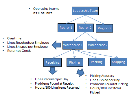
The KPI for the Leadership Team is % operating income. There are three regions in our company. These regions probably have the same KPIs as the Leadership Team. In each region, there are a number of warehouses. Each warehouse should have performance measures that impact our KPI. Remember, operating income is income – total expenses. Dividing operating income by income gives the % operating income.
The warehouse usually doesn’t directly impact income but the warehouse does directly impact total expenses. So the warehouse should be looking at performance measures that have the biggest impact on their total expenses. A few possible examples are shown above. Overtime in the warehouse has a direct impact on total expense. Lines shipped and received per employee is a measure of productivity that impacts expense. Note that these measures can easily be taken more often than monthly – weekly and in some cases daily. As you link measurements downward in an organization, the frequency of data collection should increase. For each performance measure, there should be a goal and the results should be tracked using control charts.
Finally, the KPIs link down to the people closest to the job. There are four areas in our warehouse – receiving, picking, packing and shipping. The figure above shows some possible performance measures for those closest to the process in receiving and picking. For example, the person receiving might be tracking lines received per day and problems found during receiving or when putting material away. A picker would be tracking picking accuracy, problems found at picking and lines picked per day. People closest to the job should be collecting data on a daily basis, a week at the most. Again, they should be using control charts to monitor their results.
Some people have concerns about monitoring individual performance. But, if you understand variation, you will realize that the vast majority of problems are due to common causes of variation – the way you designed the process and manage it on a day-to-day basis – not due to the people. Someone will always be the best picking accuracy. Someone will always have the lowest picking accuracy. The goal is continuous improvement. And it is almost always the process that must be changed for lasting improvement to occur. You can read more about applying SPC in a warehouse environment in our August 2007 newsletter.
Summary
This newsletter has demonstrated how to track KPIs using control charts. Most scorecards today do not take into account the underlying process behavior when providing results to leadership. The control chart approach does this and is superior in analyzing process results. KPIs are often after-the-fact measurements. To improve KPIs, you need to link the KPIs throughout the organization down to those closest to the process. The frequency of data collection increases as you move down through the organization. And, of course, those performance measures should be tracked using control charts. And remember to check out Stacey Barr’s website (www.staceybarr.com) for a lot of great information on performance measures.
Nice article overall. I like the measurement map. Still – it is hard to get upper management to understand how to use control charts.
Thanks Bill for the mention, but most of all, thanks for laying out so clearly such a powerful way to display KPIs. I have always been an advocate of control charts (my statistics background probably) and always encourage people to use XmR charts for their KPIs.
Donald Wheeler's book "Understanding Variation", which you mention, is fantastic. It's a book truly written for management, in such an approachable and practical style.
Love your work,
Stacey Barr.