February 2017
(Note: all the previous SPC Knowledge Base in the control chart examples category are listed on the right-hand side. Select this link for information on the SPC for Excel software.)

In January 2016, we examined the data from 1997 on using a trend control chart. We predicted what we thought the global temperature increase would be in 2016. We predicted an increase of 0.764 °C. This publication looks at how close we were with our prediction and updates the charts with the most recent information. It turns out that we didn’t do so well. The temperatures are getting hotter more quickly than our trend control chart predicted.
In this issue:
- Global Temperature Data
- The Global Temperature Data Changes
- Global Temperature Deviation as a Run Chart
- Trend Control Chart Approach from 1997 On
- Summary
- Quick Links
You may download a pdf version of this publication at this link. Please feel free to leave a comment at the end of the newsletter.
Global Temperature Data

There is also the LOTI (land-ocean temperature index). According to the GISS website, LOTI “provides a more realistic representation of the global mean trends than dTs; it slightly underestimates warming or cooling trends, since the much larger heat capacity of water compared to air causes a slower and diminished reaction to changes; dTs on the other hand overestimates trends, since it disregards most of the dampening effects of the oceans that cover about two thirds of the earth’s surface.”

In our December 2015 publication, we converted these anomalies from the baseline period to an absolute temperature by using 14°C as the baseline temperature. It is sometimes easier to understand an absolute temperature than the anomalies. But 14 is not absolute. Like everything, there is variation.
In our January 2016 publication, however, we used the anomalies as given on the website. We will refer them as deviations from here on. For example, for 2015, the deviation in temperature from the baseline period was reported as 87. You divide this by 100 to get the deviations in degrees Celsius. So, the deviation in 2015 from the baseline period was 87/100 or 0.87 °C. At the time this was the largest increase ever in one year.
The Global Temperature Data Changes
I assumed that I would simply take the deviation for 2016, add it to my dataset and update the control chart to see how 2016 played out. I re-downloaded the data and was surprised to see that the data had changed somewhat. There were not big changes – in the range of 0.01 or 0.02 °C. So, I contacted Dr. Reto A. Ruedy who oversees the on-line data to find out why the data changed. Here is his response:
“https://data.giss.nasa.gov/gistemp/faq/#q211 indicates that the estimates for these monthly mean anomalies come with an error bar of +-0.15 deg C, which is about 10 times larger than the differences you spotted, i.e. these changes are insignificant.
This still leaves the question why those estimates change. There are several potential reasons:
-
-
- Weather stations replaced early reports by corrected reports (a relatively rare occurrence)
- Weather station reports came in one or several months late
- Early data from a less reliable source were replaced by later reports from a more reliable source for the same location
- The time history of stations were newly included in the collection
- NOAA/NCEI’s homogenization scheme may affect older data when new data are added
- Our scheme for combining data from various stations slightly changes the whole time series if new data are added unless these stations have complete records (which is not true for the majority of stations).”
-
I very much appreciate Dr. Reto’s response. So, there are some reasons the data changes slightly as it is updated, but it appears to be well within the error of 0.15 °C. So, it is part of the noise. I am still not sure about historical data that changes over time – no matter how slight the change.
But since the data had changed, the data were re-downloaded and the updated data was used for this analysis. The data are now in deviations and you don’t have to divide by 100 as we did in January 2016.
Global Temperature Deviation as a Run Chart
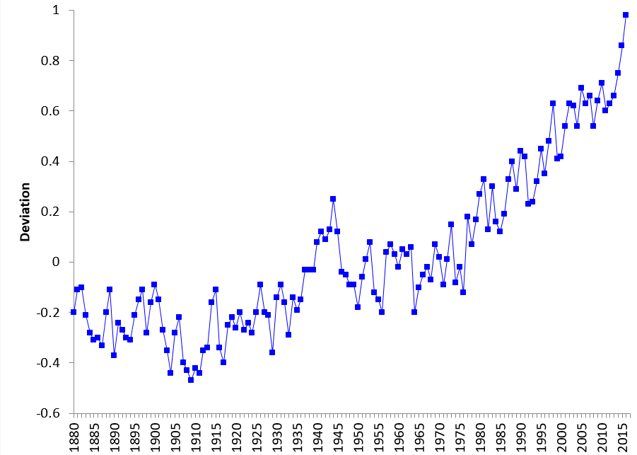
Figure 1 is a plot the global temperature deviation as run chart over time from 1880 using the current data as deviations from the baseline period.
Figure 1: Global Temperature Deviation Run Chart
These data show patterns like the dTs data from December 2015. There are periods of “constant” temperature that is followed by step change – upward through most of the chart.
Trend Control Chart Approach from 1997 On
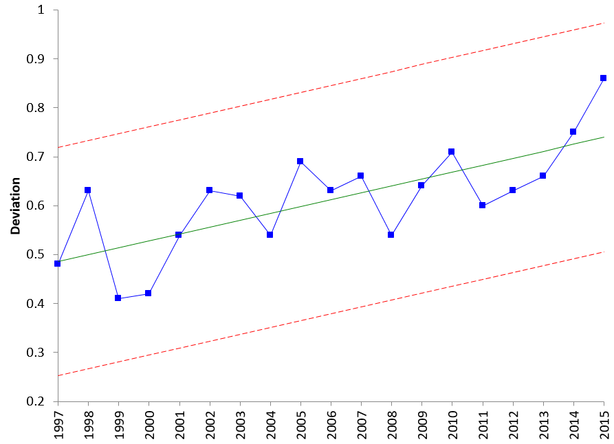
The January 2016 publication took the data from 1997 and examined it as a trend control chart. The updated deviation data were re-analyzed for the same time period from 1997 to 2015 using a trend control chart again. The trend control chart is shown in Figure 2
Figure 2: Trend Control Chart for Global Temperature Deviation
A little review on trend control charts. The trend control chart handles situations where the data are increasing or decreasing in a predictable fashion. The first step is to determine the best-fit line of the data. This equation has the following form:
Xt = mt + b
where (for our example) Xt is yearly global temperature deviation, t is the year, m is the slope of the line and b is the y-intercept. You then substitute this equation for the average in the control limit equations. So, the control limits for the trend control chart are given by:
UCLx = mt + b + 2.66R
LCLx = mt + b – 2.66R
where R is the average moving range between consecutive points (0.0878 in this example).
The best fit line is given by for the 1997 data to 2015 is given by:
Global Temperature Deviation =0.0141(Year) – 27.683
This is the equation of the centerline (the “average”) on the chart in Figure 2. The slope is 0.0141. This means that for the years from 1997 to 2015, the global temperature deviation increased by 0.0141 on average. The control limits for the year 2015 in Figure 2 can be calculated as the following:
UCLx = 0.0141(Year) – 27.683 + 2.66(0.0878) = .962
LCLx = 0.0141(Year) – 27.683 – 2.66(0.0878) = .495
You can now use the trend control chart to predict, within a range, what the deviation in the global temperature will be in 2016.
- UCL = 0.976
- 2016 Prediction = 0.746
- LCL = 0.509
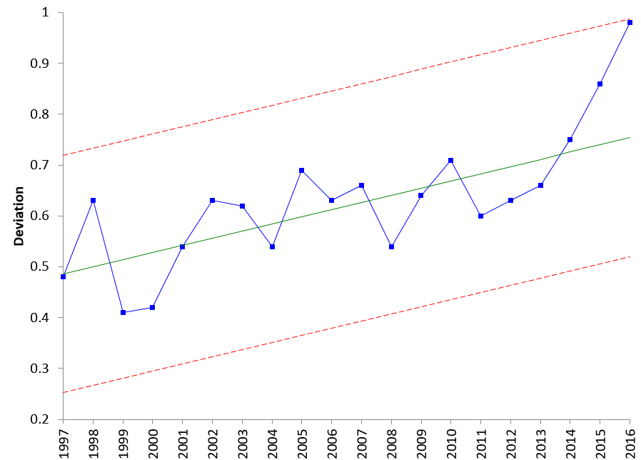
This “model” predicts that the 2016 results would be 0.746 and in between 0.509 and 0.976. Remember that the control limits are set at +/- three standard deviations. Therefore, there is a “wide”” range of possible results. So how did we do in predicting the results for 2016? Pretty poor! The 2016 deviation was 0.98 – the largest ever. We can add 2016 to the data in Figure 2 and keep the control limits set on the data from 1997 to 2015. The resulting chart is show in Figure 3. 2016 is right at the UCL. And look at the last 4 years. It sure seems that the rate of global warming has taken off in even more of an upward pattern.
Figure 3: Global Temperature Deviation through 2016
Summary
This month’s publication updated our two previous publications on global warming. Our last publication on global warming had predicted an increase in 2016 of 0.764 °C. The data had changed somewhat and were re-analyzed in this publication. The predicted increase in 2016 was 0.746. How was our prediction? Not too good. The deviation in 2016 was 0.98 °C – the largest ever seen so far. The 2016 point is right at the UCL on the trend control chart with limits based on 1997 to 2015 data. And the last four years have set up a new trend most likely with a much higher slope for increasing deviations each year. The results suggest that we will be getting hotter for a while.


