October 2014

- Introduction
- Introduction to training
- Process flow diagrams
- Data collection
- Pareto diagrams
- Histograms
- Cause and effect (fishbone) diagrams
- Control Charts
- Summary
- Quick Links
And your second treat – Version 5 of SPC for Excel is now available! Simple, but powerful. That says it all.
OK, ready to combine M&M’s and the problem solving tools? Let’s get started!
To read this in our e-book format or download a pdf file of this publication, please click here.
Introduction

It is assumed that you are familiar with each of the problem solving tools covered. If not, you can learn about each of them through our monthly publications. Each problem solving tool is introduced using the following:
- What the problem solving tool is and looks like
- When to use it
- What you can learn with this tool
The M&M’s are then used to demonstrate how to make a process flow diagram, Pareto diagram, etc. The training process is described below as if you were teaching the workshop. It is beneficial and important to have examples of each of the problem solving tools from your own company. This training does not teach participants the details of each tool – just introduces the tools to the participants.
Introduce the Training
Let the class know that they will be taking a tasty journey during which they will be introduced to several problem solving tools. During this process, they will have to do what they do in their own problem solving efforts – collect data, analyze it using one or more problem solving tools and then decide what it means to their process. Let them know they will be studying peanut M&M’s. This peaks their interest right away.
Process Flow Diagrams
Again make sure you have the M&M’s available. But do not pass the bags out yet! The first problem solving tool introduced is the process flow diagram. The following points are made about the process flow diagrams:
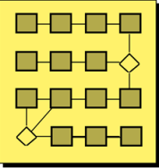
What is a process flow diagram?
- A process flow diagram is a detailed picture of a process. It represents the logical flow of activities from the beginning of the process to the end of the process.
- When do you use a process flow diagram?
- You use a process flow diagram when you want to improve the process. This is usually the first step in process improvement. PFDs are also useful for training.
- What can you learn from using a process flow diagram?
- You gain agreement from everyone on what the steps in the process are. You also can identify potential areas for improvement and measurement.
- Where have we used a process flow diagram?
- This is where you show examples within your own company. For example, you might have PFDs for entering an order, making a sales call, picking a line item in the warehouse, changing a work procedure, or handling a customer complaint.
Tell the class we are going to learn a lot about peanut M&M’s through the use of our problem solving tools. Ask the class the following questions:
Have you ever had trouble opening a bag of M&M’s?
- Have you ever tried to open one end, could not and turned the bag around to try the other end?
- Have you ever ripped the bag open only to see the M&M’s go everywhere, ending up on the floor?
- What is your horror story about opening a bag of M&M’s?
Tell the class that it is evident that the people who make M&M’s (Mars, Inc.) need our help in developing the process for opening the bag – and that we will be developing a process flow diagram to do that. The following describes how the class will do this:
- Divide the class into teams of 4 – 5 people to make a process flow diagram on how to open a bag of M&M’s.
- Give each team a piece of flip chart paper to tape on the wall along with some Post-it Notes.
- Give each team one bag of M&M’s to look at, but tell them not to open the bag.
- As a class, determine the starting and ending steps for the process flow diagram.
- Have each team write the starting step on a Post-it note and the ending step on a Post-it Note and place them on the flip chart – starting in the upper left-hand corner and ending in the lower right-hand corner.
- Each team constructs a process flow diagram by filling in the steps between the starting and ending steps using Post-it notes.
- Remind the teams that it is not a very good process flow diagram without a decision box in it.
- When all teams are finished, have the teams move to the next team’s process flow diagram on their left.
- Using that process flow diagram, see if the team can open the bag of M&M’s by following each step in the process flow diagram.
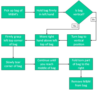
Figure 1 is an example of a process flow diagram from one class. The starting point was picking a bag of M&M’s. The ending point was removing an M&M from the bag to prove it was open. Note the decision box in the process flow diagram. You will most likely find that most of the teams cannot open the bag of M&M’s if they follow another team’s process flow diagram verbatim.
Figure 1: Opening a Bag of M&M’s
When debriefing the process flow diagram, ask the class the following questions:
- How many teams could open the bag of M&M’s based on the process flow diagram?
- Did the process flow diagram you use agree with the one your team developed?
- Why are there differences in the PFDs?
- What insights into PFDs did this exercise give you?
Data Collection

- What are the colors in a bag of M&M’s?
- What color occurs most frequently?
- How many M&M’s are there in one bag?
- How much variation is there in the number of M&M’s in one bag?
- What do we need to do to answer these questions?
The answer to the last question is data. Then tell the class we are going to find out the answers to these questions by collecting data.
Pareto Diagrams
Then introduce our next problem solving tool – the Pareto diagram. The following points are highlighted about the Pareto diagram:
What is a Pareto diagram?
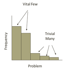
- The Pareto diagram is a special type of bar chart used to determine which problem to work on first to improve a process. It is based on the 80/20 rule (80% of our problems are due to only 20% of the possible causes).
- When do you use a Pareto diagram?
- You use a Pareto diagram to determine what problem to work on first.
- What can you learn from using a Pareto diagram?
- You can learn what the “vital few” problems or causes of a problem are. This allows you to focus your time and attention where you will get the most return.
- Where have we used a Pareto diagram?
- This is your company examples again, for example, reasons for credits, reasons for customer complaints, kinds of defects, or downtime by machine.
Finally, each person is about to get his/her own bag of M&M’s. After the discussion above, do the following:
- Hand out one bag of M&M to each participant. Tell them not to eat the M&M’s until you have said it is OK to do so.
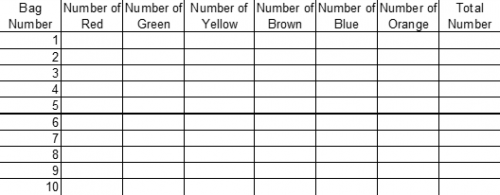
- Tell the class to open the bags and record the number of different colors they have. It is helpful to have created a data collection sheet for them (see below).
- Then have the class return to their teams and construct one Pareto diagram for the combined results of their team. This is done by totaling the number of each color for a team. You should provide each team a blank Pareto diagram. The most frequently occurring value is listed first, then the next most frequently occurring value, etc.
- When each team is done, have the participants return to their seats and debrief the exercise.
- Tell them they can now eat the M&M’s.
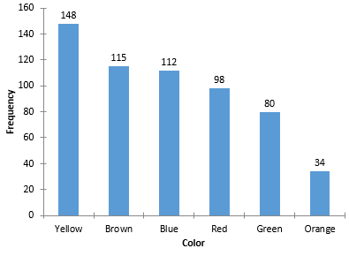
Figure 2 is an example of a Pareto diagram from one class. These data are about ten years old. The data does change over time. In this class, yellow occurred most frequently and orange occurred least frequently.
Figure 2: Pareto Diagram on M&M’s Colors
When debriefing the Pareto diagram, ask the class the following questions:
- What did you learn from your Pareto diagram?
- Which color appeared most frequently? Least frequently?
- Why don’t all the Pareto diagrams look the same?
As the teams are making the Pareto diagram, take a data collection sheet and go around to each team and record the total number of M&M’s in each bag. These are the data you need to complete the rest of the problem solving training. There should be one line completed on the data collection sheet for each person in the class.
An example of the data collection form is shown in Figure 3. This type of sheet is easily setup in a spreadsheet program such as Excel. Make copies of the completed data collection sheet for everyone in the class.
Figure 3: Data Collection Sheet
Histograms
Now you are ready to introduce the histogram – a tool that easily shows the variation in the total number of M&M’s in a bag. The following points are made about histograms:
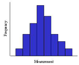
What is a histogram?
- Histograms present a picture of how the process “stacks up” over time. Histograms illustrate how many times a certain data value or range of data values occurred in a given time frame.
- When do you use a histogram?
- You use a histogram to examine the variation in a process.
- What can you learn from using a histogram?
- You learn four things from a histogram: how much variation there is in the process, what the mode is, what the shape of the distribution is, and the relationship of the specifications to the data.
- Where have we used a histogram?
- Back to your company examples again, e.g., density, color, bag weight, time to close books at end of the month.
Now return to the M&M’s. Ask the class the following questions:
- How many M&M’s did you have in your bag?
- Did everybody on your team have the same number of M&M’s in his or her bag?
- Why do you think there is not the same number each time?
- What would happen to the maker of the M&M’s if there was too much variation in the number of N&M’s in a bag (e.g., from 2 to 40)?
There appears to be valid reasons for Mars, Inc. to control this variation. Tell the class that we will using the histogram to determine the amount of variation present in the number of M&M’s in a bag as well as determining which value occurs most frequently and the shape of the variation.
- Pass out a copy of the data collection sheet.
- Divide the class back up into their teams to do a histogram on the total number of M&M’s in a bag (the total is on the data collection sheet). Have a blank histogram chart ready to hand out. Ask the class simply to count how many times each number occurred and plot that as a bar on the chart.
- When the histograms are complete, bring the class back together and debrief.
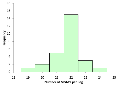
Figure 4 is an example of a histogram from one class (the same as for the Pareto diagram above). This is typical of what you see – most are within one of the mode but there is some variation (in this example, from 19 to 24).
Figure 4: Histogram of Number of M&M’s per Bag
When debriefing the histogram, ask the class the following questions:
- What is the maximum number in a bag? The minimum?
- What is the mode (the most common value)?
- What does the shape of the distribution look like?
- What are the advantages to Mars, Inc. in keeping the variation in the histogram at a minimum?
Cause and Effect (Fishbone) Diagrams
Ask what causes the number of M&M’s to vary in a bag? This leads into the introduction of the next problem solving tool: the cause and effect (fishbone) diagram.
The following points are made about the fishbone diagram:
- What is a fishbone diagram?
-
- A fishbone diagram is a tool that shows the relationship between a quality characteristic (effect) and possible sources of variation for this quality characteristic (causes).
- When do you use a fishbone diagram?
- You use a fishbone to determine the causes of a problem.
- What can you learn from using a fishbone diagram?
- The fishbone diagram helps organize the results of a brainstorming session on causes of the problem. It helps you identify the possible causes, discuss the causes and determine the most likely cause.
- Where have we used a fishbone?
- Back to company examples again here – e.g., causes for late deliveries to customers, for defective product, customer complaints and downtime
Now return to the M&M’s. The class is going to develop a fishbone diagram on possible causes of variation in the number of M&M’s in a bag. Yes, you do not work for Mars – you don’t know the process. But this is a chance to have some fun – think of wild reasons why there is variation – maybe even have a prize for farthest out reason. So do the following:
- Divide the class back up into their teams to do a fishbone on the reasons for varying numbers of M&M’s in a bag.
- Use a piece of flip chart paper taped to the wall.
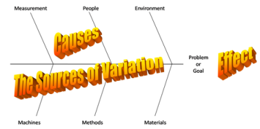
- Use the 4 M’s, a P and an E as the major categories on the fishbone (machines, methods, measurement, materials, people and environment)
- Remind the class that the idea is to brainstorm – generate a large quantity of ideas in as short a time as possible.
- When each team is finished, debrief by going around the room for each team to highlight a few of their answers.
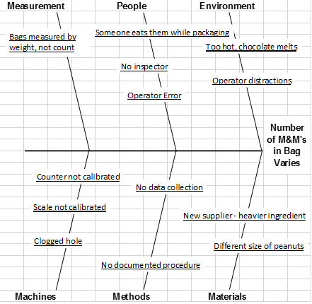
Figure 5 is an example of the fishbone diagram for this class.
Figure 5: Fishbone Diagram on Number of M&M’s per Bag
Control Charts
The next problem solving tool introduced is the control chart. It is helpful if you have already trained the group in the concept of variation and common/special causes of variation.
The following points are made about control charts:
- What is a control chart?
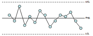
- A control chart is a picture of the variation in your process over time.
- When do you use a control chart?
- You use a control chart to monitor the key variables in any process.
- What can you learn from using a control chart?
- You can learn if the process is in statistical control – whether there are just common causes of variation present or if you have special causes present also.
- How do you make a control chart?
- There are five basic steps to develop a control chart: gather data, plot the data, calculate the average, calculate the control limits, and interpret the chart.
- Where have we used a control chart?
- Back to company example again, e.g., picking accuracy, service level, customer complaints, and average time for delivery.
Now, return to the M&M’s. Ask the class the following question:
- Can we predict, based on our sample, how many M&M’s are in a bag?
The answer to the last question is yes – by doing a control chart. Then,
- Divide the class back up into their teams.
- Ask each team to plot the number of M&M’s per bag on a blank control chart.
- You will need to calculate the average and control limits and give them those values to plot.
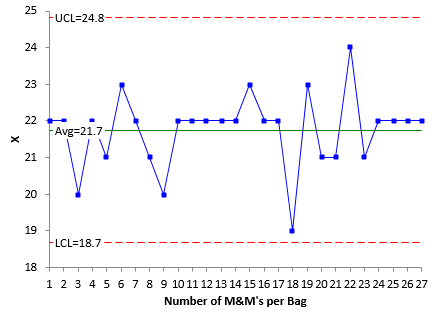
Figure 6 is shows the X chart (from the X-mR (individuals) chart) for the data in the histogram. There are no points beyond the control limits. So, the process appears to be in statistical control.
Figure 6: X Chart for Number of M&M’s per Bag
When the exercise is done, tell the class to return to their seats and debrief the exercise. When debriefing the control charts, ask the class the following questions:
- How much variation can you expect within a bag? Answer: between the lower and upper control limits.
- Are there any special causes of variation (points beyond the control limits)?
You can also use a p chart if you want to examine the variation in % of a certain color in each bag. This gives you a range for the % of a color within a bag of M&M’s.
Summary
This month’s publication has demonstrated how you can use peanut M&M’s to introduce the basic problem solving tools. The tools covered included:
- Process flow diagrams
- Pareto diagrams
- Histograms
- Control Charts
- Cause and effect (fishbone) diagrams
Examples from a class were shown to see how the various tools are used.
 What is a process flow diagram?
 Have you ever had trouble opening a bag of M&M’s?
 What is a Pareto diagram?
 What is a histogram?
Please consider refocusing the basic problem solving tools – to solving Human Error. Reference "The Field Guide to Human Error Investigatins" by Sidney Dekker.