June 2013
You hear the word “average” a lot. You probably even use it quite often at home and at work. Lots of ways to use the word “average”. For example,
- On average, it takes about 20 minutes get from home to work.
- The average of 10, 6, 8, and 4 is 7.
- An average of 40,000 people attend each baseball game in St. Louis.
- Prices have increased about 5% on average.
- The average test score was 82.
- The monthly average rainfall is 2.1 inches.
- This month’s sales were average.
- This week’s rework was below average.
We hear the word all the time. But when is an average not an average? What? Is that a trick question? Isn’t an average found by simply adding the values and dividing by the number of values? You know, like, (10 + 6 + 8 + 4)/4 = 7. Yes, that is how you find the average. Basic math. Straight forward. While the math will give you an average, it does not mean that it is the “average.” What?
This month we take a look at what an average really means. Far too often people assume that historical data are a good basis for determining what the average is. So, they take a month’s worth of data and calculate an average. “There, I know my average.” But do you?
And then sometimes, people take that average and use it to determine a process capability value. “There, I know my monthly Cpk.” Do you calculate Cpk monthly and put it on a scorecard? Then you may not understand when an average is not an average. For sure, whoever designed that scorecard doesn’t. But it is so easy to do those monthly calculations.
We will use “average” temperature – something we can all relate to – to examine when an average isn’t an average. And, of course, we will use control charts. After all, this is a newsletter about statistical process control.
In this issue:
- Definition of Average
- Temperature Data
- The Data Analysis
- What Does This Mean at Work?
- Summary
- Quick Links
The Definition of Average
Are you average? How do you define average? The on-line Merriam-Webster dictionary defines average as the following:
- a single value (as a mean, mode, or median) that summarizes or represents the general significance of a set of unequal values
- an estimation of or approximation to an arithmetic mean
- a level (as of intelligence) typical of a group, class, or series
- a ratio expressing the average performance especially of an athletic team or an athlete computed according to the number of opportunities for successful performance
We will stay away from the poorer uses of average, e.g., your work is above or below average. We will stay with numbers for this newsletter. So, we will define average as the mean of a set of numbers – just the way we find the center line on a control chart:

where Xi is an individual result and n is the number of values we have. To examine the average in more detail, we will use temperature data.
Temperature Data
Ever look on the web to see what the “average” temperature is for a place that you will be visiting? For example, suppose you wanted to visit Houston, TX in August and you wanted to know what the temperature is for August. You really don’t care about the “average” temperature for the day. You would like to know how hot it will get during the day (the maximum) and how cool it will get in the evening (the minimum). It does not get “cool” in Houston in August.
You can search on-line for the temperature in August. Here are some results you will find:
Table 1: Houston, Texas Temperatures in August
|
Link |
Average Minimum |
Average Maximum |
|
74.8 |
94.5 |
|
|
75 |
93 |
|
|
72.4 |
92.5 |
There is variation in the results. Not surprising. The average minimum and maximum temperatures are based on a given time period, although many sources do not give that time period or the source of their data. So, you don’t really know the context of the data – where it came from. The first link does show that the data comes from www.noaa.gov for the years from 1981 to 2010. But the raw data is not available – just the average minimums and maximums. To really examine the temperatures, we need to look at the raw data.
To examine the temperature in August, we will use data taken from the Old Farmer’s Almanac (www.almanac.com) using their customized weather history tool. Daily minimum and maximum temperatures were downloaded for the time period from 1/1/1960 to 12/31/2012. The data for August of each year were extracted. Then the average minimum and maximum temperatures were found for each year for the month of August. The data are shown below in Table 2.
Table 2: Temperatures (°F) During August
|
Year |
Min |
Max |
Year |
Min |
Max |
|
|
1960 |
75.7 |
88.9 |
1987 |
76.6 |
94.7 |
|
|
1961 |
72.7 |
89.1 |
1988 |
76.6 |
94.6 |
|
|
1962 |
72.8 |
94.0 |
1989 |
74.7 |
90.5 |
|
|
1963 |
76.0 |
95.0 |
1990 |
75.4 |
95.6 |
|
|
1964 |
75.5 |
92.8 |
1991 |
76.6 |
93.6 |
|
|
1965 |
74.1 |
91.1 |
1992 |
72.9 |
91.0 |
|
|
1966 |
74.9 |
89.4 |
1993 |
76.5 |
95.2 |
|
|
1967 |
72.1 |
88.6 |
1994 |
74.2 |
91.1 |
|
|
1968 |
72.0 |
90.6 |
1995 |
76.5 |
92.6 |
|
|
1969 |
75.6 |
93.1 |
1996 |
75.1 |
89.4 |
|
|
1970 |
74.1 |
91.5 |
1997 |
76.4 |
92.7 |
|
|
1971 |
71.0 |
87.2 |
1998 |
76.8 |
94.0 |
|
|
1972 |
72.6 |
90.4 |
1999 |
77.0 |
96.3 |
|
|
1973 |
74.2 |
88.6 |
2000 |
74.9 |
95.3 |
|
|
1974 |
75.0 |
90.2 |
2001 |
75.3 |
91.5 |
|
|
1975 |
74.2 |
89.7 |
2002 |
75.3 |
91.2 |
|
|
1976 |
73.2 |
91.8 |
2003 |
75.8 |
92.5 |
|
|
1977 |
77.0 |
92.4 |
2004 |
74.5 |
92.0 |
|
|
1978 |
74.5 |
92.5 |
2005 |
77.1 |
93.6 |
|
|
1979 |
74.4 |
89.9 |
2006 |
76.6 |
92.2 |
|
|
1980 |
75.8 |
93.1 |
2007 |
78.1 |
93.4 |
|
|
1981 |
75.6 |
91.2 |
2008 |
75.6 |
91.3 |
|
|
1982 |
75.7 |
93.3 |
2009 |
77.0 |
95.4 |
|
|
1983 |
76.0 |
90.1 |
2010 |
77.6 |
96.2 |
|
|
1984 |
73.7 |
90.0 |
2011 |
77.7 |
102.7 |
|
|
1985 |
74.2 |
92.8 |
2012 |
76.2 |
96.2 |
|
|
1986 |
75.2 |
92.8 |
We will use these data to take a look at the average minimum and average maximum temperatures during the month of August for Houston.
The Data Analysis
As always, when looking at data, it is best to plot the data over time – using control charts if at all possible with the data. We will start with the average minimum temperature for the month of August. We will use an individuals control chart and plot the average minimum temperature for August each year. If you are new to control charts, please see our newsletter on the purpose of control charts. The control chart for these data are shown in Figure 1. We will just use the X chart here.
Figure 1: X Chart for Average Minimum Temperature
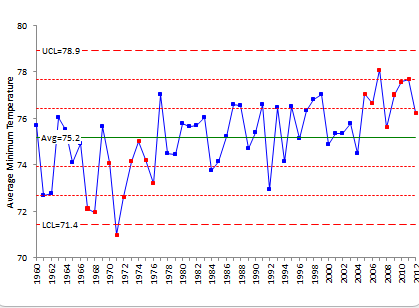
What does the control chart tell you? The overall average is 75.2. Thus, we can say that the average minimum temperature from 1960 to 2012 is 75.2. This is the calculated average. But is it the average minimum temperature I could expect this coming August in 2013 in Houston? The answer is no – it is not. Why is that?
Look at the control chart in Figure 1. The first thing to notice is that there are periods where the chart is not in statistical control. The red points represent out of control conditions. We have a run below the average for the time period from 1966 to 1976. During this time frame, the average minimum temperature was lower – this means that the data does not come from the same distribution – it is not homogenous. This is the key point of our discussion on the average – if the data are not homogenous, there is not one average for the process. We can use the control chart to guide us in finding which parts are homogenous and which are not.
To start, we can split the control limits starting in 1966 and then again at 1977. By the way, splitting the limits with the SPC for Excel software is a breeze. Simply select the point where you want the split to occur and select split the limits. So simple. Sorry, had to put some marketing.
The resulting chart is shown in Figure 2. Note that we are not worrying about the run above the average at the end of the chart. We have to remove the first “out of control situation” from the data to see what the chart looks like without it.
Figure 2: Minimum Temperature with Split Limits
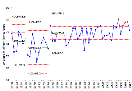
The minimum temperature for August averages 73.4 for the ten year period starting in 1966. So, since 1966, we have at least two processes working. The first process from 1966 to 1976 has an average of 73.4 and appears to be homogenous because the control chart shows the temperature in control over that time. Since 1977, the average is 75.8. Is this average a “good” average?
There is still an out of control situation at the end of the chart. Four out of five points are beyond one sigma on the high side of the chart. In fact, 7 out of the last 8 points are above average. You can make the case that another process had started in 2005. Once again, we can split the control limits starting in 2005. The resulting chart is shown in Figure 3.
Figure 3: Minimum Temperature with Third Split Limits
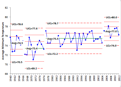
The control chart now appears to be in control but with respect to four different periods of time. Mother Nature has changed the temperature. The process has not stayed the same.
Now you can begin to see the problem with saying “average.” If you take the average of all the data shown in Figure 1, you will get 75.2. But the data are not homogenous – they do not come from the same distribution as you see when the data are plotted over time. There are actually four different periods as shown on this chart with four different averages: 74.5, 73.4, 75.5 and 77.0. The minimum average temperature is now around 77. Higher than the values from the websites – because the control chart shows the different processes.
Does the maximum temperature follow a similar pattern? Well, yes and no. Chart it and see what you think. 2011 sure was hot.
What Does This Mean at Work?
This newsletter is really tied closely to our last newsletter – Just Plot the Data – It is So Simple! (May 2013). You have to consider the state of the process that produce the metrics that you use to monitor your processes and business. Were the metrics generated from a homogenous dataset (in statistical control) or from a non-homogenous dataset (either out of control or more than one period of a homogenous process)? Return to the comments above about the calculating process capability monthly. Why do you do that? If the process never changes, you have no need to recalculate the process capability ever. Of course, no process is like that, but you should use the control chart to guide your calculations – not a time period. Again, plot the data. It will tell you a story about your process.
Summary
If your process is not stable (in statistical control), your calculated average really has no meaning because your process is not the same (homogeneous). This applies to more than just averages. Any statistical calculations or statistical tests (e.g., comparing means) have no meaning if the processes that generated the results are not in statistical control. You can’t be sure of getting the same results in the future without the process being in control. So, always plot the data over time to see what the process is doing. So simple.