August 2021
(Note: all the previous SPC Knowledge Base in the variable control chart category are listed on the right-hand side. Select this link for information on the SPC for Excel software.)

There really should be some thought given to how a control chart is designed – and that depends on what you want to obtain from the control chart. What variation do you want the control chart to analyze/monitor? Every control chart is a movie of the variation in your process over time. You just need to be sure it is a movie of the variation you are interested in examining.
To explore this concept, two control charts will be examined and compared in this publication: the individuals (X-mR) control chart and the X-R control chart. The X-R chart, at one time, was the most used control chart. It has probably given way to the X-mR chart as the use of SPC spread beyond manufacturing into other areas and “frequent” data became less frequent. If you have infrequent data (like monthly), you don’t have many options beyond the X-mR chart. Some say the X-mR chart is the only chart you need to know because it always works. Yes, it usually works – but is it the best choice always?
This publication compares the X-R chart with the X-mR chart to better understand the differences – and to show that the X-mR chart actually can give more false signals than the X-R control chart. A simulation is used to show why this is true. In this issue:
- Understanding the Variation Being Monitored
- Variation and the X-R Chart
- Variation and the X-mR Chart
- The Simulation
- Simulation Results
- Conclusions
- Summary
- Quick Links
Please feel free to leave a comment at the end of this publication. You can download a pdf copy of the publication at this link.
Understanding the Variation Being Monitored
Control charts, when properly designed, monitor variation over time. Consider the following scenario. You are in charge of a line that loads a product into bags. The weight in the bags is critical. Too much and you are giving away product; too little and you may get customer complaints that the bag is not full enough.
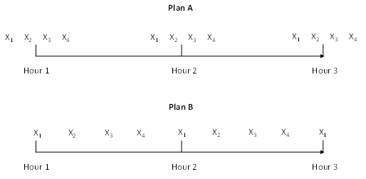
You want to take four samples per hour to monitor the variation. There are numerous ways you could do this including taking four consecutive samples at the top of each hour (Plan A). In this case, the X-R chart is the best option. Do you know why the X-mR chart is not good for this sampling plan?
Another option is to take a sample every 15 minutes (Plan B). In this case, either the X-R chart or the X-mR chart will work. But is one better than the other? We will see. First, the variation examined on each chart is discussed.
The two sampling plans are shown in Figure 1.
Figure 1: Sampling Plans
Variation and the X-R chart
With the X-R chart, samples are taken, and a subgroup is formed. Remember, some thought has to go into how you form the subgroups. The average of each subgroup is found and plotted on the X chart. The range of each subgroup is found and plotted on the range chart. What is the variation being monitored on the X and R chart?
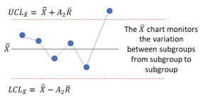
The X chart monitors the variation in subgroup averages over time (often called the between-subgroup variation). Each subgroup average is compared to the overall average to determine if a significant change has occurred. If a subgroup average is beyond the control limits, it is a signal that something has changed for that subgroup average. The variation being monitored is shown in the figure below.
X is the overall average of the X values, R is the average range, UCL is the upper control limit, LCL is the lower control limit, and A2 is a control chart constant that depends on subgroup size.
What is the X chart monitoring in Plan A for the bag weight example?
The X chart monitors the variation in the average bag weight from hour to hour.
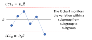
The range chart monitors the variation between results within a subgroup (often called the within-subgroup variation). Each subgroup range is compared to the average range to determine if a significant change has occurred. If a subgroup range is beyond the control limits, it is a signal that something has changed for that subgroup range. This is shown in the figure below.
D4 and D3 are control chart constants that depend on subgroup size.
What is the range chart monitoring in Plan A for the bag weight example?
The range chart monitors the variation in the four bag weights within a subgroup from hour to hour.
What variation is being monitored if you used plan B with the X-R chart? The X-R chart is still monitoring the same variations: the variation in average bag weight from hour to hour and the variation in the four bag weights within a subgroup from hour to hour.
What is the difference between Plans A and B? In plan A, four consecutive bags are measured in a row, while with Plan B, four bags are measured at 15 minute intervals. What do you think will be the differences in the X-R charts for Plan A and Plan B? The average range will probably be smaller for Plan A than Plan B. This is because Plan A selects four bags in a row, while Plan B selects one every 15 minutes. Plan A is better than Plan B because of this. It represents one of the tenets of rational subgrouping:
Select the subgroups so the chance for variation within a subgroup is minimized. This forces the X chart to do the work of finding the special causes.
For more information, please see our four SPC Knowledge Base articles on rational subgrouping.
Variation and the X-mR Chart
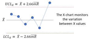
With the X-mR chart, the individual values (X) are plotted on the X chart, and the moving range (mR) between consecutive points are plotted on the mR chart. The X chart monitors the variation in individual values over time. You can refer to this as the long-term variation for the X-mR chart. Each individual value is compared to the overall average to see if it is significantly different. If the value is beyond the control limits, a significant difference exists. This is shown in the figure below.
X is the average X value, and mR is the average moving range.
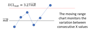
The mR chart monitors the variation in the range between consecutive X values over time. You can refer to this as the short-term variation for the X-mR chart. Each moving range value is compared to the average moving range to see if it is significantly different. If a moving range is beyond the control limits, a significant difference exists. This is shown in the figure below.
Why shouldn’t you use the X-mR chart for Plan A? Plan A collects four consecutive bag weights at the start of each hour. If at all possible, you want to minimize the variation in the mR chart, so the X chart does the work in finding out of control points. You attempt to do this with the X-mR chart by ensuring that the time between the samples is the same. The first three moving ranges represent these differences: |X1 – X2|, |X2 – X3|, and |X3 – X4|. What is the fourth moving range? It is between X4 and X1 for the start of the next hour. A large time difference compared to the first three samples. The odds of these moving ranges being homogeneous is lower due to the sampling. Applying the X-mR chart with Plan A will probably lead to problems – most likely missed signals.
Plan B will work with the X-mR chart. The time period between samples is the same so the short-term variation between consecutive samples will probably be more homogeneous.
What variation is the X chart monitoring in Plan B for the bag weight example?
The X chart is monitoring the variation in bag weights every 15 minutes.
What variation is the mR chart monitoring in Plan B for the bag weight example?
The mR chart is monitoring the variation in consecutive bag weights every 15 minutes.
Notice in the descriptions of what the X-R and X-mR charts are measuring, there is always time mentioned. Time is always a part of the variation a control chart is monitoring.
Plan B works with either chart. So, is one better than the other? Maybe it is the X-mR chart. A point is plotted every 15 minutes compared to a point every hour with the X-R chart. It is the more frequent charting of points that causes potential problems with the X-mR chart. There are more false signals with the X-mR chart. This is shown in the simulation described below.
The Simulation
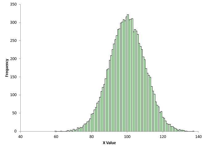
A simulation was created to compare the X-mR chart and the X-R chart. The objective is to compare the two charts for monitoring a process. Our process for the simulation has an average of 100 and a standard deviation of 10. We will assume that our process is normally distributed. A random number generator was used to generate 10,000 points for a normal distribution.
These 10,000 points represent our “population.” This is all possible outcomes from the process. A histogram of the 10,000 points is shown in Figure 2.
Figure 2: Population Histogram
The average of the 10,000 point is 99.999 with a standard deviation of 9.931. This population is randomly sampled to obtain the X values. Since these 10,000 values don’t change and the samples are randomly selected, you would expect the process to be in statistical control.
The simulation (created in Excel) is run the following way:
- Randomly sample 120 X values from the population
- Construct the X-mR chart from the 120 X values
- Determine if there are any out of control points on either the X or mR chart
- Use the same 120 points and form subgroups of size 4 (in the order the data was randomly selected)
- Construct the X-R from the 30 subgroups
- Determine if there are any out of control points on either the X or R chart
- Repeat this 1,000 times
- Compare the results between the two control charts
You might ask why this simulation is repeated 1000 times. It is called variation. The simulation could be run 1 time and the results for the two control charts compared. But will you get the same result the second time you run the simulation? Most likely not.
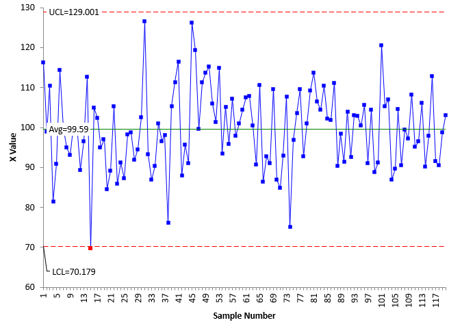
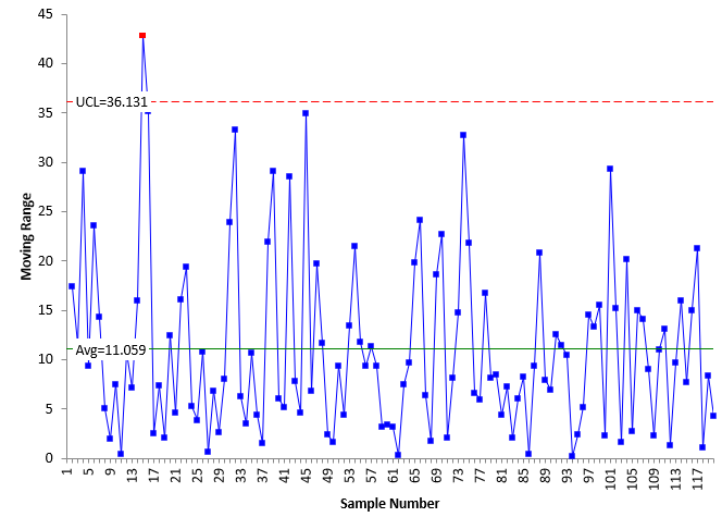
Figures 3 and 4 show the results for the X-mR chart from one run of the simulation.
Figure 3: X Chart from 1 Simulation Run
Figure 4: mR Chart from 1 Simulation Run
There is one out of control point on each of the X chart and the X-mR chart. Are these true signals that the process has changed? No, they are not. The process doesn’t change, and the X values were drawn at random from the process. These are false signals.
The fraction of area beyond +/- 3 standard deviations for a true normal distribution (doesn’t exist) is 0.0027 – which means you would expect 2.7 false signals per 1000 points you plot.
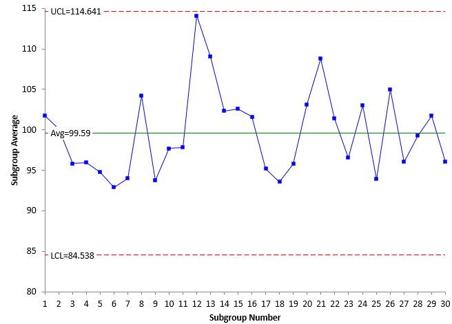
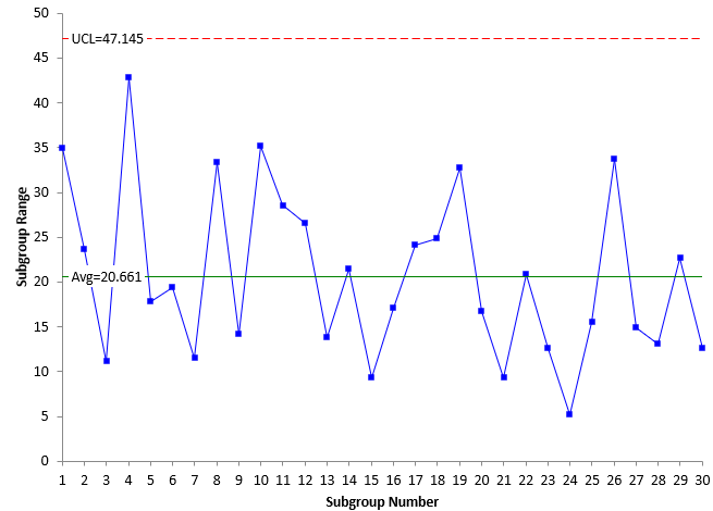
Figures 5 and 6 show the results for the X-R chart using the same data as in Figures 3 and 4 but with a subgroup size of 4.
Figure 5:X Chart from 1 Simulation Run
Figure 6: R Chart from 1 Simulation Run
There are no out of control points on the X-R chart, while there were two on the X-mR. Will this always be the case? No out of control points on the X-R chart? No, there will be false signals as well on the X-R chart. The subgroup averages are normally distributed, so you would expect (for a true normal distribution) a false signal 2.7 times per 1000 points plotted on average.
Now, let’s see the results from running the simulation 1000 times.
Simulation Results
The simulation was run 1000 times. The calculations were done for each control chart. The results are summarized in the table below.
Table 1: Simulation Results
| Chart | X | mR | X | R |
|---|---|---|---|---|
| Charts with no out of control points | 758 | 350 | 931 | 889 |
| % of Charts with out of control points | 24% | 65% | 7% | 11% |
| Points plotted | 120,000 | 119,000 | 30,000 | 30,000 |
| Points out of control | 290 | 1014 | 73 | 114 |
| % of Points out of control | 0.24% | 0.85% | 0.24% | 0.38% |
The results look at two items primarily: the % of charts out of the 1000 that had at least one point beyond a control limit and the % of points beyond the control limits. Remember, the process is stable, so theoretically, these are false signals. When an X-mR chart is used, 24% of the time the X chart had an out of control point. 65% of mR charts had at least one out of control point. Both these are larger than the corresponding numbers for the X-R chart, at 7% and 11%.
This implies that the X-mR produces more false signals than the X-R chart. Part of the reason for this is that the X-mR plots each individual value while the X-R plots subgroup averages – fewer points when the same data set is used in each chart. The points plotted on the X chart for 1000 charts at 120 points a chart is 120,000. The X chart has 30 subgroup averages on each chart or 30,000 total points plotted (1/4 of the X chart points since using a subgroup size of 4).
The % of points beyond the limits for the X and X chart is essentially the same at 0.24%. You would expect this since they both follow the normal distribution. The mR chart though has 0.85% points out of control compared to 0.38% for the range chart.
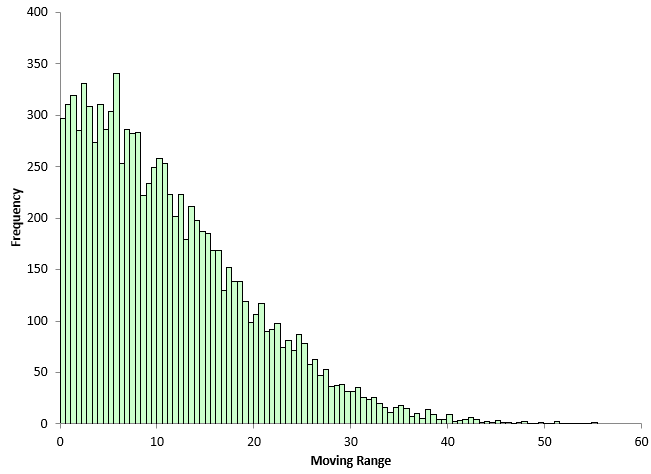
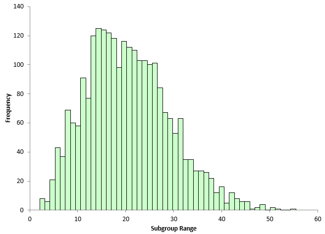
Why does the mR chart has so many out of control points? Part of it is that the moving range and subgroup range values are not normally distributed. The moving range chart and the range chart are both skewed, with the moving range being more skewed.
Figures 9 and 10 show the histograms for the moving range values and the subgroup range values.
Figure 9: Moving Range Histogram
Figure 10: Subgroup Range Histogram
The mR chart has more false signals in the simulation due to the fact it is a skewed distribution. The subgroup range chart has more than the X chart – again because the range distribution is skewed – but not as much as the mR chart.
Conclusions
If you are faced with a situation where you can use the X-R chart or the X-mR chart, the X-R chart is probably the better choice. The subgrouping of data allows you to specifically look at the variation you are interested in monitoring. In addition, for the same amount of data, the X-R control chart gives less false signals than the X-mR chart.
Summary
This publication compared the differences in the X-mR and X-R charts in terms of the variation they monitor and in the number of false signals that can occur. In situations where either can be used, it is probably best to use the X-R control chart. You plot fewer points because you are subgrouping the data and this leads to fewer false signals.
Another great one Billwould be interestbig to show the arl for each and compare to ooc points observed on the x-mr chart.my recollection says that what you found is not a surprise when compared against the predicted arl false alarm rate
Thanks Edward. Yes good suggestion. It would be interesting. I have't looked much at ARL for Xbar-R charts but i should.