April 2025
Each month, an engineer prepares your monthly report for management for a key process. The engineer takes last month’s data and constructs an individuals control chart so management can see what happened in the process during the month.
The control chart is almost always in statistical control – stable – consistent and predictable. The engineer calculates a process capability value. But even though the process is almost always in control, the process metrics – averages, control limits, estimated sigma – seem to vary from month to month. This month’s estimated sigma value is 5.5 compared to 3.5 last month. This made the process capability value much lower. But the process is in control every month. Why does the engineer get this much variation from month to month?
Pure and simple, even stable processes have variation. No process is truly unwavering. Variation can be summarized in the following:
- All processes vary and you must understand the variation – whether it is predictable (common causes) or unpredictable (special causes).
- A stable (only common causes present) process still fluctuates.
- Processes with no variation don’t exist.
This publication explores the differences you obtain when sampling a process that is stable. It is more than you may think and explains why the results can be so different. A simulation using an individuals control chart is used to demonstrate this. It shows the problems with comparing the control charts from two periods of time for the same process.
In this publication:
Please feel free to leave a comment below. You can download a pdf copy of this publication at this link.
Revisiting Variation
It always seems to start with variation. It did with us. Our first newsletter in January 2004 started with variation. Here is what we wrote:
 I used to, now and then, spill a glass of milk when I was young. Our table slanted toward where my mother sat. So, the milk always headed in her direction. And she usually had some choice words when this happened. Of course, I was at fault. I needed to be more careful. Or was that really true? If you understand variation, you will realize that most of the problems you face are not due to individual people, but to the process — the way it was designed and the way it is managed on a day-to-day basis.
Variation comes from two sources, common and special causes. Think about how long it takes you to get to work in the morning. Maybe it takes you 30 minutes on average. Some days it may take a little longer, some days a little shorter. But as long as you are within a certain range, you are not concerned. The range may be from 25 to 35 minutes. This variation represents common cause variation — it is the variation that is always present in the process. And this type of variation is consistent and predictable. You don’t know how long it will take to get to work tomorrow, but you know that it will be between 25 and 35 minutes as long as the process remains the same.
Now, suppose you have a flat tire when driving to work. How long will it take you to get to work? Definitely longer than the 25 to 35 minutes in your “normal” variation. Maybe it takes you an hour longer. This is a special cause of variation. Something happened that was not supposed to happen. It is not part of the normal process. Special causes are not predictable and are sporadic in nature.
Why is it important to know the type of variation present in your process? Because the action you take to improve your process depends on the type of variation present. If special causes are present, you must find the cause of the problem and then eliminate it from ever coming back, if possible. This is usually the responsibility of the person closest to the process. If only common causes are present, you must FUNDAMENTALLY change the process. The key word is fundamentally — a major change in the process is required to reduce common causes of variation. And management is responsible for changing the process.
It has been estimated that 85 to 94% of the problems a company faces are due to common causes. Only 6 to 15% are due to special causes (that may or may not be people related). So, if you always blame problems on people, you will be wrong at least 85% of the time. It is the process most of the time that needs to be changed. Management must set up the system to allow the processes to be changed.
So, Mom, sorry. But most of the time, spilling the milk was not my fault. It was usually yours (management). The glasses were too big for my small hands (no spill-proof cups in those days). When I wanted to put it by the edge of the table to make it easier to reach, you said move it back – I might spill it. And with the meal-time conversation, how could I concentrate on my milk!
Review of Individuals Control Charts
The individuals control chart monitors individual values over time. The individual values are plotted on the X chart. The moving range between consecutive individual values is plotted on the mR chart.
Suppose we take a sample once a day from a process and measure it for some quality characteristic. The results for the last 30 samples are shown in Table 1.
Table 1: Process Data
|
Sample |
X |
Sample |
X |
|
|
1 |
99.196 |
16 |
89.395 |
|
|
2 |
104.356 |
17 |
103.49 |
|
|
3 |
103.596 |
18 |
90.529 |
|
|
4 |
93.393 |
19 |
100.198 |
|
|
5 |
105.884 |
20 |
97.025 |
|
|
6 |
103.116 |
21 |
96.915 |
|
|
7 |
96.013 |
22 |
95.523 |
|
|
8 |
100.48 |
23 |
96.358 |
|
|
9 |
87.893 |
24 |
87.519 |
|
|
10 |
101.657 |
25 |
100.372 |
|
|
11 |
99.944 |
26 |
99.258 |
|
|
12 |
104.221 |
27 |
106.61 |
|
|
13 |
99.07 |
28 |
104.683 |
|
|
14 |
96.305 |
29 |
97.617 |
|
|
15 |
107.903 |
30 |
98.901 |
The first moving range value is the range between samples 1 and 2:
First Moving Range: |99.196 – 104.356| = 5.160
The overall average (X) and the average moving range (R) are then calculated using the following formulas:
X = SX/k
R = SR/(k-1)
where k = number of samples. Now you can calculate the upper control limit (UCLx) and lower control limit (LCLx) for the X chart as follows:
UCLx = X + 2.66R
LCLx = X – 2.66R
The upper control limit (UCLr) for the moving range chart can then be calculated as well as the estimated process standard deviation (s).
UCLr = 3.268R
s = R/1.128
The 2.66, 3.268, and 1.128 are constants based on using a moving range of 2 in the analysis.
The averages and control limits can then be added to the charts. Figure 1 is the X chart. Figure 2 is the mR chart.
Figure 1: X Chart
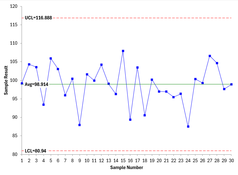
Figure 2: mR Chart
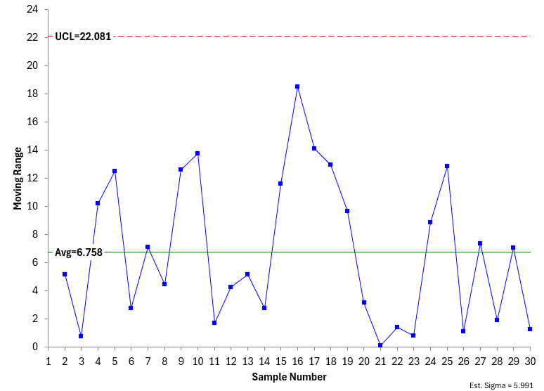
Both charts were made using the SPC for Excel software and are in statistical control – there are no points beyond the control limits or patterns in the data (e.g., 8 points in a row below the average). So, the process is stable.
Does this mean that we will get the same results if we take another 30 samples from the process and construct a control chart? No, it does not. In fact, the results can be quite different. Let’s look at a simulation to see the variation in the results for a stable process.
Simulation
To simulate this, we need a stable population – one that does not change over time. To create this population, we generated 5,000 random numbers from a normal distribution using the SPC for Excel software. The average was 100, and the standard deviation was 5. The results represent all possible results from our stable process – so it is the population. The histogram for our stable population is shown below.
Figure 3: Population Histogram
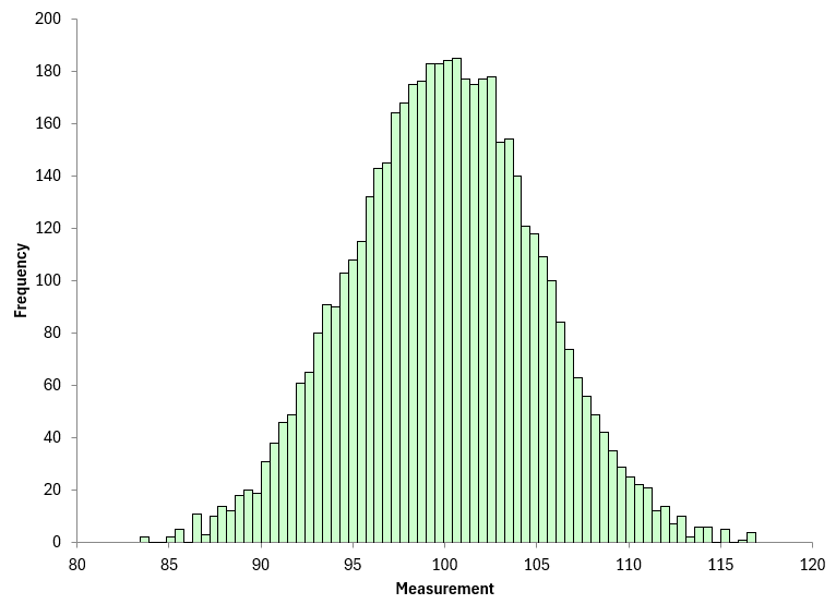
The population average is 100.0021 and the population standard deviation is 5.0628, both close to the 100 and 5 used to generate the 5,000 point population.
Results
To judge how the control chart parameters change for a stable population, we randomly selected 30 points from the population and constructed a control chart. We did this 500 times – so we constructed 500 control charts, taking 30 random samples from our stable population each time.
Each control chart generates different values for the averages and the control limits. For example, Figure 4 is the X chart from another set of 30 random samples from the stable population. Figure 5 is the moving range chart.
Figure 4: Another X Chart
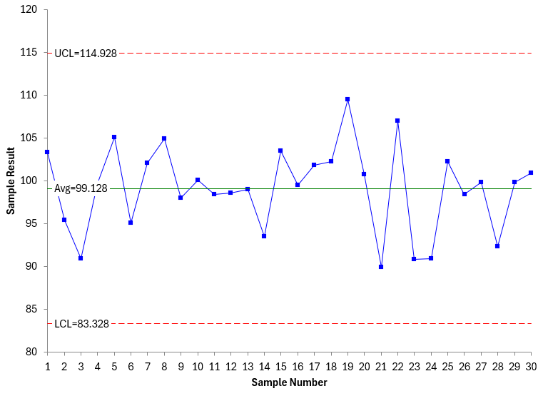
Figure 5: Another mR Chart
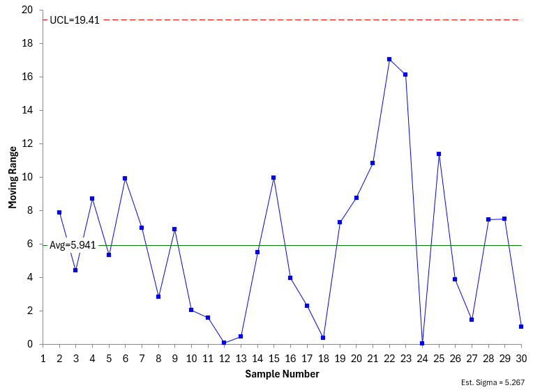
Comparing Figure1 and 2 with Figures 4 and 5, you can see there are differences. The results are not the same even though the population is stable. This is shown in the table below.
Table 2: Comparing Two Control Charts from the Stable Population
|
Figure |
X |
UCLx |
LCLx |
R |
UCLr |
Sigma |
|
1 & 2 |
98.914 |
116.888 |
80.94 |
6.758 |
22.081 |
5.991 |
|
4 & 5 |
99.128 |
114.928 |
83.328 |
5.941 |
19.041 |
5.267 |
Table 2 just compares two control charts. There are differences, but not huge. What happens when run the simulation for 500 control charts constructed from the random samples from the stable population? Table 3 summarizes the results for all 500 control charts.
Table 3: Results from 500 Control Charts
| Metric | X |
UCLx |
LCLx |
R |
UCLr |
Sigma |
|
Average |
99.987 |
115.378 |
84.595 |
5.786 |
18.904 |
5.130 |
|
Minimum |
96.859 |
106.672 |
77.311 |
2.911 |
9.509 |
2.580 |
|
Maximum |
102.291 |
123.696 |
91.870 |
8.282 |
27.058 |
7.343 |
|
Range |
5.432 |
17.024 |
14.559 |
5.372 |
17.549 |
4.762 |
|
Standard Dev. |
0.947 |
2.669 |
2.622 |
0.929 |
3.034 |
0.823 |
|
COV |
0.95% |
2.31% |
3.10% |
16.05% |
16.05% |
16.05% |
The table gives the average of each metric, the minimum and maximum, the range, standard deviation and the COV (coefficient of variation). There is definite variation in the results, particularly for the range metrics.
The COV is calculated by dividing the standard deviation by the average. It allows you to compare the variability in metrics that are very dissimilar. The larger the COV, the larger the variability in the results. You can see that the X values have the lowest variability. The range metrics have the largest variability.
You can see this by constructing a histogram on those metrics. Figure 6 is the histogram of the 500 X values.
Figure 6: Histogram of 500 X Values
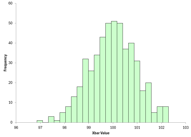
You can see that mode is close to 100 and the range is 97 to 102. So, there is not a lot of variation in the X values.
Figure 7 shows the results for sigma, the estimated standard deviation.
Figure 7: Histogram of 500 Sigma Values
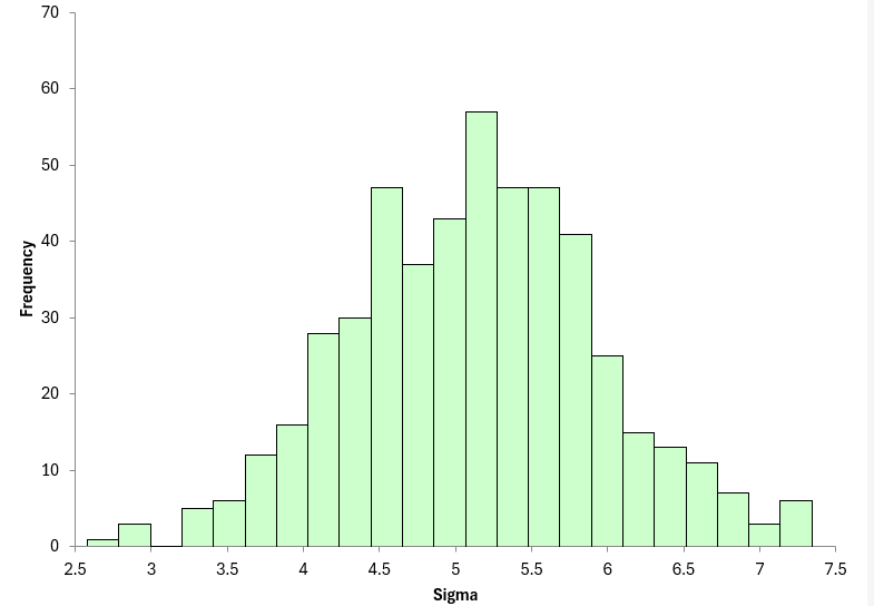
You can see the variation in this histogram is much wider than with the X values relative to the average.
So why does this matter? Well, for one, it shows that there can be a lot of variation when constructing a control chart from random samples in a stable population. And it is higher for the moving range values than the X values.
And what key metric is sigma used to calculate? Process capability. That means the process capability is going to have variation. Calculating a single number for process capability is not a good indication of what your process capability could be.
Our SPC Knowledge Base article on Process Capability and Variation explores this in more detail.
So, what about the engineer doing a new control chart each month and comparing each month’s result to the previous? The metrics – averages, control limits, and sigma – will vary each month. It is best to construct the control chart over a certain period of time – enough so that all the sources of variation have a chance to be present. Then set the control limits and use these to determine if the process is in control or not in the future. You should not create new control charts from month to month.
For more information on when to set control limits, please see our SPC Knowledge Base article When to Calculate, Lock, and Recalculate Control Limits.
Summary
This publication examined how a stable process still can vary significantly in terms of its metrics, such as X and sigma. The range metrics have more variability in them than do the X metrics. This can influence calculations for process capability. It is best not to create new control charts each month. Instead, set the limits and use those to judge process performance.