October 2022
(Note: all the previous SPC Knowledge Base in the bar charts category are listed on the right-hand side. Select this link for information on the SPC for Excel software.)

Lots of items can be added to a histogram. But what is really needed for the histogram to tell you something about your process? It all revolves around the bar width used on the histogram. Too large of a width or too small of a width just masks the underlying variation. This publication examines how to set the bar width, so a histogram gives you insights into your process.
In this issue:
- Overview of Histograms
- Histogram Data
- Impact of the Number of Bars on the Histogram
- Dot Plot and the Number of Bars on a Histogram
- Histograms and Statistical Control
- Summary
- Quick Links
Please feel free to leave a comment at the bottom of this publication. You can download a pdf copy at this link.
Overview of Histograms
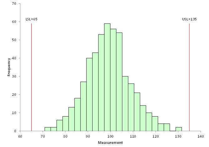
A histogram is a picture of how your process data stacks up over time. An example of a histogram is shown in Figure 1.
Figure 1: Histogram
This histogram contains 500 points – a lot of data. The histogram is composed of bars that represent how often data falls into a range of measurements. The x-axis represents that range of measurements (e.g., 72 – 74). The y-axis is the number of data points that fall in that range (the frequency). This histogram has the specifications added. It is easy to see that there are no points beyond the specifications.
A histogram tells us four things:
- What the most common value is
- The amount of variation present
- The shape of the variation
- The relationship of the data to the specifications
The most common value in Figure 1 is around 98 – 100. This is called the mode – the highest bar on the histogram. The variation in the histogram runs from around 70 to 130. The distribution appears to be bell shaped. And, as mentioned, there are no points beyond the specifications. Histograms can also detect problems in a process. For more general information on histograms, please see our two-part series on histograms in our SPC Knowledge Base or our video on histograms.
Figure 1 is an easy histogram to interpret. Not all are that way, as we will see. All the charts used in this publication were made using the SPC for Excel software.
Histogram Data
Consider the data in Table 1 below.
Table 1: Histogram Data
| 4.4 | 0.7 | 3.0 | 1.7 | 2.2 |
| 0.9 | 1.9 | 5.8 | 3.8 | 3.3 |
| 0.6 | 2.4 | 0.4 | 13.1 | 0.3 |
| 3.4 | 2.7 | 2.6 | 0.1 | 2.1 |
| 3.8 | 1.8 | 0.2 | 0.5 | 2.0 |
| 1.3 | 0.1 | 2.4 | 2.2 | 5.5 |
| 4.0 | 0.9 | 0.4 | 1.7 | 2.7 |
| 6.8 | 0.5 | 1.4 | 0.3 | 3.2 |
| 0.3 | 4.8 | 5.7 | 0.4 | 2.0 |
| 5.0 | 1.6 | 1.5 | 3.1 | 0.2 |
| 1.5 | 1.9 | 2.6 | 4.9 | 2.2 |
| 2.4 | 7.6 | 1.9 | 0.7 | 0.6 |
| 2.5 | 1.6 | 7.0 | 1.2 | 0.5 |
| 2.3 | 2.0 | 2.1 | 0.5 | 4.2 |
| 3.0 | 4.7 | 9.5 | 3.7 | 2.1 |
| 8.3 | 3.6 | 2.9 | 2.8 | 0.1 |
| 0.9 | 1.4 | 7.6 | 2.9 | 4.0 |
| 1.4 | 2.9 | 0.2 | 2.6 | 2.3 |
| 0.2 | 0.6 | 11.4 | 3.5 | 6.2 |
| 0.8 | 0.6 | 0.5 | 1.5 | 0.3 |
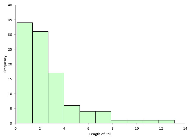
There are 100 points in Table 1. The data was generated by using the random number generator in the SPC for Excel software for the exponential distribution with a scale = 3. This data could represent the time a call takes in a customer call center. You would expect that data to be skewed – lots of calls that don’t take much time and a few that take quite a while. Figure 2 is the histogram based on the data in Table 1.
Figure 2: Initial Histogram
This histogram shows the length of call on the x-axis. It is clearly skewed to the left, with a lot of short calls and then a few long calls. The software determined the number of bars to use in this histogram. There are 10 bars, each about 1.3 in width.
Is it the “right” number of bars to use? Perhaps it is. One thing is very true: the shape of the histogram will change significantly in most cases as you change the number of bars on the histogram or the width of the bar on the histogram. The number of bars and the bar width, of course, are related. You change one and you will change the other.
What is the logic that you should use to determine how many bars to use on a histogram? You don’t want the bars too wide. Then the histogram tells you very little. You don’t want too many bars because then you just have a flat histogram most likely. How do you find that balance to give you the right number of bars?
Impact of the Number of Bars on the Histogram
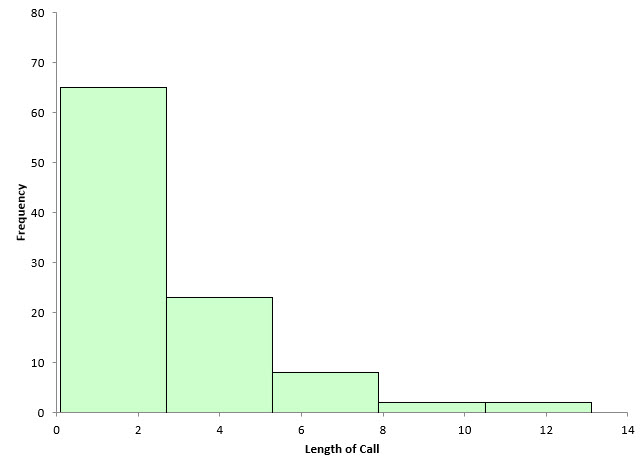
With software, it is easy to change the number of bars on a histogram. For example, with the SPC for Excel software, you can change the number of bars, or you can change the width of the bar and specify the starting point for the histogram. Figure 2 has 10 bars. What happens if there are only five bars? This is shown in Figure 3.
Figure 3: Histogram with 5 Bars
The width of each bar is about 2.6 now. Decreasing the number of bars simply combines the data and makes the frequency of each bar larger. In this example, it appears to mask information the histogram might have. Histograms with only a few bars that are very wide are of limited use in determining what the process is doing.
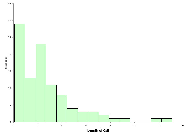
What happens if we increase the number of bars from 10 to 15? This is shown in Figure 4.
Figure 4: Histogram with 15 Bars
The width of each bar is now about 0.85. This histogram begins to show some interesting patterns in the data. There are now two high points in the histogram plus a break in the data around 10.
The number of bars have a big impact on the way a histogram looks and the information that you can obtain from it. Software makes it easy to change the number of bars, but is there any technique that might help determine what the number of bars should be? Yes, there is.
Dot Plot and the Number of Bars on a Histogram
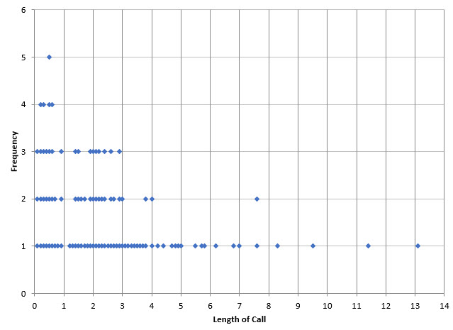
A dot plot is like a histogram. The x-axis is the number scale (length of a call in this case). The dots are arranged to represent the values of the data. One dot is plotted for each point. The dots accumulate in frequency for the same value. The dot plot for the data in Table 1 is shown in Figure 5.
Figure 5: Dot Plot
The dot plot gives some more insights into how the data are distributed. You can see with this plot, there are no times between 10 and 11 or 12 and 13. It also shows the peak in the first minute as well as the grouping in the 2 to 3 minute range. From this chart, it looks like a bar width of 1 might give good information for the histogram.
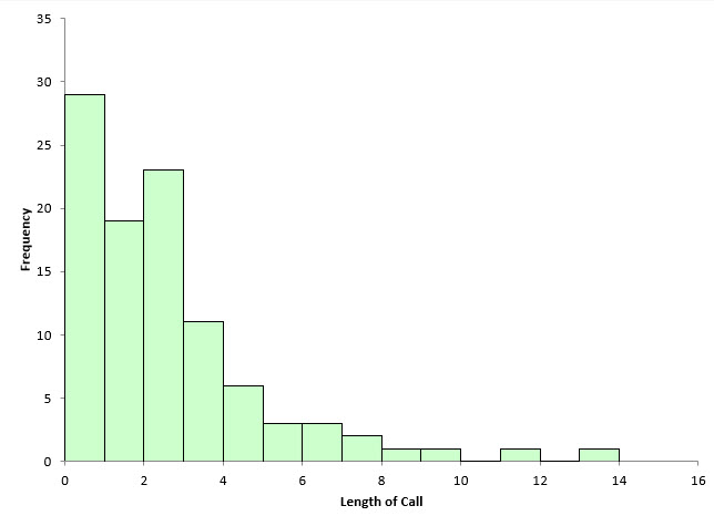
Figure 6 shows the histogram with a bar width of 1.
Figure 6: Histogram with Bar Width of 1
Note that this histogram was set using the bar width of 1 and a starting point of 0. The other histograms were based on the number of bars and started at the minimum value. This histogram gives a lot of information about the process. It is easy to see the two modes as well as the times that have no data. The dot plot helped quickly determine a good bar width to use in the histogram.
Histograms and Statistical Control
Is the data shown in Table 1 and the figures above in statistical control? Histograms do not tell you if a process is in statistical control. To determine that, you must use a control chart that plots the data over time. You can’t determine if a process is in statistical control if the data are not in time-order. With a histogram, the time-order of the data is lost. But what about those two calls that are at the 12 and 14 minute mark? Aren’t they special causes? Maybe, probably. Regardless, you probably would like to know what happened to cause those calls to be so long.
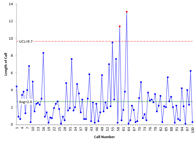
If the data are in time-order, you can do a control chart. The X chart for the individuals control chart is shown in Figure 7 for the data in Table 1.
Figure 7: X Chart
The control chart does confirm that those two points are indeed special causes of variation.
Summary
A good histogram has bars that make the histogram easy to understand. With a good histogram, the bar widths are small enough so that the details of the histogram can be seen, but they are also set so that it is easy to see how the data stacks up over time. The dot plot helps define a useful bar width if you are struggling with that issue. Software also makes it easy to change the bar width or the number of bars on the histogram. Remember, a histogram does not tell you if the process is in statistical control. Only a control chart can do that. But a histogram can show outliers that should be investigated.
