June 2026
 I made my first control chart back in 1982. 44 years later and I still use them. If you are like me and have worked with statistical process control (SPC) for any length of time, you have probably heard statements that sound perfectly reasonable – but just are not true. There are myths about SPC that just don’t seem to want to go away. Some have been around forever; some are newer, but they refuse to die as they are passed from one well-meaning person to another.
These myths lead you to poorer decisions about separating the noise from the signals. You end up making unnecessary adjustments and missing opportunities for improvement.
In this publication, we will examine the following 5 myths about SPC:
- The Only Control Chart You Need is the Individuals Control Chart
- You Only Need Rule #1 to Interpret a Control Chart
- Control Charts Require Normally Distributed Data
- A High Cpk Means the Process Is Under Control
- Out of Control Points Should Always Be Removed
We will introduce each myth and then explain why they are not true. Of course, we will end with our summary and quick links.
Please feel free to leave a comment at the end of this publication. You can download a pdf copy of this publication at this link.
Myth #1: The Only Control Chart You Need is the Individuals Control Chart
This is a relatively new myth. It most likely comes from a misunderstanding of what Dr. Donald Wheeler has said about individuals (X-mR) control charts. First, a few words about Dr. Wheeler. There are none better than him when it comes to SPC and the practical application of statistics. He has written extensively about SPC. You can visit his website here: www.spcpress.com.
Dr. Wheeler has also written about different types of control charts – the advantages and disadvantages of each. I wondered why he would write that much about other control charts if the only one you need is the individuals control chart.
So, I emailed him and asked him if that was true – the individuals control chart is the only one you ever need. Here is part of his response (with his permission to share):
- “I definitely use and recommend average and range charts as appropriate.”
- “While I am the major promoter of the XmR chart, I do use other tools as well.”
It would appear that Dr. Wheeler does not fully agree the individuals control chart is the only control chart you need. Yes, it works in most places – and is the go to control chart if you don’t know what to use. But it is not the only one.
If you have limited data, then your obvious choice is the individuals control chart. But if you have more frequent data, you have the opportunity to use rational subgrouping to explore the variation you are interested in. In that case, the X-R control chart is your best bet. Remember, a control chart is a movie of the variation in your process over time. It matters how you sample the process because that determines the variation you are examining on a control chart.
If you would like to see the entire conversation I had with Dr. Wheeler, please see our SPC Knowledge Base article Two Questions I Asked Dr. Wheeler.
Myth #2: You Only Need Rule #1 to Interpret a Control Chart
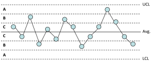
There are a number of rules that can be used to interpret a control chart – to tell if it is in statistical control. These include:
- Rule #1: a special cause of variation exists if there are any points beyond the control limits
- Rule #2 (or Zone A test): a special cause exists if 2 out 3 consecutive points are in Zone A or beyond
- Rule #3 (or Zone B test): a special cause exists if 4 out of 5 consecutive points are in Zone B or beyond.
- Rule #4 (or Zone C test): a special cause of variation exists if 8 or more consecutive points are in Zone C or beyond (a run of 8 or more above or below the average).
Rules 2 to 4 are also collectively called the zones test. They are based on dividing the control chart into 3 equal zones above the average and three equal zones below the average as shown below.
These are the four major rules for detecting special causes of variation. There are others including number of runs test, test for stratification, test for mixtures, test for overcontrolling, and trends up or down tests. You can get more details on these tests with our SPC Knowledge Base article: Control Chart Rules and Interpretation.
Recently I have heard that you only need to consider Rule #1 in interpreting a control chart. Again, this appears to be a misunderstanding with what Dr. Wheeler has said. Since I had heard he was the one who said this, I decided to ask him directly via e-mail again. Here are two quotes from his response:
- “In practice, Rule 1 is often all we need because there are so many signals.”
- “I do recommend turning off the other detection rules in your software, but I also tell my classes to keep those run test rules in their hip pockets, and to pull them out when something looks suspicious. When one of the run tests is satisfied and the run tells a story in the context of the data, you have a license to go looking for an assignable cause.”
It is true that when you first start out using a control chart on a process, there will probably be a significant number of points beyond the control limits. But, hopefully over time, these will decrease and you can use the other tests to begin to find additional special causes.
But enabling every possible rule in your software isn’t always the best approach. Each additional rule increases the likelihood of false alarms. Too many false signals can lead you to investigate problems that don’t exist, wasting time and increasing frustration.
Limiting the number of out of control tests is probably a good idea. As Dr. Wheeler said in this response, rules #1 and #4 were commonly used before software. I think that is still good today.
This is the second question I asked Dr. Wheeler. You can see the entire conversation from the link above.
Myth #3: Control Charts Require Normally Distributed Data
This myth has been around for a long time. In fact, the company that taught me SPC back in the early 1980s, a well-known company, said that control charts required a normal distribution. They taught that the central limit theorem helped make the subgroup averages normally distributed so the control limits would be valid. And that, for an individuals control chart, the data must be normally distributed.
Dr. Wheeler has demonstrated over the years that this is not true. Control limits are very robust to the type of distribution. Dr. Wheeler examined many distributions and showed that each gave very similar results for detecting out of control points when using the individuals control chart. Individuals control charts work regardless of the distribution.
There is a caveat with this from my perspective though. Dr. Wheeler’s analysis focused on the points beyond the control limit. He did not focus on the zones test. These tests do depend more on the type of distribution. Those tests are based on the normal distribution. If you have a highly skewed data set, it will give you more false out of control points with the zone tests. So if you are going to use the zones tests with the individuals control chart, the distribution of data should be, at the least, fairly symmetrical.
Remember – the purpose of a control chart isn’t to estimate probabilities from a distribution—it’s to distinguish common cause variation from special cause variation over time.
Myth #4: A High Cpk Means You Don’t Need to Worry about Control Charts
Capability indices such as Cp and Cpk tell you how well a process fits within specification limits. They do not tell you whether the process is in statistical control. In fact, some say if my Cpk value is large enough, I don’t need to worry about statistical control. Everything is in spec by a wide margin. Why worry?
This is a myth. You do need to worry about the state of process statistical control. Dr. Wheeler has developed four phases of a process based on the following:
- The product is either in or out of specifications
- The process is either in or out of control
You can use the “control” and “specification” categories to create a quadrant as shown below.
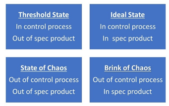
The quadrants were defined by Dr. Wheeler to be the following:
- Ideal State: the process is in statistical control, and the product is within specifications
- Threshold State: the process is in statistical control, and some product is out of specifications
- Brink of Chaos: the process is out of statistical control, and the product is within specifications
- State of Chaos: the process is out of control, and some product is out of specifications
If your process meets specifications, you could be in the Ideal State if the process is in statistical control. But what happens to a process over time that is not being monitored? It begins to deteriorate over time. You aren’t putting in any work to keep the process in statistical control. Over time, the process goes out of statistical control. You move to the Brink of Chaos category. As the process continues to become more out of control, you suddenly find you are making out of specification material and have moved into the State of Chaos.
You need to monitor key processes for statistical control. If not, you may well find yourself in the State of Chaos. For more information on the four process states ,please our SPC Knowledge Base article on Control Limits and Specifications: The Four Process States.
Myth #5: Out of Control Points Should Always Be Removed
This myth says that all out of control points should be removed from the chart and the calculations because this gives a better picture of what the process is capable of doing.
First, you should never remove a point that is on the control chart. It is part of the history of the process. So leave the point alone, no matter how bad it looks on the control chart. Don’t’ worry about deleting it – worry about asking “what happened in the process?”
Removing it from the calculations can be a different story. My rule of thumb is that if you know the reason for the out of control point and have removed it from the process, you can delete it from the calculations. Otherwise, leave it in the calculations.
But when do you stop calculating control limits? What if the baseline has out of control points? If at all possible, you want to continue to collect data until you have at least 20 points in a row that are in control. Then calculate and lock your control limits to judge the process against in the future.
For more information on calculating and locking control limits please see our SPC Knowledge Base article “When to Calculate, Lock, and Recalculate Control Limits.”
Summary
This publication has examined 5 myths about SPC that will not seem to go away. These 5 myths are:
- The Only Control Chart You Need is the Individuals Control Chart
- You Only Need Rule #1 to Interpret a Control Chart
- Control Charts Require Normally Distributed Data
- A High Cpk Means the Process Is Under Control
- Out of Control Points Should
Each myth was discussed. It was explained why each is not true.