May 2017
(Note: all the previous SPC Knowledge Base in the control charts basics category are listed on the right-hand side. Select this link for information on the SPC for Excel software.)
For some time, I believed the following was the approach to take. If I had skewed data, I would subgroup it – with little regard to how the subgroups were formed. Then I could place the data on a X-R control chart. I definitely made one mistake in doing this. That mistake was that my objective was to make a control chart for my process – not to control my process or to learn something about my process. There was no rational approach to the subgrouping I used. Just used enough data so the subgroup averages looked normally distributed.
So, it sounds like data needs to be normally distributed to go on a control chart. Right? And if you don’t have normally distributed data, then form subgroups so that the subgroup averages are normally distributed (the central limit theorem at work) so the control chart will work. Right? In addition, the three sigma limits are based on the normal distribution. Right? No, wrong in all three cases. But the shape of the distribution does make a difference in what out of control tests you may want to apply.
This month’s publication examines the relationship between control charts, the central limit theorem, three sigma limits, and the shape of the distribution.
You may download a pdf version of this publication at this link. Please fee free to leave a comment at the end of the publication.
In this issue:
- Introduction
- Central Limit Theorem
- Subgroup Averages and the Central Limit Theorem
- Subgroup Ranges and the Central Limit Theorem
- Three Sigma Limits
- Impact on Interpreting the Control Chart
- Summary
- Quick Links
Introduction
You never stop learning. That includes about control charts – something that has been around for years and years. I had my initial training and read many books on statistical process control (SPC). Then I ran across the works of Dr. Donald Wheeler (www.spcpress.com). I first saw Dr. Wheeler in one of Dr. W. Edwards Deming’s seminars around 1984. Dr. Wheeler was one of Dr. Deming’s masters – the ones we are supposed to learn from.
Over the years, the writings of Dr. Wheeler have given me many additional insights into the world of SPC. Dr. Wheeler is very clear that it is a myth that control charts work because of the central limit theorem. We will examine his reasoning on this. While he is correct about it being a myth, it does matter what the underlying distribution is when you apply out of control tests besides points beyond the control limits.
Central Limit Theorem
The central limit theorem can be stated as:
Regardless of the shape of the distribution, the distribution of average values (X) of subgroups of size n drawn from that population will tend towards a normal distribution as n becomes large.
The standard deviation of the distribution of subgroup averages (σX) is equal to the standard deviation of individual values (σ) divided by the square root of the subgroup size (n):
σX=σ/√n
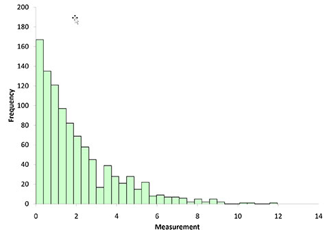
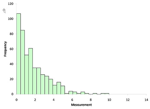
We will use a randomly generated distribution to take a look at control charts and the central limit theorem. Our population is 1000 points randomly generated from an exponential distribution with a scale of 2. Figure 1 is a histogram of that distribution. We call this our population since it represents all possible outcomes from our process.
Figure 1: Histogram of 1000 Individual Data Points (Population)
You definitely would not consider Figure 1 to be normally distributed. Do we need to subgroup the data before we put these data on a control chart? Maybe and maybe not. It depends what you are trying to accomplish.
But we will begin by investigating the impact of subgrouping the data on the distribution of the subgrouped data, starting with subgroup averages.
Subgroup Averages and the Central Limit Theorem
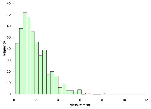
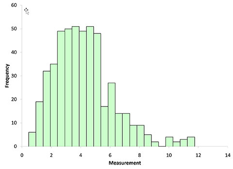
Subgroup sizes of 2, 5 and 10 were used in this analysis. 500 subgroups were formed randomly from our population and the subgroup averages calculated. Figure 2 shows the distribution of subgroup averages when n = 2.
Figure 2: Subgroup Averages Histogram for n = 2
You can start to see the impact of the subgrouping. The histogram is not as wide and looks more “normally” distributed than Figure 1. Figure 3 shows the histogram for subgroup averages when n = 5.
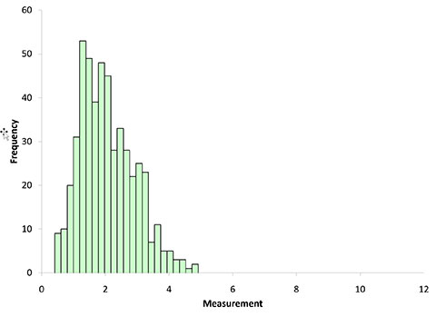
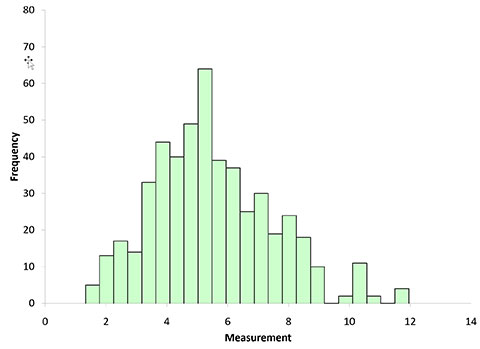
Figure 3: Subgroup Averages Histogram for n = 5
Figure 3 is even more narrow and it looks more normally distributed. Figure 4 shows the histogram for the subgroup averages when n = 10.
Figure 4: Subgroup Averages Histogram for n = 10
Figures 2 through 4 show, that as n increases, the distribution become narrower and more bell-shaped -just as the central limit theorem says.
This knowledge is used in many statistical techniques. For example, if your subgroup size is large enough, you can reasonably assume that the subgroup averages are normally distributed and use the normal distribution to construct a confidence interval about a subgroup average.
What about charting the data from Figures 1 through 4 on a control chart? What would be the differences you see? Figure 1 is definitely skewed. There would be more points below the average on that control chart than on the control charts for the subgroup averages shown in Figures 2 to 4. Does it matter on a control chart if the data are not symmetrical about the average? What do you think? It does have an impact if you choose to use certain rules for out of control points as we will see.
But what about subgroup ranges? What impact does the central limit theorem have on these?
Subgroup Ranges and the Central Limit Theorem
When the subgroup averages were calculated as described above, the subgroup ranges were also calculated. The histograms for these are shown in Figures 5 to 7. What do you see as you look at these three figures?
Figure 5: Subgroup Ranges with n = 2
Figure 6: Subgroup Ranges with n = 5
Figure 7: Subgroup Ranges with n = 10
They don’t seem to be behaving like subgroup averages. They don’t seem to be forming a normal distribution that is tighter than the original data as the subgroup size increases. So, what does this mean to us? It means that the central limit theorem does not hold for subgroup ranges.
And this is the point that Dr. Wheeler makes: “If the central limit theorem was the foundation for control charts, then the range chart would not work.” Pure and simple. He has shown that it is a myth that control charts work because of the central limit theorem.
Part of the confusion comes it seems from how control limits are set. It is easy to see the familiar normal distribution with 99.73% of the data within ± three sigma of the average. The control limits sit right at ± three sigma marks. And how many times have we seen a normal curve superimposed on a control chart? So, it is easy to believe that data should be normally distributed to be put on a control chart. But that is not true. Three sigma limits were not chosen because the data were normally distributed.
Three Sigma Limits
Walter Shewhart, the father of SPC, used three sigma limits for control charts. But it was not because of the central limit theorem and the data being normally distributed. It was because that ± three sigma will contain the vast majority of the data regardless of the shape of the population’s distribution. And the three sigma limits represented a good economic trade-off when looking for special causes. The exponential distribution in Figure 1 only has 17 points out of 1000 beyond three standard deviations. Table 1 summaries that the percentage of points that are beyond the three-sigma limits for each of the histograms of subgroup averages above.
Table 1: % of Points Beyond the Three-Sigma Limits
| Subgroup Size (n) | Subgroup Averages Histogram | Subgroup Range Histogram |
| 2 | 1.4% | 1.4% |
| 5 | 0.6% | 1.4% |
| 10 | 0.6% | 0.8% |
Dr. Wheeler’s point is that there is a small chance of a false alarm – a control chart showing that there is a special cause because a point is beyond the control limits when it is actually due to common causes – if you use three sigma limits – regardless of the underlying distribution. But this applies to points beyond the control limits only. What about false alarms with the other out of control tests? Does the underlying distribution matter for the zones tests, for example?
Impact on Interpreting the Control Chart
The Western Electric rules involve dividing a control chart into zones and applying certain tests to those zones. These rules are covered in several of our earlier publications. For example, 2 out of 3 consecutive points in Zone A or beyond is an out of control situation. Or 8 points in a row on one side of the average is an out of control situation. Does the underlying distribution make a difference for these types of rules? The answer is yes, it does.
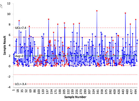
These tests are built around having a somewhat symmetrical distribution with about half the points above the average and half below the average. Figure 1 is not symmetrical. In fact, almost 63% of the points lie below the average. This means there is an increased likelihood that there will be more runs below the average than above the average. If your data are not somewhat symmetrical, be careful about applying the zone tests. Figure 8 shows the individuals chart (X) for the first 500 points from the exponential distribution shown in Figure 1. The red points represent out of control points from the zone tests. You can see how many there are below the average. These are not due to special causes but to the distribution of the data.
Figure 8: Individuals Control Chart
For an more in-depth discussion of control charts and non-normal data, please see our June 2014 publication.
Summary
This publication has examined the impact of the central limit theorem on control charts. It is myth that control charts work because of the central limit. Dr. Wheeler showed that very clearly since the central limit theorem does not work with the range chart. Part of the confusion is over the issue of three sigma limits. They were not chosen because of the normal distribution, but because, regardless of the distribution, most of the points lie within ± three standard deviations of the average. But the shape of the distribution does make a difference in what out of control tests you apply. You should use care in applying the zones tests if the data you are plotting is heavily skewed. You may get false alarms.

HELPFULL &USEFULL THANKS & REGARDS
As we increase the number of detection rules we increase the sensitivity of the chart to detect process changes. But, we also risk an increased false alarm rate. While Rule 1, a point beyond 3-sigma, will always be applied your article lends to two questions:- Which (other) detection rules to use given skewed data?- What justifies the choice?With detection rules specified in advance of the analysis we have an operational definition of a special cause. Will you cover this in a future article? Your last sentence in the article raises awareness in the user, but doesn't necessarily guide the user to an effective course of action (which detection rules to use) given this increased level of awareness.Thanks for the article and looking forward to hearing your response.Scott.
The main thing is to be aware. I imagine you could, for a set distribution, do the calculations to figure out the probabilities of the various tests for that distribution and adjust them accordingly. But more work than it is worth. The key thing to me is that the data are plotted over time and you are asking the question what does this chart tell me about my process. If i have heavily skewed data, i would probably just use points beyond the control limits and watch for "long" runs below or above the average. What is "long"? Depends on your process. You know your process. But for non-normal processes, points beyond the control limits is the only for sure test I would use.
liked very much your article and there are a couple of points that come to my mind. Your problem is how to solve the process summarised in graph 1. I do not want to think that the statistician /engineer /administrator etc. in charge of analizing your process drew graph 1 with an absolute lack of knowledge of the process itself. Results are what they really are. Subgrouping is a well known refuge technique that I compare to "moving averages" in order to provide an answer of the type "in the long run your results are…" BUT you might crash tomorrow. Still your problem is that you have a graph 1 like process. What to do? Probably re-assesing the whole lot of the process and avoid hiding behind statistical/arithmetical techniques and still crash at the end of the day with all your staistical magic. Dr. Wheeler gets nicely in the "why's" the reacomodation will not work but to my way of thinking the problem is still the same: Graph 1: it is like cancer: if somebody is sick of cancer, a new subgrouping or other techniques will not solve it: it is cancer. I do not see any other solution but revising completely the process: do you? Thanks for reading me, regards Guillermo
Changing the process is definitely one thing to do, but there are naturally occurring skewed processes. The question is how do you deal with skewed distribution? Subgrouping is one approach.
Hi Bill,Did you know that British SPC (as espoused by John Oakland) had redone Range charts to try to make them work better? That's right, no fake symmetric ±3 sigma limits on Range or StDev charts for the British. Their constants draw lines at reasonable 0.1% tails based on a proper Chi-Square distribution for ideal normally distributed data. Guess they were tired of getting 0.92% false positives above the UCL on their simulated Moving Range charts, instead of the ideal 0.135%, so they fixed it.
Was not aware of that. I will take a look at his work. In the simulation used for the newsletter, the range chart had many false signals for the ideal random sampling.
Maybe a mention of Chebyshev’s inequality? At least 89% of data in any unimodal distribution must fall will 3 standard deviations.Some place in the archives of the DEN (Deming Electronic Network defunct for a while) there was a discussion about this.
Good point. Here is a link that decribes it: https://www.thoughtco.com/chebyshevs-inequality-3126547
Though normal distribution is not a prerequisite for control chart but suppose there is a process and its historical data show that this specific process had followed a normal distribution over several years. Now, instead of sampling, we run the system for 3 shifts and produce 50 consecutive parts, and then measure required characteristic and check the probability plot. P value is less than 0.05 and box plot also shows an outlier. Can it be concluded that there is (at least) a special cause for this system? Any advice would be appreciated.
50 points may not be enough to determine if data are normally distributed, particularly if you take then consecutively in a short period of time. You know your process – has anything you know of changed? I would not conclude that there is an issue based on 50 consecutive samples. Have you done a control before and after?
I'm confused. You state that the Range Charts for the differing sample sizes "<em>don’t seem to be behaving like subgroup averages. They don’t seem to be forming a normal distribution that is tighter than the original data as the subgroup size increases</em>"I'm looking at the graphs you provided and they sure seem, to me, to behave just like the averages. The distribution may not be as tight as the average charts, but they sure look to me like they're moving to normality.
Subgroup averages tend to form a normal distribution very quickly as subgroup size increases. All the data are used to calculate the average. Ranges, regardless of subgroup size, use two numbers- the max and the min. The range and averages chart do not look the same as the subgroup size increases.