August 2019
(Note: all the previous SPC Knowledge Base in the control charts basics category are listed on the right-hand side. Select this link for information on the SPC for Excel software.)
So, this months’ publication describes ten ways you can mess up control charts – and then reach the opinion they don’t work. In this issue:
- Purpose of Control Charts
- How to Mess Up Control Charts
- Too Many Control Charts
- Too Many Data Points on a Control Chart
- Too Many Out of Control Tests
- Not Understanding the Purpose of a Control Chart
- Not Charting Important Things – the Key Process Characteristics
- Using Specifications as Control Limits
- Not Using Baseline Data to Set Control Limits for the Future
- Not Understanding a Control Chart Compares the Within Subgroup Variation to the Between Subgroup Variation
- Not Understanding Rational Subgrouping
- Not Using the Moving Range Chart Effectively
- Using the Wrong Control Chart
- Summary
- SPC for Excel Version 6 is Now Available
- Quick Links
Please feel free to leave a comment at the end of this publication. You can also download a copy of this publication at this link.
Purpose of Control Charts
Control charts have different purposes. Some of the purposes of a control chart are:
- To monitor a process for those special causes of variation that can occur and remove them, so they don’t occur again.
- To estimate the process average.
- To estimate the variation (the spread in the histogram).
- To judge the impact of process improvement efforts.
Control charts give you insights into your process. When used properly, those insights will help you improve your process.
How to Mess Up Control Charts
Of course, there are things that can go wrong that mess up using a control chart effectively. I don’t believe people do these things intentionally. They just don’t understand sometimes. Dr. W. Edward Deming said something along the lines of doing your best is not good enough anymore, you must know what to do. That is true of using control charts.
So, below we present some ways to mess up the use of control charts. We will start with the “too many” reasons.
Too Many Control Charts

How many control charts should be in use at any one time? Of course, it depends on the situation, but the reality is not very many. For example, suppose you are in charge of a maintenance department. You can plot many things in a maintenance department. The key is deciding which characteristics are most important. And that is where you start.
For example, you might decide the two most important metrics are % downtime due to maintenance and the time for maintenance to respond to a problem. You have two charts then for a whole department. Of course, you will need some supporting tools like a Pareto diagram on reasons for downtime.
So, limit the number of control charts. A bulletin board full of control charts is seldom a sign of effective use of control charts.
Too Many Data Points on a Control Chart
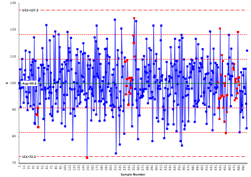
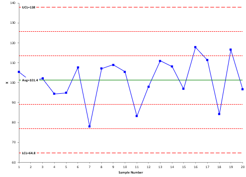
This was not a problem in the old “manual” control chart days. In that PVC plant, we had control charts blown up on 11 x 17 sheets of paper where the data could be recorded, calculations done, and charts updated. We typically had 25 points on each sheet of paper. Enter computers and software. Software today can plot thousands and thousands of points on a chart. Why you want that many is beyond me, but the software can do it. Below are two examples of control charts – one with 20 points and one with 400 points. Which is more useful?
There is nothing wrong with basing your average and control limits on a large data sample – just use a software that gives you an option of showing just the last twenty points or so.
Too Many Out of Control Tests

- Points beyond the control limits
- Zone A Test
- Zone B Test
- Zone C Test
- Test for Stratification
- Test for Mixtures
- Test for Overcontrol
- Rule of Seven Tests
The more tests you apply, the more possibility you have for out of control points – which take time to investigate. You should never start a control chart with all the out of control tests. Being in control is not the natural state. It takes work to get there. Start with the basic tests (e.g., points beyond the control limits) and then slowly add other tests as your process becomes more stable by the removal of special causes.
For more information on out of control tests, please see our SPC Knowledge Base article Applying the Out of Control Tests. This is one of several articles we have on interpreting control charts and the out of control test.
Not Understanding the Purpose of a Control Chart
Every control chart should have a stated purpose. Why are we charting this variable? And that purpose needs to be communicated to everyone. For example, you might want to monitor a variable for a few weeks due to recent problems. That purpose is different from monitoring a variable that is key to a customer and required for process capability calculations. Far too often, people do not understand the purpose of a control chart – and you can’t contribute to making something successful without knowing the purpose.
Not Charting Important Things – the Key Process Characteristics
Control charts take time to use effectively. You should always use a control chart to monitor the key characteristics in your process. This is one area where leadership fails to lead – they don’t use control charts to monitor their key process characteristics. They use things like dashboards which give you no information about the underlying process – only if you made or missed a target or were better or worse than last month.
Using Specifications as Control Limits
Specifications are not control limits – and control limits are not specifications. They are NOT interchangeable. Specifications come from a source external to the process. Customers often have specifications. Management often has targets. Specifications are placed on a process by an external source. Control limits are not determined by anyone – they are determined by the process itself and how we sample that process. I had different managers say to me that the control limits are too wide, change them. Sorry, that is not how it works.
The process defines its own limits. That is the reason we can use the out of control tests to look for special causes of variation. Just because a point is beyond the specification limit does not mean it is caused by a special cause of variation. But our specification view of the world almost reinforces this approach. Never use specification limits as control limits. The control chart will not work as it is supposed to then.
Not Using Baseline Data to Set Control Limits for the Future
One purpose of a control chart is to send a signal when something has changed. For example, a signal could be a run above the average. To be effective, you need the baseline data. This should be a period of time when the process has been stable. The averages and control limits are then calculated based on that baseline data and extended into the future. Future performance is then compared to the baseline control limits. Far too often, people simply recalculate the control limits anytime new data is added. I say people – it is actually the software nowadays. Be sure to understand how your software works and learn how to lock the control limits for the baseline period.
For more information on setting baseline data, please see our SPC Knowledge Base articles When to Calculate, Lock, and Recalculate Control Limits and The Difficulty of Setting Baseline Data for Control Charts.
Not Understanding a Control Chart Compares the Within Subgroup Variation to the Between Subgroup Variation
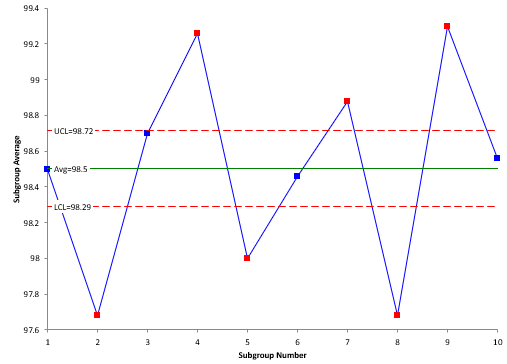
Have you ever seen a control chart like the one below? People have shown me this control chart and then say the control chart doesn’t work – everything is out of control.
The issue is that the person putting the control chart together doesn’t understand how a control chart works. You get the pattern above sometimes with the X-R chart. This type of chart compares the within subgroup variation (from the range chart) with the between subgroup variation (from the X chart). If those two are the same, the process will be in statistical control. Sometimes though, there is no reason to expect this to be true.
For example, you make material in batches. You sample a batch four times and form a subgroup from that sample. You do that for every batch. Sometimes in this situation, it is not reasonable to expect the within batch variation to be the same as the between batch variation. Often, the within batch variation is much, much smaller than the between batch variation. If this is true, you will get the control chart with the tight control limits shown above. There is a way around this. Use the X-mR-R chart. This is three charts: the range chart to monitor the within subgroup variation, the moving range to measure the range between batch averages, and the X chart to monitor the batch averages (as individual values).
For more information, please see our SPC Knowledge Base article X-mR-R (Between/Within) Control Chart.
Not Understanding Rational Subgrouping

For example, you might decide to weigh the first five bags of sand produced each hour and form your subgroups. Or you might decide to weigh one every 10 minutes and form a subgroup using the six samples from the hour. The different sampling procedures will produce different control charts. It is important to give thought about how you form your subgroups and be sure you are studying the variation you want to be studying.
We have four articles on rational subgrouping in our SPC Knowledge Base.
Not Using the Moving Range Chart Effectively
Sometimes the moving range chart is not used effectively or not at all. One of the things missed most often is when there are too few possible values for a moving range. For example, sometimes a moving range may have only four or fewer values. Dr. Donald Wheeler calls this “chunky” data. Chunky data occurs when the range between possible values becomes too large. The example Dr. Wheeler cites is measuring a person’s height to the nearest yard. This measurement is too large and would obscure the variation in height from person to person. Excessive round-off will lead to chunky data. It can also occur when the measurement process cannot tell the difference between samples. In this case, the measurement unit is too large (as in the case of measuring a person’s height to the nearest yard). Chunky data often leads to the incorrect interpretation of the X chart. Chunky data can also occur with the X-R control chart.
For more information on chunky data please see our SPC Knowledge Base article Chunky Data and Control Charts.
Using the Wrong Control Chart
This is an issue – but not necessarily a big issue. Even if you use the wrong control chart, you will probably learn something about your process just by plotting the data over time. Using the wrong control chart usually is with attributes data and the corresponding control charts: p, np, c and u. These control charts assume that you have a certain distribution (p and np assume a binomial distribution; c and u assume a Poisson distribution). The conditions for these are rarely satisfied and can lead to incorrect signals from the control charts. The key here is to understand when these type of control charts can be used. If you are not sure, you can always go with the individuals control chart (X-mR).
Our SPC Knowledge Base article, An Example of the Misuse of SPC in the Health Care System gives an example of what can happen when you use the wrong control chart.
Summary
Control charts work. That has been proven time and time again for years. Yet, using control charts effectively is not always easy. This publication examined 10 ways we can mess up using control charts effectively. Avoiding these pitfalls will help make the use of control charts more effective. As of the August 2019, we have 66 publications on control charts in our SPC Knowledge Base – a wealth of free knowledge for you about control charts.
SPC for Excel Version 6 is Now Available

