December 2017
(Note: all the previous SPC Knowledge Base in the control charts basics category are listed on the right-hand side. Select this link for information on the SPC for Excel software.)

Variation – quite often you don’t know what causes it in your process. You make a product. You sample the process on a regular basis and test the product for one or more quality characteristics. You want to be sure that the product is OK – whatever that means to you. What are the sources of variation present in the sample you take? There are three major sources of variation: the measurement system, the sampling method, and the product itself. We often don’t consider the sampling method. In fact, in many cases, the variability due to sampling is very small. But not always.
Now suppose one of those quality characteristics has too much variability. Maybe it is not capable of meeting specifications. Where is most of the variation coming from? Answering that question is a good place to start. This publication presents a method of determining whether the product, the sampling methodology or the measurement system is causing the most variation in a quality characteristic. This allows you, at least, to determine where to start on your efforts of reducing variability.
To do this, you can run experiments to help determine which variation is causing you the most problems. Experiments are often analyzed using Analysis of Variance (ANOVA). This type of analysis helps determine which sources of variation have a significant impact on the quality characteristic. Let’s not forget about control charts though. Control charts help you “see” what is going on in a process – and often can be used with ANOVA to gain more insight into the process.
In this issue:
Please feel free to leave a comment at the end of the publication. You can download a pdf copy of this publication at this link.
Our Process
Our process is a batch process where the quality characteristic of interest is the moisture content of a pigment paste. The data are taken from Statistics for Experimenters by Box, Hunter, and Hunter. A batch of material is produced, the material is sampled, and taken to the lab to measure the moisture content. Sometimes the moisture content is “good” – meaning within specifications. Sometimes the moisture content is “bad” – meaning it is out of specifications. Your boss has given you the task of decreasing the variation in this process so that no material is out of specifications.
Where do you start? One place that you could start is to define how much variation is due to the three major sources of variation in each sample taken:
- Batch to batch variation
- Variation due to sampling
- Variation due to the measurement system
The first step is to define an experiment that will give you the information about the variation in the three sources above. This is remarkably similar to setting up a control chart and using rational subgrouping to explore the variation of interest to you. You decide to use a nested experimental design to find out the information you need. The design is shown in Figure 1 for 3 batches.
Figure 1: Nested Experimental Design
In this design, a batch of material is produced. Each batch is then independently sampled twice. Each sample is then thoroughly mixed and split into two subsamples. Each subsample is then submitted to the lab to test for moisture content. This process is repeated for 15 batches. This represents a total of 60 subsamples (15 batches x 2 samples per batch x 2 subsamples per sample).
The results for the moisture content are given in Table 1. Batch 1 has two samples: 1 and 2. Sample 1 is thoroughly mixed and split in half and tested twice. The results are 40 and 39. What are the sources of variation in these two results? It is the same batch. It is the same sample. The only difference is the measurement system. The difference in these two test results reflects the variability in the measurement system. There are 30 such samples. We have 30 estimates of the measurement system variability. This design is setup to allow us to estimate the measurement system contribution to the total variance – one of the three sources of variation we are studying.
Table 1: Data from Nested Experimental Design
| Batch | Sample | Test Result 1 | Test Result 2 |
|---|---|---|---|
| 1 | 1 | 40 | 39 |
| 2 | 30 | 30 | |
| 2 | 3 | 26 | 28 |
| 4 | 25 | 26 | |
| 3 | 5 | 29 | 28 |
| 6 | 14 | 15 | |
| 4 | 7 | 30 | 31 |
| 8 | 24 | 24 | |
| 5 | 9 | 19 | 20 |
| 10 | 17 | 17 | |
| 6 | 11 | 33 | 32 |
| 12 | 26 | 24 | |
| 7 | 13 | 23 | 24 |
| 14 | 32 | 33 | |
| 8 | 15 | 34 | 34 |
| 16 | 29 | 29 | |
| 9 | 17 | 27 | 27 |
| 18 | 31 | 31 | |
| 10 | 19 | 13 | 16 |
| 20 | 27 | 24 | |
| 11 | 21 | 25 | 23 |
| 22 | 25 | 27 | |
| 12 | 23 | 29 | 29 |
| 24 | 31 | 32 | |
| 13 | 25 | 19 | 20 |
| 26 | 29 | 30 | |
| 14 | 27 | 23 | 24 |
| 28 | 25 | 25 | |
| 15 | 29 | 39 | 37 |
| 30 | 26 | 28 |
Sample 1 has an average of 39.5. Sample 2, also from Batch 1, has test results of 30 and 30 for an average of 30. What are the sources of variability in the two samples? The batch is the same, so this is not a source of variation. There are two sources of variability accounting for differences in sample results: sampling and measurement system. The sampling variability includes two of the three sources of variation we are studying.
Batch 1 has an overall average of 34.75. Batch 2 has an average of 26.25. What sources of variation cause these numbers to be different? The batches are different so that is a source of variation. Also, the sampling and measurement sources of variation are present. The batch-to-batch variability includes all three sources of variation.
We will analyze the results using ANOVA and then control charts to see what information comes from the two different analysis procedures.
ANOVA Approach
The data for moisture content in Table 1 were analyzed using the ANOVA portion of the SPC for Excel software. The moisture content is the “response variable” we are interested in. If you want more information on ANOVA, you can access our publication on single factor ANOVA in our SPC Knowledge Base. This will give you a general idea of how ANOVA works. The ANOVA results for the data in Table 1 is shown in Table 2.
Table 2: ANOVA Results for Nested Experimental Design
| Source | Sum of Squares | Degrees of Freedom | Mean Square | F | p Value |
| B | 1210.9 | 14 | 86.50 | 1.492 | 0.2256 |
| S(B) | 869.8 | 15 | 57.98 | 63.255 | 0.0000 |
| Within | 27.50 | 30 | 0.917 | ||
| Total | 2108.2 | 59 |
This table is composed of the following columns:
- Source: this lists the sources of variation in the design; batch -B, sampling nested within a batch – S(B), and the within variation (measurement system variability).
- Sum of Squares: this represents a measure of variation from the mean; it is calculated by summing the squares of the deviation from the mean; it is a measure of the total variation caused by the source.
- Degrees of Freedom: this is the number of independent pieces of information that went into calculating the sum of squares.
- Mean Square: this is determined by dividing the sum of squares by the degrees of freedom; this allows you to compare the various sources for their impact on variation.
- F Value: this is a ratio of mean squares; this is the value that is used to determine if the source of variation has a significant impact on the response variable.
- p-value: this is the probability of getting the F value if the source of variation has no impact; typically, if the p-value is less than 0.05, the source has a statistically significant effect on the response variable.
You can determine the variance due to batches, sampling and the measurement system from the data in Table 2. The calculations of the individual variances are based on the expected mean squares (EMS) shown in Table 3. The EMS is the value the mean square in Table 2 is estimating.
Table 3: Variances
| Source | Variance | % of Total | Standard Deviation | EMS |
| B | 7.128 | 19.5% | 2.670 | σ2+2σ2S(B)+4σ2B |
| S(B) | 28.53 | 78.0% | 5.342 | σ2+2σ2S(B) |
| Within | 0.917 | 2.5% | 0.957 | σ2 |
| Total | 36.58 | 100.0% | 6.048 |
The within variance is the variance of the measurement system. It is denoted by σ2. Remember the discussion of the data in Table 1 above. The only source of variation in the two test results is the measurement system variability. The variance of the measurement system is 0.917.
The sampling variance is written as σ2S(B). The value in Table 3 for the sample variance is 28.53. This is calculated using the EMS for S(B):
EMS for S(B) =σ2+2σ2S(B)
Remember that in our discussion of the data in Table 1, we said that the differences in two samples included both the sampling variability and the measurement variability. Both are included in the EMS for S(B).
From Table 2, the mean square of S(B) is 57.98. Thus:
57.98 =σ2+2σ2S(B)
Solving forσ2S(B)gives:
σ2S(B)= (57.98 -σ2)/2 = 28.53
The variation for the batch results can be determined in an equivalent manner. Note all three sources of variation are present in the EMS for batch variability. Table 3 also includes the % of total variance attributed to each source. It shows that the sampling variance accounts for 78% of the total variance. You should begin working on determining why the sample process is generating this much variation between samples.
Control Chart Approach
Now let’s look at the control chart results. We will “roll-up” the control charts starting with the subsample results and moving to the batch average results. Take a look at Table 1. What are the sources of variation between Test Result 1 and Test Result 2 for Batch 1 and Sample 1? Remember, sample 1 was thoroughly mixed and divided into two parts – which we assume are essentially the “same.” The only source of variation between these two results is the measurement system. If it was perfect, the results would be the same. But, of course, no measurement system is perfect. The difference between running the two subsamples for each sample is a measure of the variation in the measurement system.
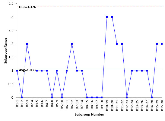
We can analyze the results using a X-R control chart using a subgroup size of 2 based on the results for running the two subsamples. The range control chart tracks the measurement system variation while the X chart looks at significant differences in the sample average from sample average to sample average.
Figure 2 is the range control chart based on the subsamples. The first subgroup is B1-1. This the first batch and the first sample, which was divided in half to create the subsamples. The range between test results are plotted on the range control chart. B1-1 had a range of 1. B1-2 had a range of 0.
Figure 2: Range Control Chart for Samples
The range chart is in statistical control. This means that the measurement system is repeatable; i.e., the lab test results are consistent and predictable. If we repeat the experimental design, we should get comparable results. There are no special causes present in the lab test results. This gives us additional information that ANOVA did not.
Since the range control chart is in statistical control, the measurement standard deviation can be estimated from the average range using:
σ=R/d2=R/1.128 = 1.033/1.128 = 0.916
d2 is a control chart constant that depends on subgroup size. For a subgroup size of 2, d2 = 1.128. The variance of the measurement system is the square of the standard deviation:
σ2 = 0.84
This corresponds to a value of 0.917 found using ANOVA. The values are similar, but the control chart method let you know that the measurement system was repeatable and in statistical control during the experimental runs. It should be noted that the range control chart does not have very many possible values – only four. This is borderline to being what Dr. Donald Wheeler calls chunky data. This means that the measurement system may need to be improved.
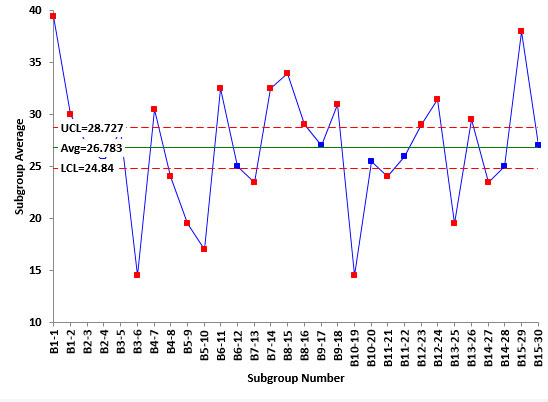
Figure 3 is the Xchart for the data. Each average plotted represents the average of the two subsamples for a sample. Most of the points in Figure 3 are beyond the control limits. This is good when looking at measurements systems. It means that the measurement system can tell the difference between samples. This is because the average range above, based on the measurement system, is used to determine the control limits on theXchart. There is a wealth of information on measurement systems analysis in our SPC Knowledge Base if you would like to explore this further.
Figure 3:XChart for Measurement System
Now we are ready to roll-up the results to the sample averages with each batch. For batch 1, there were two samples taken. Sample 1 had results of 40 and 39 for an average of 39.5. Sample 2 had results of 30 and 30 for an average of 30. What are the sources of variation in the two averages of 39.5 and 30? Since there are two samples, sampling is a source of variation. Of course, the variation due to the measurement system is also present.
We can look at the sample control charts by taking these two sample averages and forming a subgroup for batch 1. Table 4 shows the data used to look at sampling.
Table 4: Sampling Data
| Subgroup Number | Sample 1 | Sample 2 |
| B1 | 39.5 | 30 |
| B2 | 27 | 25.5 |
| B3 | 28.5 | 14.5 |
| B4 | 30.5 | 24 |
| B5 | 19.5 | 17 |
| B6 | 32.5 | 25 |
| B7 | 23.5 | 32.5 |
| B8 | 34 | 29 |
| B9 | 27 | 31 |
| B10 | 14.5 | 25.5 |
| B11 | 24 | 26 |
| B12 | 29 | 31.5 |
| B13 | 19.5 | 29.5 |
| B14 | 23.5 | 25 |
| B15 | 38 | 27 |
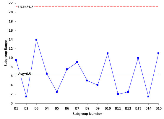
Figure 4 shows the range control chart for the sample data. We will not show the Xchart but it is in statistical control. The first point is the range of the two samples for Batch 1. This range is 39.5 – 30 = 9.5. The second point is the range of the two samples for Batch 2. This range is 27 – 25.5 = 1.5.The range control chart in Figure 4 is in statistical control. This means that the sampling process (along with the measurement system) was consistent over time. We can expect comparable results if we repeat the design again.
Figure 4: Range Control Chart for Sampling
Sigma can now be estimated from the average range as done before.
Sigma from Sampling Range Chart =R/d2=R/1.128= 6.5/1.128 = 5.76
The square of this is the sampling variance (Vs). Thus, Vs = 33.18. Remember, this variance contains two sources of variation: sampling and the measurement system. The equation below shows how the two sources of variation add up to Vs. The divisor 2 is based on the number of test results for each sample.
Vs=σ2S+σ2/2
Solving for σ2Sgives:
σ2S= Vs-σ2/2 = 33.18 – 0.84/2 = 32.76
This corresponds to a value of 28.53 from the ANOVA analysis.
The last thing to estimate is the batch-to-batch variability. This is done by constructing an individuals control chart for the batch averages (the average of the two samples per batch). The data used are shown in Table 5.
Table 5: Batch Averages Data
|
SubgroupNumber |
BatchAverage |
| B1 | 34.75 |
| B2 | 26.25 |
| B3 | 21.5 |
| B4 | 27.25 |
| B5 | 18.25 |
| B6 | 28.75 |
| B7 | 28 |
| B8 | 31.5 |
| B9 | 29 |
| B10 | 20 |
| B11 | 25 |
| B12 | 30.25 |
| B13 | 24.5 |
| B14 | 24.25 |
| B15 | 32.5 |
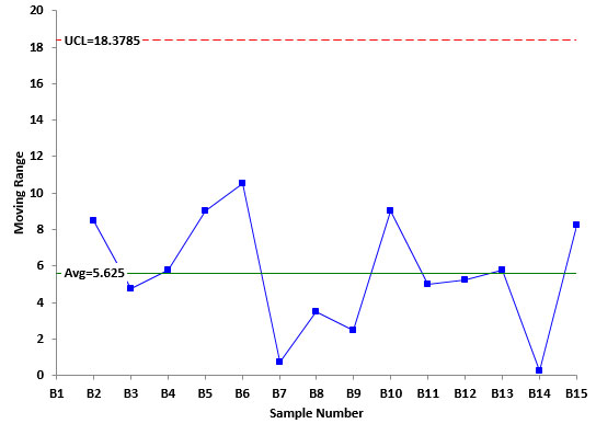
Figure 5 is a plot of the moving range between the batch averages. This range control chart is in statistical control. Again, we will not include the X control chart but it is in statistical control as well. There is no evidence of special cause of variation during the experimental design. We can expect to get similar results again in the future.
Figure 5: Moving Range Between Batch Averages
The sources of variation include the batch-to-batch variability, the sampling, and the measurement system. Sigma for this range chart can be estimated as the following:
Sigma for Moving Range Between Batches =R/1.128= 5.625/1.128 = 4.99
The square of this is the variance (Vb). Thus, Vb = 24.9. Again, this contains the three sources of variation: batch to batch, sampling and measurement system as shown in the equation below.
Vb=σ2B+ 2σs2/2 +σ2/4
The divisor 2 represents the two samples per batch; the divisor 4 represents the four test results per batch.
Solving forσ2B gives:
σ2B= Vb-2σs2/2 -σ2/4 = 24.9 – 32.76/2 – .84/4 = 8.31
This corresponds to the value of 7.128 found with ANOVA.
Comparing the Approaches
Table 6 compares the results from the two approaches.
Table 6: Comparison of Control Chart and ANOVA Results
| Variance form the Average Range | % of Total Variance | Variance from ANOVA | % of Total Variance | |
| MS | 0.84 | 2.0% | 0.917 | 2.5% |
| Sampling | 32.76 | 78.6% | 28.53 | 78.0% |
| Batch | 8.31 | 19.4% | 7.128 | 19.5% |
| Total | 41.7 | 36.578 |
You can see that there are some minor differences in the variance values, but the conclusion is the same regardless of which technique you use: sampling is causing the most variation. The % of total variance was very close regardless of which method was used. The control charts give you further insight into the stability of the process.
Summary
This publication examined using ANOVA and control charts to analyze a nested experimental design. The experiment was designed to determine which source of variation was causing the most variation in the process. The two approaches give very similar results. The control chart approach gives you the added ability to determine how repeatable the experimental design is.


How did you decide the range charts were in-control? AD? Like you said…very few groups.ThanksJim
The range chart is in control because there are no points beyond the upper control limit and no patterns (like a long run above or below the average).
Hello Bill,why times 2 of σ2S(B) in below equation? should times 4 when calculate EMS for B like EMS for B = σ2+2σ2S(B)+4σ2(B) ?EMS for S(B) = σ2+2σ2S(B)Thank youVenx
Hello, it is not clear to be me what equation you are asking about. RUns together in the comment. Maybe email me: bill@www.spcforexcel.com