February 2024
 We live in a world where there is usually an abundance of data related to our processes. We are overloaded with data. This is particularly true of many manufacturing processes. Suppose you are in charge of a process where you want to maintain a certain temperature range. And you love control charts! You believe that a control chart is the best way to monitor the variation in your process – to look for signals of special causes.
Your data collection system is great. It records data every second into a database. That means you have 60 temperature readings per minute, 3,600 temperature readings each hour and 86,400 temperature readings per day. How do you handle data like this if you want to use a control chart?
This publication examines how control charts can be used even when there is data overload. The first question you need to answer is will a control chart work with the parameter. Not everything you take data on needs a control chart. And if you can use a control chart, how do you handle the case when you have data overload.
In this issue:
- What to Measure
- Historical Data Collection
- Data Collection Today
- Autocorrelated Data
- Control Chart Based on One Minute Average and Standard Deviation
- Increasing the Time Period for Calculating the Statistics
- Summary
- Quick Links
Please feel free to leave a comment at the end of this publication. You can download a pdf copy of this publication at this link.
What to Measure on Control Charts
The opportunity to collect data varies a lot with the type of process you have. For example, if your processes are service in nature, there is going to be less data than in a manufacturing process – significantly less in most cases. Since this publication is about control charts and data overload, we will be focusing on manufacturing processes. In manufacturing, there are three types of parameters: process variables, process responses and product responses.
We may bring part of worrying about data overload and control charts on ourselves by not realizing that you do not use control charts every place. There are lots of process variables in a manufacturing plant. These are process parameters over which there is direct control. In statistical terms, these are the independent variables. They are the “knobs” that are used to control or adjust the process. Examples include temperature, speed and pressure whose values are determined by controllers. These process variables are not responses. They do not have the random variation that is required for control chart usage. Thus, control charts are not needed for process variables. This eliminates many things that we have data overload on.
Process responses are measurements determined primarily on-line that relate to the quality of the product being produced. In statistical terms, process responses are dependent variables. They are affected by process variable settings, raw materials used, the environment, etc. Process responses can be controlled only indirectly. Control charts can be used for process responses.
Product responses are measurements made on the product for the purposes of controlling the process or controlling the product to be shipped. These measurements are normally measured off-line, e.g., in the laboratory. Examples include purity, color, bulk density, etc. Control charts should be used to monitor important product responses. But the measurements on these are limited – we are not measuring things every second.
So, process responses are really the potential responses that may have data overload.
Historical Data Collection
Data collection has changed over the years. It used to be that there was relatively limited data, with a focus primarily on the product. This is often still true today. For example, suppose your process places sand in 50-pound bags. It takes about 1 minute to fill a bag of sand. There are various sampling plans you can use to monitor the bag weights. For example, you might measure the weight of the first four bags produced at the start of each hour and use an X-R chart to monitor the results. Or maybe weigh a bag each 15 minutes, form a subgroup from those 4 bags each hour and use an X-R chart to monitor the results. You could measure a bag every 15 minutes and use an X-mR (individuals chart) to monitor the results. Many possibilities depending on how you rationally subgroup the data. In terms of control charts, the focus was primarily on the product in the past.
Data Collection Today
Today, things are different. Data collection systems today collect data on everything – not just product characteristics but process responses like speed, temperature, pressure. It is not only that data is collected on more things, but there is much more data being collected – every second or less in many cases.
Consider a batch process where you are producing a resin from a batch reactor. It takes 5 hours to complete the reaction. Process responses and process variables like temperature, rpm, and pressure are recorded in the database each second. This means that there are 60 readings per minute, 3600 readings per hour and 18,000 readings for the 5-hour reaction.
You would like to use a control chart to help monitor some of the process responses for special causes of variation. If you need a refresher in the purpose of control charts and common and special causes of variation, please see our SPC Knowledge Base article on The Purpose of Control Charts.
You like individuals control chart and would like to use one to monitor the variation in temperature. The temperature is not directly controlled. You start out plotting each individual temperature reading – one per second. You might get an X-mR (individuals) control chart that looks like the following.
Figure 1: X-mR Control Chart for Temperature at 1 Second Interval

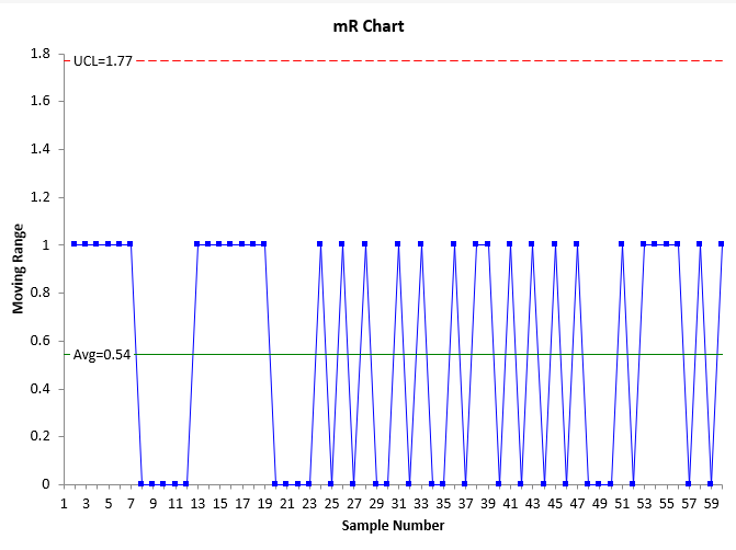
The individuals control chart is two charts. The individual values are plotted on the X chart while the range between consecutive values is plotted on the moving range (mR) chart. The average of the individual values is plotted on the X chart while the average moving range is plotted on the mR chart. The control limits, which define the range of common causes of variation, are plotted on the charts. The UCL is the upper control limit and the LCL is the lower control limit. Points beyond the control limits or patterns like 8 in a row above the average represent special cause of variation. You can see on the X chart, there are only two values. The same on the mR chart. These charts are not very useful to you – there is too much data in a short period of time.
Will plotting more data help make the control chart more useful? Figure 1 has 60 points plotted on it, one for each second. Suppose we chart the data for 5 minutes. Will that help? Having 300 points? Figure 2 is the X chart for five minutes of temperature readings taken each second. We won’t include the mR chart.
Figure 2: X Chart for Temperature at 1 Second Intervals for 5 Minutes
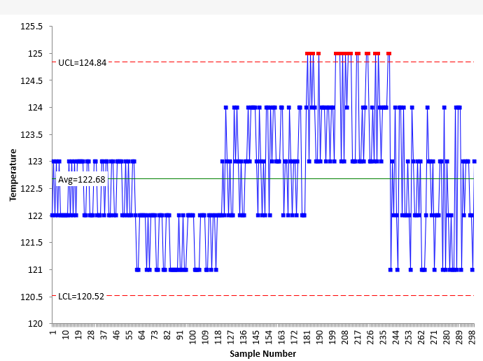
What does Figure 2 tell you? Still have a lot of runs with the same value. It is not a lot of use to us. It shows a few out of control points. We could continue to add data points to the chart, but you can see that the individual points are hard to see in Figure 2. What about after an hour, when you have plotted 3,600 data points? Or after the 5-hour reaction when you have plotted 18,000 points.
Obviously, plotting all the data when you are in data overload is not going to work. Even if you just show a certain number of points on the chart as time passes, the control limits often are not valid with data overload. These data are sampled too frequently. There is not time for all the sources of variation to occur with that frequent sampling.
Autocorrelated Data
One problem with data overload is that the data points are often autocorrelated. This means that a value stored in the database is very similar – or quite often, the same – as the next data point. This means that there is very limited variation between consecutive points. Look at the X charts in Figures 1 and 2. See how the same point is repeated over and over again in the chart. Again, there is no time for process variation (which a control chart monitors) to occur when the data are sampled too frequently.
What does this do to the control limits on the X chart? The control limits for the X control chart are given by:
LCL = X – 2.66R
UCL = X + 2.66R
where X is the average of the individual values, R is the average moving range, and LCL and UCL are the lower and upper control limits, respectively.
What happens to when the same value is repeated over and over. Remember, mR is the range between consecutive points. So, the moving range is quite often 0 and this leads to a small and the tight control limits since is used to set the LCL and UCL on the X chart.
How do you solve the problem of autocorrelation? We are going to ignore it. We are going to move away from defining variation as the moving range between consecutive points. Instead we want to form subgroups, calculate the average temperature and standard deviation for the subgroup and then plot the results on a control chart. This is a little different – we will be plotting the average temperature and the standard deviation both as individual statistics on an individuals control chart. Let’s see how that works.
Control Chart Based on One Minute Average and Standard Deviation
This approach uses all the data – even the autocorrelated data. The first approach is to take the 60 readings in a minute (one per second) and calculate the average and standard deviation of those readings. You can download the data used in this analysis at this link. The average for the first minute is 122.483 and the standard deviation is 0.504. We do this calculation every minute. And then we construct an individuals chart based on the average temperature and the temperature standard deviation each minute. We will only look at the X chart here. The X chart for the average temperature each minute is given in Figure 3.
Figure 3: X Chart for Average Temperature Each Minute
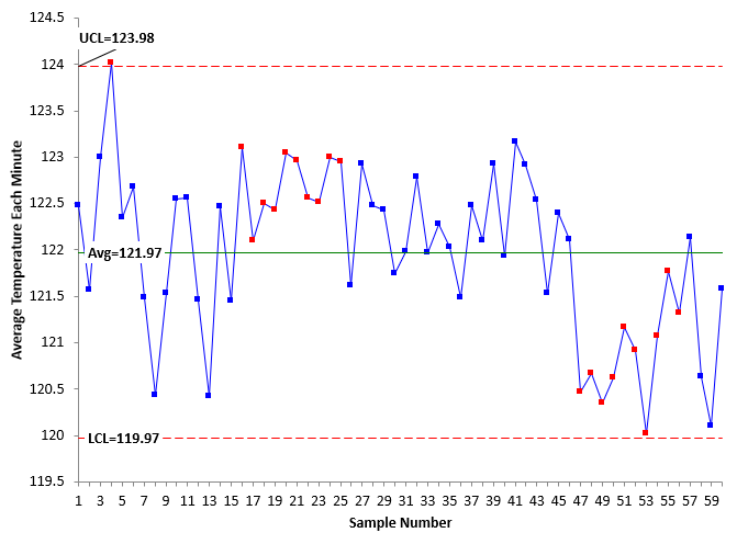
Remember that each point on the chart is the average of the 60 readings for that minute. Each sample number is really the minute number. Note that Figure 3 looks much different than Figures 1 and 2. And we continue to use all the data. There are out of control points on the chart. There is a point beyond the UCL early in the chart as well as a run above the average. The average temperature has decreased in the last part of the control chart as seen by the run below the average. But is clear that this chart is much more useful than the charts in Figure 1 and Figure 2.
Figure 4 shows the X chart for the standard deviation for each minute.
Figure 4: X Chart for the Standard Deviation Each Minute
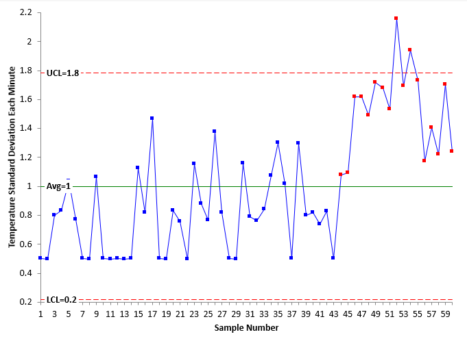
Remember, that the standard deviation of each of the 60 readings each minute is plotted in Figure 4. You can see that the standard deviation has increased towards the end of the chart. There are points beyond the control limits as well as runs above the average.
This represents one approach you can use when there is too much data. 60 points on a chart is not too much and you can set up most software to show just the last 60 points. Our SPC for Excel software does this. It was used to make all the control charts in this publication. For more information on SPC for Excel, please select this link.
But you can increase the time period if you want to have fewer points. This is shown below.
Increasing the Time Period for Calculating the Statistics
If you wanted to have fewer points, you could calculate the average temperature and standard deviation every 5 minutes. Again, you include all the data points – ignoring that autocorrelation. Figures 5 and 6 show the results for the average temperature and standard deviation each 5 minutes.
Figure 5: X Chart for Average Temperature Each Five Minutes
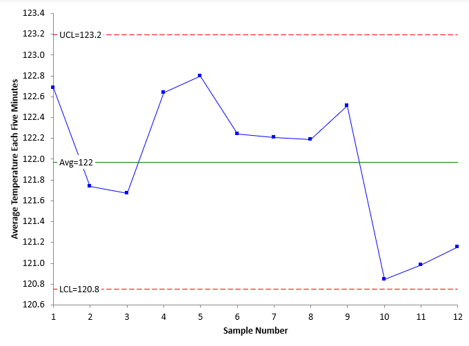
Figure 6: X Chart for the Standard Deviation Each Five Minutes
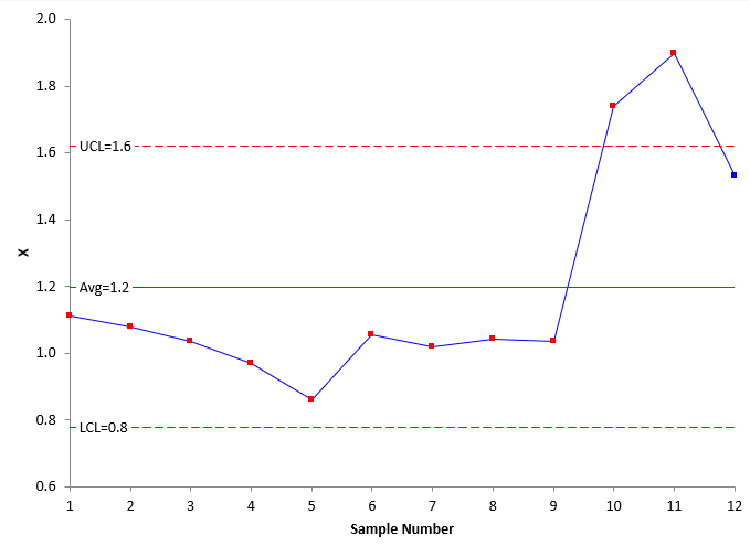
Note that these charts, even at 5-minute intervals, still pick up the decrease in average temperature and increase in temperature standard deviation. If you continue to increase the time you are using as a subgroup, you will reach a point where you mask out of control points. Finding the time period to use is really trial and error. You don’t want too many points, but you don’t want to mask signals.
Summary
This publication has examined how to handle control charts in the situation when you have data overload. First, be sure that the variable you want to monitor has the random variation needed for a control chart. To handle data overload, calculate the average and standard deviation for set time periods (each minute, each five minutes) using all the data and monitor the results using the X-mR chart for the average and for the standard deviation. Finding the best time period to use is a trial and error process.