March 2018
(Note: all the previous SPC Knowledge Base in the control chart examples category are listed on the right-hand side. Select this link for information on the SPC for Excel software.)

“Earth’s global surface temperatures in 2017 ranked as the second warmest since 1880, according to an analysis by NASA.
Continuing the planet’s long-term warming trend, globally averaged temperatures in 2017 were 1.62 degrees Fahrenheit (0.90 degrees Celsius) warmer than the 1951 to 1980 mean, according to scientists at NASA’s Goddard Institute for Space Studies (GISS) in New York. That is second only to global temperatures in 2016.”
The good news in this was that 2017 was cooler than 2016. The bad news was it is still the second warmest year since 1880, behind 2016. So, are we getting cooler? Probably not. One data point does not make a trend. Over the past few years, we have examined global temperature data. We began our look at this back in December 2015 by looking at global temperature changes over time using a control chart.
A control chart helps tell if the data are homogeneous over a period of time – that is, in statistical control. The control chart, with yearly data starting in 1880, showed there were periods of homogeneity (stability) where the global temperature neither increased or decreased significantly from year to year. In between these periods, there were sudden step changes in the global temperature. That changed around 1997. At that point, the global temperature began a somewhat steady upward trend almost yearly.
Then we looked at the data from 1997 using a trend control chart. This trend control chart was stable – in statistical control. Based on that trend control chart, we predicted a temperature rise of 0.764 °C for 2016. Turns out we were off a bit as the official temperature rise was 0.98 °C.
This month’s publication updates our journey of examining the variation in global temperature changes, looking at how the 2017 global temperature change fits with our analysis using the trend control chart, examining the way the historical data changed from 2016 to now (yes, the past data has been changed), and what we can predict for 2018 based on this analysis.
In this issue:
- Past Global Temperature Publications
- The Historical Data Changes Over Time
- Global Temperature Deviation as a Run Chart
- Trend Control Chart Approach from 1997
- Summary
- Quick Links
You may download a pdf version of this publication at this link. Please feel free to leave a comment at the end of the newsletter.
Past Global Temperature Publications

-
- SPC and Global Warming (December 2015): This publication used global temperature data referred to as dTs data. This is data based on the meteorological station data. This publication showed the periods where the global temperature was essentially stable. There were five such periods, each followed by a sudden increase in the global temperature. It also showed the trend that began in 1997. This trend was used to predict the global temperature for 2016.
- Trend Control Charts and Global Warming (January 2016): This publication expanded on how to use trend control charts and the calculations involved.
- SPC and Global Warming Update (February 2017): This publication updated the results with the 2016 data. The data used in this analysis was the LOTI (land-ocean temperature index) data. The LOTI data are considered more accurate than the dTs data used in the first publication listed above. This is also where it was discovered that the historical data had changed somewhat since it was examined in 2015. Our predicted global temperature for 2016 was quite a bit lower than the actual.
The Historical Data Changes Over Time
In our last publication, I assumed that I would simply take the temperature deviation for 2016 and add it to my dataset and update the control chart to see how 2016 played out. I decided to re-download the data and was surprised to see that the data changed somewhat. I contacted the person who oversees the data and he explained some reasons why the data changes over time. Those reasons are in the last publication.
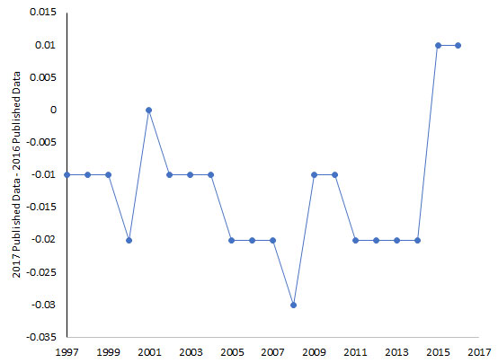
This year, I decided to take a closer look at how the historical data changed from February 2017 to March 2018, when I download the data for the last and this publication. The changes are small – usually .01 to .03. So, the changes are not really that significant in the analysis of the data. However, I always have a little concern when historical data changes. Here is a link to the data used in this publication
Figure 1 shows the change in data that was downloaded in March 2018 to that downloaded in February 2017 from the website for 1997 to 2016. The changes appear to have slightly reduced the global temperatures for each year since 1997 except for the last two that saw a slight increase. But again, the differences do not impact the analysis overall.
Figure 1: Changes in Historical Global Temperature Data
Global Temperature Deviation as a Run Chart
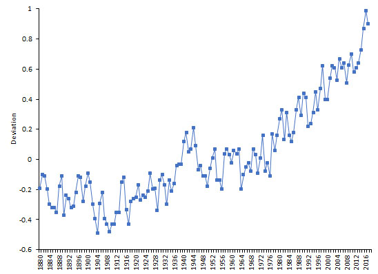
Figure 2 is a plot the global temperature deviation as run chart over time from 1880 to 2017 using the current data as deviations in °C from the baseline period.
Figure 2: Global Temperature Deviation Run Chart
As discussed in previous publications, there are periods of “constant” temperature that is followed by a step change upward through most of the chart. Figure 1 shows the decrease in global temperature for 2017. But there does appear to be the same general trend upward.
Trend Control Chart Approach from 1997
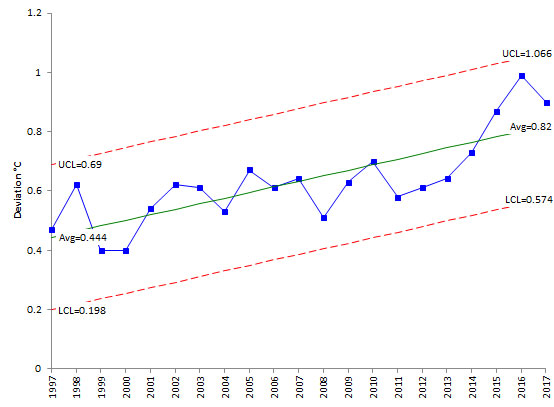
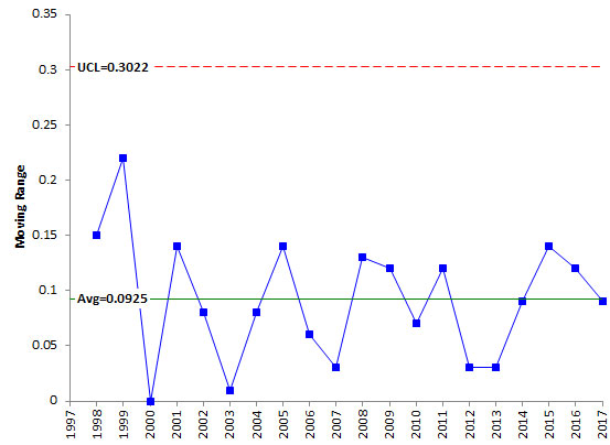
Data from 1997 to 2017 were analyzed using a trend control chart. The trend control chart is described in the previous publication. The trend control chart is shown in Figure 3. Figure 4 is the moving range chart associated with the trend control chart. Both charts are in statistical control. There are no points beyond the control limits and no patterns within the data. The average moving range is 0.0925.
Figure 3: Trend Control Chart for Global Temperature Deviation
Figure 4: Moving Range Chart for Global Temperature Deviation
The best fit line for the global temperature deviations from 1997 to 2017 is given by:
Global Temperature Deviation =0.01878(Year) – 37.058
This is the equation of the centerline (the “average”) on the chart in Figure 3. The slope is 0.01878. This means that for the years from 1997 to 2017, the global temperature deviation increased by 0.01878 on average. The control limits for the year 2017 in Figure 3 can be calculated as the following:
UCL = 0.01878(Year) – 37.058 + 2.66(0.0925) = 1.067
LCL = 0.01878(Year) – 37.058 – 2.66(0.0925) = 0.575
The differences with the control limits in Figure 3 are simply due to rounding. You can now use the trend control chart to predict, within a range, what the deviation in the global temperature will be for this year (2018).
UCL = 1.086
2018 Prediction = 0.849
LCL = 0.594
This “model” predicts that the 2018 results would be 0.849 and in between 0.594 and 1.086. Remember that the control limits are set at +/- three standard deviations, so there is a “wide”” range of possible results. But it does appear that the global temperature continues to be in an upward trend.
Summary
This month’s publication updated our three previous publications on global warming. The trend continues to be upward in terms of global temperature since 1997. The predicted temperature rise for this year is 0.849. Stay cool!


Bill,Good, useful article – thanks – that should put the global warming argument to bed unless, that is, people don’t trust the data (which I guess forms part of the global warming sceptic’s argument). If we say that the Shewhart “model” is based on a prediction within 3-sigma process limits, and not exact values, I don’t agree that the predicted next value is 0.746 for 2016. Isn’t the prediction simply that no change in the system is expected to give a value between 0.509 and 0.976 ?Using the formal detection rules, is the 2016 value a detected process change (using Rule 1 in the software)? If the upper limit for 2016 is 0.976 and the observed 2016 deviation value is 0.98, shouldn’t it be a detectable signal of change, albeit just a fraction over the upper limit? Your Figure 3 looks visually as though the 2016 value is just inside the upper limit, not a fraction outside it.When you write “And look at the last 4 years” in the last paragraph before the Summary, I take it you’ve taken the 2016 observation to be a signal and you have a licence to dig deeper, e.g. looking at the four most recent years. With a change detected, you have evidence that your 1997-2015 “model” no longer applies to the new 2016 value. In short, I take it that the temperatures have increased year on year, you’ve proven this, but now the increase is different and even more pronounced. Do you agree?Thanks, Scott.
Thanks Scott. You are correct on the interpreation. Control chart says it is between 0.509 and 0.976. I just use the center line as the predicted value. People don't like having that big of range! Yes 0.98 is above 0.976 so it should be a signal. When you run the data through the software rounding happens last. That is why the last chart has the point below the limits. Probably should have changed the calculations to match it. The UCL is really just a little above 0.98, but it is right there. The last four years appear to be forming a new pattern for sure. I agree with that.
Great work as usual. Would love to promote your articles on Twitter but there is no link to do so?Am I missing something or is there not one?
Thanks Allan. I don't have a Twitter account, but will look into it.