August 2017
(Note: all the previous SPC Knowledge Base in the process improvement category are listed on the right-hand side. Select this link for information on the SPC for Excel software.)

One of the first quality improvement books I bought back in 1982 was the “Guide to Quality Control” edited by Dr. Kaoru Ishikawa. It was originally published in 1968 in Japan. Dr. Ishikawa was the developer of the cause and effect diagram as well as “the father” of quality circles. Glancing through the book brought me back to what many call the seven basic quality tools. These seven are covered in the book in detail – with the calculations done by hand! Not much but slide rules back then.
The book reminded me of several things I had forgotten including some of the rules he recommended using for interpreting a control chart and a process classification cause and effect diagram. But what I was really reminded of was the simplicity of the seven basic tools. It has been written that Dr. Ishikawa believed that 90% of the problems in the factory could be solved with just these simple tools. Maybe, sometimes, it is time to be simple again.
This publication reviews these seven basic tools introduced in his book, which also contains many examples and practice problems. The tools are introduced below in the order they appear in the book. In this issue:
- Introduction
- Histograms
- Cause and effect diagrams
- Check sheets
- Pareto diagrams
- Graphs
- Control charts
- Scatter diagrams
- Summary
- Video: Seven Quality Tools
- Quick Links
Please feel free to leave a comment at the end of the publication. You can download a pdf copy of this publication at this link.
INTRODUCTION
First, a little about Dr. Ishikawa (1915 – 1989). He had a profound impact on quality improvement world-wide. He wrote over 600 articles and 31 books. One of those was the “Guide to Quality Control” mentioned above. This was one of his two books translated into English. The other was “What is Total Quality Control? The Japanese Way.”
Dr. Ishikawa developed the concept of quality circles. He believed that everyone should be involved in quality improvement. Quality circles provided a method of doing this. It enabled everyone to work on process improvement by suggesting ideas to improve products and processes. All quality circles were given training in the basic problem-solving tools, including the seven basic tools covered in this publication. Dr. Ishikawa developed the cause and effect diagram, also known as the fishbone diagram.
Dr. Joseph Juran gave the following tribute to Dr. Ishikawa after his death in 1989:
“There is so much to be learned by studying how Dr. Ishikawa managed to accomplish so much during a single lifetime. In my observation, he did so by applying his natural gifts in an exemplary way. He was dedicated to serving society rather than serving himself. His manner was modest, and this elicited the cooperation of others.”
You can find more information on the web about Dr. Ishikawa and his life, including this link.
The seven basic tools from his book are covered below. You can download an Excel workbook that contains the data used in this publication at this link.
HISTOGRAMS
The histogram is the first tool introduced by Dr. Ishikawa. The chapter starts with the statement “data have dispersion.” How true. A histogram is a “snapshot” in time of the dispersion (variation) in your process. A histogram tells you four things about your process:
- What value or range of values occur most frequently (called the mode)
- The amount of variation in the process
- The relationship of the process variation to the specifications
- The shape of the variation (e.g., bell shaped, skewed)
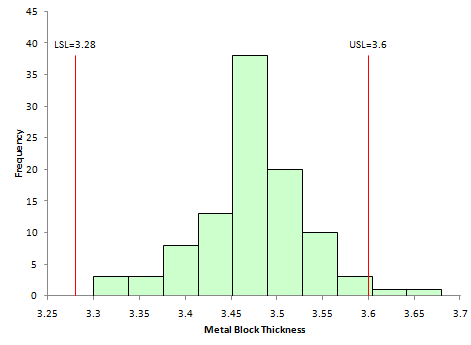
An example using the metal box thickness data from the book is shown in Figure 1.
Figure 1: Metal Box Thickness Histogram
The x-axis is the measurements. The y-axis is the frequency each value or range of values occurred. The histogram in Figure 1 appears to be bell-shaped. There are some data above the upper specification limit (USL).
Our SPC Knowledge Base contains two publications that describe histograms including how to construct a histogram manually. Histograms can also reveal problems in a process. This is discussed in these publications as well.
CAUSE AND EFFECT DIAGRAMS
The second tool introduced is the cause and effect diagram. This chapter starts with the question “why does quality dispersion occur?” In other words, why does the data shown in our histogram have variation? A cause and effect diagram summarizes reasons for variation in our process. The effect is placed on the right-hand side of the chart. The “effect” can be a problem or a goal. The major categories are selected. These are often the 4M’s, a P and an E: methods, materials, measurements, machines, environment, and people. The assorted reasons for variation are then brainstormed under each of the major categories.
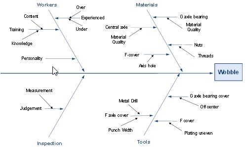
An example of an edited cause and effect diagram from the book is shown in Figure 2. It deals with wobble during machine rotation. Note that this cause and effect diagram does not have the 4M’s, a P and an E. In fact, most of the examples in the book have different major categories. In this example, the four major categories are workers, materials, inspection and tools.
Figure 2: Example of Cause and Effect Diagram from “Guide to Quality Control”
The above cause and effect diagram is called a “dispersion analysis” cause and effect diagram. You keep asking why does wobble occur. We have two publications in our SPC Knowledge Base about cause and effect diagrams. The first discusses how to create a cause and effect diagram. The second one provides a method of analyzing a completed cause and effect diagram to help determine the most likely cause of the problem.
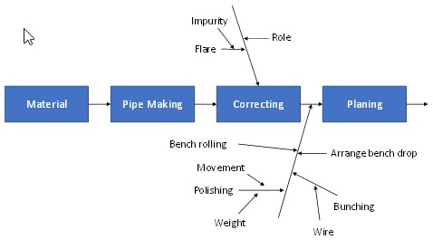
The book introduces another one called the ‘production process classification” cause and effect diagram. With this method, the diagram’s center line follows the production process. All things that can impact quality are added to the appropriate process stage. Figure 3 is an edited example of this type of cause and effect diagram (using the first four steps of a process) from the book.
Figure 3: Process Classification Cause and Effect Diagram
CHECK SHEETS
When was the last time you used a check sheet? It probably has been a long time. This is the third tool introduced in the book. Check sheets used to be a major way of collecting data. If you wanted to track reasons for defective items, you developed a check sheet and tracked the reasons over time on that sheet. Now it seems, all the information is entered in a computer system and the system tracks things for us. Figure 4 is an example of a check sheet from the book for tracking defects at final inspection.
Figure 4: Check Sheet Example
The reasons for defects are listed on the left-hand side. Each time a defect occurs, a tick mark is placed in the column for the reason for the defect. When the product has finished being inspected, the defects are totaled and the total placed in the last column.
PARETO DIAGRAMS
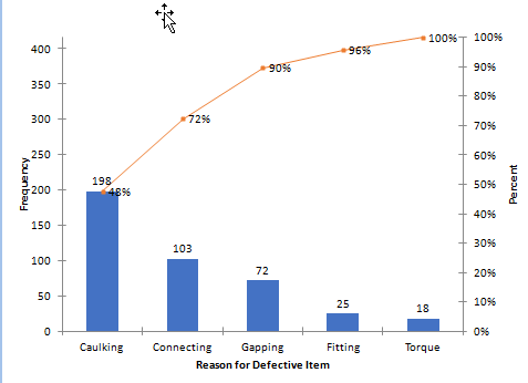
The fourth tool introduced in the book is the Pareto diagram. A Pareto diagram is a bar chart that is used to help separate the “vital few” problems from the “trivial many” problems. It is a data-based approach to help decide what problem to work on first. An example of the Pareto diagram from the book is given in Figure 5.
Figure 5: Pareto Diagram for Defective Items
This Pareto summarizes the reasons for defective items. The item with the most defects is “caulking.” It is listed first. The other reasons for defectives items are listed in descending order. The bar height represents how often each reason occurred. The line on the Pareto diagram is the cumulative percent line. The figure gives 72% for the “connecting” bar. These means that 72% of the defectives items were due to “connecting” and “caulking” defects. It is clear from the Pareto diagram that “caulking” is the reason that needs to be addressed first.
Our SPC Knowledge Base contains two publications on Pareto diagrams. One covers the basics of Pareto diagrams while the other covers how to use Pareto diagrams with control charts.
GRAPHS
The fifth tool introduced is “graphs.” There are actually a number of different graphs shown in this chapter. It begins with three questions:
- What is the purpose of the chart?
- How is the chart used?
- How can it be made more useful?
These are actually three interesting questions. Too often, a chart is put out without much thought of the purpose of the chart or how it will be used. And how to make it more useful? Probably not many of us think about that. Good advice from decades ago.
A variety of graphs are shown in this chapter of the book including graphs by groups (like shifts), run charts, and pie charts.
If you search on-line for the basic seven tools of quality, you will often find this one called stratification. This is the graphing by group where you are looking for patterns based on a variety of sources. You sometimes will see this one replaced by a flow chart or a simple run chart.
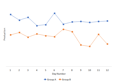
Figure 6 is a modified example from the book on a factory’s foreman’s graph.
Figure 6: Stratification Graph by Group
It plots the output from two groups: A and B. It is clear that group A’s production is higher each day that Group B’s. If you plotted one group by itself, you would have a run chart.
CONTROL CHARTS
The sixth tool is the control chart. Dr. Ishikawa wrote “the purpose of a control chart is to determine whether each of the points on the graph is normal or abnormal, and thus know the changes in the process from which the data has been collected.”
He also wrote “we draw limits on the graphs to indicate the standards for evaluation. These lines will indicate the dispersion of the data on a statistical basis and let us know when an abnormal situation occurs in production.” Control limits do provide a method for people to look at the same data set and make the same conclusion.
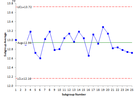
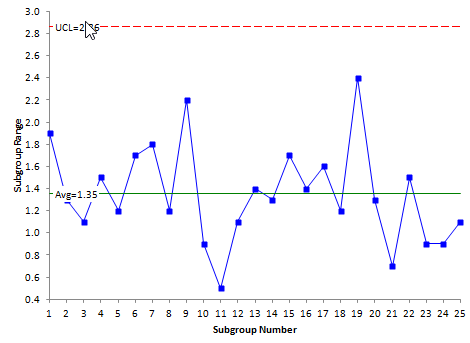
Five control charts are introduced in the book: X-R, p, np, c and u control charts. A X-R control chart from the data in the book is given in Figure 7.
Figure 7: X-R Chart Example
The book also contains information on “non-randomness and its evaluation” – this is, interpreting the control chart for out of control points. The following rules are suggested.
Runs
A run is defined by a series of consecutive points on one side of the centerline. “If a run has a length of 7 points, we consider there is an abnormality in the process.” He also says that there are out of control situation if 10 out of 11 or 12 out of 14 points lie on one side of the average. The centerline for the X control chart is the average. Interestingly, it is recommended that the median be used for the R, p, np, c and u control charts.
Trends
According to the book, if there is trend of seven points in a row up or down, there is an abnormality in the process.
Periodicity
Periodicity occurs “if the points show the same pattern of change over equal intervals.” There is no test for periodicity. You just have to look at the chart and make a decision if it exists or not.
Hugging of the Centerline
To determine if the data “hug” the centerline, the chart is divided into four zones. A line is drawn between the centerline and the upper control limits and the center line and the lower control limit. So each line is 1.5 sigma from the center line. If most of the points lie between these two lines, there is an abnormality in the process. He does not define “most.”
Hugging the Control Limits
There is also a test to determine if the points hug a control limit. The chart is divided into six zones, three on each side of the centerline. This is the same as for the common tests for zones A, B and C. However, this test just focuses on zone A. There is an abnormality if 2 out of 3 consecutive points are in zone A or beyond. This is the same as the common Zone A test. However, he adds two more. If 3 out of 7 points or 4 out of 10 points are in zone A are beyond, there is an abnormality present.
Our SPC Knowledge Base has over 60 publications dealing with control charts. You can access them at this link. The articles are divided in five major categories: basics, variable control charts, rational subgrouping, attribute control charts and control chart examples.
SCATTER DIAGRAMS
A scatter diagram is the seventh basic tool. According to Dr. Ishikawa, when you talk about the relationship of two types of data, you are talking about one of the following usually:
- a cause and effect relationship
- a relationship between one cause and another
- relationship between one cause and two causes
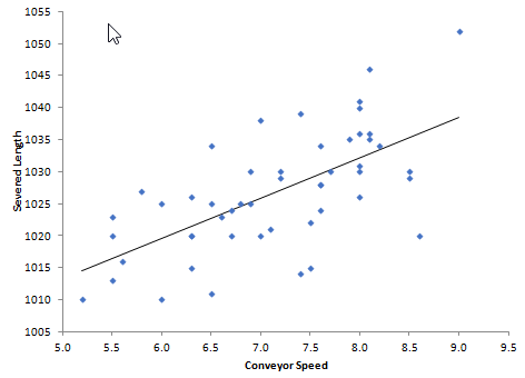
A scatter diagram shows the relationship between these two types of data. Figure 8 shows a scatter diagram for the data on conveyor speed (cm/sec) and severed length (mm). The scatter diagram plots paired samples of data. For example, when the conveyor speed was 8.1, the severed length was 1046.
Figure 8: Scatter Diagram Example
The scatter diagram is trying to determine if there is a positive, a negative or no correlation between the two data sets. If there is a positive correlation, increasing one variable increases the other. If there is a negative correlation, increasing one variable decreases the other. If there is no correlation, changing one variable does not impact the other variable.
This scatter diagram shows a positive correlation between conveyor speed and severed length. Severed length increases as conveyor speed increase.
Our SPC Knowledge Base contains two publications on scatter diagrams. One describes how to construct and interpret a scatter diagram. The other explains the scatter plot matrix technique.
SUMMARY
This publication looked back at Dr. Ishikawa’s seven basic quality tools. He believed that 90% of problems could be solved with these simple tools: histograms, cause and effect diagrams, check sheets, Pareto diagrams, graphs, control charts and scatter diagrams. These tools can easily be taught to everyone in an organization. His book (“Guide to Quality Control”) described each tool with numerous examples and practice problems. Still a very relevant book after all these decades.

Your article on Ishikawa’s Seven Quality Tools was incredibly informative. The clear explanations of each tool and their applications in process improvement were very helpful.
As someone involved in the tree removal business, I’m curious about how these quality tools can be adapted to our industry. Are there specific examples or tips for using these tools to enhance efficiency and safety in tree removal operations?