July 2010
This month’s newsletter examines waterfall charts. Waterfall charts are not “statistical” charts as such but they provide an easy method of visualizing how an initial value is impacted by series of intermediate positive and negative values leading to a final value. Wikipedia, the on-line encyclopedia, defines this chart as the following:
“A Waterfall Chart is a form of data visualization which helps in determining the cumulative effect of sequentially introduced positive or negative values.”
In this issue:
Waterfall charts can be used in many areas including inventory analysis, profit-loss analysis, and sales analysis. We will examine a waterfall chart example and then take a look at how to construct one using Microsoft Excel. Of course, our SPC software, SPC for Excel, will construct the waterfall chart for you automatically.
Introduction
Suppose you sell 7 products in your business. You would like to graphically see how the change in sales of those products from one to the next impacted your sales. You can use a waterfall chart to do this. The data needed for the waterfall chart is shown in the table below.
Table 1: Sales by Product Data
| Sales by Product |
$ (MM) |
| Sales 2008 | 7.9 |
| Product A | 2.3 |
| Product B | -0.4 |
| Product C | 1.3 |
| Product D | 1.6 |
| Product E | -1.1 |
| Product F | 0.1 |
| Product G | 1.3 |
| Product H | 0.5 |
| Sales 2009 | 13.5 |
The initial value is sales for 2008, which was $7.9 million. Each product is listed along with the change in its sales from 2008 to 2009. For example, Product A had $2.3 million more in sales in 2009 than in 2008. Product B had $0.4 million less in sales in 2009 than in 2008. The final value is the total sales in 2009. This data was used to make the waterfall chart shown in Figure 1.
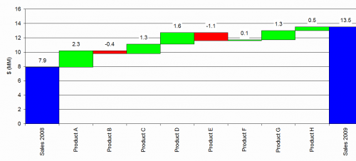
The blue bars represent the initial and ending points. The first blue bar represents sales in 2008. The height of this bar is $7.9 million. The ending last blue bar represents sales in 2009. The height of this bar corresponds to $13.5 million. This represents the total sales of the seven products in 2009.
The red and green bars in between are “floating” columns. These represent the impact of each product on the change in sales from 2008 to 2009. Product A had $2.3 million more in sales in 2009 than in 2008. This is shown by a green floating column. The green column floating indicates a positive contribution to the initial value. The floating column, when it is positive, starts at the top of the previous column (7.9) and goes upward by the change of that product (2.3). So, the floating column for Product A ranges from 7.9 to 7.9+2.3 = 10.2.
Product B sales were down by 0.4 million in 2009. This is indicated by a red floating column. The floating column, when it is negative, starts at the top of the previous column (10.2) and goes downward by the change of that product (-0.4). So, the floating column for Product B extends from 10.2 down to 9.8.
From this chart, it is easy to see that Product A had the largest positive contribution to increased sales in 2009. Product E had the largest negative contribution to sales in 2009.
How to Make a Waterfall Chart in Excel
One would think that making a waterfall chart would be a fairly easy task. It does not look like it is a difficult chart. However, it is not easy to make the chart in Excel. You will need to make a stacked column chart to account for the “floating” column. The process for doing this is described below.
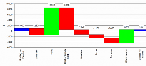
Suppose you want to use a waterfall chart to visually understand a profit and loss statement. The statement is given below.
| Profit and Loss | $ |
| Starting Net Income | 1,000 |
| Write-offs | -2,500 |
| Sales | 10,000 |
| Cost of Goods Sold | -8,000 |
| Overhead | -1,800 |
| Taxes | -1,150 |
| Bonuses | -2,000 |
| Other Income | 5,000 |
| Ending Net Income | 550 |
The starting net income is $1,000. The profit and loss items are in the table above with the positive additions to net income being the positive values and the negative additions (the loss) to net income being the negative values. The waterfall chart for this data is given below. The steps in constructing the chart are given below.
Step 1: Enter the data in an Excel spreadsheet
To start, the data is added into an Excel spreadsheet as shown below.
| A | B | |
| 1 | $ | |
| 2 | Starting Net Income | 1000 |
| 3 | Write-offs | -2500 |
| 4 | Sales | 10000 |
| 5 | Cost of Goods Sold | -8000 |
| 6 | Overhead | -1800 |
| 7 | Taxes | -1150 |
| 8 | Bonuses | -2000 |
| 9 | Other Income | 5000 |
| 10 | Ending Net Income | 550 |
Be sure to leave the first cell blank (A1 in this example). To make the waterfall chart, we will need to add some columns.
Step 2: Add the cumulative column
The cumulative column simply adds up the numbers in column B in a cumulative fashion. You can do this by adding the following formula in cells C2 and copying it to cell C9: “=SUM(B$2:B2)”. The result is shown below. Leave the last cell (in this case C10) blank.
| A | B | C | |
| 1 | $ | Cumulative | |
| 2 | Starting Net Income | 1000 | 1000 |
| 3 | Write-offs | -2500 | -1500 |
| 4 | Sales | 10000 | 8500 |
| 5 | Cost of Goods Sold | -8000 | 500 |
| 6 | Overhead | -1800 | -1300 |
| 7 | Taxes | -1150 | -2450 |
| 8 | Bonuses | -2000 | -4450 |
| 9 | Other Income | 5000 | 550 |
| 10 | Ending Net Income | 550 |
Step 3: Add the endpoints column
The next column to add is the endpoints. This simply contains the initial value (1000) in cell D2 and the ending value (550) in cell D10 as shown below. The rest of the cells in the column are blank.
| A | B | C | D | |
| 1 | $ | Cumulative | Endpoints | |
| 2 | Starting Net Income | 1000 | 1000 | 1000 |
| 3 | Write-offs | -2500 | -1500 | |
| 4 | Sales | 10000 | 8500 | |
| 5 | Cost of Goods Sold | -8000 | 500 | |
| 6 | Overhead | -1800 | -1300 | |
| 7 | Taxes | -1150 | -2450 | |
| 8 | Bonuses | -2000 | -4450 | |
| 9 | Other Income | 5000 | 550 | |
| 10 | Ending Net Income | 550 | 550 |
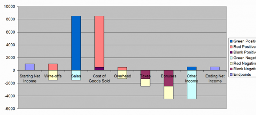
Step 4: Add the six columns for creating the floating columns.
The next six columns are used for the plotting of the results. These columns are used to create the floating columns between the initial and final result. Each floating column is either red or green. It is green if it adds the net income (positive values) or red if it subtracts from the net income (negative values). The values are determined by comparing values in columns B and C. Details are given below by explaining the first calculation and then showing the formula that can be copied and used in the rest of the column.
| A | B | C | D | E | F | G | H | I | J | |
| 1 | $ | Cumulative | Endpoints | Blank Negative | Red Negative | Green Negative | Blank Positive | Red Positive | Green Positive | |
| 2 | Starting Net Income | 1000 | 1000 | 1000 | ||||||
| 3 | Write-offs | -2500 | -1500 | 0 | -1500 | 0 | 0 | 1000 | 0 | |
| 4 | Sales | 10000 | 8500 | 0 | 0 | -1500 | 0 | 0 | 8500 | |
| 5 | Cost of Goods Sold | -8000 | 500 | 0 | 0 | 0 | 500 | 8000 | 0 | |
| 6 | Overhead | -1800 | -1300 | 0 | -1300 | 0 | 0 | 500 | 0 | |
| 7 | Taxes | -1150 | -2450 | -1300 | -1150 | 0 | 0 | 0 | 0 | |
| 8 | Bonuses | -2000 | -4450 | -2400 | -2000 | 0 | 0 | 0 | 0 | |
| 9 | Other Income | 5000 | 550 | 0 | 0 | -4450 | 0 | 0 | 550 | |
| 10 | Ending Net Income | 550 | 550 |
Step 4a: Fill in the “blank negative” Column
This column (E) is used to create the float if the floating column is entirely below zero. Look at the “Taxes” bar in the above chart. You can see that the entire floating column for Taxes is below zero. This column provides the eventual blank area between zero and where the column begins. The calculation in cell E3 compares the values in cells C2 and C3. If both values are below zero, the maximum of C2 and C3 is placed in cell E3. If both values are not below zero, 0 is entered into cell E3. The formula to use in cell E3 is =IF(AND(C3<0,C2<0),MAX(C2:C3),0).
Step 4b: Fill in the “red negative” column.
This column (F) is used to create the portion of the floating column that is below zero for the negative contributions to net income. For example, when you look at “Write-offs” in the above chart, there is a portion of the red floating column that is above zero and a portion that is below zero. You have to account for both. This step accounts for the area below zero. Step 4c will account for the area above zero. The calculation in cell F3 compares cells B3 and C3. If both values are below zero, the maximum of B3 and C3 is placed in cell F3. If both values are not below zero, 0 is entered into cell F3. The formula to use in cell F3 is =IF(AND(C3<0,B3<0),MAX(B3,C3),0).
Step 4c: Fill in the “green negative” column
This column (G) is used to create the portion of the floating column that is above zero for the negative contributions to net income as explained in Step 4b. The calculation in cell G3 compares cells B3 and C2. If C2 is negative and B3 is positive, the maximum of -B3 and C2 is entered in cell G3. Otherwise, 0 is entered. The formula for cell G3 is “=IF(AND(C2<0,B3>0),MAX(-B3,C2),0)”.
Step 4d: Fill in the “blank positive” column
This column (H) is used to create the float if the floating column is entirely above zero. The formula for cell H3 is =IF(AND(C3>0,C2>0),MIN(C2:C3),0).
Step 4e: Fill in the “red positive” column
This column (I) is used to create the portion of the floating column that is below zero for positive contributions to net income. The formula for cell I3 is = IF(AND(C2>0,B3<0),MIN(-B3,C2),0).
Step 4f: Fill in the “green positive” column
This column (J) is used to create the portion of the floating column that is above zero for positive contributions to net income. The formula for cell J3 is = IF(AND(C3>0,B3>0),MIN(B3,C3),0).
Step 5: Select the data to make the chart
Select the data shaded below. To select multiple areas in Excel, select the first area and then hold down the “CTRL” key while you select the second area.
| A | B | C | D | E | F | G | H | I | J | |
| 1 | $ | Cumulative | Endpoints | Blank Negative | Red Negative | Green Negative | Blank Positive | Red Positive | Green Positive | |
| 2 | Starting Net Income | 1000 | 1000 | 1000 | ||||||
| 3 | Write-offs | -2500 | -1500 | 0 | -1500 | 0 | 0 | 1000 | 0 | |
| 4 | Sales | 10000 | 8500 | 0 | 0 | -1500 | 0 | 0 | 8500 | |
| 5 | Cost of Goods Sold | -8000 | 500 | 0 | 0 | 0 | 500 | 8000 | 0 | |
| 6 | Overhead | -1800 | -1300 | 0 | -1300 | 0 | 0 | 500 | 0 | |
| 7 | Taxes | -1150 | -2450 | -1300 | -1150 | 0 | 0 | 0 | 0 | |
| 8 | Bonuses | -2000 | -4450 | -2400 | -2000 | 0 | 0 | 0 | 0 | |
| 9 | Other Income | 5000 | 550 | 0 | 0 | -4450 | 0 | 0 | 550 | |
| 10 | Ending Net Income | 550 | 550 |
Step 6: Create the Stacked Column chart
Select the Stacked Column chart option. Be sure that the series in columns option is checked. You will get the chart below. You can use the legend to see how the different columns are plotted on the chart.
Step 7: Hide the “blank” columns
You are now ready to begin formatting the chart. Start by hiding the “Blank Positive” and “Blank Negative” columns. Double-click on one of the two blank series to get the Format Data Series dialog box.
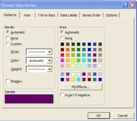
Then select Patterns and “None” for both the Border and Area. Then select options and set the gap width to 0. This removes the space between the columns. Select OK. Repeat this for the other blank series. The chart now looks like the following:
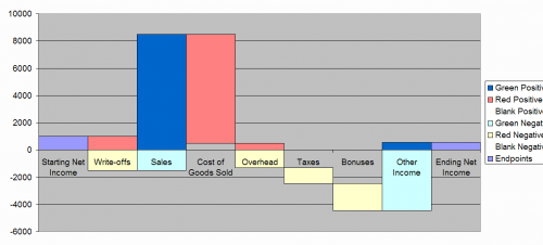
You can see where the blanks have created the floats for the columns.
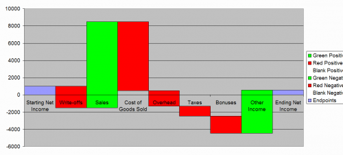
Step 8: Set the color of the negative columns to red.
Double-click of one of the “red” series, such as “Red Positive”. When the Format Data Series dialog box appears, select Patterns and set the area color to red. Repeat for the other red series.
Step 9: Set the color of the positive columns to green.
Double-click of one of the “green” series, such as “Green Positive”. When the Format Data Series dialog box appears, select Patterns and set the area color to green. Repeat for the other green series. The chart now looks like the following:
Step 10: Format the x-axis.
Double-click on the x-axis. The Format Axis dialog box will appear. Set the major and minor tick mark types to “None” and the tick mark labels to “Low”. Select Alignment and set the alignment to 90. Select OK.
Step 11: Delete the legend
Select the legend and delete it.
Step 12: Format the plot area.
Double-click on the plot area. Select “None” for both the border and area. The resulting chart is shown below.
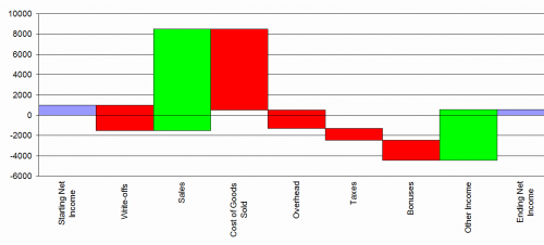
Step 13: Add labels if desired.
You can also add labels to the chart so it will look like the one in Figure 2. You can do this manually by selecting each series and adding the data labels. You can also use a free utility to do this automatically. See the resource section below.
Resources
I have spent a lot of time over the years learning Excel and how to use Visual Basic for Applications to develop software programs like SPC for Excel. But I am not an expert and I get stuck at times on what to do. One of the best resources on the web today is the site www.peltiertech.com. This is Jon Peltier’s website. Jon is an Excel MVP. He has worked with me over the past few years to improve the SPC for Excel program.
If you search for waterfall charts on Google, you will see links to his website. If you visit those links you will also discover that the method described above is pretty much what Jon lays out. That is because I learned to do waterfall charts at one of his excellent training courses (Excel Dashboard and Visualization Bootcamps).
His website contains a wealth of information on Excel charting. In addition, Jon has developed some standalone Excel utilities including waterfall chart, Box and Whisker, and dot plot utilities. He also has a blog where he routinely posts valuable information on Excel and its charting capabilities.