August 2015

I read a three-part post that compared this year’s Triple Crown winner to past Triple Crown contenders – in particular, Secretariat, a Triple Crown winner and arguably the best racehorse ever. Secretariat holds the records in each of the Triple Crown races. The purpose of that post was to answer the question:
What is the probability of a horse beating Secretariat’s record?
The statistical analysis in this series of posts included a control chart, normal probability plots, Johnson transformations, Box-Cox plots, the two sample t-test, the Mood Median test, and several process capability analyses. A lot of statistical techniques for sure – and some pretty advanced ones.
The series of posts started because an earlier post had an error in it (a transformation was not done). “Stats gone wrong” was a phrase used and the series of posts explained what had happened and then re-analyzed the data with the techniques listed above. The author is to be commended for admitting a mistake and trying to address what should have happened.
But in reality, the stats had not gone wrong. What went wrong is something we all do too often. We don’t “listen” to what the control chart is telling us. If we did, we would sometimes discover that we shouldn’t be using all those fancy statistical techniques.

So, this month’s publication takes a look at horse racing and shows how, if you listen to your control chart, it will usually guide you down the correct path. Don’t listen and you most likely will be wondering what went wrong.
In this issue:
- Triple Crown of Thoroughbred Racing
- The Post’s Approach
- The Data
- Kentucky Derby
- The Variation Approach
- Belmont Stakes
- Preakness Stakes
- Comments on Secretariat
- Summary
- Quick Links
You can download a pdf copy of this publication at this link. Please feel free to leave a comment at the end of the publication.
Triple Crown of Thoroughbred Racing

- Kentucky Derby (1 1?4-mile track at Churchill Downs in Louisville, Kentucky)
- Preakness Stakes, (1 3?16-mile track at Pimlico Race Course in Baltimore, Maryland)
- Belmont Stakes (1 1?2-mile (2.4 km) track at Belmont Park in Elmont, New York)
The Kentucky Derby is held on the first Saturday in May. The Preakness is held on the third Saturday in May. The Belmont Stakes is held 3 weeks after The Preakness in June. There are have been 12 horses to win each of the three races in the year since 1919. These horses are called Triple Crown winners.
In 1973, Secretariat won the Triple Crown. In addition, he set records in all three races – records that still stand today and give credence to him being the best Thoroughbred horse ever. Secretariat is the “standard” or “specification” we will use our analysis.
The Post’s Approach
The three-part post appears on Quality Digest’s website. The link to the first post is here. The approach was to start with a control chart on the Belmont Stakes winning times – just exactly where you should start. Then a normal probability plot was used to determine if the data were normally distributed.

If the data were not normally distributed, you would have to either find a distribution to fit the data or transform the data to a normal distribution. Then you can do the process capability analysis.
There is nothing wrong with this approach. It is what you should do in this analysis. You can look at the link above to see how the analysis unfolded. There was a problem with the rounding of the data to start with – and this causes some problems in the analysis. Excessive rounding contributed to the data not appearing to be normally distributed. Data without excessive rounding was used in the third post. The issue though was that the control chart does not appear to have been used when the data were re-analyzed. You can’t listen to a control chart if it is not there.
The Data
The winning times data used in this analysis can be downloaded here. The data came from Wikipedia by searching for each of the three races. The Belmont Stakes data includes the actual time, the time in seconds to the nearest 0.1 second, rounded to the nearest second, and rounded down (the data used in the first post). The other two races include the actual time and the time rounded to the nearest 0.1 seconds. We will start our analysis by taking a look at the Kentucky Derby times used in the third post.
Kentucky Derby
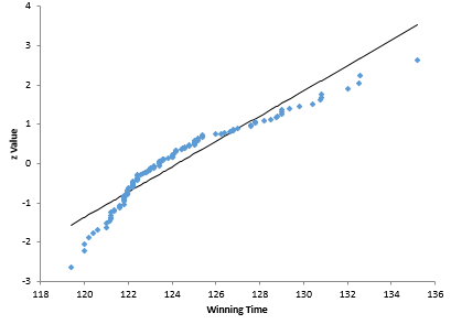
The Kentucky Derby data uses the results from 1896. The post started immediately with the normal probability plot of the data to answer the question of if the data were normally distributed. The normal probability plot (recreated using the SPC for Excel software) is shown in Figure 1.
Figure 1: Kentucky Derby Normal Probability Plot for Races Since 1896

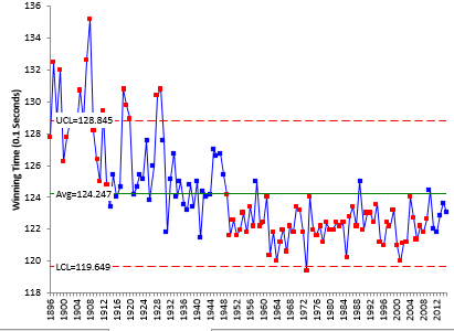
A step appears to be missing – and that step is listening to your control chart. The first step of any analysis like this should be to take a look at the data over time in control chart format. Figure 2 is an individuals control chart for the Kentucky Derby data.
Figure 2: X Chart for Kentucky Derby Winning Times Since 1896
Listen to the control chart. What is it telling you? It appears that we have some longer times early in the chart, a little lower times in the middle and even lower times toward the last half of the chart. The main thing the control chart is telling you is that the process from 1896 to 2015 is not stable. The data are not homogenous – they do not come from one system.
Does it make sense to perform a normal probability plot on data that are not homogenous? Would you combine the data from the Kentucky Derby (1.25 miles in length) and the Belmont Stakes (1.5 miles in length) and do a normal probability plot? You would say of course not. Those are two separate processes – one is a shorter race with shorter times. But this is what the control chart in Figure 2 is trying to tell you – the data are not homogenous – there is more than one process in play here.

What the objective of this analysis? The objective is to determine the probability of a horse beating Secretariat’s record time. This is predictive. We are trying to predict the future. And the past matters when trying to predict something into the future. This is what Dr. W. Edwards Deming said (Out of the Crisis, 1982):
“Analysis of variance, t-test, confidence intervals, and other statistical techniques taught in the books, however interesting, are inappropriate because they provide no basis for prediction and because they bury the information contained in the order of production.”
The control chart in Figure 2 shows the “order of production” of winning times. There are at least three “processes” operating – three different systems. It does not make sense to apply a single normal probability analysis to two or more different systems. No one listened to the control chart.
The Variation Approach

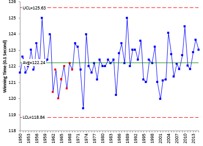
If you look at Figure 2, things appear to be pretty stable since about 1950. You can check this by constructing a control chart based on the data from 1950 on as shown in Figure 3.
Figure 3: Kentucky Derby Winning Times Since 1950
This data looks pretty homogenous. One run below the average, but it looks a lot more homogeneous than Figure 2. Note that Secretariat’s winning time in 1973 is not below the lower control limit. Now you can ask if the data are normally distributed. Figure 4 is a normal probability plot for the data since 1950.
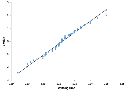
Figure 4: Normal Probability Plot for Kentucky Derby Since 1950
This normal probability plot looks a lot different than the one in Figure 1. The data now falls close to the straight line. The p value is 0.19. You can conclude that the data are normally distributed. No need to do any data transformation.
The process capability analysis can now be done. However, if we want to predict the probability of a horse beating Secretariat’s time of 119.4, then we probably need to remove Secretariat from the data. The process capability analysis without Secretariat’s time is shown in Figure 5.
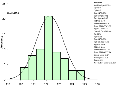
Figure 5: Kentucky Derby Process Capability
The Cpl value in this case is 0.9, which corresponds to a 0.35% chance of a horse beating Secretariat’s time. The post, using all the data and the Johnson transformation got a value of 0.32%. Pretty close. How come? Just lucky I would think. There is not a single distribution present with all the data.
 The Belmont Stakes
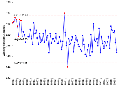
The Belmont Stakes has been 1.5 miles in length since 1926. We will use the same approach as above and start with listening to the control chart as shown in Figure 6.
Figure 6: Belmont Stakes Winning Times
There are two points beyond the control limits.
- Secretariat’s 1973 time of 144 seconds (the record)
- High Echelon’s 1970 time of 154 seconds (the slowest)

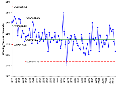
There is still a run above the average at the start of the chart. It is clear from the control chart that the process changed around 1937. We will split the control limits starting in 1937. Figure 7 shows the control chart with the limits split at the year 1937 and the two points beyond the limits removed from the calculations. The two points beyond the control limits are still plotted, but they are not shaded indicating that they were not used in the calculations.
Figure 7: Belmont Stakes Winning Times with Split Control Limits
The process looks pretty stable since 1937. It is appropriate now to ask if the data from 1937 through 2015 are normally distributed. You are applying the test to “one system” as defined by the homogeneity of the data from 1937 on. If you apply the normal probability analysis to the data from 1937 on (excluding the two out of control points), you will find the data are normally distributed (p-value = 0.83).
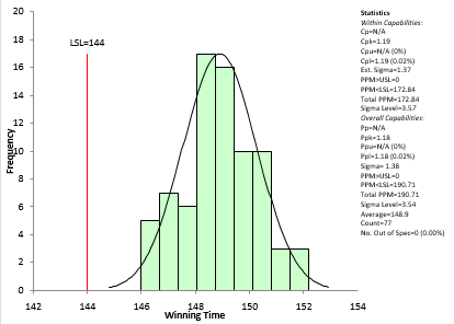
You can now do the process capability analysis using the data from 1937 on excluding 1970 and 1973. The results are shown in Figure 8.
Figure 8: Belmont Stakes Process Capability Analysis
Cpl for this analysis is 1.19, which means that there is a 0.02% probability that a horse will generate a time less than Secretariat’s time of 144. Pretty small odds of someone beating Secretariat’s record time.
Preakness Stakes

Comments on Secretariat
Secretariat is, no doubt, the greatest race horse there has ever been. The table shows the results of this analysis. Just not much chance of a horse beating his record times.
| Race | Length (Miles) | % Probability of Beating Secretariat |
|---|---|---|
| Preakness | 1 3/16 | 0.49 |
| Kentucky Derby | 1 1/4 | 0.35 |
| Belmont Stakes | 1 1/2 | 0.02 |
The table also implies that the longer the race, the less probability of a horse beating Secretariat’s time. In fact, if you plot the % probability versus the length, it is just about a straight line. Interesting.
Summary
This publication has highlighted the importance of understanding what a control chart is telling you when you are trying to predict future results. There is a difference in the approach you take if you are trying to find something out about a data set (an enumerative study) versus trying to predict something in the future (an analytic study).
With analytic studies, simply applying statistical tests to a set of data may or may not be valid. You have to let the control chart give you that answer. The past matters when trying to predict the future – and what matters the most is the information contained in variation from the past. Unless you have a process that is stable, you can make no predictions about the future.
So, start with variation. Plot the data over time – and then listen to what the control chart is telling you!
 The Belmont Stakes
Siri carefully read your article on horse racingsappears to me that this approach, taking real data and applying statistic thinking,should be very helpful for people as me, who wants to spread the message on statistics as a real life tool.regards,
Great analysis, and a compelling illustration of the need to 'listen to the control chart'. (Ironically, Quality Digest, where the original article appeared, has an article with the same message…) But you didn't follow through to answer the original question: What is the probability of a horse beating Secretariat’s record? Given that the 3 races are not independent experiments, one cannot simply take the product of the 3 probabilities of beating Secretariat in each one. Some sort of Bayesian network analysis needed?
Thanks for the comment, Chris. Yes, I guess I did not answer that question – just what is the probabilty of a horse beating Secretariat's record in each individual race. That was the stated purpose of their analysis – mine was a little different – to listen to the control chart. But, I am not sure how I would proceed to come up with one probability. I have not done anything with Bayesian network analysis.