2010 is drawing to an end. This month marks the end of our 7th year of publishing our monthly SPC newsletter. This is our 84th newsletter and our readership continues to hold steady at around 6500. A special thanks to all of you.
We have revisited variation several times over the years. The last time we did this was in our February 2009 newsletter when we demonstrated how the red bead experiment can be used to teach variation. This demonstration is a great way to introduce everyone to the concept of variation. Understanding variation is the key to improving processes.
This month’s newsletter presents a method of explaining variation to leadership. It is designed to reinforce the red bead experiment and enhance leadership’s understanding of variation by showing how the concept applies to the data leadership looks at regularly. You can also download a PowerPoint presentation that is based on the information in this newsletter for free. In this issue:
- Leadership and Data
- How Leadership Typically Examines Data
- Leadership and Variation
- Every Control Chart Tells a Story
- Summary
- Presentation Download
- Variation Test
- Quick Links
Leadership and Data
Leadership looks at lots of data – some daily, some monthly and some quarterly. Many organizations are driven by the monthly report and how it impacts their “balanced” scorecards. There is often a dashboard that gives leadership a static snapshot of where their key performance indicators are versus last month or versus goal. The problem with these approaches is that they almost universally ignore variation.
Many leaders know nothing about variation and, if they have been exposed to this body of knowledge, they think about variation as simply being control charts that people closest to the process use to monitor their work. Leaders don’t think about how control charts can help them understand what is really happening with their own processes.
Important measures to leadership typically fall into three categories: financial, operational and personnel. The financial measures are the ones that get the most focus. Typical financial measurements include sales revenues, gross profit, SG&A as % of sales and days sales outstanding. Operational measures include freight, on-time delivery, uptime, and inventory turns. Personnel measurements include turnover, training hours, and absenteeism.
Why do leaders examine these measurements? The same reason people lower in the organization use control charts: to know how they are performing (staying the same, improving, or declining), to know how they are performing versus a standard, target or goal, and to know how they performed historically.
How Leadership Typically Examines Data
But how do leaders examine their data? Let’s use sales as an example. Congratulations! You are the sales manager for your company – in charge of all sales. Suppose sales in January 2010 are $11,129 (in thousands).
Sales in Jan-10: $11,129
What’s in this number? Does it mean we had a good month in sales? A bad month? A mediocre month? Obviously, a number by itself has little meaning. So what do we do? What do you suggest?
Of course, we can compare it to something. That way we will know if it is better, the same, or worse. But what to compare it to? How about budget? The budget for the month was $10,000. Sales exceeded budget. Good job! How about comparing the results for January 2010 with January 2009? Sales in January 2009 were $7,997. January 2010 blow way past that number. Good job! How about comparing it to the previous month? December 2009 sales were $6,789. Again, sales blow this number away. Good job! Things are looking good based on the January 2010 numbers.
Making comparison between two numbers is very common. Typical comparisons made by leadership are usually in the form of a monthly report statement and include:
- This month’s result to last year’s result
- This month’s result to budget
- Year-to-date (YTD) result to last year-to-date (LYTD)
- YTD result to budget
Let’s look at some quarterly numbers. Below is a table for the first quarter 2010 sales results. What does this table tell you about sales?
Table 1: First Quarter Results
| 2010 YTD | Budget | Variance | 2009 YTD | Variance | |
|---|---|---|---|---|---|
| Sales $ | 30,148 | 30,000 | 148 | 23,823 | 6,325 |
Things look pretty god. You beat budget and are well ahead of last year. Your sales team has done a great job! Of course, you send out the letter thanking all the wonderful sales people for their hard work and tell them to keep it up. 2010 looks like it will be a great year!
Table 2 contains the numbers for the second quarter 2010. What does this table tell you about sales?
Table 2: Second Quarter Results
| 2010 YTD | Budget | Variance | 2009 YTD | Variance | |
|---|---|---|---|---|---|
| Sales $ | 27,460 | 30,000 | -2,540 | 33,545 | -6,085 |
Now sales are below budget for second quarter. You are down compared to last year. What happened to those wonderful sales people and all their hard work? Obviously something has changed! Or has it?
Leadership and Variation
Consider sales for the two months shown below:
Jan-10: $11,229
Feb-10: $10,016
Are these sales numbers the same? The measurements we take reflect the variation in the process. The problem with measurement systems that compare one time frame to another (like the monthly report) is that the actual performance (variation) of the process is hidden – we don’t know what the underlying process is doing. Let’s explore another method of examining the data that reveals the “voice of the process” – the true performance.
The only tool to effectively examine the behavior of a process is a time series or control chart. The data in Table 3 was used to develop the “reports” above. What does this table of data show you?
Table 3: Sales Data
| Month | Sales (000) |
| Jan-09 | $7,997 |
| Feb-09 | $9,132 |
| Mar-09 | $6,694 |
| Apr-09 | $10,005 |
| May-09 | $12,055 |
| Jun-09 | $11,485 |
| Jul-09 | $8,133 |
| Aug-09 | $7,215 |
| Sep-09 | $8,278 |
| Oct-09 | $11,117 |
| Nov-09 | $6,481 |
| Dec-09 | $6,897 |
| Jan-10 | $11,229 |
| Feb-10 | $10,016 |
| Mar-10 | $8,903 |
| Apr-10 | $9,617 |
| May-10 | $8,190 |
| Jun-10 | $9,653 |
The table does begin to show some of the variation in the underlying process. It is an improvement over the limited comparison of two numbers. But it is still difficult to see the underlying process behavior.
The first step in “seeing” the process behavior is to plot the data over time. The time series chart for sales is shown in Figure 1.
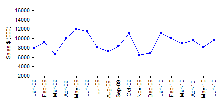
This picture begins to show us the underlying process behavior. You can see that the sales vary from about 6,200 to 12,000 each month. In addition, you can conclude the following:
- No major change in monthly sales – some months better than others
- Quarterly report indicated a problem (2Q 2010) – time series tells a different story
- There is a problem though – sales aren’t increasing
You can enhance the time series chart by adding an average line. This is shown in Figure 2.
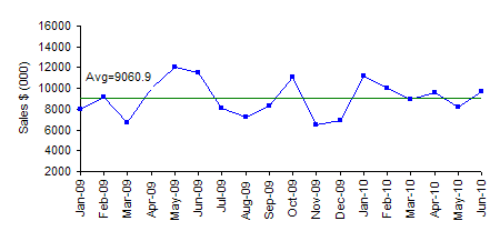
There are 9 points above the average and 9 points below the average. This chart could provide warnings of problems like a run of sales below the average. But this chart doesn’t seem to indicate any problems.
The chart in Figure 2 can be further enhanced by adding control limits. These control limits define the boundaries for common causes of variation. Remember that common causes of variation are the naturally occurring variation in a process. Special causes are those things that should not be present. Please see our February 2009 newsletter on the red bead experiment for more information on common and special causes of variation.
The upper control limit (UCL) is the largest value you would expect from a process with just common causes of variation present. The lower control limit (LCL) is the smallest value you would expect. As long as the all the points are within the limits and there are no patterns, only common cause of variation are present. The process is said to be “in control” To improve it, you must fundamentally change the process.
Figure 3 is the control chart for sales (based on an individual’s control chart).
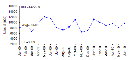
All the points are within the control limits and there are no patterns. The sales process is “in control.” Sales might be as low as 3,899 or as high as 14,222 each month. The variation is simply the random variation in the process. We can predict what will happen in the future. As long as the process remains the same, sales will average 9060 per month with the monthly variation being between the control limits.
Quite often, leadership will say that the control limits are too wide – and don’t really help them. They miss the point. It is not the control limits, but the story that the control chart tells. It provides feedback to leadership on the state of the process – improving or declining or in control. And this process is in statistical control, it tells leadership that the process must be fundamentally changed if sales are to increase. The key word here is fundamentally. This means new products, new sales approaches, etc. And the control chart can be used to judge the impact of those fundamental changes.
Every Control Chart Tells a Story
A control chart tells a story about your process. But to understand it, you must know how to interpret a control chart. Teach leadership the following tests for out of control situations: points beyond the control limits, zone tests and the rule of seven tests. See our April 2004 newsletter for more information on these tests. An excellent example of how a control chart tells a story is shown in the figure below. This control chart plots the monthly on-time percentage for airlines in the United States from January 2000 through December 2002.
Figure 4: On-Time Percentage for US Airlines
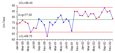
Take a moment to examine this control chart. What is this control chart tracking? Is the process in control or out of control? What time period is covered on the chart? What story does this control chart tell you? Answers next month.
Summary
Leadership must understand the concept of variation and be able to apply it to the processes they track – financial, operational and personnel. Using control charts to monitor the results of a company gives leaders insight into what is happening in the process. These control charts will show if the overall company processes are in control or if they are trending up or down. Once a process is in control, you can use the results to predict the future. From the financial perspective, think about all the time that could be saved on the budgeting process. Use the control charts to set budgets.
Presentation Download
If you would like to download a PowerPoint presentation of the material covered in this newsletter, please select this link. We would ask that you give credit to us for the presentation.
Variation Test
The questions below are designed to test your basic knowledge of variation. All the answers can be found in our newsletters.
- What is quality?
- What are the 4 M’s, a P and an E?
- What is the detection mode of operation?
- What is the prevention mode of operation?
- Why is the prevention mode of operation better than the detection mode of operation?
- What is variation?
- What must we do to eliminate variation in our processes?
- Who was the father of SPC?
- What is common cause of variation and who is responsible for reducing this type of variation?
- What is special cause of variation and who is responsible for finding this type of variation?
- What percent of a company’s problems are normally due to common causes?
- What does it mean when a process is in statistical control?
- What type of variation is represented by the red beads in the red bead experiment?