June 2009
In this issue:
Introduction
Last month’s newsletter introduced the normal distribution. This month’s newsletter takes a look at how to answer the following question:
Do my data follow a normal distribution?
The normal distribution is one of many distributions. In past newsletters, we have talked briefly about two discrete distributions: the binomial distribution (the underlying distribution for n and np control charts) and the Poisson distribution (the underlying distribution for c and u control charts). The normal distribution, on the other hand, is used with continuous data.
The normal distribution is a very important distribution in statistics. And, if your data can be represented by a normal distribution, there are a lot of things you can find out. As shown last month, you can use z values to determine what percentage of the data is below some value, above some value or between two values. Many statistical techniques are based on the assumption that the data are normally distributed.
Normal Distribution Review
The normal distribution is the familiar bell-shaped curve shown below.
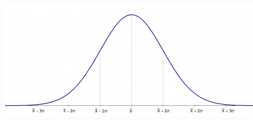
The normal distribution has several interesting characteristics:
- The shape of the distribution is determined by the average, μ (or X), and the standard deviation, σ.
- The highest point on the curve is the average.
- The distribution is symmetrical about the average.
- As you move away from the average, the points occur with less frequency.
- Most of the area under the curve (99.7%) lies between -3σ and +3σ of the average.
Please see last month’s newsletter for a complete review of the normal distribution.
So, how can you find out if your data are normally distributed? There are two easy ways that depend on how much data you have. If you have lots of data (100 points or more), you can use a histogram. If you have less data, you can use a normal probability plot.
Histograms
There are a number of ways to determine if you have a normal distribution. One of the easiest is to construct a histogram based on the data. Simply examine the histogram and see if you think it is bell shaped. If you have lots of data, this is a perfectly valid way of determining if your data are normally distributed. Please see our December 2005 and January 2006 newsletters for more information on creating and using histograms.
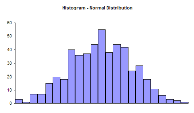
Note that a histogram of real data will not look like a perfect normal distribution. All you are trying to determine is if describing the data as a normal distribution is reasonable. For example, take a look at the histogram below. Does it look like a bell-shaped curve? Does it look normal? It is not perfect, but it appears that it is reasonable to assume that these data come from a normal distribution.
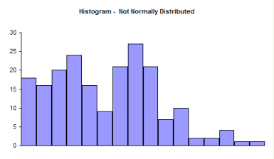
Now examine the histogram below. Does it look like a bell-shaped curve? This does not look bell-shaped. Most values tend toward zero. With these data, it is not reasonable to assume that there is a normal distribution present.
So, it is perfectly valid to use a histogram to determine it you think your data can be reasonably represented by a normal distribution. If you don’t have a lot of data, histograms will not be very useful in determining if you have a normal distribution. You can randomly take 20 samples from a normal distribution and the resulting histogram may not look normal. In these cases, you need to use the normal probability plot.
Normal Probability Plots
A normal probability plot can be used to determine if small sets of data come from a normal distribution. This involves using the probability properties of the normal distribution. We will eventually make a plot that we hope is linear. We will demonstrate the procedure using the data below.
Suppose we have ten samples from our process.
100, 98, 101, 93, 123, 112, 85, 76, 119, 111
We want to know if we can reasonably assume that these data come from a normal distribution. We can make a normal probability plot to help tell us this.
The steps below are used to make a normal probability plot of these data.
1. Sort the data in ascending order.
| Data | Sorted Data |
| 100 | 76 |
| 98 | 85 |
| 101 | 93 |
| 93 | 98 |
| 123 | 100 |
| 112 | 101 |
| 85 | 111 |
| 76 | 112 |
| 119 | 119 |
| 111 | 123 |
2. Number the sorted data from 1 to n where n is the number of samples (10 in this example).
| Data | Sorted Data | Number |
| 100 | 76 | 1 |
| 98 | 85 | 2 |
| 101 | 93 | 3 |
| 93 | 98 | 4 |
| 123 | 100 | 5 |
| 112 | 101 | 6 |
| 85 | 111 | 7 |
| 76 | 112 | 8 |
| 119 | 119 | 9 |
| 111 | 123 | 10 |
3. Calculate (i-0.5)/n for each value; this represents the cumulative probability.
| Data | Sorted Data | Number | Cumulative Probability |
| 100 | 76 | 1 | 0.05 |
| 98 | 85 | 2 | 0.15 |
| 101 | 93 | 3 | 0.25 |
| 93 | 98 | 4 | 0.35 |
| 123 | 100 | 5 | 0.45 |
| 112 | 101 | 6 | 0.55 |
| 85 | 111 | 7 | 0.65 |
| 76 | 112 | 8 | 0.75 |
| 119 | 119 | 9 | 0.85 |
| 111 | 123 | 10 | 0.95 |
4. Determine the z value from the standard normal distribution for each cumulative probability.
There are a number of ways to do this. The first cumulative probability value is 0.05. You can use the standard normal distribution table in last month’s newsletter to find the value of z corresponding to 0.05 probability. If you look at the table, you will see that z = -1.64 gives a cumulative probability of 0.0505 and a z = -1.65 gives a cumulative probability of 0.0495. So, the value of z that gives a cumulative probability of 0.05 is between -1.65 and -1.64.
The easiest way to do this is to use Excel’s NORMSINV function. For example, NORMSINV(0.05) = -1.64485. The rest of the values are shown in the table below.
| Data | Sorted Data | Number | Cumulative Probability | z Value |
| 100 | 76 | 1 | 0.05 | -1.64485 |
| 98 | 85 | 2 | 0.15 | -1.03643 |
| 101 | 93 | 3 | 0.25 | -0.67449 |
| 93 | 98 | 4 | 0.35 | -0.38532 |
| 123 | 100 | 5 | 0.45 | -0.12566 |
| 112 | 101 | 6 | 0.55 | 0.125661 |
| 85 | 111 | 7 | 0.65 | 0.385321 |
| 76 | 112 | 8 | 0.75 | 0.67449 |
| 119 | 119 | 9 | 0.85 | 1.036433 |
| 111 | 123 | 10 | 0.95 | 1.644853 |
5. Plot the sorted data versus the z values. The plot is shown below.
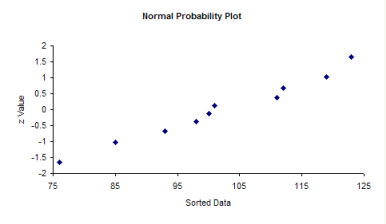
The question you want to ask yourself is “Do the points fall roughly in a straight line?” If they do, you can assume that you have a normal distribution. You can see from the chart above, the points appear to fall along a straight line. With Excel, you can add the best-fit line by right-clicking on a point in the plot and selecting “Add Trendline.” The resulting plot is shown below.
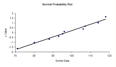
Since the data fall in a straight line, you can assume that you have a normal distribution.
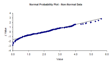
If the data do not fall in a straight line, then you cannot assume that you have a normal distribution. The normal probability plot for the non-normal histogram is shown below. Note that it tails like an S at one end. This is often typical of distributions that are not normal.
Summary
There are two simple methods of determining if your data are normally distributed. If you have lots of data (100 points or more), you can use a histogram. If the histogram is somewhat bell-shaped, you can assume that you have a normal distribution. If you don’t have lots of data, construct a normal probability plot and see if the points fall roughly in a straight line. If they do, you can assume that your data are normally distributed.