November 2016
(Note: all the previous SPC Knowledge Base in the basic statistics category are listed on the right-hand side. Select this link for information on the SPC for Excel software.)
There are all sorts of correlations we can look at. Sometimes variables increase or decrease over time. For example, the earth’s temperature is increasing over time. So are the levels of greenhouse gases. If you run a correlation analysis on these two variables, you will find that global temperature correlates strongly to the level of greenhouse gases. But does this mean that one is the cause of the other? Not necessarily. When two variables are trending up or down, a correlation analysis will often show there is a significant relationship – simply because of the trend – not necessarily because there is a cause and effect relationship between the two variables.
Some correlations with trending data make sense; others do not. This month’s publication takes a look at method you can use to help determine if the correlation between two trending variables could be real. It involves “de-trending” the results, i.e., removing the trend to see if there is still a correlation between the two variables.
In this issue:
- Review of Correlation
- Confusing Correlation with Causation Example
- Nonsensical Correlations
- Removing the Trend to See if the Correlation Still Exists
- Summary
- Quick Links
You may also download a pdf copy of this publication at this link. Please feel free to leave a comment at the end of the publication.
Review of Correlation
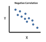
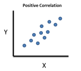
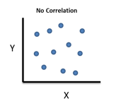
There are two straightforward ways to determine if there is a correlation between two variables, X and Y. One is simply to construct a scatter diagram. In a scatter diagram, paired values of X and Y are plotted. The scatter diagram will show a picture of the correlation. You can see if the correlation is positive, negative or non-existent.
It is important to remember that simply because there is a significant correlation between two variables, it does not mean that one is the cause of the other. Suppose we find a significant correlation between X and Y. There is still a lot we don’t know. For example:
- We don’t know if the correlation is real.
- And if it is real, we don’t know the direction of the correlation – does a change in X cause a change in Y or does a change in Y cause a change in X.
- And we don’t know if there are a third variable at play that is actually causing the changes in both X and Y.
The key point is that is impossible just from a correlation analysis to determine what causes what. You don’t know the cause and effect relationship between two variables simply because a correlation exists between them. You will need to do more analysis to define the cause and effect relationship.
Confusing Correlation with Causation Example
The classical example of confusing correlation with causation involves the population in Oldenburg, Germany and the number of storks observed during the years from 1930 to 1936. The original data is given in Ornithologische Monatsberichte, 44, No.2, Jahrgang, 1936, Berlin, and 48, No.1, Jahrgang, 1940, Berlin. The data are given in Table 1.
Table 1: Population vs Number of Storks Observed Data
| Year | Storks (X) | Population (Y) |
|---|---|---|
| 1930 | 140 | 55.5 |
| 1931 | 148 | 55.5 |
| 1932 | 175 | 64.9 |
| 1933 | 195 | 67.5 |
| 1934 | 245 | 69.0 |
| 1935 | 250 | 72.0 |
| 1936 | 250 | 75.5 |
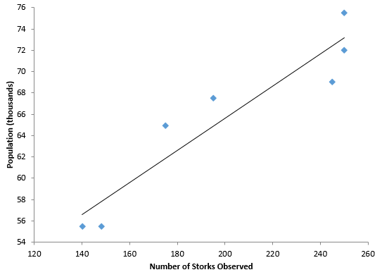
The scatter diagram is show in Figure 1. It includes the best-fit line. The R2 value for these data is 0.886 – which means 88.6% of the variation in population is explained by the number of storks observed. The p-value for R is less than 0.01 – so it confirms that there is a statistically significant correlation.
Figure 1: Population versus Number of Storks Scatter Diagram
But remember, correlation does not equal causation. In this example, both the number of storks and the population both increased with time over these seven years. Whenever you have two variables increasing (or decreasing) over time, the odds are that there will be a correlation when the two are examined as a scatter diagram. That doesn’t mean that one is the cause of the other.
Nonsensical Correlations
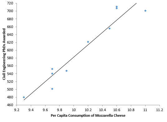
There are many “significant” correlations that are absolutely nonsense – like the example above. The internet has many more examples of these. Tyler Vigen has a website where he lists thousands of “spurious correlations.” These are available at this link. One of the examples show the correlation between per capita consumption of mozzarella cheese (US) and civil engineering doctorates awarded (US) from 2000 to 2009. The data are shown in Table 2. The scatter diagram is shown in Figure 2, along with the best fit line.
Table 2: Civil Engineering PhD’s Awarded versus Per Capita Consumption of Mozzarella Cheese
| Year | Per Capita Consumption of Mozzarella Cheese | Civil Engineering PhDs Awarded |
|---|---|---|
| 2000 | 9.3 | 480 |
| 2001 | 9.7 | 501 |
| 2002 | 9.7 | 540 |
| 2003 | 9.7 | 552 |
| 2004 | 9.9 | 547 |
| 2005 | 10.2 | 622 |
| 2006 | 10.5 | 655 |
| 2007 | 11 | 701 |
| 2008 | 10.6 | 712 |
| 2009 | 10.6 | 708 |
Figure 2: Civil Engineering PhD’s vs Mozzarella Cheese Consumption Scatter Diagram
The R2 value for this dataset if 0.919. So, almost 92% of the variation in civil engineering PhD’s awarded is explained by the variation in per capita consumption of mozzarella cheese. The p-value for R is less than 0.01 – again confirming a statistically significant correlation between the two.
Once again though, this correlation is simply nonsense in terms of causation. So, what can we do – fairly quickly – to determine if a correlation is simply nonsense?
Removing the Trend to See if the Correlation Still Exists
Many correlations exist because two variables are trending up at the same time or trending down at the same time. Suppose there is a real correlation between X and Y. And further suppose that a change in X causes a real change in Y. This means that we would expect to see evidence of this as each point is added to the correlation. This means that the change in X from time 1 to time 2 impacts the change in Y from time 1 to time 2. To explore this, we simply compare the changes from time period to time period to see if the correlation may be possible. You do this by subtracting each point from the point that came before it:
X’(t) = X(t) – X(t-1)
Y’(t)=Y(t) – Y(t–1)
The primed X and Y values represent the change in each variable per time period. You then determine if there is a correlation between X’ and Y’. This approach essentially “de-trends” the data.
Let’s return to the stork data. Table 3 shows the original data plus columns that compare time period to time period. The first value in the X’ column is the change in stork observations from 1930 to 1931: 148 – 140 = 8. There was no change in population so the first value in the Y’ column is 0.
Table 3: Population/Stork Data Revisited
| Year | Storks (X) | Population (Y) | X’ | Y’ |
|---|---|---|---|---|
| 1930 | 140 | 55.5 | ||
| 1931 | 148 | 55.5 | 8 | 0 |
| 1932 | 175 | 64.9 | 27 | 9.4 |
| 1933 | 195 | 67.5 | 20 | 2.6 |
| 1934 | 245 | 69.0 | 50 | 1.5 |
| 1935 | 250 | 72.0 | 5 | 3 |
| 1936 | 250 | 75.5 | 0 | 3.5 |
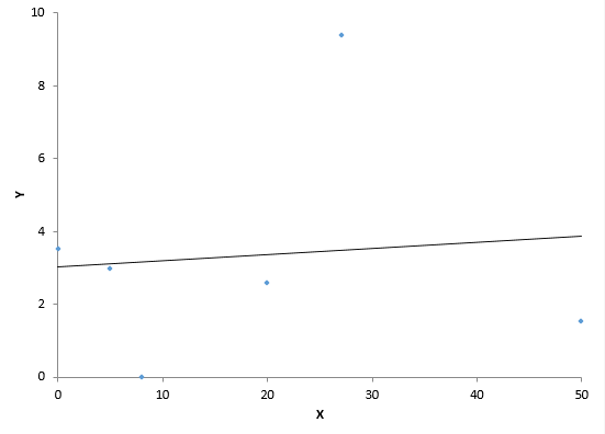
Figure 3 is a scatter diagram of X’ versus Y’ and contains the best-fit line. The data displayed in Figure 3 are not correlated. The R2 value is less than 1%. And the p-value for R is 0.853.
Figure 3: X’ versus Y’ Scatter Diagram for Population/Stork Data
Figure 3 shows a different story than Figure 1. What does this mean? It means that there is probably not a causal relationship between population and storks. The change from period to period for the two variables is not correlated. So much for one being the cause of the other. You will find the same thing if you analyze the data from Table 2 the same way.
What happens if there really is a cause and effect relationship between two variables that are increasing? The correlation will still exist when you remove the trend as shown above. Consider the data shown in Table 4. The X and Y column are the raw data. The X’ and Y’ columns represent the difference between consecutive points.
Table 4: X and Y Data
| Month | X | Y | X’ | Y’ |
|---|---|---|---|---|
| Jan | 33.3 | 125.8 | ||
| Feb | 33.9 | 126.8 | 0.6 | 1 |
| Mar | 34.6 | 128.3 | 0.7 | 1.5 |
| Apr | 35.8 | 130.3 | 1.2 | 2 |
| May | 37 | 132.8 | 1.2 | 2.5 |
| Jun | 37.9 | 134.7 | 0.9 | 1.9 |
| Jul | 38.5 | 135.9 | 0.6 | 1.2 |
| Aug | 39.6 | 138.3 | 1.1 | 2.4 |
| Sep | 40.9 | 141.6 | 1.3 | 3.3 |
| Oct | 41.9 | 143.2 | 1 | 1.6 |
| Nov | 43 | 145 | 1.1 | 1.8 |
| Dec | 44.3 | 147.4 | 1.3 | 2.4 |
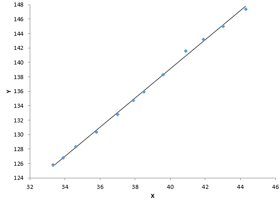
Figure 4 is the scatter diagram for X and Y. You can see there is very significant correlation. The R² value is 0.998. The p-value associated with R is less than 0.01.
Figure 4: Scatter Diagram for X and Y
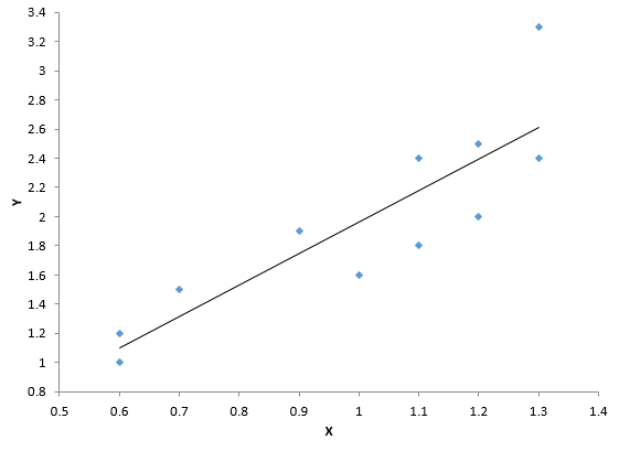
Figure 5 is the scatter plot for X’ and Y’ – after the trend has been removed. Note that the correlation still exists. The R² value is 0.75 and the p-value for R is less than 0.01.
Figure 5: Scatter Diagram for X’ and Y’
Does this mean there is a causal relationship between X and Y? Not necessarily. You still need to do more work to confirm this (e.g., experimental designs). It is still possible that there is a third variable impacting the results. And even if there is a causal relationship, you still don’t know if X causes the change in Y or Y causes the change in X.
But, if de-trending the data shows there is no longer correlation between X and Y, you can pretty sure that there is no correlation. For two variables that are trending over time, it is a good idea to de-trend the data before deciding if there may be a correlation present.
Summary
The publication showed how to handle examining the correlation between two variables that are trending up or trending down. Two variables might be increasing over time and a correlation analysis shows that the two are correlated. But there might not really be a cause and effect relationship. You might just be seeing the impact of the trend. To determine if two trending variables may actually have a causal relationship, you need to remove the trend from the analysis. A simple way to do that is to examine the difference between consecutive points for the two variables. If these differences are correlated, then there may just be a real correlation between the two variables. If these differences are not correlated, then there is not a relationship between the two variables.
