June 2014
Not all data are normally distributed. There are many naturally occurring distributions. For example, the exponential distribution is often used to describe the time it takes to answer a telephone inquiry, how long a customer has to wait in line to be served or the time to failure for a component with a constant failure rate. These types of data have many short time periods with occasional long time periods. These data are not described by a normal distribution.
So, how can you handle these types of data? This publication examines four ways you can handle the non-normal data using data from an exponential distribution as an example. In this issue:
- Exponential Example Data
- Individuals Control Chart
- X-R Control Chart and the Central Limit Theorem
- Transform the Data
- Non-Normal Control Chart
- Summary
- Quick Links
You may download a pdf copy of this publication at this link.
Exponential Example Data

Table 1: Exponential Data
| 2.26 | 2.68 | 4.17 | 0.03 | 2.02 |
| 7.77 | 0.13 | 4.05 | 0.04 | 5.28 |
| 3.67 | 1.37 | 5.12 | 0.21 | 0.03 |
| 0.91 | 0.65 | 2.24 | 2.67 | 0.75 |
| 0.11 | 0.13 | 0.53 | 0.6 | 0.43 |
| 0.36 | 0.14 | 0.29 | 2.95 | 1.53 |
| 0.06 | 1.35 | 2.09 | 0.54 | 2.22 |
| 0.31 | 1.46 | 2.82 | 3.54 | 0.19 |
| 0.91 | 0.01 | 1.24 | 3.43 | 0.75 |
| 1.01 | 0.18 | 1.03 | 2.65 | 2.99 |
| 3.21 | 1.98 | 0.5 | 1.7 | 0.3 |
| 0.24 | 0.82 | 2.02 | 0.16 | 2.41 |
| 3.84 | 1.77 | 0.86 | 0.16 | 2.07 |
| 2.28 | 2.49 | 0.51 | 4.06 | 1.31 |
| 1.75 | 0.53 | 2.17 | 2.04 | 1 |
| 1.45 | 0.4 | 0.11 | 3.56 | 2.15 |
| 1.81 | 1.67 | 0.8 | 6.1 | 1.3 |
| 0.3 | 1.02 | 3.63 | 0.77 | 5.25 |
| 0.63 | 0.81 | 0.6 | 0.87 | 2.44 |
| 2.22 | 0.15 | 0.13 | 4.74 | 0.76 |
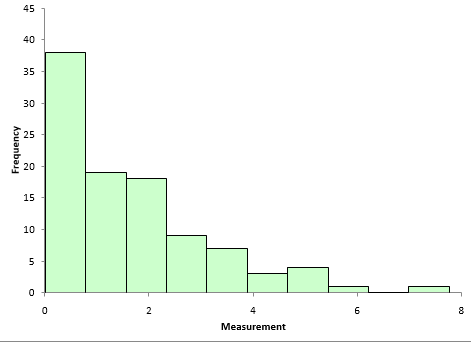
The histogram of the data is shown in Figure 1. It is definitely not normally distributed. A normal distribution would be that bell-shaped curve you are familiar with. The high point on a normal distribution is the average and the distribution is symmetrical around that average.
Figure 1: Histogram of Exponential Data
That is not the case with this distribution. It is skewed towards zero. The high point on the distribution is not the average and it is not symmetrical about the average. For more information on how to construct and interpret a histogram, please see our two part publication on histograms.
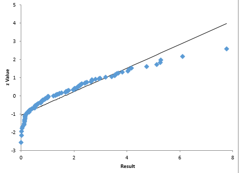
From Figure 1, you can visually see that the data are not normally distributed. You can also construct a normal probability plot to test a distribution for normality. The normal probability plot for the data is shown in Figure 2. The assumption is that the data follows a normal distribution. If this is true, the data should fall on a straight line. It is easy to see from Figure 2 that the data do not fall on a straight line. So, again, you conclude that the data are not normally distributed.
Figure 2: Normal Probability Plot of Exponential Data Set
So, now what? How can we use control charts with these types of data? What are our options? Basically, there are four options to consider:
Use the individuals control chart
- X-R control chart
- Transform the data to a normal distribution and use either an individuals control chart or the X-R control chart
- Use a non-normal control chart
If you had to guess which approach is best right now, what would you say? You are right! Actually, all four methods will work to one degree or another as you will see.
Individuals Control Chart
The first control chart we will try is the individuals control chart. With this type of chart, you are plotting each individual result on the X control chart and the moving range between consecutive values on the moving range control chart.
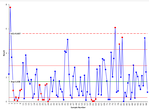
The X control chart for the data is shown in Figure 3. Since the data cannot be less than 0, the lower control limit is not shown.
Figure 3: X Control Chart for Exponential Data
The UCL is 5.607 with an average of 1.658. The two lines between the average and UCL represent the one and two sigma lines. These are used to help with the zones tests for out of control points. Only one line is shown below the average since the LCL is less than zero. For more information, please see our publication on how to interpret control charts.

If you look back at the histogram, it is not surprising that you get runs of 7 or more below the average – after all, the distribution is skewed that direction. The conclusion here is that if you are plotting non-normal data on an individual control chart, do not apply the zones tests. These tests are designed for a normal (or at least a somewhat symmetrical) distribution. Using them with these data create false signals of problems.

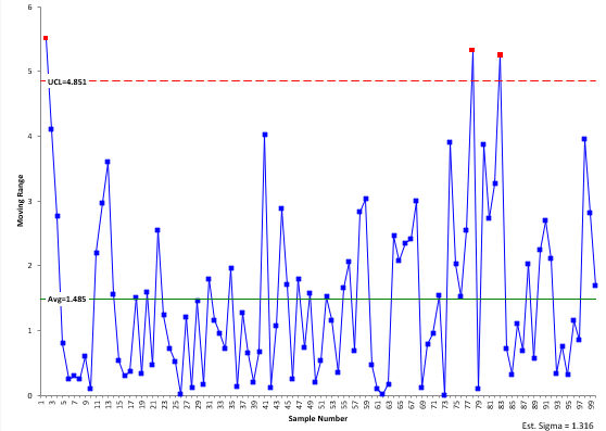
Figure 4 shows the moving range for these data. Not surprisingly, there are a few out of control points associated with the “large” values in the data.
Figure 4: Moving Range Control Chart for Exponential Data
The amazing thing is that the individuals control chart can handle the heavily skewed data so well – only two “out of control” points out of 100 points on the X chart. This demonstrates how robust the moving range is at defining the variation. The +/- three sigma limits work for a wide variety of distributions.
X-R Chart and the Central Limit Theorem
Perhaps you have heard that the X-R control chart works because of the central limit theorem. Another myth. The central limit theorem simply says that the distribution of subgroup averages will be approximately normal – regardless of the underlying distribution as the subgroup size increases.
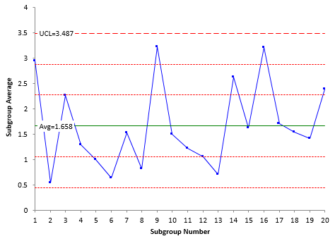
Suppose we decide to form subgroups of five and use the X-R control chart. Remember that in forming subgroups, you need to consider rational subgrouping. This is a key to using all control charts. But, for now, we will ignore rational subgrouping and form subgroups of size 5. Figure 5 shows the X control chart for the subgrouped data (we will skip showing the R control chart)
Figure 5: X-R Control Chart for Exponential Data
Note that this chart is in statistical control. In addition, there are no false signals based on runs below the average (note: with a larger data set, there probably would be some false signals). Subgrouping the data did remove the out of control points seen on the X control chart. So, this is an option to use with non-normal data. But, you have to have a rational method of subgrouping the data.
Transform the Data

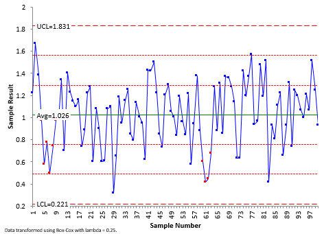
This control chart does still have out of control points based on the zone tests, but there are no points beyond the control limits. So, transforming the data does help “normalize” the data. The biggest drawback to this approach is that the values of the original data are lost due the transformation. You cannot easily look at the chart and figure out what the values are for the process.
Figure 6: X Control Chart Based on Box-Cox Transformation
Non-Normal Control Chart
The fourth option is to develop a control chart based on the distribution itself. This entails finding out what type of distribution the data follows. Beware of simply fitting the data to a large number of distributions and picking the “best” one. You need to understand your process well enough to decide if the distribution makes sense. Then you have to estimate the parameters of the distribution.
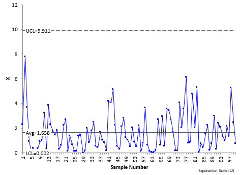
We are using the exponential distribution in this example with a scale = 1.5. The control limits are found based on the same probability as a normal distribution. So, the LCL and UCL are set at the 0.00135 and 0.99865 percentiles for the distribution. For the exponential distribution, this gives LCL = .002 and UCL = 0.99865 (for a scale factor = 1.5). The only test that easily applies for this type of chart is points beyond the limits.
The exponential control chart for these data is shown in Figure 7. All the data are within the control limits. The process appears to be consistent and predictable. This type of control chart looks a little “different.” The main difference is that the control limits are not equidistant from the average.
Figure 7: Exponential X Control Chart
There is nothing wrong with using this approach. It does take some calculations to get the control chart. But with today’s software, it is relatively painless.
Summary
This publication looked at four ways to handle non-normal data on control charts:
Individuals control chart: This is the simplest thing to do, but beware of using the zones tests with non-normal data as it increases the chances for false signals. The +/- three sigma control limits encompass most of the data. And those few points that may be beyond the control limits – they may well be due to special causes. But then again, they may not. Probably still worth looking at what happened in those situations.
X-R control chart: This involves forming subgroups as subgroup averages tend to be normally distributed. You need to have a rational method of subgrouping the data, but it is one way of reducing potential false signals from non-normal data.
Transform the data: This involves attempting to transform the data into a normal distribution. This approach will also reduce potential false signals, but you lose the original form of the data. No one understands what the control chart with the transformed data is telling them except whether it is in or out of control.
Non-normal control chart: This involves finding the distribution, making sure it makes sense for your process, estimating the parameters of the distribution and determining the control limits. This approach works and maintains the original data. But it does take more work to develop – even with today’s software.
So, looking for a recommendation? Stay with the individuals control chart for non-normal data. Simple and easy to use. Don’t use the zones tests in this case. If the individuals control chart fails (a rare case), move to the non-normal control chart based on the underlying distribution. There is nothing wrong with this approach. Only subgroup the data if there is a way of rationally subgrouping the data. Stay away from transforming the data simply because you lose the underlying data.
 Use the individuals control chart
Thank you for another great and interesting Newsletter Bill, and your SPC teaching. Looking forward to Version 5. Didrik
now i don't have cognitive dissonance on normality in control charts 🙂
Hi thank you for writing this article- it’s very helpful and informative. I just have a quick question- is it unusual for non-normal data to have Individuals and Moving Range graphs in control before transformation, but to have the graphs out of control after transformation? Any advice would be greatly appreciated. Kind regards
Hello,
I find that odd but I would have to see the data to understand what is going on. Have you seen this?
Bill
Does it will be more pedagogical to suggest the readers to evaluate data distribution (such as shown in Figure 1) and then choose the most appropriate chart (exponential chart for this case/data)?
There is nothing wrong with doing that. Just need to be sure that there is a reason why your process would produce that type of data. But most of the time, the individuals chart will give you pretty good results as explained above.
Hii Bill, Thanks for the great insight into non-normal data. Can you please explain this statement " The control limits are found based on the same probability as a normal distribution. So, the LCL and UCL are set at the 0.00135 and 0.99865 percentiles for the distribution. " in detail. I want to know how control limits will be calculated based on above mentioned percentiles.
If you have a perfect normal distribution, those probabilities represent the the probability of getting a point beyond three sigma limits. So, you simply use the functions for each different distribution to determine the values that give the same probabilities.
Thanks for this insightful information. I have read that option three (transformation to normal data) is not recommended as that is manipulating the data? Would this be correct or is it advisable to transform it? Thanks
Transforming the data gives different values – this makes it more difficult to understand the output. I usually don't do this, although there are some who believe it is ok to do. If you are only interested in out of control points, i guess it would be ok. But i would stick to the X-mR chart most likely.
Thanks for the response Bill