In this issue
- “In Control” Control Chart
- Points Beyond the Control Limits
- Zone Tests: Setting the Zones and Zone A
- Zone Tests: Zones B and C
- Test for Stratification
- Test for Mixtures
- Rule of Seven Tests
- Quick Links
The focus for this month is on interpreting control charts. Processes, whether manufacturing or service in nature, are variable. You will not always get the same result each time. The reason for this is that there are sources of variation in all processes.
There are two major sources of variation (see January 2004 e-zine, available on the website). One is common cause variation, which is the inherent variation in the process due to the way it was designed and is managed. It can be reduced only by fundamentally changing the process. This is usually management’s responsibility. There will always be common cause variation present in a process.
The second type of variation is special cause variation, which is caused by things that don’t normally happen in the process. Employees closest to the process have the responsibility for finding and removing (if possible) special causes of variation.
A process is in statistical control if only common cause variation is present. How do we know if only common cause variation is present or if there are also special causes of variation present? The only way to determine this is through the use of a control chart.
“In Control” Control Chart
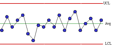
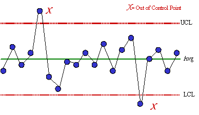
This pattern is typical of processes that are stable. Three characteristics of a process that is in control are:
- Most points are near the average
- A few points are near the control limits
- No points are beyond the control limits
If a control chart does not look similar to the one above, there is probably a special cause present. Various tests for determining if a special cause is present are given below.
Points Beyond the Control Limits
A special cause is present in the process if any points fall above the upper control limit or below the lower control limit. Action should be taken to find the special cause and permanently remove it from the process. If there is a point beyond the control limits, there is no need to apply the other tests for out of control situations. Points on the control limits are not considered to be out of statistical control.
Zone Tests: Setting the Zones and Zone A
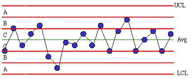
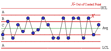
The zone tests are valuable tests for enhancing the ability of control charts to detect small shifts quickly. The first step in using these tests is to divide the control chart into zones. This is done by dividing the area between the average and the upper control limit into three equally spaced areas. This is then repeated for the area between the average and the lower control limit.
The zones are called zones A, B, and C. There is a zone A for the top half of the chart and a zone A for the bottom half of the chart. The same is true for zones B and C. Control charts are based on 3 sigma limits of the variable being plotted. Thus, each zone is one standard deviation in width. For example, considering the top half of the chart, zone C is the region from the average to the average plus one standard deviation. Zone B is the region between the average plus one standard deviation and the average plus two standard deviations. Zone A is the region between the average plus two standard deviations and the average plus three standard deviations.
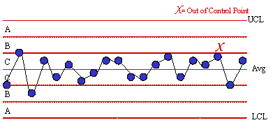
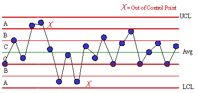
A special cause exists if two out of three consecutive points fall in zone A or beyond. The figure below shows an example of this test. The test is applied for the zone A above the average and then for the zone A below the average.
This test, like those below, is applied to both halves of the chart. However, only one half is considered at a time. For example, if one point falls in the zone A above the average and the next point falls in zone A below the average, this is not two out of three consecutive points in zone A or beyond. The two points in zone A must be on the same side of the average.
Zone Tests: Zones B and C
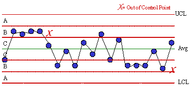
A special cause exists if four out five consecutive points fall in zone B or beyond. The figure below shows an example of this test. This test is applied for zone B above the average and then for zone B below the average.
A special cause exists if seven consecutive points fall in zone C or beyond. An example of this test is shown below. The test should be applied for the zone C above the average and then for the zone C below the average.
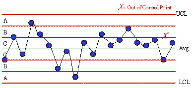
Test for Stratification
Stratification occurs if two or more processes (distributions) are being sampled systematically. For example, stratification can occur if samples are taken once a shift and a subgroup size of 3 is formed based on the results from three shifts. It is possible that the shifts are operating at a different average or variability. Stratification (a special cause) exists if fifteen or more consecutive points fall in zone C either above or below the average. The figure below is an example of this test. Note that the points tend to hug the centerline. This test involves the use of the zones but is applied to the entire chart and not one-half of the chart at a time. If stratification is occurring, a histogram of the individual measurements will probably be bimodal.
Test for Mixtures
A mixture exists when there is more than one process present but sampling is done for each process separately. For example, suppose you take three samples per shift and form a subgroup based on these three samples. If different shifts are operating at different averages, a mixture can occur. A mixture (a special cause) is present if eight or more consecutive points lie on both sides of the average with none of the points in zone C. The figure below shows an example of this test. Note the absence of points in zone C. This test is applied to the entire chart.
Rule of Seven Tests
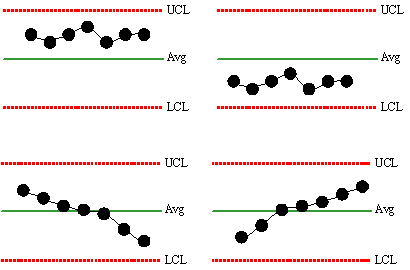
These tests are often taught initially to employees as the method for interpreting control charts (along with points beyond the limits). The tests state that an out of control situation is present if one of the following conditions is true: 1) Seven points in a row above the average, 2) Seven points in a row below the average, 3) Seven points in a row trending up, or 4) Seven points in a row trending down. These four conditions are shown in the figure below.
