April 2020
(Note: all the previous SPC Knowledge Base in the control chart examples category are listed on the right-hand side. Select this link for information on the SPC for Excel software.)

Within the United States, states are slowly beginning to open up again – to the delight of some and to the worries of others. The Trump administration has released suggested guidelines for states to use to help decide when to begin to reopen again. Part of these guidelines require measurements, for example, a downward trajectory of documented cases within a 14-day period.
I have seen a lot of data on COVID-19 – by country, by state, by county. Whenever I look at data over time, the first thing I do is to analyze the results using a control chart – looking for patterns in the data – trying to answer the questions – are things staying the same, are things getting better, or are things getting worse.
This publication examines some of the available COVID-19 data using the control chart approach to help understand the data. We start with the United States as a whole and then tunnel down into one state, my home state of Texas.
In this issue:
- Federal Guidelines for Opening Up America Again
- Data Source
- United States COVID-19 Analysis
- Tunneling Down into the States
- Texas COVID-19 Analysis
- Summary
- Quick Links
Please feel free to leave a comment at the end of this publication. You may download a pdf copy of this publication at this link.
Federal Guidelines for Opening Up America Again
The Trump administration published guidelines for states to follow to begin to open again. The guidelines are published at this link. The proposed approach includes the following objectives:
- Based on up-to-date data and readiness
- Mitigates risk of resurgence
- Protects the most vulnerable
- Implementable on statewide or county-by-county basis at governors’ discretion
Note that it involves “up-to-date data.” Before even starting to open up, there are “gating criteria” that must be satisfied before moving to the phased comeback. These gating criteria are in three areas:
- Symptoms: downward trajectory of influenza-like illnesses (ILI) reported within a 14-day period AND downward trajectory of COVID-like syndromic cases reported within a 14-day period
- Cases: downward trajectory of documented cases within a 14-day period OR downward trajectory of positive tests as a percent of total tests within a 14-day period (flat or increasing volume of tests)
- Hospitals: treat all patients without crisis care AND robust testing program in place for at-risk healthcare workers, including emerging antibody testing
Most of these also involve data – particularly the number of cases. So, let us look at how the data may be viewed using control charts.
Data Source
The data used in this analysis comes from The COVID Tracking Project website. The website updates data daily for the United States and the individual states. From the website:
“
The website provides historical data over time – a must to use to see if something is increasing, decreasing or staying the same. Just a word of caution about these data – the historical data changes some over time as new information is obtained, particularly the data for the last couple of days. The data used in this publication was downloaded on 4/28. Data through 4/27 were used in the analysis. You may download an Excel workbook with the data used at this link.
United States COVID-19 Analysis
It was not until 3/16 that data from all states and territories were being reported. So, 3/16 will be the starting point for the data analysis. We will look at the data for four variables on a daily basis:
- Number of Cases (part of the gating criteria)
- % of Positive Tests (part of the gating criteria)
- Number of Hospitalizations
- Number of Deaths
The individuals (X) control chart from the SPC for Excel software is used in all the control charts below. The moving range was not included in the analysis. Please see our publication on individual control charts to learn more about this type of control chart.
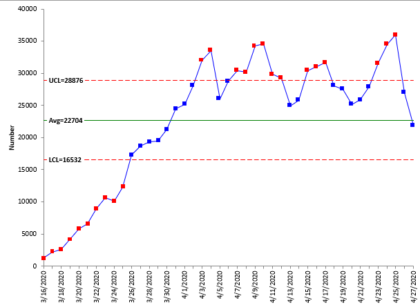
Figure 1 is the X control chart for the number of new cases per day in the United States.
Figure 1: Number of New COVID-19 Cases per Day in the United States
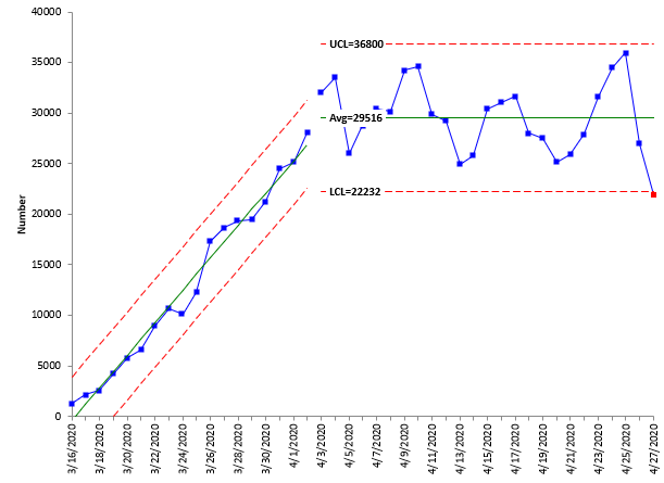
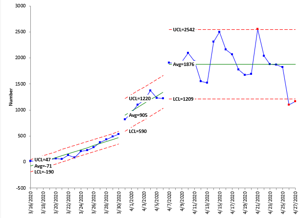
Not surprisingly, this X control chart does not do us much good as it is. You must use your ability to see where the shifts occur in the control chart to split the average and control limits. You can see in Figure 1 that there is an upward trend from 3/16 to about 4/2 – even predictable. This is followed by a period that look stable – consistent in control chart terms. Figure 2 shows the number of new cases with the control limits split starting on 4/3 and the option to check for trends used.
Figure 2: Number of New COVID-19 Cases per Day in the United States with Control Limits Split
Figure 2 shows a period where the number of new cases increased daily in a predictable fashion from 3/16 to 4/2. The slope of line during that time frame is about 1,606 – which is the increase in new cases each day. The period starting 4/3 appears to be stable – with the exception of the last point on 4/27. The average number of new cases from 4/3 to 4/26 is 29,516 with an upper control limit (UCL) of 36,800 and a lower control limit (LCL) of 22,232.
Right now, the data are fairly consistent, and the number of new cases will remain between the LCL and UCL until more of the efforts to combat the virus take hold. This will be seen when the data breaks out of that range – as it may be starting to do with the last data point. The best approach here would be to set the control limits based on the data from 4/3 to 4/26 and use those limits to judge the future number of cases of COVID-19.
This same approach was taken with the rest of the control charts in this publication. Periods of consistency were found, if present, and the control limits were split to reflect those periods. The control charts with the split limits are shown below.
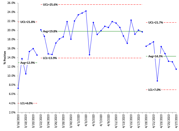
The data also includes the number of COVID-19 tests each day and the number that were positive and the number that were negative. The gating criteria include looking at the % of tests that are positive, when the number of tests is increasing or staying the same. Figure 3 shows the % of tests that are positive over time.
Figure 3: % of Tests That are Positive for COVID-19 in the United States
There are three patterns it seems. The first range has an average of 12.9%, then there is a range that averages 19.8% and finally it drops off some to an average of 14.3%. The availability of tests has been an issue in the United States. After the outbreak, the tests were limited to people with severe symptoms. Now more people are being tested, which may be the reason for the decrease recently in % of people testing positive.
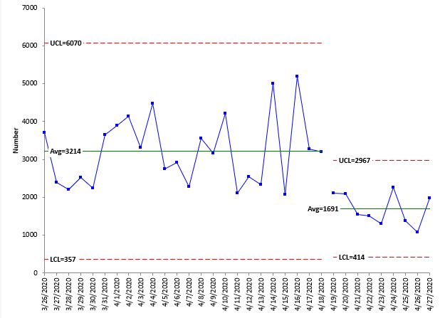
Figure 4 shows the number of new people hospitalized each day.
Figure 4: Number of New People Hospitalized Each Day in the United States Due to COVID-19
Data for hospitalization was not reported as early as cases. It appears that from 3/26 to 4/18, the process is fairly stable with an average of 3,214, although there is a lot of variation in the numbers. There has been a step change downward in the number of hospitalizations starting at 4/19. The average number since 4/19 per day is 1,691.
Figure 5 shows the number of deaths per day for the United States.
Figure 5: Number of Deaths per Day from COVID-19 in the United States
There appears to be two trends at the first part of the data, one flatter, then the rate of death from the virus increases. Then about 4/7, the pattern becomes more stable. For the last part of the chart, the average number of deaths per day from COVID-19 is 1,876. The control limit range is 1,209 to 2,542. Note that the last two points are below the LCL. This is an indication that the number of deaths per day may be decreasing – in fact, you probably should set the control limits for the time period from 4/7 through 4/25 and use that baseline period to judge future decreases in the number of deaths. But the two points below the LCL are encouraging.
Tunneling Down into the States
While the data above shows what is happening in the United States as a whole, it is not much use for helping states determine when they can reopen for business. There is a lot of variation in the results from state to state. New York is the largest contributor to the data in the United States, but the path New York takes to open will be different than states like Oklahoma. The states must look at their own data to decide what steps they need to take. I live in Texas. We will take a quick look at the data for this state.
Texas COVID-19 Analysis
Texas Governor Greg Abbott announced on 4/27 that businesses would begin to reopen in Texas on 5/1 in a phased process starting with retail stores, restaurants and movie theaters among others but with limited capacity. What do the data tell us about the situation in Texas. The three charts below show the Texas data for number of cases, % positive cases, and number of deaths.
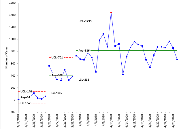
Figure 6: Number of New COVID-19 Cases per Day in Texas
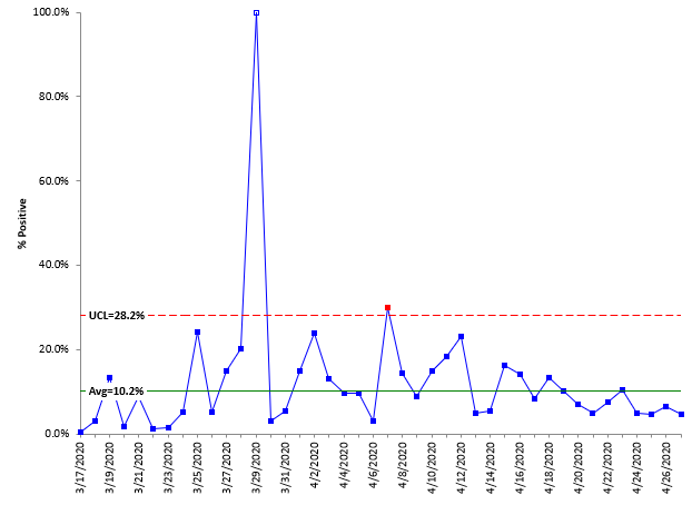
Figure 7: % of Tests That are Positive for COVID-19 in Texas
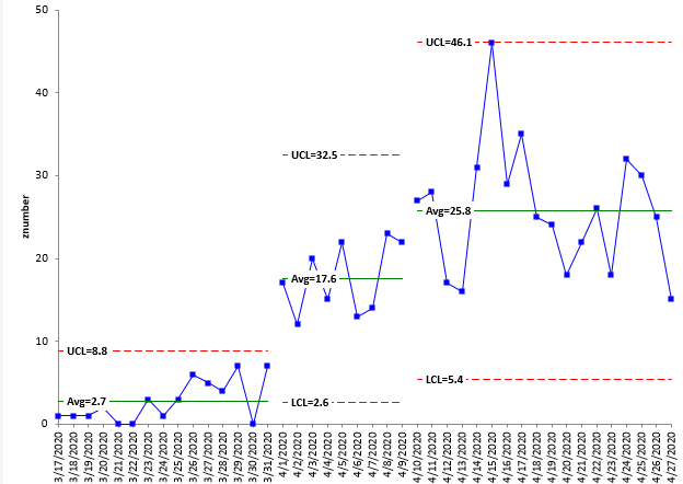
Figure 8: Number of Deaths per Day from COVID-19 in Texas
Figure 6 shows that the number of new cases per day in Texas has leveled out at 816. It does not appear to be decreasing at this time, but it is not increasing either. Examining Figure 7 shows that the % of tests that are positive appears to be decreasing in recent days – although there is no clear signal from the chart. One point had 100% of the day tests being positive. There were only 52 tests run that day. Figure 8 shows that the deaths per day have leveled off, averaging about 26 since 4/9. The number does not appear to be decreasing significantly, although it has decreased from the highs on the chart – so it might be moving in the right direction. For Texas, things might be getting better, but the data does not offer proof of it yet.
So, should Texas reopen? The next logical step in the data analysis is to look at the various counties. As of 4/27, there were still 46 counties (out of 254) in Texas with no cases. Most cases in Texas, of course, involve the bigger cities (e.g. Houston and Dallas). You can tunnel down further to look at the data on a county by county basis. Perhaps opening more on a county to county basis is best for Texas.
Summary
This publication has examined some of the COVID-19 data using control charts. The results show that a control chart can pick out the periods where data are increasing or are decreasing or staying the same. The data for the United States show some promising turns in the number of cases as well as the number of deaths with the last points on those two charts dipping below the LCL.
Let us all hope and pray for a cure and vaccine for COVID-19.
Dear Dr. Bill,Thank you for this article written in simple and accessible language.With respect,Sergey Grigoryev<br />DEMING.PRO
good analysis
Great control chart analysis!1) Number of New COVID-19 Cases per Day in the United States – Bad special causes noticed and unstable 2) Number of New COVID-19 Cases per Day in the United States with Control Limits Split – Eventhough cases per day higher but from 4.03.2020 no further hike and stable 3) % of Tests That are Positive for COVID-19 in the United States – Stared to decline and UCL and LCL too4) Number of New People Hospitalized Each Day in the United States Due to COVID-19 – 50% reduction from 19.04.2020 and stable 5) Number of Deaths per Day from COVID-19 in the United States – Deaths are high from 10.04.2020 but stable and out of control6) Number of New COVID-19 Cases per Day in Texas: On 9.04.2020 bad special cause and out of UCL, after that the status quo maintained.7) % of Tests That are Positive for COVID-19 in Texas : On 28.03.20 & 07.04.2020 two bad special causes and particularly 28.03.20 very high positive cases, however reducing trend noticed after 14.04.20208) Number of Deaths per Day from COVID-19 in Texas : Controlled but increased day by day, however hike controlled from 16.04.2020. Conclusion : After 15.04.2020, there is control in all aspects.
Hi Dr Bill, I’m observing the figure N.5 about the death per day.”For the last part of the chart, the average number of deaths per day from COVID-19 is 1,876. The control limit range is 1,209 to 2,542. Note that the last two points are below the LCL. This is an indication that the number of deaths per day may be decreasing – in fact, you probably should set the control limits for the time period from 4/7 through 4/25 and use that baseline period to judge future decreases in the number of deaths. But the two points below the LCL are encouraging.”this part for me is not clear beacause in the last part of the chart I don’t see 2 points below the LCL.probably I’m not looking the right chart or I’m not looking in the right way, let me know.Guido Casadio
Hello, yes we messed up on the chart and put the chart for Texas in twice; Figure 5 should have been for the USA. That has been corrected in the above.
Really interesting data, charts and opinions but I’m a little confused by Figure 5: Number of Deaths per Day from COVID-19 in the United States.The narrative doesn’t appear to match the chart ?
Thanks Keith, yes we put the chart for Texas in twice; we have corrected that. Figure 5 should have been for the USA.
Hello, Bill! Thanks for the article. How did you manage to create a control chart with control lines on a slant like in Figure 2? I'm using Minitab. When I create the same graph, I get the image below, which clearly shows out-of-control data points. Is that a feature of SPC, by any chance?
Hello Tom,
The calculations for a trend control chart are given in this link when I applied it to global warming:
<a href="https://www.spcforexcel.com/knowledge/variable-control-charts/trend-control-charts-global-warming">https://www.spcforexcel.com/knowledge/variable-control-charts/trend-control-charts-global-warming</a>
It is a feature of the SPC for Excel software. Minitab does not have it that i am aware of.
Bill