April 2013
 Ten people are presented a data set to analyze. Suppose this dataset involves the monthly on-time performance of one airline over the past three years. So, there are thirty-six data points to consider. The ten people are given the goal for the process. The goal is an average on-time performance of 90%. The ten people are asked to individually analyze the data for insights into the on-time performance for the airline.
How many different approaches do you think there would be? Ten? Six? Five? All taking the same approach? What would your approach be? You don’t need to see the data set to determine what approach to use. This month’s newsletter discusses an approach to use – an approach that is simple to use but will allow you to interpret data effectively and efficiently. The approach includes the four lessons of interpreting data presented by Dr. Don Wheeler in his great book Understanding Variation. We will use a few data sets from the aviation industry to demonstrate this approach to making sense of data – one that so few uses. Of course, this approach is based on statistical process control (SPC) and control charts.
In this issue:
- Aviation Data
- The Lessons of Dr. Wheeler
- Unruly Passengers
- Number of Boardings at Atlanta’s Hartsfield Airport
- Departure On-Time Performance at Atlanta’s Hartsfield Airport
- Average Yearly Fare for an Airline Ticket
- Summary
- Quick Links
Aviation Data
 The Federal Aviation Administration (FAA) and other groups have pages and pages of data related to the airlines and airports – almost always in tables with maybe a pie chart thrown in there somewhere. Tables and tables of data. Consider the following questions:
- Why is it that so few of us have taken the time to learn how to turn all that data into information to provide us insights into the process? Trying to see anything in a table is difficult at best – particularly the more data there are in the table.
- Why do we continue to compare one data point in time to another data point later in time? Atlanta’s Hartsfield airport saw a 2.8% increase in passengers from 2010 to 2011, the latest year with data available. Wow, the world’s busiest airport just got busier. Or did it? Is it less safe now? That must mean that the on-time departure performance at Atlanta has gotten worse. Or has it?
- Why do we assume a single data point is a signal that something has changed before we remove the noise in the data? The average airfare is highest it has been in the past ten years. Perhaps a true statement, but is it a signal that something has changed?
Of course, these questions apply to all industries. In his great book, Understanding Variation, Dr. Don Wheeler lays out some lessons about data analysis. This month we apply those lessons to the data from the FAA. We will look at the following data from the FAA and other sources:
- Number of unruly passengers per year (hope you aren’t one of these!)
- Number of boardings per year at Hartsfield airport
- On-time departure performance at Hartsfield airport
- Average yearly fare for an airline ticket
The Lessons of Dr. Wheeler
In his book, Understanding Variation, Dr. Wheeler lays out four major lessons (or principles) in understanding data. His books are available here: www.spcpress.com. No process improvement library is complete without a copy of Understanding Variation. The four lessons are summarized below.
 1. Data have not meaning apart from their context.
This means that you can’t just present a table of numbers. People looking at the data would have no idea where it came from or how it was collected. Dr. Wheeler refers back to Dr. Walter Shewhart, the father of SPC, in this principle. He paraphrases Dr. Shewhart’s two rules for presentation of data:
- “Data should always be presented in such a way that preserves the evidence in the data for all the predictions that might be made from the data.”
- “Whenever an average, range, or histogram is used to summarize data, the summary should not mislead the user into taking any action that the user would not take if the data were presented in a time series.”
So, what does this mean? It means quit presenting data just in tables. Use a chart to accompany the table. The charts could be a control chart (time series) chart, a histogram or a Pareto diagram. The charts provide a visual picture of the data in the table.
Shewhart’s second statement involves averages, ranges, and histograms. The problem with using these types of techniques is that the time order of the data is lost. A histogram can show a nice symmetrical curve that can be characterized by an average and a range. But a control chart of the same data could show a steadily decreasing process – something that cannot be seen with a histogram. The key point here is that you should be examining data over time to ensure that the context of the data is known. That means, in most cases, it would be wise to include a time series with a histogram, an average or a range.
 2. Before you can interpret data, you must have a method of analysis.
This is the key to interpreting data. You must have a method of analysis – and, if we all use the same method, we will generally reach the same conclusions. The method most commonly used by companies today is to compare a result to a specification (if the product is in spec, ship it!), to a target or goal (we reached our sales budget this month, yes!), or to performance in the past (this month’s sales is less than this month last year, oh no!). Sometimes we compare a result to an average. Yes – we are above average! No – we are below average! All these approaches ignore the concept of variation and how the process is actually performing.
Control charts are the best method of analyzing data over time. Control charts take into account variation –the normal variation in the process (common causes) and the “non-normal” variation in the process (special causes). If your process just has common causes of variation, the process is in statistical control. It is consistent and predictable. For more detailed information on the purpose of control charts, please see our March 2011 newsletter.
 3. While all data contain noise, some data contain signals.
Control charts separate the noise (common causes) from the signals (special causes) – something the other approaches cannot effectively do. Dr. W. Edwards Deming used to ask:
“How do you know?”
Four simple words. How do you know something has changed? That the last point is a signal? The most effective way to do this is through the use of a control chart.
 4. The purpose of analysis is insight.
You analyze data to gain insight into the process. Dr. Wheeler says that using control charts (along with the other simple tools such as histograms, process flow diagrams, fishbone diagrams, etc.) will allow you to gain insight into what is happening in the process and why.
We will now take a look at some example data from the aviation industry and see how these four lessons – particularly using control charts to separate the noise from the signals – apply.
Unruly Passengers
The FAA tracks yearly data on unruly passengers. The data for 1995 – 2011 are shown in the table below.
Table 1: Number of Unruly Passengers by Year
| Year | Number |
| 1995 | 146 |
| 1996 | 184 |
| 1997 | 235 |
| 1998 | 200 |
| 1999 | 226 |
| 2000 | 227 |
| 2001 | 300 |
| 2002 | 306 |
| 2003 | 302 |
| 2004 | 330 |
| 2005 | 226 |
| 2006 | 156 |
| 2007 | 176 |
| 2008 | 134 |
| 2009 | 176 |
| 2010 | 149 |
| 2011 | 140 |
The web page also includes the following general information:
- Interfering with the duties of a crewmember violates federal law.
- Federal Aviation Regulations 91.11, 121.580 and 135.120 state that “no person may assault, threaten, intimidate, or interfere with a crewmember in the performance of the crewmember’s duties aboard an aircraft being operated.”
- The FAA’s database contains only those incidents reported to FAA. Reporting is at the discretion of the crewmember.
- Security violations are excluded. Those cases are handled by the Transportation Security Administration (TSA).
- Updated numbers are posted on this web page quarterly.
- The repercussions for passengers who engage in unruly behavior can be substantial. They can be fined by FAA or prosecuted on criminal charges.
- As part of the FAA’s Reauthorization Bill (April 16, 2000) FAA can propose up to $25,000 per violation for unruly passenger cases. Previously, the maximum civil penalty per violation was $1,100. One incident can result in multiple violations.
How does this compare to the four lessons? The FAA does attempt to provide some context with their notes. But missing is a method of analysis and determining if the data contains any signals or just noise. Look at Table 1. What does the table of numbers tell you? It is not easy to see. It is better to put the data in a control chart format as shown in Figure 1. An individuals control chart (X-mR) is used. Only the X chart is shown.
Figure 1: Control Chart for the Number of Unruly Passengers per Year
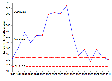
This chart makes the analysis of data much easier. It provides some insight to the process. There appear to be signals in the process as evidenced by a run above the average and then a run below the average. Taking a look at the chart shows a significant increase in the number of unruly passengers starting in 2001 and going through 2005. It appears that something happened to increase the number of unruly passengers.
Remember, a control chart signals that something has changed. It does not tell you why it changed. That is why you must use other techniques (see lesson 4 above) to find out what happened. That is why it important to understand where the data came from (the context of the data). Perhaps the increase was due to 9/11 and the crewmembers changed their impression of unruly passengers for a number of years.
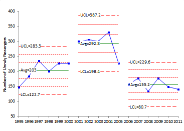
In fact, Figure 1 looks like there are three processes: one from 1995 to 2000, one from 2001 to 2005 and then one from 2006 on. Figure 2 shows the chart with the limits split for those three time periods.
Figure 2: Control Chart for the Number of Unruly Passengers per Year (Split Limits)
Number of Boardings at Atlanta’s Hartsfield Airport
The FAA tracks boardings for each airport in the United States. Atlanta is the world’s busiest airport. Unfortunately, the data contained at this link only shows data for two consecutive years. For example, you can compare 2011 with 2010 or 2010 with 2009 and so on. All you can really do with this is say something like Atlanta’s boardings increased 2.8% from 2010 to 2011. Is that significant? Is it a signal? What does the data tell you?
This approach really limits your method of analysis (the second lesson above). It makes much more sense to take a look at data over time – from year to year so you can see what the underlying process is doing.
The year-to-year data are shown in Table 2 (yes, I went through each table and pulled out the data). To the FAA’s credit, they do have some information on where the data comes from on the webpage – so they are trying to provide some context.
Table 2: Number of Boardings by Year at Atlanta’s Hartsfield Airport
| Year | Boardings |
| 2001 | 37181068 |
| 2002 | 37720556 |
| 2003 | 38893670 |
| 2004 | 41123857 |
| 2005 | 42402653 |
| 2006 | 41352038 |
| 2007 | 43236665 |
| 2008 | 43761280 |
| 2009 | 42280868 |
| 2010 | 43130585 |
| 2011 | 44414121 |
Again, what can you see from the table of numbers? It does seem that things are getting busier at Atlanta. But to tell for sure, you should use a control chart. Figure 3 shows the individuals control chart for these data.
Figure 3: Control Chart for the Number of Boardings in Atlanta Each Year
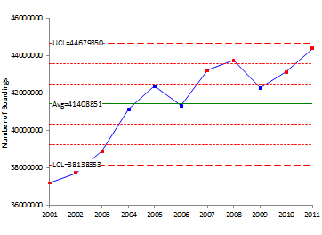
The control chart does show an increasing number of boardings over time in Atlanta. A much better picture than just the table of numbers. You would need to take a look at changes to the Atlanta airport (e.g., when new terminals opened, new runways, etc.) to begin to look for the reasons for the increases (beyond just additional travelers).
You could also look at the data with a trend control chart. This type of chart is used if there is a variable that is moving upward or downward at “predictable” rate. Figure 4 shows the trend control chart for the boardings data.
Figure 4: Trend Control Chart for Atlanta’s Boardings
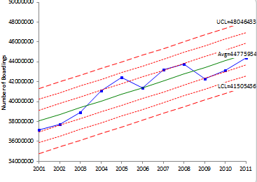
The chart shows an “in control” process for the boardings. The equation for the center line on this chart is:
y=673417x + 37368351
where y = number of boardings and x = the year number (1 = 2001, 2 = 2002, etc.). The slope of the line is 673,417. This means that the boardings at Atlanta’s airport are increasing an average of 673, 417 per year.
So, that must been that the on-time departure performance at Atlanta is decreasing. Or does it?
Departure On-Time Performance at Atlanta’s Hartsfield Airport
The data above shows that the number of boardings in Atlanta is increasing each year on average. Does that mean that the on-time departure performance is decreasing? The Bureau of Transportation Statistics tracks these data and can be found at this link. The data are summarized in Table 3.
Table3: Yearly On-Time Performance at Atlanta’s Hartsfield Airport
| Year | No. of Departures | No. On-time | % On-Time |
| 2004 | 66,779 | 49,916 | 74.7% |
| 2005 | 69,312 | 50,545 | 72.9% |
| 2006 | 63,828 | 47,897 | 75.0% |
| 2007 | 62,123 | 44,974 | 72.4% |
| 2008 | 66,284 | 49,207 | 74.2% |
| 2009 | 64,129 | 52,269 | 81.5% |
| 2010 | 65,005 | 50,806 | 78.2% |
| 2011 | 60,985 | 47,341 | 77.6% |
| 2012 | 61,190 | 53,204 | 86.9% |
What does this table of numbers show? Might be an increase in on-time departure performance. Again, it makes sense to look at the data from a control chart format. Figure 5 shows the control chart for on-time performance.
Figure 5: Control Chart for On-Time Performance at Atlanta’s Hartsfield Airport
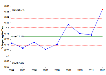
Wow, we do have a signal! On-time performance is out of control on the good side for 2012 – despite the increase in boardings. It would be interesting to understand why this occurs – but you would need additional information. Atlanta opened a new international terminal in 2012 that added 12 gates to the existing 195. Maybe this was the reason. But this chart shows how a signal is separated from the noise using a control chart. Sometime has changed to increase the on-time departure performance at Atlanta’s airport.
Average Yearly Fare for an Airline Ticket
Feel like you are paying more to travel on an airline now? Let’s find out. The Bureau of Transportation Statistics tracks these data. The data are shown in Table 4.
Table 4: Average Yearly Fare for an Airline Ticket
| Year | Average Fare |
| 1995 | 292 |
| 1996 | 277 |
| 1997 | 287 |
| 1998 | 309 |
| 1999 | 324 |
| 2000 | 339 |
| 2001 | 321 |
| 2002 | 312 |
| 2003 | 315 |
| 2004 | 305 |
| 2005 | 307 |
| 2006 | 329 |
| 2007 | 325 |
| 2008 | 346 |
| 2009 | 310 |
| 2010 | 336 |
| 2011 | 364 |
| 2012 (thru 3Q) | 375 |
Again the website does provide some context:
“Fares based on domestic itinerary fares. Itinerary fares consist of round-trip fares unless the customer does not purchase a return trip. In that case, the one-way fare is included. Fares are based on the total ticket value which consists of the price charged by the airlines plus any additional taxes and fees levied by an outside entity at the time of purchase. Fares include only the price paid at the time of the ticket purchase and do not include other fees paid at the airport or onboard the aircraft. Averages do not include frequent-flyer or “zero fares” or a few abnormally high reported fares.”
But you are still somewhat lost without looking the data over time. This is done in Figure 6.
Figure 6: Control Chart for Average Airline Ticket Fare by Year
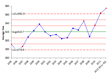
What does the control chart show? Again, it has separated a signal from the noise. The signal occurs at the end of the chart where there are four of five points beyond two standard deviations as well as the last two years being above the upper control limit. There has been a significant increase in the average yearly fare. You are paying more to fly.
Summary
This month’s newsletter has reviewed the four lessons in the interpretation of data presented by Dr. Wheeler. We also looked at examples from the aviation industry. Like most industries, the data are usually presented in tables – perhaps with some explanation of the numbers and perhaps with some average statistics. Also never do you see the data presented to provide the most information – in a control chart format. A control chart is a simple technique to use. It is sad that so few understand the power contained in having the knowledge of variation at their fingertips. Don’t be one of those.
Thanks for a good article. Wheeler's book is very good.