June 2020
(Note: all the previous SPC Knowledge Base in the control chart examples category are listed on the right-hand side. Select this link for information on the SPC for Excel software.)

The other is to see if the trend can be explained by step changes in the results and split the control limits to account for the step changes. This publications examines these two approaches using yearly global temperature deviations.
In this issue:
- Previous Publications
- Global Temperature Deviations as a Run Chart
- A Trendline Does Not Mean There is a Trend
- Global Temperature Deviations as a Trend Chart
- Global Temperature Deviations as a Series of Step Changes on a Control Chart
- Trend or Split Control Limits – Which is Better?
- Summary
- Quick Links
You may download a pdf version of this publication at this link. Please feel free to leave a comment at the end of the publication.
Previous Publications
We have four previous publications on using control charts to analyze global temperature changes. The data used in all our publications were downloaded from the Goddard Institute for Space Studies (GISS) website at this link. GISS is part of the National Aeronautics and Space Administration (NASA). The data are now given as a deviation from the baseline period from 1951 – 1980. For example, the temperature deviation for 2017 is 0.9 °C. This means that 2017 was 0.9 °C higher than the baseline mean from 1951 to 1980. Our previous publications on global warming are reviewed briefly below.
- SPC and Global Warming (December 2015): This publication used global temperature data referred to as dTs data. These are data based on the meteorological station data. This publication showed the periods where the global temperature was essentially stable. There were five such periods, each followed by a sudden increase in the global temperature. It also showed the trend that began in 1997. This trend was used to predict the global temperature for 2016.
- Trend Control Charts and Global Warming (January 2016): This publication expanded on how to use trend control charts and the calculations involved.
- SPC and Global Warming Update (February 2017): This publication updated the results with the 2016 data. The data used in this analysis were the LOTI (land-ocean temperature index) data. The LOTI data are considered more accurate than the dTs data used in the first publication listed above. Our predicted global temperature for 2016 was quite a bit lower than the actual.
- SPC and Global Warming – 2017 Update (March 2018): This publication updated our journey of examining the variation in global temperature change. It examined how the 2017 global temperature change fit our analysis using the trend control chart, examining the way the historical data changed from 2016 to 2018, and we predicted the global temperature change for 2018. This prediction was remarkably close to the actual 2018 result.
Global Temperature Deviation as a Run Chart
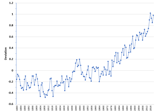
The data used in the analysis below can be downloaded in an Excel workbook here. That data gives the monthly deviation in global temperature from 1880 to May 2020. The data also includes the change for the entire year. This annual change is shown in Figure 1 from 1880 to 2019.
Figure 1: Global Temperature Deviations (1880 – 2019)
The temperature deviations in the first part of the chart are negative, meaning that this time was cooler than the baseline data from 1951 to 1980. Then there is a period where the temperature deviations bound around 0. This includes the baseline period – so that is not too surprising. Then, in 1977, the deviation is above 0 and it has stayed that way ever since.
The data, prior to 1997, has been characterized by periods of stability followed by a step-change to new levels (see our first publication on global warming). Since 1997, the data has been trending upward – or has it? With more data now since 1997, there is a case to be made that it is still a series of step changes (like prior to 1997) and not a trend. We look at both cases below. But first a note on trends.
A Trendline Does Not Mean There is a Trend
It seems most of us use Excel. Excel has this interesting feature that misleads many of us. When you plot some data in an Excel chart, you can right-click on it and select the option “Add Trendline” and you have a trendline added to the chart. You can add a trendline to any data. And that line may go up or it may go down. But it does not mean there is a true trend in the data.
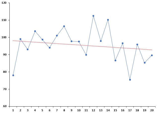
Twenty random numbers from a normal distribution were generated using the SPC for Excel random number generator routine. The normal distribution had a mean of 100 and standard deviation of 10. The twenty random numbers are plotted in Figure 2, along with the trendline added using Excel.
Figure 2: A Trendline That Is Not a Trend
The trendline “appears” to be going down, so some might conclude there is a downward trend in the data. That is not the case. This trend is not significant. To use a trend in a control chart, it must be statistically significant – which means you must do a regression to discover if the relationship is significant or not. The calculation of a p-value from the regression helps you do this. If the p-value is less than 0.05, you conclude that there is a significant trend. If it is greater than 0.05, you conclude there is not a significant trend. If you did a regression on the data in Figure 2, the p-value you would obtain is 0.47. Since it is not less than 0.05, you conclude that there is not a significant trend in the data.
The data used in Figure 2 is included in the workbook with the global temperature deviations, which you can download here.
Global Temperature Deviations as a Trend Chart
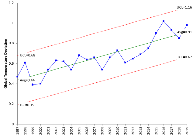
The global temperature deviations from 1997 to 2019 were analyzed as an individuals control chart using the SPC for Excel software. The software has the option to check for a trend and, if the trend is significant (a p-value < 0.05), then a trend control chart is created. If the trend is not significant, the normal individuals control chart is created. There is a statistically significant trend between the year and the global temperature deviation for the time from 1997 to 2019. The trend control chart is shown in Figure 3. We will not worry about the moving range chart in this analysis, just the X chart.
Figure 3: Global Temperature Deviations as a Trend Control Chart
The calculations for the trend line and control limits are covered in the earlier publication Trend Control Charts and Global Warming. This trend chart is in statistical control. The slope of the center line is 0.0216, which means, on average, the temperature deviation increases 0.0216 each year. This is one way to look at the recent changes in global temperatures.
Global Temperature Deviations as a Series of Step Changes in a Control Chart
There is a challenge when examining data that is trending upward or downward. Is there an actual trend (like indicated in Figure 3) or can the trend be explained by a series of step changes in the data? This section gives some ideas on how you determine possible step changes in trending data.
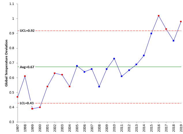
The first thing to do is to simply make a control chart with no splits or trend analysis. Figure 4 is the control chart for global temperature deviations from 1997 to 2019.
Figure 4: Control Chart with No Split Control Limits
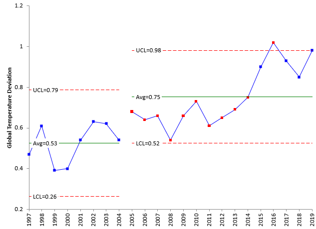
The idea is to look at when there are shifts in the data, usually denoted by out of control points. You can see the first 8 points (from 1997 to 2004) are below the average. This signals it could be a spot to split the control limits. Figure 5 shows the control chart with the control limits split at year 2005.
Figure 5: Control Chart with Control Limits Split Once
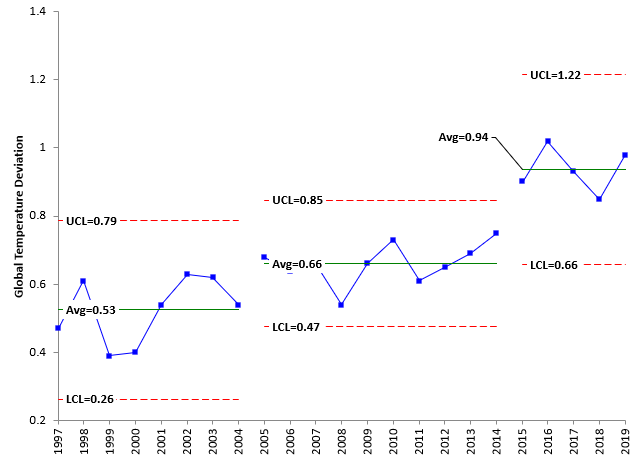
You can see from Figure 5 that the first 8 points now form their own stage – nicely in statistical control. Now there appears to be a second stage. There are 10 points (2005 – 2014) below the average. This suggests another place to split control limits. Figure 6 shows the control chart with control limits split at year 2015.
Figure 6: Control Chart with Control Limits Split Twice
This control chart, with the split limits, is also in statistical control. There appear to be three distinct stages in the last 23 years:
- 1997 – 2005: an eight-year period with an average 0.53 temperature deviation
- 2006 – 2014: a ten-year period with an average of 0.66 temperature deviation
- 2014 – 2019: a five-year period (so far) with an average 0.94 temperature deviation
The data for the first 5 months of 2020 shows a temperature deviation of 1.154. If this continues, it will be between the control limits for the last five-year period.
Trend or Split Control Limits – Which is Best?
Compare Figure 3 with the trending control limits, and Figure 6 with the three distinct stages. Which is better? Simple answer, the one you think best describes the process and is plausible to you.
Our first article demonstrated how the data from 1880 to 1996 could be described as a series of step changes over time. Only when you got to 1997 did the data really look like it was beginning to trend up quickly from year-to-year through 2015 – particularly with the upward trend from 2011 to 2015. But with additional years added to 2019, it begins to look more like the previous data – periods of stability leading to a step change in the temperature.
So, with the temperature data, I tend to think the staged approach is best because it is a pattern that has been repeated quite often since 1880. Now the question: what causes those step changes? Good question. Perhaps it is time to study how the greenhouse gasses or other factors have grown over the years and see if there is a similar pattern.
Summary
Sometimes data trends up or down. The question with control charts is how to handle this type of data. There are options sometimes. If the trend is close to a straight line going up or down, use a trend control chart. Other times, the data tends to go up or down but bounces around a lot. In that case, you may still want to use a trend control chart. Or you might want to see if the trend is caused by step changes and is really composed of stages with each stage being in control but step changes in between the stages. The global temperature deviations were used to explore these options.
Thank you for one of the few climate-change analyses by a non-climate-scientist (as I take you to be) that does not attempt to debunk the incontrovertible fact of global warming by bogus methods like picking 1998 as the baseline year etc. This article clearly shows the progression of warming and the periods of stability – it should be required reading for presidential candidates. You have stayed away – for now – from the discussion of whether the changes are anthropogenic, but I can see a future article on the correlation between temperature and GHG emissions as explicated using SPC.
Hi Chris,
Thanks for the comment. As you suspected, I am not a climate scientist. Just thought it would be fun to look at the data in a different light. Control charts are great for telling when a change has occurred – finding out why it changed is much more challenging of course.
Hi,have a generaal question about control charts for trending systems… the type you aluded to at teh end of your recent post.In looking at the overall temperature data at teh start of your post, it seems to be following waht coudld be an exponential trend… I woudl be temped to try to find a best fit curve (exponential or whatever it might b) a, then build control limits around it as you did in teh lat section to see if the porces is in ciontrol around that predefined trend…Maybe other "in control" tests could be adaptaed to to fit the trend rather than a constant average (e.g. counts on a positive or negative run, could be changed to counts on a run above or below expected trend)I lack the strong statistical backround you have so my question is, woudl this be an acceptable practice or is there some kind of intinsic statistical flaw in doig this?Thanks,ET
Thanks for the comment. I tend to like to keep things simple – and the individuals chart is really very robust. Of course, you could try to fit the data to different distributions, but there are not really enough data points to get a good idea of what the distribution would be. All things being equal, if nothing was changing, I would expect the data to some what normal.
Hi Bill, I would like to reproduce fig 1 run chart but I cannot locate the data column in the data sheet. Which column in the data sheet do I use? I do not understand the column headers.Thank you.Stan Alekman
Hi Stan, If you want the data in degrees C, use column N (the J-D data). The baseline for the data is 14 degrees. Divide the number in column N by 100 to get the change in temperature for that year and then add it to 14.
I added a column to the workbook with the converted temperatures. You can redownload it if you would like.
Thank you.
Interesting analysis. I know you’ve done many more of these charts then I have, but I think I disagree with your final statement that the latter part of the temperature trend is best made up of a series of shorter horizontal segments. When I constructed this using your entire data set, starting at 1880 and not 1997, I get the following chart. For about 100 years, the process continued in two horizontal regimes. Thereafter, the horizontal steps were barely a decade long.The shift from long undisturbed segments to short segments is itself a process change. In fact, it is more of a process mechanism change than merely a process shift. Even within these shorter steps, one can imagine that the points follow a slope. And the changed mechanism has to be related to the runaway increase of greenhouse gases.Given this change in mechanism, I have changed the latter part of the chart to a ramp, and selected the transition where the sloped centerline intersects the horizontal mean of the previous segment.In light of the changing mechanism of warming, and the reasonable fit of the points to the centerline, this approach makes more sense to me.
Thanks for your great input and analysis. I don't disagree with your analysis. There are points that show out of control conditions in the long patterns you have – I think those are different periods of homogeneity and it is valid to split the control limits there.
It is definitely true that the step changes (if you go that route) have been much shorter in recent years. I believe it is two different ways in looking at the data. The trend is what most people would say is going on because of the correlation to greenhouse gases increase. I still find the pattern of step changes interesting and provides another way to look at the data.
Mr. McNeese,Would you give me permission to use some of these charts in a class presentation about statistical process control?Thank you,Susanna Galens
Hello Susanna,
You have my permission. I would ask you give credit with a link to the website.. Thanks,
Bill
Thank you so much! Done!