September 2019
(Note: all the previous SPC Knowledge Base in the comparing processes category are listed on the right-hand side. Select this link for information on the SPC for Excel software.)

Several months ago, I ran across a new one to me – the Analysis of Mean Moving Ranges (ANOMmR). This month’s publication explores how this technique is used to look for differences in the average moving ranges between processes. All the ANOM techniques use a chart to easily show when significant differences do or do not exist.
In this issue:
- Introduction to Analysis of Mean Moving Ranges (ANOMmR)
- The Data
- Start with Consistency
- The ANOMmR Technique
- Summary
- Quick Links
You may download a pdf copy of this publication here. Please feel free to leave a comment at the end of the publication.
Introduction to Analysis of Mean Moving Ranges (ANOMmR)
The ANOMmR method was introduced to me in an article published this year by Quality Digest entitled When are Instruments Equivalent? – Part Two. The article was written by Dr. Donald Wheeler and James Beagle III. The two-part series examined how you can tell if measurement instruments are equivalent. Part 1 of the series used the ANOM technique to look for instrument bias. Part 2 introduced the ANOMmR technique to look for differences in measurement error as defined by the average moving ranges.
So, the ANOMmR method is used to find out if a group of “things” have the same or different average moving ranges. The “things” can be measurement instruments, machines, shifts, etc. The following must be true to perform the ANOMmR technique:
- There are m processes being examined.
- There are k individual data points for each process.
- This means that each average moving range for each process is based on k-1 two-point moving ranges.
There is an ANOMmR chart that easily shows if there are differences in the average moving ranges between the m processes. The average moving range of each process is plotted on the ANOMmR along with the mean average moving range – which is the average of the m average moving ranges and is the centerline on an ANOMmR chart. There are lower and upper detection limits that are calculated and added to the ANOMmR chart. Any average moving range that is beyond the detection limits is evidence that there are significance differences in the average moving ranges. The ANOMmR chart provides a simple, visual view of the results that is easy to communicate. We will introduce the ANOMmR technique through an example.
The Data
There are four machines that make the same product. We want to know if the variation is the same between the four machines. A sample is taken from each machine every 30 minutes and measured for a quality characteristic. The results for the past 15 hours are shown in Table 1 for the four machines.
Table 1: Data from Four Machines
| Sample | A | B | C | D |
|---|---|---|---|---|
| 1 | 215 | 213 | 220 | 205 |
| 2 | 217 | 210 | 211 | 205 |
| 3 | 216 | 220 | 217 | 216 |
| 4 | 214 | 211 | 210 | 225 |
| 5 | 213 | 217 | 213 | 213 |
| 6 | 218 | 216 | 217 | 206 |
| 7 | 214 | 216 | 212 | 225 |
| 8 | 217 | 212 | 214 | 203 |
| 9 | 222 | 215 | 212 | 204 |
| 10 | 216 | 215 | 214 | 221 |
| 11 | 219 | 219 | 209 | 211 |
| 12 | 210 | 209 | 214 | 218 |
| 13 | 218 | 212 | 218 | 223 |
| 14 | 214 | 217 | 213 | 223 |
| 15 | 211 | 216 | 212 | 203 |
| 16 | 214 | 223 | 210 | 218 |
| 17 | 218 | 219 | 211 | 217 |
| 18 | 216 | 214 | 212 | 215 |
| 19 | 218 | 212 | 216 | 207 |
| 20 | 216 | 214 | 213 | 208 |
| 21 | 211 | 216 | 219 | 210 |
| 22 | 222 | 217 | 210 | 202 |
| 23 | 214 | 215 | 210 | 217 |
| 24 | 211 | 221 | 213 | 209 |
| 25 | 211 | 220 | 210 | 210 |
| 26 | 217 | 220 | 208 | 213 |
| 27 | 222 | 220 | 218 | 205 |
| 28 | 219 | 211 | 212 | 209 |
| 29 | 216 | 212 | 210 | 222 |
| 30 | 208 | 214 | 212 | 223 |
In this example there are m = 4 processes and each process has k individual values.
Like many things, the first thing to address is consistency. Are the results from each machine consistent? Remember, it makes no sense to compare any processes unless those processes display consistency. The easiest way to demonstrate consistency is by using a consistency chart – in this case an individuals control chart (X-mR).
Start with Consistency
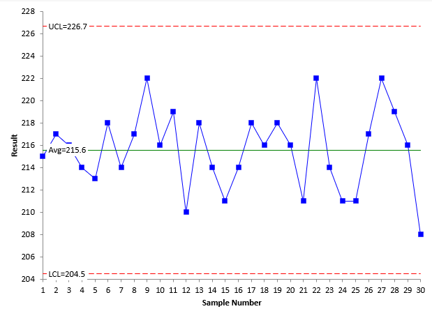
The only way to tell if a process is consistent is to chart it over time as a control chart. Since the ANOMmR technique uses the moving ranges, it makes sense to use an individuals control chart to determine if the process is consistent. The results of each machine should be analyzed using a X-mR chart. The X chart for Machine A is shown in Figure 1.
Figure 1: X Chart for Machine A
Each of the k individual results is plotted on the X chart. For example, the first two samples from the table for Machine A are 215 and 217. These are plotted as the first two points in the X chart. The centerline on the X chart is the average of the 30 individual values.
The other two lines are the upper control limit (UCL) and lower control limit (LCL). These limits set the bounds of the normal (common cause) variation for Machine A. If all the points are within the limits and there are no patterns, the process is consistent with respect to the X values. This means the process is in control with respect to the X values. This is the case in Figure 1.
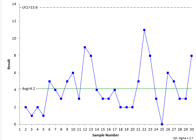
The moving range (mR) chart for Machine A is shown in Figure 2.
Figure 2: mR Chart for Machine A
The moving range chart plots the range between consecutive values. For example, the first two samples from Machine A have values of 215 and 217. The moving range between these two values is |215 – 217| = 2. Each moving range – which is a measure of the variation in individual results – is plotted on the chart. There are k – 1 moving ranges. The centerline is the average of the moving ranges. It is this average moving range that will be compared to the other machines to see if there are any differences in the variation between machines. The upper control limit (UCL) is added to the chart. This sets the upper bound for the normal (common cause) variation in the moving range chart. There is no lower control limit with a moving range based on the range between consecutive points. If all the moving ranges are within the UCL, the process is consistent with respect to the moving range. This is the case for Machine A.
So, Machine A is consistent with respect to both the X values and the moving range values. The data for the other three machines are consistent also. These charts will not be shown here. In reality, you only need to check to see if the processes are consistent with respect to the moving range.
The ANOMmR Technique
The ANOMmR technique compares the average moving ranges of the four machines. Figure 2 shows that the average moving range of Machine A is 4.2. The average moving ranges for all machines are:
- Machine A: 4.2
- Machine B: 3.6
- Machine C: 3.9
- Machine D: 7.9
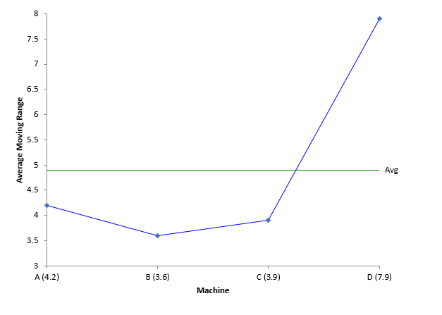
The ANOMmR chart plots these average moving ranges. The mean of the four average moving range is calculated and plotted on the chart as well. The mean is 4.9. The ANOMmR chart at this point is shown below in Figure 3.
Figure 3: Start of ANOMmR Chart
The chart above shows that Machine D may have a larger variation (average moving range) than the other 3 machines. To confirm this, lower detection limits and upper detection limits are calculated and placed on the chart. The limits are defined as:
Lower Detection Limit = = LLα[Mean Average Moving Range)
Upper Detection Limit = = ULα[Mean Average Moving Range)
where LL and UL are scaling factors that depend on the alpha (α)level, the number of average moving ranges being compared (m), and the number of individual values for each machine (k). Alpha is the risk of getting a false alarm. The Quality Digest article contains a table of the scaling factors for alpha = 0.10, 0.05, and 0.01, m values from 2 to 20 and k values from 5 to 50. You can also download the table of scaling factors for the ANOMmR technique here. For alpha = 0.05, m = 4 and k = 30, the scaling factors are:
LL0.05 = 0.661
UL0.05 = 1.378
The detection limits are then:
Lower Detection Limit = = 0.661(4.9) = 3.2
Upper Detection Limit = = 1.378(4.9) = 6.8
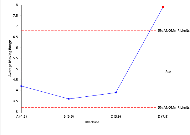
These detection limits are then added to the ANOMmR chart as shown in Figure 4.
Figure 4: Completed ANOMmR Chart
Any point beyond the detection limits indicates that there is a detectable difference in the average moving ranges (variation). You can see from Figure 4, that Machine D has a detectable difference. The other three machines appear to have the same amount of variation. The ANOMmR provides a picture that is easy for everyone to interpret.
Summary
This month’s publication examined the Analysis of Mean Moving Ranges technique. This technique determines if there are any significant differences in the average of m moving ranges, each with k individual values. The average moving range for each of the m processes is determined and plotted on the ANOMmR chart along with the mean of the average moving ranges. Scaling constants that depend on alpha, m and k are determined from a table and used to calculate the upper and lower detection limits. The detection limits are added to the ANOMmR chart. Any points that are beyond the detection limits are evidence that significant differences exist between the average moving ranges. The ANOMmR chart provides a visual picture of the results that is easy to interpret. It is also easy to communicate the results to others.


