January 2019
(Note: all the previous SPC Knowledge Base in the comparing processes category are listed on the right-hand side. Select this link for information on the SPC for Excel software.)

In this issue:
Please feel free to leave a comment below. You can download a pdf copy of this publication at this link.
The Data
The data and the methodology below are taken from the book “Analyzing Experimental Data” by Dr. Donald Wheeler (www.spcpress.com). In this example, parts are coated using different treatments. It is desired to compare five different treatments. Four parts are coated using each different treatment and the coating weight was measured. The data are shown in the table below.
| Treatment | One | Two | Three | Four | Five |
|---|---|---|---|---|---|
| 250 | 310 | 250 | 340 | 250 | |
| 260 | 330 | 230 | 270 | 240 | |
| 230 | 280 | 220 | 300 | 270 | |
| 270 | 360 | 260 | 320 | 290 | |
| Average | 252.5 | 320 | 240 | 307.5 | 262.5 |
| Range | 40 | 80 | 40 | 70 | 50 |
The experiments were run in random order. The five treatments are the column headings. The results for each of the four parts from each treatment are below the headings. For example, for treatment one, the four coating weights obtained were 250, 260, 230 and 270.
The table above shows the averages for each treatment. They are not equal. Of course, this is not unexpected. Normal process variation will cause the averages to be different. The question we want to answer is:
“Are there any significant differences in the treatment means?”
We are essentially testing the following hypotheses:
Ho: μ1= μ2= μ3= μ4= μ5
H1: μi ≠ μj
where μ is one of the treatment averages, H0 is the null hypotheses and H1 is the alternate hypotheses.
Analysis of Means (ANOM)
The steps in the ANOM are given below.
- Collect the data by running the experiments
- Calculate the subgroup (treatment) averages and ranges (as shown in the table above)
- Calculate the overall average and the average range
- Plot the subgroup averages and overall average on the ANOM chart
- Calculate the detection limits:
- Detection Limits = Overall Average ± ANOMα(Average Range)
- Plot the detection limits on the ANOM chart
- Interpret the ANOM chart
Looks very much like how you put together a control chart – until you get to the part about the detection limits. ANOMαis called a scaling factor. It depends on the subgroup size, the number of subgroups and the overall alpha (α) level you select for the analysis. The scaling factors come from a table. Dr. Wheeler has three tables based on alpha values of 1%, 5%, and 10%. You can also download the scaling factors at this link.
So, what does alpha represent? For ANOM, it represents how sensitive the analysis is. It is about getting false signals, e.g., deciding that a treatment significantly impacts the coating weight when it doesn’t. The larger alpha is, the more sensitive the analysis is and the more likely it is to get a false signal. The smaller alpha is, the less sensitive the analysis is and the less likely it is to get a false signal.
For this type of experiment – when we want to see if a treatment impacts coating weight – we want the analysis to be sensitive. Yes, we may make a wrong decision, e.g., that treatment one impacts the coating weight when it really does not. But we will discover we were wrong when we do the confirmation runs. That is better than deciding that treatment one does not impact the coating weight when it really does. You would never make that confirmation run. So, higher values of alpha are desirable for this type of experiment.
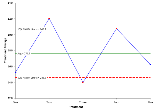
In this example, there are five subgroups, each with a subgroup size of 4 (the number of parts in each treatment). With alpha = 10%, the scaling factor is 0.540. The overall average is 276.5. The average range is 56. The detection limits are then:
Upper Detection Limits = 276.5 + (0.540)(56) = 306.7
Lower Detection Limits = 276.5 – (0.540)(56) = 246.3
The ANOM chart is shown in Figure 1.
Figure 1: ANOM Chart with Alpha = 10%
The ANOM chart shows three treatments beyond the detection limits: two, three and four. These three treatments have significantly different coating weight averages than the overall average of 276.5.
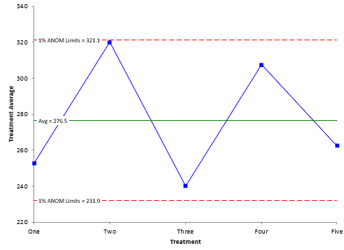
Figure 1 had an alpha of 10%. Suppose we used an alpha of 1%. This means the analysis would be less sensitive. The scaling factor for 1% alpha is 0.797. This gives the ANOM chart in Figure 2.
Figure 2: ANOM Chart with Alpha = 1%.
The detection limits with the smaller alpha are wider. Note that with this less sensitive analysis, all the treatment averages are within the detection limits. This analysis says that none of the treatment averages are significantly different than the overall average. When using ANOM to detect differences in treatments, it is best to use alpha = 10% to be more sensitive to signals.
A completed ANOM looks very much like an X control chart. The data are collected as shown above. The subgroup (treatment) averages and ranges are calculated. The overall average and the average range are calculated. The subgroup averages and overall average are plotted on the ANOM. The same process as for control charts so far.
The difference is that control charts have control limits (three sigma limits) while ANOM has detection limits based on the alpha level. Control charts also have alpha levels based on the number of subgroups and subgroup size. You want alpha levels for control charts to be smaller to avoid the false signals.
Analysis of Ranges (ANOR)
You can analyze the subgroup (treatment) ranges in a similar way. The ranges and the average range are plotted. There is only an upper detection limit for the range chart. It is given by:
Upper Detection Limit = ANORs(Average Range)
where ANORs is a scaling factor based on the number of subgroups, the subgroup size and the alpha level. In his book, Dr. Wheeler recommends using a smaller alpha for the range analysis than for the average analysis. This is because the purpose of the two charts are different.
With the ANOM, you are looking for a signal from the experiment you ran. That is not the case for the ANOR chart. If you get a signal on the ANOR chart, it means that a special cause was present in that subgroup – something happened that does not normally happen. If this occurs, then the estimate of the average range is probably inflated – which leads to larger detection limits on the ANOM chart and potentially missed signals.
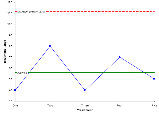
Figure 3 is a chart of ANOR with alpha = 5%. The scaling factor is 1.991.
Figure 3: ANOR Chart with Alpha = 5%
There no treatment ranges beyond the upper detection limit. This means that there is no difference in the within treatment variation – each one is the same. It also means that you can “trust” the results in the ANOM – that there are three treatment averages that are different from the overall average.
Summary
This publication introduced the Analysis of Means (ANOM) and the Analysis of Ranges (ANOR) techniques. You use the ANOM to determine if there are significant differences between averages of different treatments. This provides a visual picture of the differences. You use ANOR to ensure that the within treatment variation is the same for each treatment.


Hi Bill,I found Dr. Wheeler's attempt to replace ANOVA with adapted SPC charts very interesting. I applaud you for making his approach more available to others with your SPC for Excel add-in. For his example, we might ask whether his range-based ANOM-ANOR charts are telling us more or less than conventional ANOVA methods do. I would say that they are giving us similar information, but here classic ANOVA is more powerful at putting a p-value on whether there is any hint of unequal variance (no, p=0.759 by Bartlett's test) and at detecting which subsets are different: (Two, Four > One, Three at overall alpha=0.05 by Tukey Grouping). Modern software can provide graphs which convey overlapping CI on variances and non-overlapping 95% CI on effects nearly as clearly as adapted SPC charts will.I think that the more interesting situation occurs when there is unequal variance among subgroups. Then, how do ANOR charts compare to conventional equality of variance tests for detecting it, and are ANOM charts made markedly more robust by using average range instead of pooled variance for detecting differences between subgroups? I suspect that you might be writing about this in the future?
Hi Dale,
I have not done much work at looking at the issue of unequal variances but it is definitely something worth looking at – i image Dr. Wheeler has done it someplace. I like the simplicity of this method – and how visual it is.