June 2025
 You are an engineer in a chemical plant working on improving the purity from a reactor. You have six new catalysts to evaluate in your pilot plant. You want to know which catalyst is best. How can you find this out? Two analysis paths are the Analysis of Means (ANOM) and Analysis of Variance (ANOVA).
You decide to analyze the data using the two techniques. Do ANOM and ANOVA have the same results? Is one better than the other? This publication compares the ANOM and ANOVA techniques. While similar, they are not the same.
In this publication:
Please feel free to leave a commnet at the end of this publication. You can download a copy of the publication at this link.
Example Data
There are six catalysts (A to F) to test in the pilot plant. Each of these catalysts is called a treatment. We will denote the number of treatments by k. So, k = 6. You decide that you will make 8 batches using each catalyst. The 8 batches for each catalyst represent a subgroup. The subgroup size is denoted by n and n = 8 for this example.
There is a total of 8 x 6 = 48 runs. This is denoted by N. You have completed running each catalyst in 8 batches using the proper techniques such as randomization of the runs. The purity from each batch is measured. The data are given in Table 1.
Table 1: Purity Results
|
A |
B |
C |
D |
E |
F |
|
90.31 |
89.28 |
88.91 |
93.94 |
90.05 |
90.82 |
|
90.39 |
87.12 |
93.07 |
93.37 |
88.36 |
91.82 |
|
94.34 |
89.45 |
92.80 |
93.46 |
85.96 |
91.74 |
|
95.28 |
90.23 |
93.32 |
93.28 |
86.18 |
94.44 |
|
93.34 |
92.30 |
94.99 |
93.89 |
90.44 |
94.45 |
|
91.54 |
93.70 |
93.75 |
93.44 |
86.04 |
92.12 |
|
91.10 |
87.58 |
95.19 |
91.83 |
89.79 |
88.64 |
|
93.48 |
86.38 |
93.70 |
90.48 |
85.73 |
92.43 |
What can you see from the data? There is variation for sure. In both techniques, we will use the within subgroup variation to help determine if there are any signals in the data, i.e., any catalysts that are significantly different.
Purposes of ANOM and ANOVA
ANOM and ANOVA do have different purposes despite being similar. We will start with ANOM.
ANOM Purpose
To use ANOM, you calculate the average and the range (maximum – minimum) for each catalyst’s results. You then calculate the overall average and average range. The purpose of ANOM is to determine which catalyst averages are different from the overall average.
With ANOM, you are testing the following hypotheses:
H0: All the catalyst averages are the same as the overall average
H1: At least one catalyst average is different from the overall average
Note that ANOM is comparing each catalyst to the overall average.
ANOVA Purpose
The purpose of ANOVA is to determine if there is a statistically different catalyst average among the catalyst averages. Note that this does not compare the results to the overall average as in ANOM.
With ANOVA, you are testing the following hypotheses:
H0: All the catalyst averages are the same.
H1: At least one catalyst average is different from the others.
The Calculations
We will walk through how the ANOM and ANOVA results are calculated. This will help us understand how the two techniques are different.
ANOM Calculations
The steps in completing an ANOM analysis are given below.
- Collect the data by running the experiments (see Table 1)
- Calculate the k subgroup (catalyst) averages (X) and ranges as shown in the table below).
Table 2: Subgroup Averages and Ranges for Catalyst Data
|
A |
B |
C |
D |
E |
F |
|
|
Average (X) |
92.47 |
89.51 |
93.22 |
92.96 |
87.82 |
92.06 |
|
Range |
4.97 |
7.32 |
6.28 |
3.46 |
4.71 |
5.81 |
- Calculate the overall average (X) and the average range (R).
X = SX/k= 91.34
R = SR/k = 5.43
- Calculate the detection limits:
Detection Limits = X ± ANOMα(R)
ANOMα is called a scaling factor. It depends on the subgroup size (n), the number of subgroups (k) and the overall alpha (α) level you select for the analysis. Alpha represents how sensitive the analysis is. For more information on the scaling factor and ANOM in general, please see our SPC Knowledge Base article The Analysis of Means and Ranges. You can download the scaling factors at this link.
For alpha = 0.10, k = 6 and n = 8, the scaling factor is 0.277. You can then calculate the detection limits:
Lower Detection Limit = X – ANOMα(R) = 91.34 – 0.277(5.42) = 89.84
Upper Detection Limit = X + ANOMα(R) = 91.34 + 0.277(5.42) = 92.84
- Plot the catalyst averages and overall average on the ANOM chart
- Plot the detection limits on the ANOM chart
- Interpret the ANOM chart
The ANOM chart for the catalyst data is shown in Figure 1.
Figure 1: ANOM Chart for the Catalyst Data
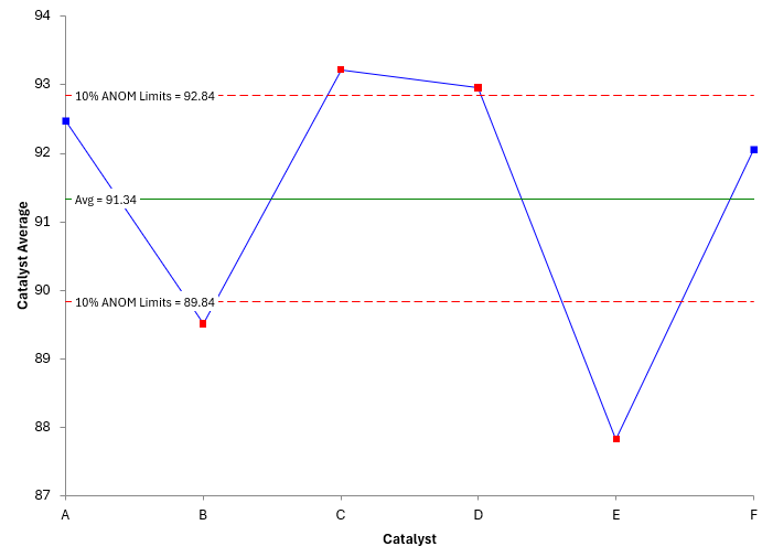
The range between the Upper Detection Limit and the Lower Detection Limit represents the noise in the process. The detection limits contain , a measure of the within subgroup variation. Points outside the limits represent signals. They can’t be explained by the within variation.
Points that are outside the detection limits are significantly different from the overall average. You can see that 2 catalysts are outside on the high side (C and D) and two are outside on the low side (B and E). This means that catalysts C and D provide significantly higher purity than the other catalysts.
Please note that ANOM assumes the within subgroup variation is the same for all treatments. This means that the average range is the “same” for all catalysts. You can see the average range is used in the calculations of the Upper and Lower Detection limits. You need to have a good “value” for that.
You can use the Analysis of Ranges (ANOR) to confirm that the within subgroup variation is the same for all subgroups. It is very similar to ANON. We won’t go through the calculations here, but the ANOR chart is shown in Figure 2.
Figure 2: ANOR for the Catalyst Data
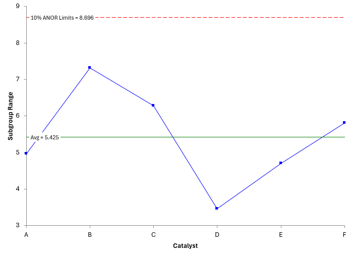
All the ranges are within the detection limits, so you may assume that the within subgroup variation is consistent between all catalysts and the ANOM technique is valid. Again, please see our SPC Knowledge Base article The Analysis of Means and Ranges for more information on the Analysis of Ranges method.
All the results in this publication were generated using the SPC for Excel software. In ANOM, the ANOR chart is generated as part of the ANOM analysis in the software.
The ANOM method showed us which catalyst are significantly different than the average and provided a visual method of seeing the results.
ANOVA Calculations
ANOVA divides the sources of variation into two major categories: within treatments and between treatments, which is essentially the same as ANOM separating the signals from the noise. In our example, each catalyst type is a treatment. The objective is to determine if there are any differences between treatments. This is done by comparing the variation between treatments with the variation within treatments.
If the variation between treatments can be explained by the within treatment variation, we will conclude that there are no differences between the treatments. If the variation between treatments cannot be explained by the within treatment variation, we will conclude that there are differences between the treatments.
For more detailed information on ANOVA, please see our SPC Knowledge Base article Single Factor ANOVA.
The output from ANOVA is a table, not a chart like for ANOM. The ANOVA table for the catalyst data is shown in Table 3.
Table 3: ANOVA for Catalyst Data
|
Source |
Sum of Squares |
Degrees of Freedom |
Mean Square |
F |
p Value |
|
Catalyst |
189.7 |
5 |
37.94 |
9.899 |
0.0000 |
|
Within |
161.0 |
42 |
3.833 |
|
|
|
Total |
350.7 |
47 |
|
|
|
Let us see how this table was created. The first column contains the source of variation. It divides the sources of variation into two major categories: within treatment (error) and between treatment (catalysts). The total source is the sum of the within treatment and between treatment.
The second column in Table 3 contains the sum of squares. These are calculated as shown below.
- The total sum of squares is given by:
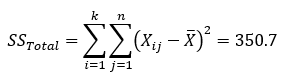
where Xij is the purity for the ith treatment and jth batch and is the overall average. You can see why this is called a sum of squares, since you are summing the square of each individual result minus the overall average. For our catalyst example, the total sum of squares is 350.7.
- The treatment sum of squares measures variation between the treatment averages and the overall overage and, for equal subgroup sizes, is given by:
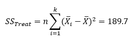
where Xi is the ith catalyst average. The treatment sum of squares for the catalyst data is 189.7.
- The error (within treatment) sum of squares is given by:
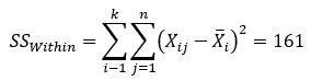
This measures the variation of the individual catalyst results around the catalyst average.
The third column in the ANOVA table shown in Table 3 is the degrees of freedom.
- The total degrees of freedom in this example is N – 1, where N is the total number of runs (8*6 = 48). So,
Total Degrees of Freedom = N -1 = 48 -1 = 47
Why do you subtract 1? This is because you use the data to calculate the overall average. Only 47 of the results can vary when the average has been calculated from the 48 results.
- The treatment (catalyst) degrees of freedom is k – 1 = 5. You subtract one again because your sample used the data to calculate the overall average.
- The within degrees of freedom is equal to the total degrees of freedom – treatment degrees of freedom = 47 – 5 = 42.
The fourth column is the mean square. The mean square is obtained by dividing the sum of squares for the source by the degrees of freedom for the source.
- The mean square for catalysts is:
MSB = mean square between = 189.7/5 = 37.94.
This number represents how different the catalyst averages are from each other. If this number is large, it can mean that there is more variation between the catalyst averages than you would expect based on the within subgroup variation.
- The within mean square is:
MSW = mean square within = 161.0/42 = 3.833
This number represents the variation you would get by random chance within each catalyst or treatment. It is the error variance.
The fifth column is the F value. This is determined by dividing the mean square for the catalysts by the mean square error. It is this value that determines if there are any significant differences between the treatment means.
- In this example,
F = MSB/MSW = 37.94/3.833 = 9.899
If F is large, we conclude that the between treatment variation is large compared to the within treatment variation. This suggests that at least one of the treatment averages is significantly different.
The last column is the p-value. This gives you the probability of getting the F value if the null hypothesis is true, i.e., the treatment averages are the same.
- You can use FDIST in Excel to calculate the p-value:
p-value = FDIST(F, df numerator, df denominator)=FDIST(9.899, 5, 42) = 2.63E-06
where df = degrees of freedom. The value is very small. We conclude that the probability of getting this result is very small if all the treatment averages are the same, so at least one of the treatment averages must be different than the others.
So, this ANOVA analysis does indicate that there are differences in the catalyst averages.
Output Differences
The output from ANOM and ANOVA are very different. ANOM provides a chart that easily shows which treatment averages are different. They say a picture is worth a thousand words. That is definitely true in this case. It is very easy for others to quickly see and understand the results. It is the perfect tool to show management.
The output for ANOVA provides only a table that tells you if there are treatment averages that are different, but not which ones if there are differences. You can explain the table to others, but it is not as easy as showing the ANOM chart.
The other thing to remember is that ANOVA does not check the within subgroup variation for consistency. The ANON method does if you include the ANOR chart – which the SPC for Excel software does.
You must run additional analysis to figure out which treatment averages are different with ANOVA. These additional analysis techniques could be the Tukey or Bonferroni tests for multiple means to find out which means are different. You can also run Barlett’s test for equality of variances to test if the within subgroup variation is the same for all treatments.
Summary
This publication compared the Analysis of Means (ANOM) to Analysis of Variance (ANOVA). ANOM provides a much better method of summarizing and visualizing the results. A single chart provides the major headlines. You can easily see which treatments are different. ANOVA on the other hand just presents a table and tells you if there are any differences in treatments but not which treatments are different.
So, use ANOM whenever you can.