April 2017
(Note: all the previous SPC Knowledge Base in the control chart examples category are listed on the right-hand side. Select this link for information on the SPC for Excel software.)

Some of these variables represent measurements taken along a continuum (e.g., time). Other represent counts (e.g., number of falls). Sometimes these counts are expressed as rates. Rates are usually more informative, particularly when something varies over time. For example, the number of falls per month depends on the number of patients present during the month. Rates are used to account for the variation in the number of patients each month. The variable might be the number of patient falls per 1000 patient days per month. Other times the variable might be expressed as a percentage, e.g., the % of drug doses that have adverse effects. Attribute control charts are often used to analyze these types of data in the health care industry.
However, there are certain conditions that must be met before an attribute control chart can be used. I was taught only part of these when I first learned about attribute control charts. For example, if I had yes/no type data and a variable subgroup size, I should use a p control chart. It turns out there are more conditions that must be met before I can use that p control chart.
If the conditions are not met, the control limits for the attributes control chart are not valid. In many industries, including health care, some of these conditions are ignored; leading to use of a control chart with invalid control limits. But does it really matter? That is the question that this publication attempts to address.
In this issue:
- Review of Attribute Control Charts
- p Control Chart Example
- u Control Chart Example
- Summary
- Quick Links
You may download a pdf version of this publication at this link. Please fee free to leave a comment at the end of the publication.
Review of Attribute Control Charts
The p, np, c and u control charts are called attribute control charts. These four control charts are used when you have “count” data. There are two basic types of attributes data: yes/no type data and counting data. The type of data you have determines the type of control chart you use.

The p and np control charts can be used to track yes/no type. The p control chart plots the fraction or percentage defective (p) over time (e.g. the percentage of patients who fell) . The subgroup size does not have to be the same each time. The np control chart plots the number defective (np) over time, and the subgroup size has to be the same each time. For example, you randomly select 100 patients each week and plot the number that fell.
Counting data is different than yes/no data. With counting data, you are counting the number of defects. A defect occurs when something does not meet a preset specification. It does not mean that the item itself is defective. When looking at counting data, you end up with whole numbers such as 0, 1, 2, 3; you can’t have half of a defect. There are two ways to track this counting type data, depending on what you are plotting and whether the area of opportunity for defects to occur is constant. The c control chart plots the number of defects (c) over time. The area of opportunity must be the same over time. You might plot the number of patient falls in a month in one hospital. The hospital is the area of opportunity. The u control chart plots the number of defects per inspection unit (c/n) over time. The area of opportunity can vary over time. Your inspection might be 1000 patient days. Here you would track the number of patient falls per 1000 patient days.
If you want to read more about attribute control charts, there are eight publications in our SPC Knowledge Base available at this link. For our analysis here, we will focus on the p and u control charts.
p-Control Chart Example

This is yes/no type data. When I first learned about p control charts (a long time ago), this is all that was taught. You could use a p control chart if you had this yes/no type data.
It turns out, that is not quite the complete story. The control limits on the p control chart are based on a binomial distribution. Our overview to attribute control charts publication gives more detail on this. To follow a binomial distribution, the counts must also satisfy the following four conditions, as shown in Advanced Topics in Statistical Process Control (Dr. Don Wheeler, http://www.spcpress.com):
- The area of opportunity for defective items to occur must consist of n distinct items (e.g., there were 100 people discharged today).
- Each of the n distinct items is classified as possessing or not possessing some attribute (e.g., for each person discharged, determine if the discharged person had been readmitted and it was unplanned).
- Let p be the probability that an item has the attribute; p must be same for all n items in a sample (e.g., the probability of a discharged person having had an unplanned readmittance is the same for all discharged persons).
- The likelihood of an item possessing the attribute is not affected by whether or not the previous item possessed the attribute (e.g., the probability that a discharged person had an unplanned admittance is not affected by other discharged persons in the group).

I recently purchased a copy of the book The Health Care Data Guide by Lloyd Provost and Sandra Murray. This book has many examples of control charts in the health care industry. It has a lot of very useful information. In the section on p control charts, they state that the “primary” assumptions required to use the p chart are:
- Each unit can be classified into only one of two categories.
- The occurrence of a unit having either of the two attributes is independent of the attributes of the other units. (This assumption is most often violated when defects occur in bunches)
- It is impossible for the numerator to be larger than the denominator (if 50 cases are reviewed, the maximum that can fail to meet the criteria is 50).
Note that the third requirement from Dr. Wheeler is not present at all. Does this matter? One example in the book involves the unplanned readmittance issue above. A team took data on the number of discharge persons with unplanned readmittances and the total discharges per month.
Does this situation meet the four requirements given by Dr. Wheeler? It does meet 1, 2 and 4, but probably not 3. I would imagine that age makes a difference in unplanned readmissions as well as the original reason for being admitted. So, the four conditions do not apply and the control limits are not valid. But does it matter?
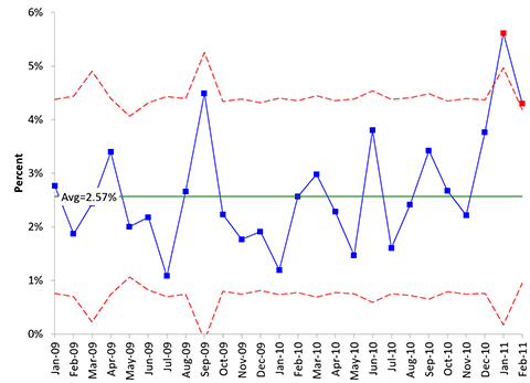
The data from the book are shown in Table 1. What does the p control chart look like. The p control chart is shown in Figure 1.
Table 1: Readmissions Data
| Month | DISCHARGED | UNPLANNED READMISSIONS | Month | DISCHARGED | UNPLANNED READMISSIONS | |
|---|---|---|---|---|---|---|
| Jan-09 | 688 | 19 | Feb-10 | 703 | 18 | |
| Feb-09 | 643 | 12 | Mar-10 | 638 | 19 | |
| Mar-09 | 411 | 10 | Apr-10 | 702 | 16 | |
| Apr-09 | 678 | 23 | May-10 | 682 | 10 | |
| May-09 | 999 | 20 | Jun-10 | 578 | 22 | |
| Jun-09 | 735 | 16 | Jul-10 | 686 | 11 | |
| Jul-09 | 647 | 7 | Aug-10 | 663 | 16 | |
| Aug-09 | 678 | 18 | Sep-10 | 614 | 21 | |
| Sep-09 | 312 | 14 | Oct-10 | 711 | 19 | |
| Oct-09 | 717 | 16 | Nov-10 | 678 | 15 | |
| Nov-09 | 680 | 12 | Dec-10 | 691 | 26 | |
| Dec-09 | 733 | 14 | Jan-11 | 392 | 22 | |
| Jan-10 | 670 | 8 | Feb-11 | 861 | 37 |
Figure 1: p Control Chart for Unplanned Readmissions
The control limits on this control chart vary because the subgroup size (number of discharges) varies each month. This chart shows two out of control points. But suppose the control limits are not accurate because the data do not meet the four requirements above. Maybe the last data point, which is out of control, had a lot of older people since it was the flu season. If the conditions to use a p control chart are not met, what options do you have?
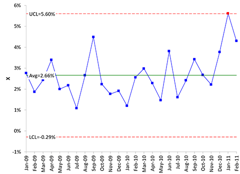
One option is to construct an individuals control chart (X-mR). The individuals chart for these data are shown in Figure 2. The p values are simply plotted on the X chart. We will just show the X chart here since that is the one we want to compare directly to the p control chart.
Figure 2: X Control Chart for Readmissions Data
The X control chart tells a similar story to the p control chart, but there is only one out of control point. Other than that, they are very similar.
Does it matter which control chart you use? Well, according to the “rules”, the data does not meet the requirements for the binomial distribution. You should go with the individuals control chart. The individuals control chart has been shown over the years to be very robust to many different situations. You usually can’t go wrong with the individuals control chart.
You also avoid the issue of having to explain why the control limits on the p control chart vary. You also avoid the issue of the small case for the binomial distribution. If the average fraction defective times the subgroup size is less than 5, the control limit equations for the p control chart are no longer valid. You must use the actual binomial distribution to determine the control limits.
For more information on the small sample case, please see the link above to our publications on attribute control charts.
u Control Chart Example
With u control charts, you are counting the number of defects that occur over an area of opportunity. These data are essentially rates, which are used very often in the health care industry. For example, you might want to track the rate of adverse drug effects (ADE). You would have to track the number of drug doses given as well as the number of ADEs.
You could track the number of ADEs per dose. But that number would be very small and difficult to understand quickly. In this case, a larger inspection is unit is one. For example, you might track the number of ADEs per 1,000 doses.
When I was first taught u charts, I was taught that you used a u control chart with counting data where the area of opportunity changed over time. Again, this is not the complete story. The control limits on the u control chart assume the data come from a Poisson distribution.
There are four conditions that must be met for data to be from a Poisson distribution; according to Dr. Wheeler’s book.
- The counts must be discrete counts (e.g., each ADE is discrete).
- The counts must occur in a well-defined region of space or time (e.g., the ADE occurs in one hospital).
- The counts are independent of each other, and the likelihood of a count is proportional to the size of the area of opportunity (e.g., the probability of a ADE occurring is the not related to an area in the hospital).
- The counts are rare compared to the opportunity (e.g., the opportunity for an ADE to occur is very large but then number that actually occur is small).
In the health care book, the authors state the following primary assumptions about using the u control chart:
- The incidents being counted are whole numbers.
- An incident in one place or time is independent of any other incident.
- The areas of opportunity between subgroups may vary.
- The chance of an incident at any one place or time is small.
- It is possible, even if unlikely, for the numerator to exceed the denominator (that is, it is possible to have more than 50 errors in 50 medical charts inspected).
Though the two lists are similar, there is no mention of the second part of the 3rd condition under Dr. Wheeler – the likelihood of a count is proportional to the size of the area of opportunity. This condition is the one that is hardest to meet.
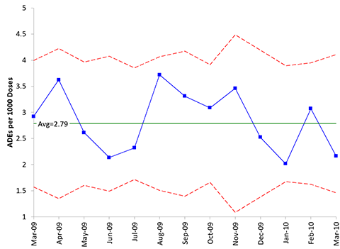
Another example in the health care data book involved the adverse drug event scenario above. Table 2 shows the data. These data were analyzed in the book using a u control chart. The u control chart is shown in Figure 3.
Table 2: Adverse Drug Event (ADE) Data
| Month | Number of Doses Dispensed | Number of ADEs | u |
|---|---|---|---|
| Mar-09 | 17110 | 50 | 2.92 |
| Apr-09 | 12140 | 44 | 3.62 |
| May-09 | 17990 | 47 | 2.61 |
| Jun-09 | 14980 | 32 | 2.14 |
| Jul-09 | 21980 | 51 | 2.32 |
| Aug-09 | 15320 | 57 | 3.72 |
| Sep-09 | 12990 | 43 | 3.31 |
| Oct-09 | 19760 | 61 | 3.09 |
| Nov-09 | 8670 | 30 | 3.46 |
| Dec-09 | 12680 | 32 | 2.52 |
| Jan-10 | 20330 | 41 | 2.02 |
| Feb-10 | 18550 | 57 | 3.07 |
| Mar-10 | 14310 | 31 | 2.17 |
Figure 3: u Control Chart for ADE Data
This process appears in statistical control. No points beyond the control limits. The control limits vary because the area of opportunity varies from month to month. But are the control limits valid? What if the likelihood of a count is not proportional to the area of opportunity? If the data were taken across several hospitals, it is much more likely than there may be more ADEs at hospitals dealing with the critically ill.
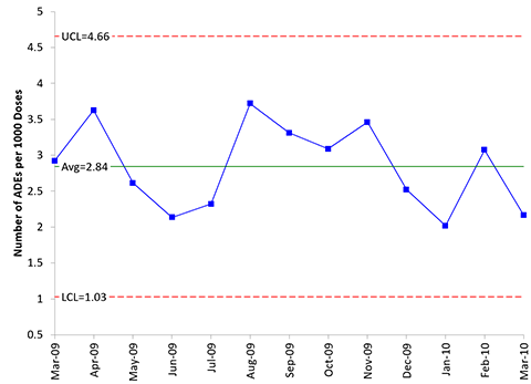
One option is to use the individuals control chart. The X chart for the data in Table 2 is shown in Figure 4. The u values are plotted on the X chart.
Figure 4: X Chart of Number of ADEs per 1,000 Doses
The two charts look very similar. Again, does it matter if the conditions for the using the Poisson distribution are not met? Maybe not. But those are the “rules” on when you can use the u control chart. If you are worried, use the individuals control chart. This solves the issue of varying control limits and the small sample case for u control charts.
Summary
This publication examined the use of attribute control charts in the health care industry. There are many potential applications for attribute control charts. Sometimes, the conditions required to use the attribute control chart are not met. In these cases, the control limits may not be valid. The X control chart provides another option to use in those situations. And, in general, the X chart is easier to explain and understand.


The data in Table 1 seems odd, but not because the last two months might be out of control on a P chart. The oddity is no significant correlation between Unplanned Readmissions and number Discharged. No correlation begs the question of what utility there is in control charting their ratio.A C Chart on Discharged count shows three VERY low months and two VERY high months, with the rest of the months more or less under control. Thus the real mystery here is the 5 extreme outlier months from a normal or Poisson distribution in no obvious pattern for the Discharge counts. Unplanned Readmissions are under control on a C Chart (or U chart at 0.53 per day) until the final month, when both variables for once go high together.
I am not sure I would expect a correlation between discharged and unplanned readmissions. If it is in control, there is just random variation in the process. Using different charts does give you different answers.
To meet this condition of a U chart (The counts are independent of each other, and the likelihood of a count is proportional to the size of the area of opportunity (e.g., the probability of a ADE occurring is the not related to an area in the hospital).), I think the better solution would be to stratify the data into units/areas where the probability is the same, rather than put messy data on an XmR chart.
Thanks Bill, I always value your posts. The other thing you can do with the XmR chart, is set the control limits on the 12 month in 2009 (rationale being you wish to look as data from 2009 compared to 2010) and also use Weaker Rules sets to look for data patterns, The second out of control point (5) is a weaker signal, 2 out of 3 points beyond 2 sigma
Regards Ian
Thanks for the kind comment. Yes, you can set the control limits for one year – that is done quite often just for the reason you said – to compare this year to that baseline year.