May 2012
 This month’s newsletter takes a look at how control charts can be used in purchasing. Purchasing is not an easy job in most companies, particularly in distribution companies. Purchasing is responsible for ensuring that product is available when the customer orders it from the distributor. What do customers want? They want the product they want, when they want it and at what they perceive is a reasonable price.
Sounds simple, right? If you are in sales, you want purchasing to carry every product you might sell. After all, if the customer wants a product and you are out of it, the customer might go elsewhere. And you lose the sale and the commission. On the other hand, management wants purchasing to control costs. They can’t carry every possible product – the cost would be huge. Purchasing, with input from sales, must decide what products to carry in stock.
So, there is an ongoing battle between sales and purchasing on what should be carried in stock. And purchasing must decide how much to carry in stock and when to re-order. You don’t want those stock outs. And purchasing doesn’t want to deal with all the dead stock issues – that stuff they put in inventory because salespeople were sure they would sell it – but never did.
Many times, purchasing metrics are part of a company’s Key Process Indicators (KPI) or scorecards. Unfortunately, the metrics are usually end-of-the-line measurements like most KPI and scorecard metrics are. Once the metric tells you have a problem, it is often too late. Even with those color coded scorecards. Most scorecards don’t take into variation – common and special causes. Those “yellow” warning signs are usually green the next month without doing anything! The challenge is to move upstream in the process for metrics that will give you early warning of potential problems – before the problem gets to the end-of-the line.
Control charts do take into account variation and give you much more insight into the behavior of the metric and the process. So, how can statistical process control and control charts help in purchasing? This newsletter examines this topic. In this issue:
- Our Scenario
- Purchasing Metrics
- The Purchasing Data
- Control Chart for Stock Outs
- Control Chart for Service Level
- Control Chart for Fill Rate
- Problems with These Three Metrics?
- Summary
- Quick Links
As always, please feel free to leave a comment at the end of the newsletter.
Our Scenario
Suppose you are the new purchasing manager in a distribution company. The company has been struggling with customer complaints about stock outs – products that are should be in stock but aren’t available when the customer orders them. This, of course, hurts customer satisfaction. And it doesn’t help the salespeople’s morale. They are losing sales. So, you have been tasked with decreasing stock outs and improving service level to the customer. How can control charts help you?
Purchasing Metrics
The distribution company calls the individual products it carries “stocking lines.” For example, work gloves might be one stocking line; one type of screwdriver another stocking line. A stock out occurs when the quantity on-hand goes to zero. One weekly metric the company tracks is % stock outs, defined as:
% Stock Outs = 100(Stock Outs/Stocking Lines)
There are two other metrics that the company tracks on a weekly basis: % service level and % fill rate. These are defined below.
% Service Level = 100(Lines Filled Complete/Lines Ordered)
% Fill Rate = 100(Quantity Shipped/Quantity Ordered)
A line is filled complete if there is sufficient quantity to fill the order completely. For example, if a customer orders 100 work gloves and you ship 100, the line is filled completely. However, if you only have 99 gloves and ship all those, the line is not filled completely. Each week, the total number of lines filled complete is determined. This is divided by the total number of lines ordered to determine the % service level.
The fill rate is quantity shipped (like 99 work gloves) divided by the quantity ordered (like 100 work gloves). Each week, the total number of items shipped is determined and divided by the total number of items ordered to determine the % fill rate.
The company has goals for each of these three metrics:
- % Stock Outs: 2% maximum
- % Service Level: 95% minimum
- % Fill Rate: 90% minimum
Each week, the metric is determined and placed on a scorecard with all those cute colors to determine if you are doing well (green), might have a problem (yellow), or have a problem (red).
Question for you to consider: what is the problem with these three metrics?
The Purchasing Data
The data for the past half-year are shown in the table below. What can you see from the table?
Table 1: Purchasing Data
| Week Number | Stock Outs | Stocking Lines | % Stock Outs | Lines Filled Complete | Lines Ordered | Service Level | Quantity Shipped | Quantity Ordered | Fill Rate |
| 1 | 84 | 1895 | 4.4% | 216 | 227 | 95.2% | 2615 | 2724 | 96.0% |
| 2 | 87 | 1895 | 4.6% | 156 | 171 | 91.2% | 846 | 855 | 98.9% |
| 3 | 66 | 1895 | 3.5% | 156 | 171 | 91.2% | 804 | 855 | 94.0% |
| 4 | 68 | 1899 | 3.6% | 207 | 228 | 90.8% | 1929 | 2052 | 94.0% |
| 5 | 75 | 1899 | 3.9% | 154 | 171 | 90.1% | 1908 | 2052 | 93.0% |
| 6 | 74 | 1905 | 3.9% | 215 | 229 | 93.9% | 2556 | 2748 | 93.0% |
| 7 | 72 | 1905 | 3.8% | 243 | 267 | 91.0% | 2590 | 2670 | 97.0% |
| 8 | 87 | 1907 | 4.6% | 181 | 191 | 94.8% | 1633 | 1719 | 95.0% |
| 9 | 54 | 1903 | 2.8% | 207 | 228 | 90.8% | 1245 | 1368 | 91.0% |
| 10 | 145 | 1922 | 7.5% | 199 | 250 | 79.6% | 1750 | 2000 | 87.5% |
| 11 | 65 | 1932 | 3.4% | 238 | 251 | 94.8% | 2801 | 3012 | 93.0% |
| 12 | 78 | 1922 | 4.1% | 177 | 192 | 92.2% | 1882 | 1920 | 98.0% |
| 13 | 76 | 1925 | 3.9% | 246 | 270 | 91.1% | 2074 | 2160 | 96.0% |
| 14 | 78 | 1932 | 4.0% | 141 | 155 | 91.0% | 1104 | 1240 | 89.0% |
| 15 | 81 | 1944 | 4.2% | 221 | 233 | 94.8% | 1314 | 1398 | 94.0% |
| 16 | 59 | 1954 | 3.0% | 162 | 176 | 92.0% | 1410 | 1584 | 89.0% |
| 17 | 58 | 1960 | 3.0% | 164 | 176 | 93.2% | 1820 | 1936 | 94.0% |
| 18 | 89 | 1960 | 4.5% | 252 | 274 | 92.0% | 3222 | 3288 | 98.0% |
| 19 | 40 | 1958 | 2.0% | 143 | 157 | 91.1% | 1168 | 1256 | 93.0% |
| 20 | 38 | 1960 | 1.9% | 186 | 196 | 94.9% | 1803 | 1960 | 92.0% |
| 21 | 89 | 1960 | 4.5% | 157 | 176 | 89.2% | 1170 | 1232 | 95.0% |
| 22 | 78 | 1960 | 4.0% | 216 | 235 | 91.9% | 1354 | 1410 | 96.0% |
| 23 | 67 | 1962 | 3.4% | 138 | 157 | 87.9% | 1606 | 1727 | 93.0% |
| 24 | 45 | 1960 | 2.3% | 240 | 255 | 94.1% | 1469 | 1530 | 96.0% |
| 25 | 56 | 1968 | 2.8% | 166 | 177 | 93.8% | 876 | 885 | 99.0% |
| 26 | 89 | 1968 | 4.5% | 181 | 197 | 91.9% | 946 | 985 | 96.0% |
It is often hard to see what is happening by looking at a table of numbers – particularly tables with lots of numbers. It is much easier to see what is happening by looking at the data over time – in a time series format. Why do so many people not see this?
Control Chart for Stock Outs
 The metrics above are fairly common for monitoring purchasing performance in a distribution company. The problem with most scorecard approaches is that the underlying process is not being examined – only this week’s results compared to a goal – that may or may not be reasonable. Control charts allow you to look at the process behavior over time – is it improving, staying the same, or getting worse? Are there any special causes of variation present or is all the variation due to common causes of variation? If you are new to control charts or need a refresher, please see our March 2011 newsletter on the purpose of control charts.
The proper control chart to analyze these data is the individuals (X-mR) control chart. We will use this chart to analyze the data here. For more information on the individuals control charts, please see our October 2006 newsletter.
The control chart for % stock outs is shown in Figure 1.
Figure 1: % Stock Outs
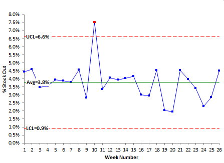
The average % stock outs for this time frame is 3.8% – definitely above the 2% goal. There is one point that is out of control during this 26 week period – the point above the upper control limits in week 10. This value (7.5%) is not part of the normal variation in the process. Something happened that caused the stock outs to be so high. The reason for this should be found and eliminated. Note that if you were just now charting these data, that special cause of variation would have happened 16 weeks ago – making it very hard to find the reason for the out of control point. This is why it is so important to plot the data in as close to real-time as possible. It makes it much easier to find the reason for special cause.
The normal variation is defined by the lower control limit and the upper control limit. However, the presence of the special cause of variation makes these values inaccurate. Figure 2 shows the % stock out chart with the special cause of variation removed from the calculations, but still plotted.
Figure 2: % Stock Outs without Special Cause of Variation
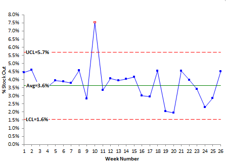
The lower control limit is 1.6%; the upper control limit is 5.7%. This defines the normal range of variation in the process. Some weeks, the stock outs may be as low as 1.6% and other weeks as high as 5.7%. And this range will continue in the future until the process is fundamentally changed. The key word here is fundamentally. The process will meet the goal of 2% sometimes, but it is just chance that it occurs. Most of the time, it will not meet the goal.
Control Chart for Service Level
The control chart for service level is shown in Figure 3.
Figure 3: % Service Level
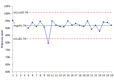
The % service level control chart has one special cause of variation – the same week as the stock outs chart. Removing the special cause of variation from the calculations gives an LCL = 85.5% and an UCL = 98.9%. The goal is 95%. So, some weeks it will be met; other weeks it will not. To improve this, again the process must be fundamentally changed.
Control Chart for Fill Rate
The control chart for fill rate is shown in Figure 4.
Figure 4: % Fill Rate
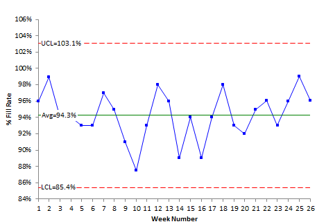
This chart does not have any special causes of variation. The process is in control. It is consistent and predictable. As long as the process stays the same, the % fill rate will vary from 85.4% to 103.1% and this is just the normal variation in the process. Is it possible to ship a larger quantity than the quantity ordered for a week? Yes, if you are making up past shipments that were not complete.
Problems with These Three Metrics?
Are there any problems with these three metrics? The biggest problem with these types of metrics is that they are end of the line measurements. You are measuring the process at the output. If there is a problem, it is has already occurred. The challenge to people using control charts is how to move upstream in the process to find out what impacts those output metrics.
For example, what impacts stock outs? That could be supplier delivery. It could lack of expediting open orders. The list goes and on. The challenge is begin to track upstream metrics to allow you to prevent the problems before they occur. If you are expediting, track the % of order expedited on-time. Track on-time supplier performance as well as their service level. All these move you upstream in the process. What other ideas do you have for things upstream that impact stock outs?
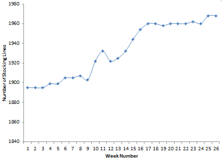
What about the number of stocking lines? Did you notice anything interesting in the number of stocking lines in Table 1? It has increased over these 26 weeks as Figure 5 below shows. What does increasing the number of stocking lines do for the potential for stock outs? The potential for sales? This is definitely a balancing act for companies!
Figure 5: Stocking Lines
Summary
This month’s newsletter examined how control charts can be used to monitor metrics in purchasing. Three metrics were examined: % stock outs, % service level, and % fill rate. An individuals control chart can be used to monitor these three metrics. The problem is that these represent end of the line measurements. The challenge is to move upstream in the process to find out what variables impact those end-of-the-line metrics and to control those variables.
Interesting post, thank you.I'm interested to know why you would use an X-mR chart here and not a p chart?Thank you
Thanks for the comment. The p control chart has to satisfy four conditions to be used. These are given in the publication at this link. For example, one is that the probability of being a stock out, for example, has to be the same for all products That is not the case – faster moving items probably have a higher probability of being stocked out – or a very slow moving item also. So, if the conditions are not met, you can’t use the p control chart.