August 2013

This month we will take a look at how SPC can help you understand how your website is performing. In particular, we will take a look at how you can track the number of visitors to the website. You can apply this information to just about any metric you track on the website – organic traffic, paid traffic, conversion rate, bounce rate, time on the websites, page views, number of backlinks etc.
We will also use this as an opportunity to review some of the basics about control charts – for example, what it means to be in statistical control, when to lock control limits, and when the process signals you something has changed.
In this issue:
- Visitors’ Data
- The Control Chart Approach
- The Daily Control Chart
- The Weekly Control Chart
- The Process Changes
- Did the Marketing Plan Work?
- Summary
- Quick Links
As usual, you can leave a comment if you would like at the end of the newsletter.
Visitors Data
To have a successful website, you need people to visit it. For some websites, the number of visitors is a key. For others, particularly for-profit websites, you want visitors who will buy something. Tracking the number of visitors is a great way to see the impact of changes you make to the website. Is your Search Engine Optimization (SEO) process really making a difference in attracting new organic traffic? Do your pay-per-click keywords actually significantly increase traffic or sales?
The first question is whether you should track visitors by day, week or month? If you are like most websites, tracking the number of visitors per day is probably not very good. First of all, many websites see a decrease in traffic on the weekends. So, you are really looking at two different processes. Suppose that the data in Table 1 is your daily traffic for one month. Lets see what we can learn from this data using the control chart approach.
Table 1: Web Visitors per Day
| Day Number | Visitors | Day of Week | Day Number | Visitors | Day of Week | |
| 1 | 563 | Wed | 17 | 451 | Fri | |
| 2 | 555 | Thu | 18 | 286 | Sat | |
| 3 | 390 | Fri | 19 | 378 | Sun | |
| 4 | 296 | Sat | 20 | 678 | Mon | |
| 5 | 387 | Sun | 21 | 610 | Tue | |
| 6 | 603 | Mon | 22 | 650 | Wed | |
| 7 | 612 | Tue | 23 | 600 | Thu | |
| 8 | 614 | Wed | 24 | 459 | Fri | |
| 9 | 584 | Thu | 25 | 305 | Sat | |
| 10 | 446 | Fri | 26 | 471 | Sun | |
| 11 | 256 | Sat | 27 | 659 | Mon | |
| 12 | 363 | Sun | 28 | 692 | Tue | |
| 13 | 587 | Mon | 29 | 650 | Wed | |
| 14 | 585 | Tue | 30 | 625 | Thu | |
| 15 | 609 | Wed | 31 | 452 | Fri | |
| 16 | 565 | Thu |
The Control Chart Approach
We want to use a control chart to look at this process over time. So, what is a control chart? One purpose of a control chart is to monitor a process result over time. The control chart is a picture of your process over time. Results vary. The results in Table 1 for the number of visitors per day is not the same each day. Some days it is more. Some days it is less. Control charts help us understand this variation. This understanding of variation is key to effectively using control charts.
Control charts divide the variation you see into two types: common and special causes of variation. Common cause of variation is the “natural” variation in the process. For example, think about how long it takes you to get to work. On average, maybe it takes you 20 minutes. Some days it may take as long as 25 minutes; other days as short as 15 minutes. But as long as you are within this “normal” range of 15 to 25 minutes, you are content – things are pretty much the same. This is what we call common cause of variation. It is the natural variation in the process. It is consistent and predictable. You know that when you leave for work, it will take you between 15 and 25 minutes as long as the process stays the same. Your processes at work have common causes of variation present.
Now suppose you have a flat tire on the way to work. How long will it take you to get to work? Maybe it will take 60 minutes. Definitely out of the normal range of variation. This is called a special cause of variation. It is not supposed to be there. You want to find the reasons for special causes of variation and prevent them from coming back again.
A process is said to be in statistical control if only common causes of variation are present, i.e., there are no flat tires. For more information, please see our newsletter on the purpose of control charts.
The Daily Control Chart
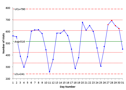
So, how do you make a control chart? You plot the data over time. We have done this in the chart in Figure 1. The daily number of visitors to the website is plotted over time. The y axis is the number of visitors; the x axis the day number. Once the data are plotted, you (or your software) do some calculations. An average value is calculated and plotted. The average is 516. This means that, on average, the website has 516 visitors per day.
Figure 1: Number of Visitors per Day Control Chart
There are a couple of other lines on the control chart. One is called the upper control limit (UCL). The other is called the lower control limit (LCL). These two lines provide the boundaries for values based on common cause of variation. The UCL is the largest value you would expect if you just have common causes of variation. The LCL is the lowest value you would expect if you just have common causes of variation. As long as all the points are within these control limits and there are no patterns, the process is said to be in statistical control. There are no special causes of variation present.
Take a look at Figure 1. Note that you can see the pattern. The four points that are always high are Monday, Tuesday, Wednesday and Thursday. Friday is always lower (guess people taking off work early or those four day work weeks). Then Saturday and Sunday are next. Note in this chart, Saturday is always lower than Sunday. Wonder if that is true usually? Probably but that is another topic.
The control chart in Figure 1 does have an out of control situation as shown by the four red points. The other four lines on the chart represent the zone tests. These are additional tests to find patterns on the chart that represent special causes. This chart fails the zone B test (four out of five consecutive points in Zone B or beyond). Please see our newsletter on how to interpret control charts for more information.
But note that this is not really an out of control point. It occurs because we are looking at two different processes – one for the first four days of the week and another for the last three days of the week. This is one of the finer points of control charts – you don’t want to mix processes on the same control chart. And there are definitely two processes at work here. Doing that generates false out of control signals.
The Weekly Control Chart
In this case, it makes more sense to look at the number of visitors per week or per month. Which you use depends on how you will use the control chart. If you want to see what impact changes you have made to the web have, then track the data weekly. If you aren’t actively trying to increase traffic, then examining the data monthly may be all you need. But, we will use weekly data. Table 2 is weekly data for another website on the number of visitors. There are data for 20 weeks.
Table 2: Web Visitors per Week
| Week Number | Number of Visitors | Week Number | Number of Visitors | |
| 1 | 1747 | 11 | 1786 | |
| 2 | 1785 | 12 | 1602 | |
| 3 | 1697 | 13 | 1608 | |
| 4 | 1771 | 14 | 1456 | |
| 5 | 1814 | 15 | 1715 | |
| 6 | 1685 | 16 | 1923 | |
| 7 | 1645 | 17 | 1733 | |
| 8 | 1555 | 18 | 1894 | |
| 9 | 1807 | 19 | 1823 | |
| 10 | 1840 | 20 | 1570 |
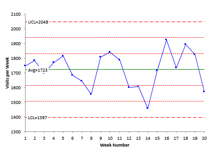
Figure 2 shows a control chart for the weekly data. Note that this process is in “statistical control”. There are no points beyond the control limits and no patterns in the data. This means that it is consistent and predictable. You can expect between 1397 and 2048 visitors each week to the website. This is the normal variation in your website. No cause for alarm when the number of visitors is 1900 one week and 1650 the next. It is all just common cause of variation.
Figure 2: Number of Visitors per Week Control Chart
One of the purposes of a control chart is to track a process to see when something has changed. You do that by “locking” the control limits once you have a stable process. This means that you extend the average and control limits into the future and monitor your process results against those values. For more information on when to “lock” control limits, please see our August 2011 newsletter on when to set and lock control limits.
The Process Changes
The control limits are locked based on the first 20 points. We continue charting the weekly data. The results for the next four weeks are shown in the table below.
Table 3: Next Four Weeks Results
| Week Number | Number of Visitors |
| 21 | 1654 |
| 22 | 1734 |
| 23 | 1694 |
| 24 | 1230 |
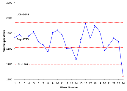
Week 24 has a big decrease in traffic. Is it significant? Is it a special cause? The control chart with the four weeks added is shown in Figure 3.
Figure 3: Updated Number of Visitors per Week Control Chart
The point for week 24 is below the lower control limit. This signals that a special cause of variation is present. You know that something has changed in your process – something has caused your traffic to drop way off. If you have not changed anything on the website, then something in the web world has changed. For example, some websites saw a decrease in traffic when Google changed it search algorithm. This type of control chart can easily pinpoint when the change occurred on your website.
Did the Marketing Plan Work?
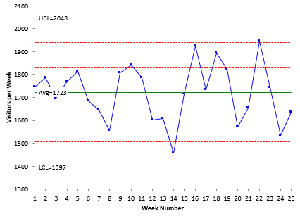
Another purpose of control chart is to see if changes to your process really impact the results. Now suppose you have again locked your control limits for weeks 1 through 20. And you rolled out a new marketing plan in week 21. You expect the marketing plan to increase website visits. In week 22, you have 1945 visitors – a nice increase over week 20 (1570) and week 21 (1654). Did the marketing plan work? Time to celebrate? Not quite. A couple of points usually don’t tell the story. You need to continue to plot the data over time to see what the control chart tells you. The data for weeks 21 through 25 is shown in Table 4. Figure 4 is the control with weeks 21 through 25 added.
Table 4: Marketing Data Results
| Week Number | Number of Visitors |
| 21 | 1654 |
| 22 | 1945 |
| 23 | 1743 |
| 24 | 1534 |
| 25 | 1634 |
Figure 4: Weekly Number of Visitors Control Chart – Marketing Plan
What do you see in Figure 4? A process in statistical control. This means that the variation continues to be consistent and predictable. Has your marketing plan worked? No, not this time. At least – not so far – and it doesn’t look promising.
Summary
This newsletter has taken a look at how control charts can be used to monitor website statistics. In particular, we used the number of visitors to the website, but the process works for other metrics as well. We also reviewed some of the basics about control charts in the process – the purpose of control charts, common and special causes of variation, when to “lock” control limits, etc.


We would like to have SPC interactive capabilities in our website. Please let me know how we can do this. Send an email to xxxxxxx