August 2009
In this issue:
Introduction
I have long wanted to do a newsletter on the use of SPC in health care. There are a few examples in previous newsletters, but not a complete newsletter that is directed specifically at health care. So, I began to do a little research to see what was out there. There is a lot of material on using SPC in health care. Some good and some not so good as it turns out.
I ran across an article in the Research Journal of Medical Sciences (3(2): 87-90, 2009). It is entitled “On the Importance of Statistical Process Control in Health Care.” In this paper, the author is looking at using a control chart to analyze the results of surgeon-specific mortality rates following colorectal cancer surgery.
The author “uses” SPC to compare the mortality rate of 13 doctors. After his “analysis”, he claims the following:
“… all of the surgeons’ results are consistent with common (random) cause of variation except Surgeon 1 patient mortality rate”
This implies that Surgeon 1 has a significantly higher mortality rate than the other 12 surgeons. For more information on common and special causes of variation and how control charts are used to separate the two, please see our January 2008 newsletter. And then the author goes on to write:
“This should be investigated by the health institution concerned and the reasons for the high rate of mortality of surgeon 1 compared to other surgeons discovered.”
Obviously, surgeons have different talents and abilities. If a surgeon has a statistically higher mortality rate than others, the reasons for this should be investigated. And, that should be based on data and proper analysis of the data.
Unfortunately, this was not the case in this paper. Does it matter what type of control chart you use? Yes, it does. And this is a perfect example of how using the wrong type of control chart leads to the wrong conclusions. The author uses a c control chart when it doesn’t apply. This led him to the wrong conclusion. In fact, if properly analyzed, Surgeon 1 is not an outlier in the data. Another surgeon could be though.
The Mortality Data
Always look at how the data was collected. The data used in the 2009 article was pulled from the following article:
“Using Statistical Process Control to Improve the Quality of Health Care,”, Mohammed, M. A., Quality and Safety in Health Care, 2004, 13: 243 – 245.
The data from the 2004 article is shown below. Surgeon 1 corresponds to Surgeon A.
| Surgeon | No. of Cases | No. of Deaths | % of Deaths | Hazard Ratio |
| A | 98 | 16 | 16% | 1.1 |
| B | 66 | 8 | 12% | 1.03 |
| C | 58 | 9 | 16% | 0.87 |
| D | 52 | 7 | 13% | 1.09 |
| E | 52 | 15 | 29% | 1.09 |
| F | 46 | 5 | 11% | 0.86 |
| G | 38 | 3 | 8% | 0.86 |
| H | 37 | 11 | 30% | 1.61 |
| I | 36 | 5 | 14% | 0.91 |
| J | 34 | 7 | 21% | 1.05 |
| K | 32 | 4 | 13% | 0.59 |
| L | 21 | 2 | 10% | 0.97 |
| M | 21 | 3 | 14% | 0.79 |
What do you see in this table? Take a close look. Yes, Surgeon A has the most deaths. But Surgeon A also has the most cases. In fact, 16% of Surgeon A’s patients died. That appears to be about the middle of the pack for all surgeons. So, just looking at the number of deaths doesn’t sound like a good way to approach this data. It turns out that the 2004 article took the data from this 1991 article:
“Impact of Variability Among Surgeons on Postoperative Morbidity and Mortality and Ultimate Survival,” McArdle, C. S. and Hole, D., British Medical Journal, Volume 302, June 22, 1991
The objective of this 1991 article was “to assess the differences among surgeons in using postoperative complications, postoperative mortality, and survival in patients undergoing surgery for colorectal cancer.” The article explains in detail how the data was developed from the 645 patients. These authors were aware of the many different factors that impact how a patient does after surgery. So, they attempted to account for these factors by developing a “Hazard Ratio.”
Using multivariate analysis, McArdle and Hole identified a number of factors associated with postoperative mortality. These included age, emergency admission, and pre-existing cardiac or respiratory disease among others. McArdle and Hole developed a “Hazard Ratio” that is adjusted for those factors. This is the number in the last column above and it is intended to account for the risk factors and compare surgeons even-handily.
Analyzing the Data
The 2004 article uses a control chart based on the hazard ratio and claims that Surgeon H is a special cause of variation. The article states “since a hazard ratio of 1 is defined as neutral, surgeons with a hazard ratio above 1 are considered a hazard to their patients.” To the author’s credit, he knows to use a control chart to determine if there are really any significant differences between the surgeons.
The control chart depicted in the article has been redrawn below. Unfortunately, the article does not tell us how the average and control limits were calculated. But it shows an upper control limit of 1.6 and a lower control limit of 0.3
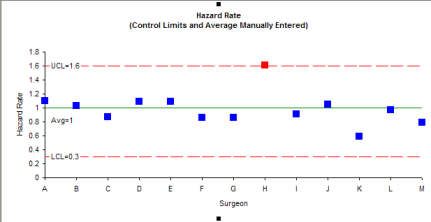
In this control chart, Surgeon H does appear to be a special cause of variation. The problem is that the author doesn’t describe how he calculated the control limits. I can’t reproduce them. If you can figure it out, please let me know. So, we need to look at how to calculate the control limits.
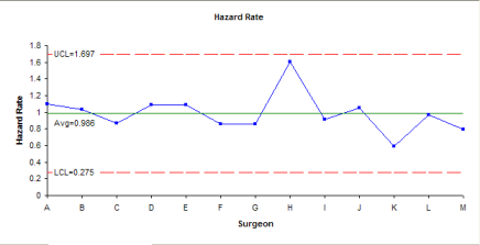
Since the data is not in run time order, you can’t really use an individuals chart to compare the surgeons. But, you can put together a chart with three sigma limits using the calculated standard deviation. The calculations for hazard rate are shown below.
Average: = 0.986
Standard Deviation: = 0.237
LCL = Average + 3(Standard Deviations) = 1.697
UCL = Average – 3(Standard Deviations) = 0.275
The chart is shown below. In this case, Surgeon H is not out of control. You might want to know that if the control chart was based on +/- 2 calculated standard deviations, Surgeon H would be out of control. The jury is probably still out on Surgeon H. But I would probably choose another one if I had to have the surgery.
The 2009 article is the one that is way off base. The author of that article does not use the Hazard Ratio. Instead, he decided to use only the number of deaths. He doesn’t even show a control chart, but claims when you use the chart for defects, that Surgeon A is a special cause of variation. Indeed, if you use a c control chart for the number of deaths, you will get the chart below. And Surgeon A is a special cause of variation.
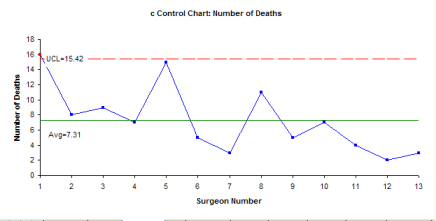
But the c control chart is the WRONG chart to use. A c control chart is used when you’re monitoring defects where each subgroup has the same opportunity for defects to occur. This is not the case in this example. The subgroup size varies from surgeon to surgeon. In addition, to use a c control chart, the opportunity for defects to occur has to be large, but the actual number that is small relative to the opportunity. Please see our April 2009 newsletter on attribute control charts for more information on this.
It is clear that using the wrong control chart leads to the wrong decision.
You might ask if the p control chart could be used for this. The answer is a definite “probably not.” I would need to know more about the process and I am not an expert in that field. The problem lies with the third assumption for using a p control chart (again please see our April 2009 newsletter for details).
- Let p be the probability that an item has the attribute; p must be same for all n items in a sample (e.g., the probability of a participant meeting or not meeting the requirements is the same for all participants).
This means that the probability that someone lived or died is the same for all people among all surgeons. This is highly unlikely with the different ages of patients, different health of patients, different skills of doctors, etc. That is why the authors of the original study attempted to develop a Hazard Rate to account for those differences.
Summary
This newsletter has examined an example of the misuse of SPC that exists in the literature. There are, no doubt, many more. The key is to be sure that you understand the assumptions underlying the control chart you want to use and clearly understand how the data was collected. Using the wrong control chart will lead to the wrong conclusions. And just because it is printed in a journal doesn’t make it valid or true.